Portfolio

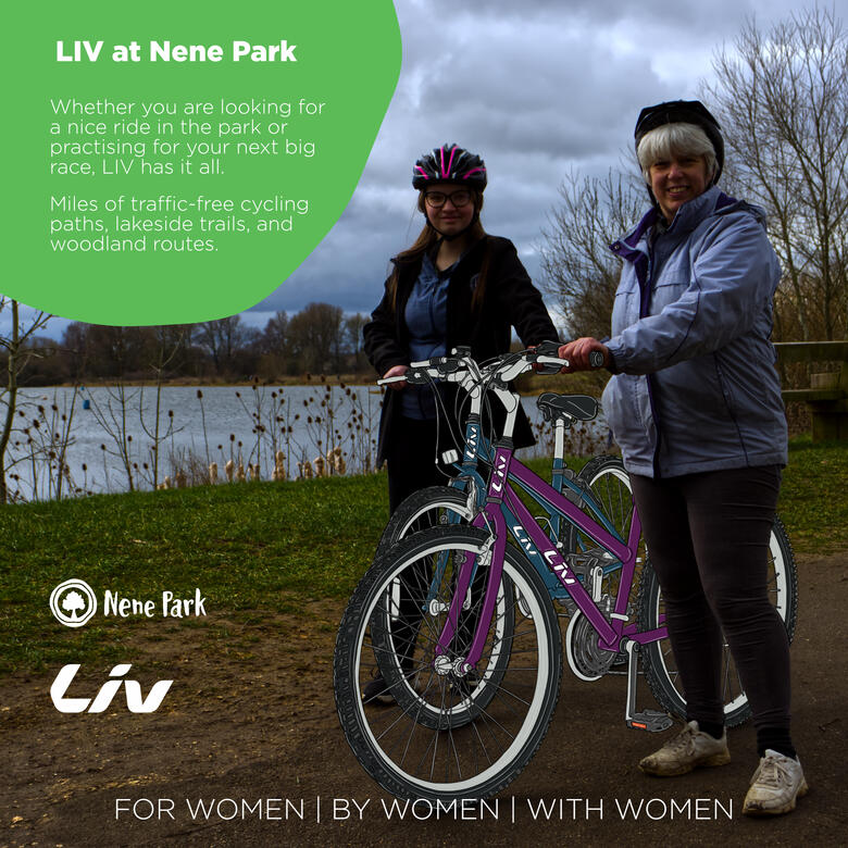
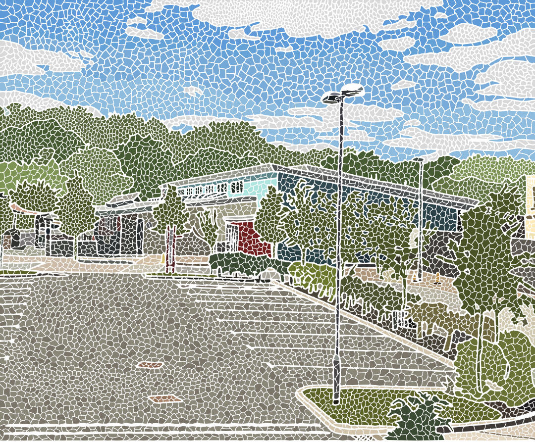
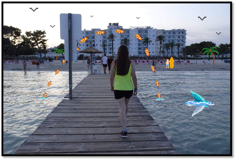
Liv at Nene Park
Bear Walk Cycle Storyboard

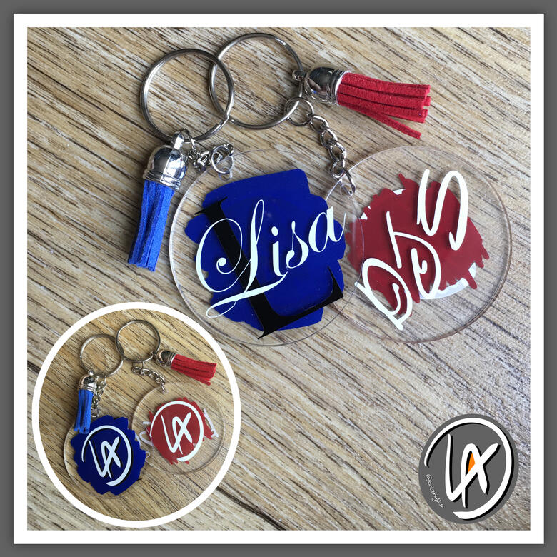
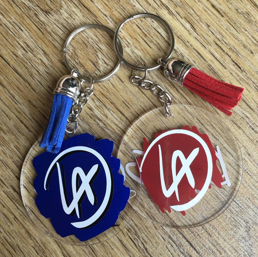
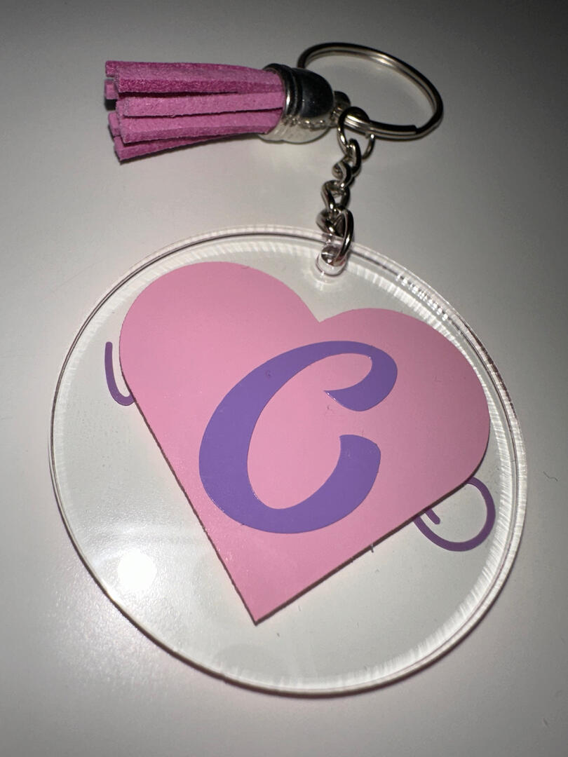
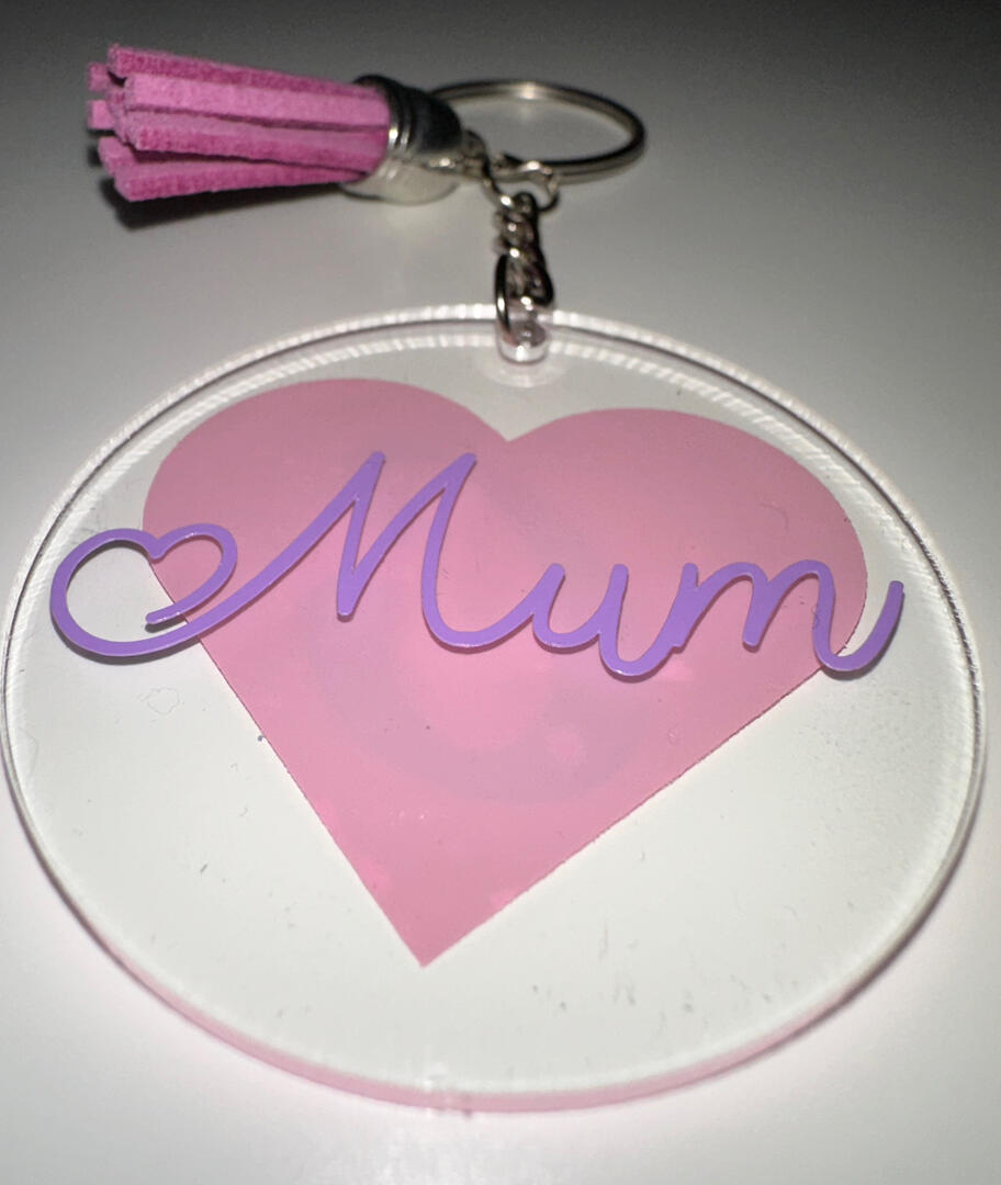
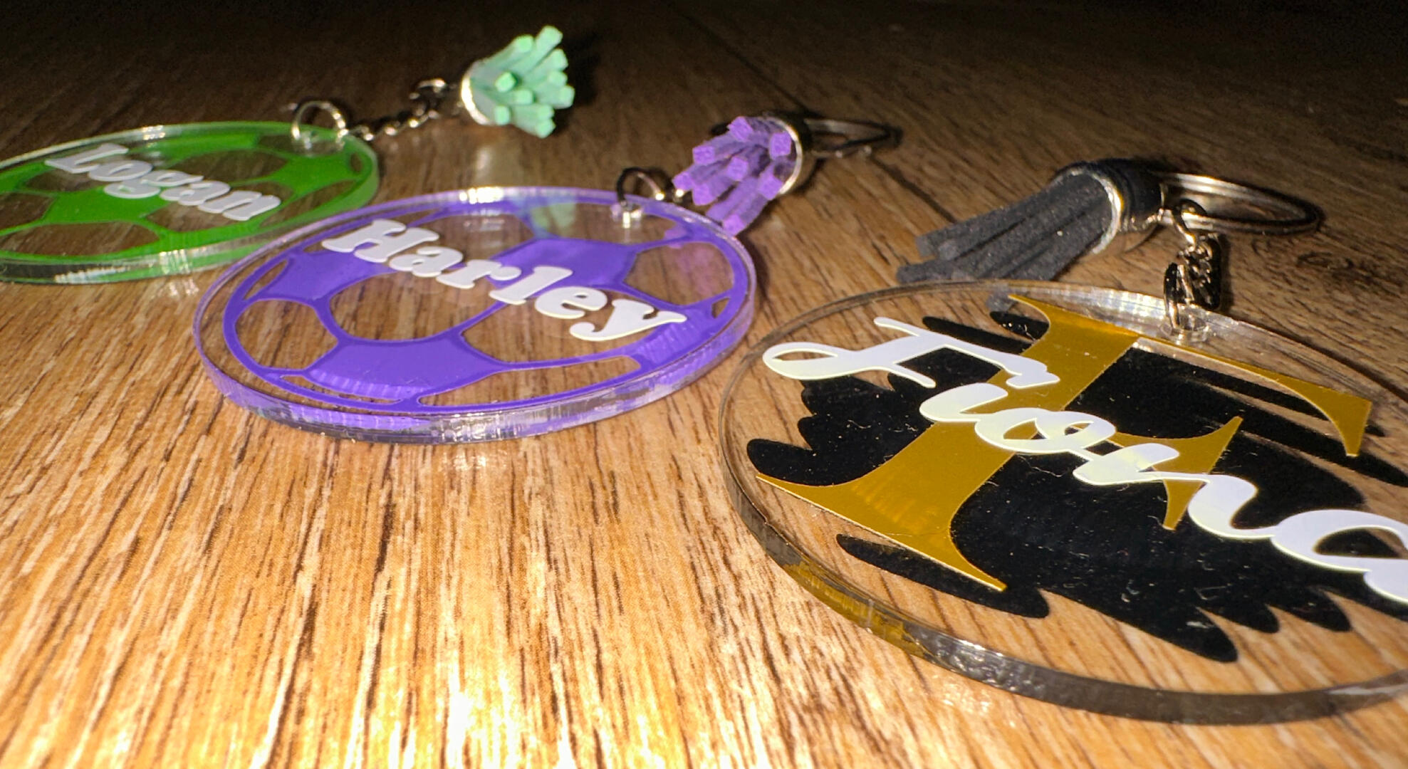
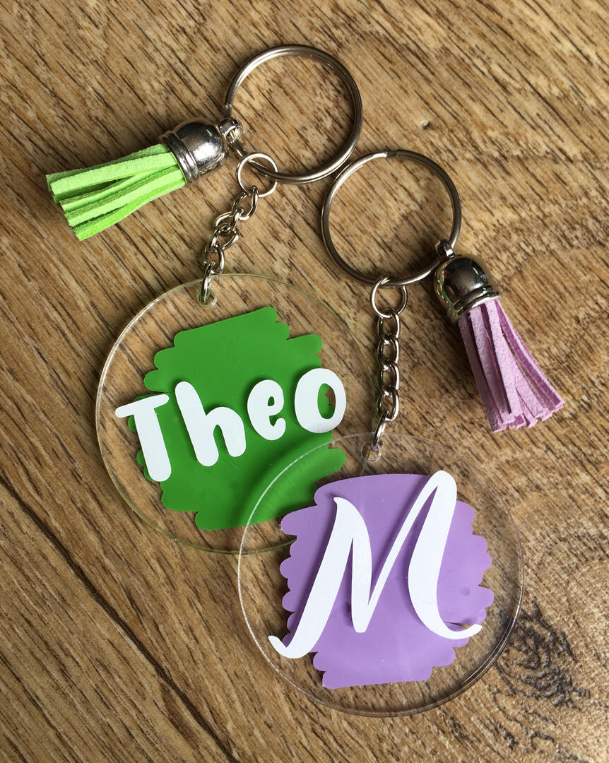
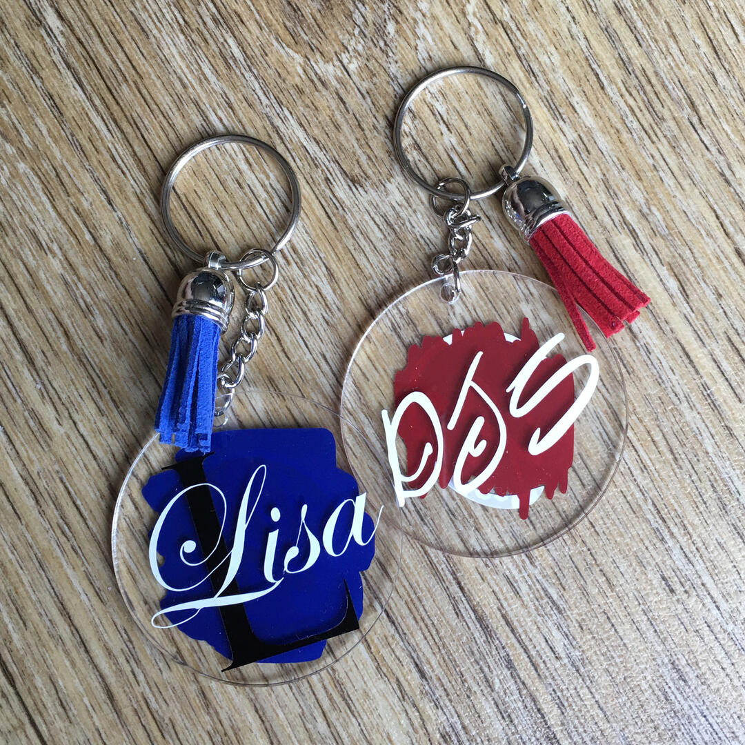
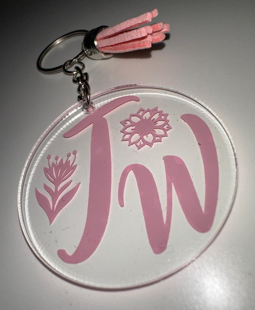
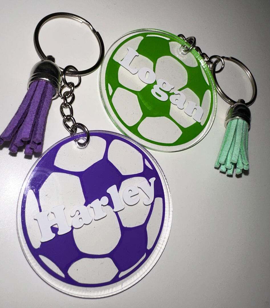
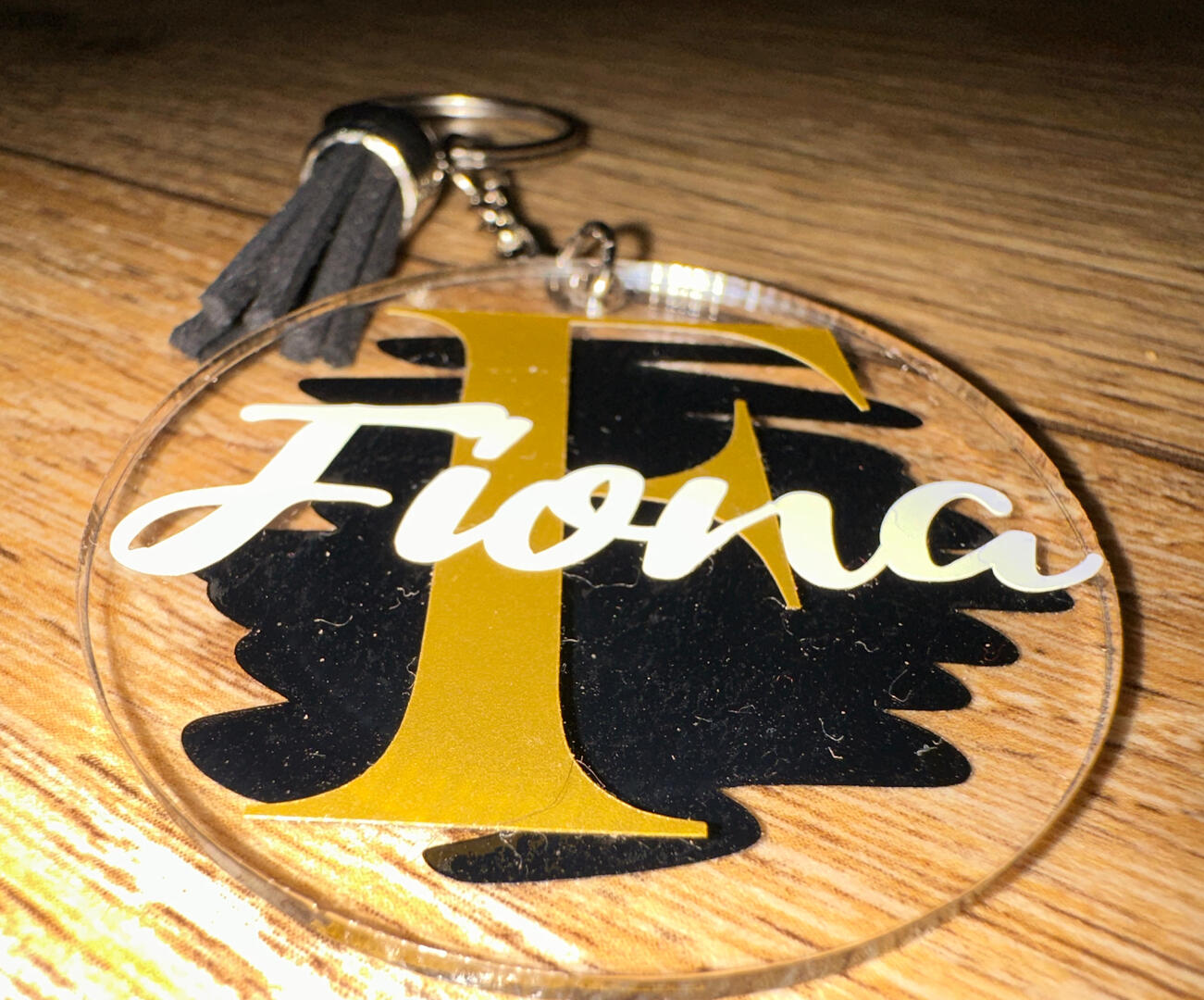
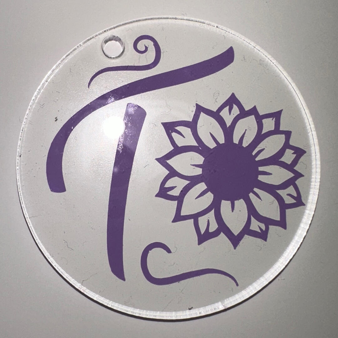
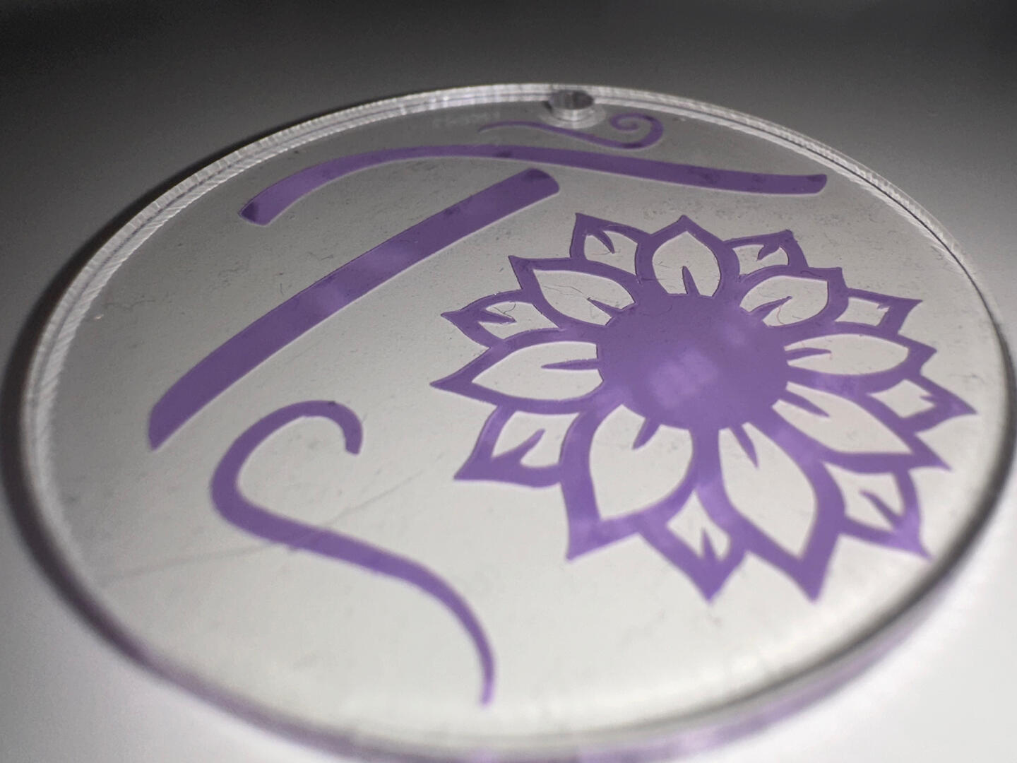
Custom Keyrings
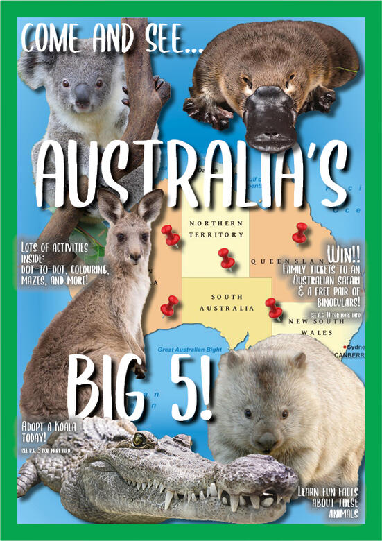
The Big 5 Magazine Cover
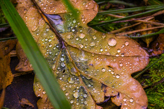
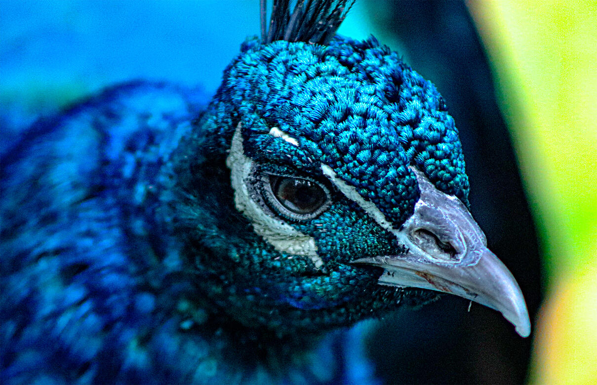
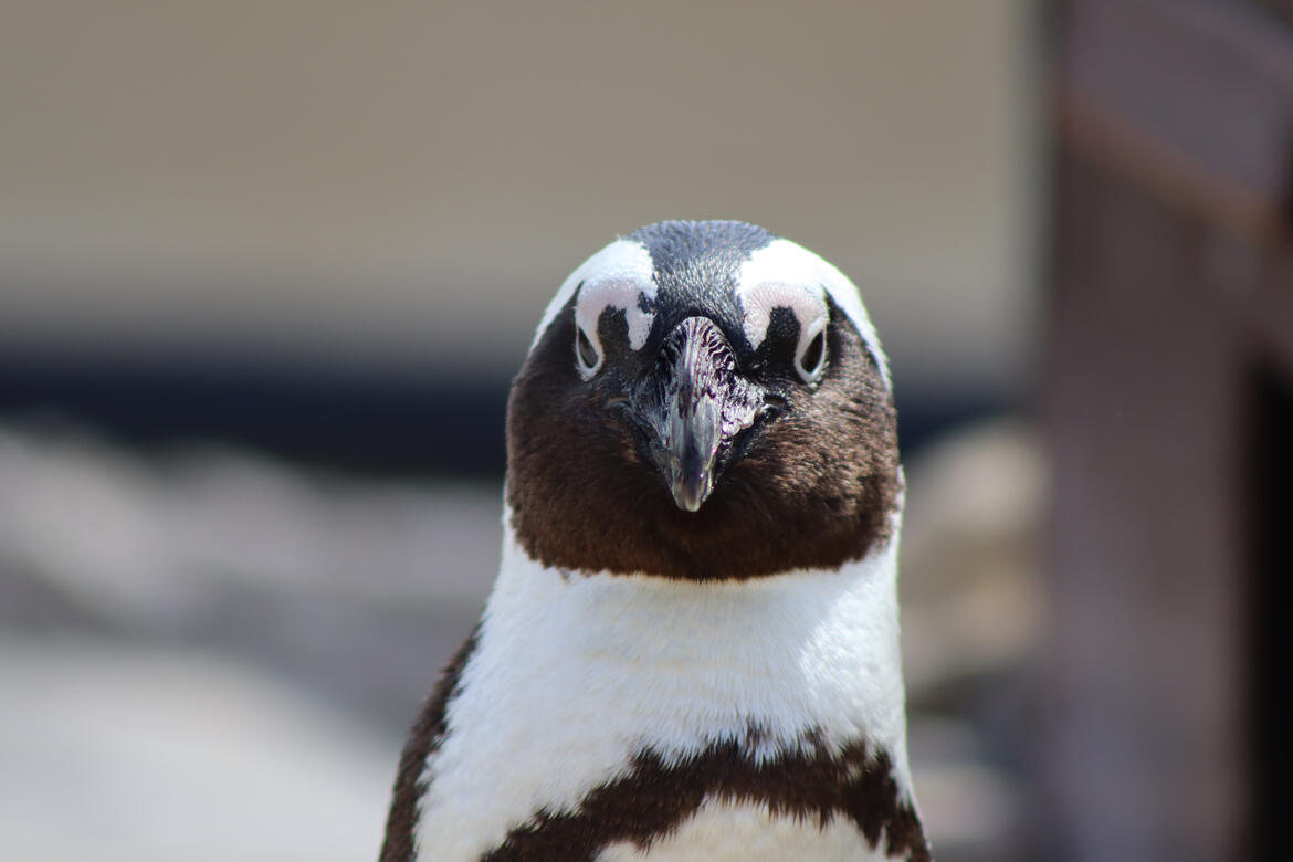
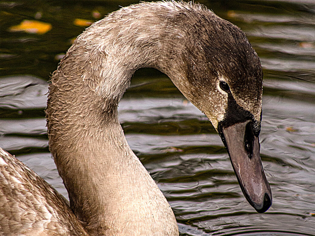
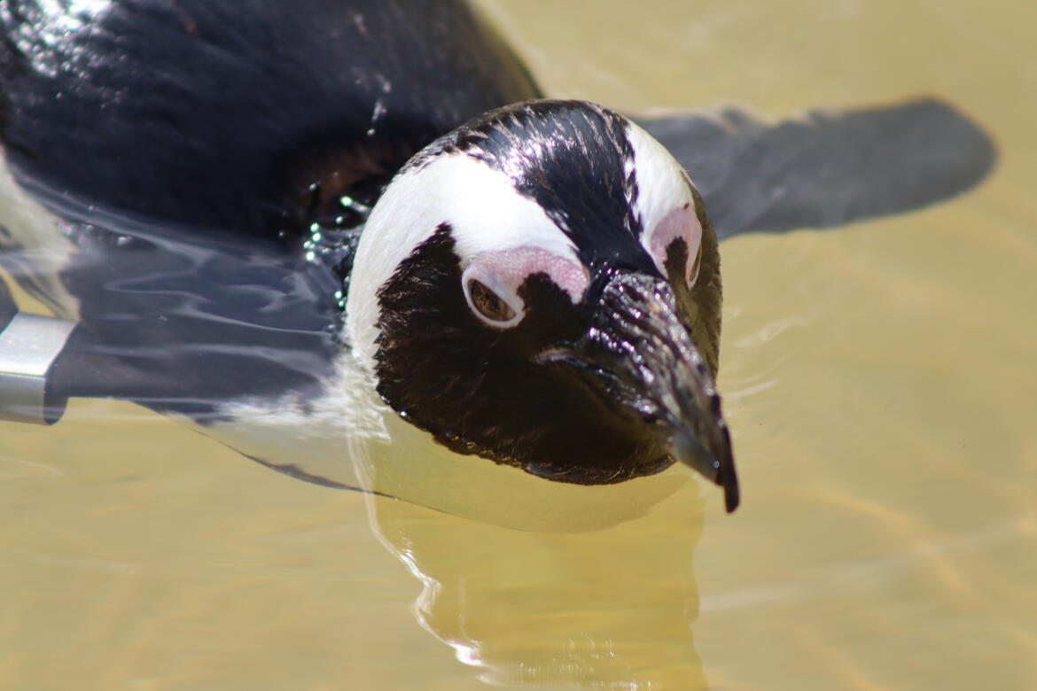
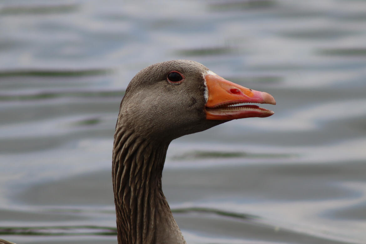
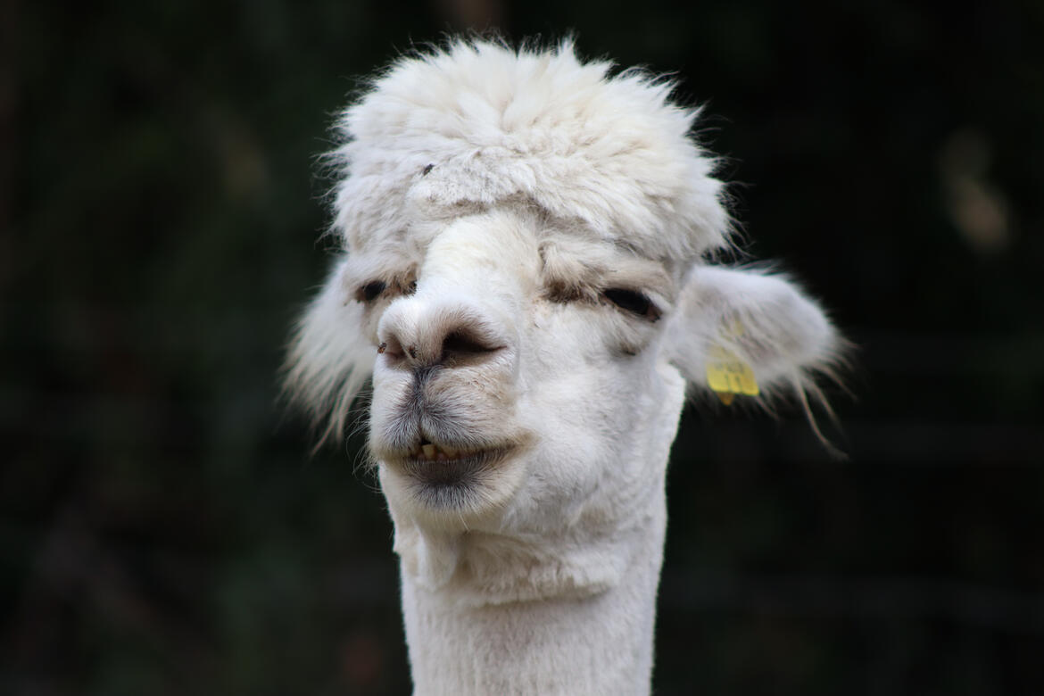
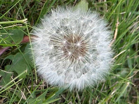
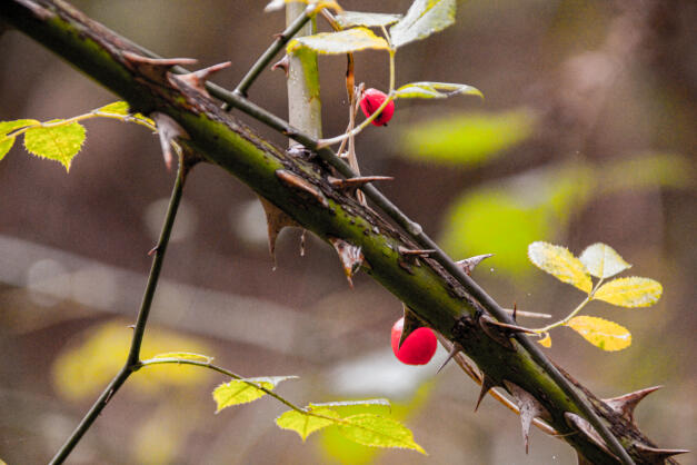
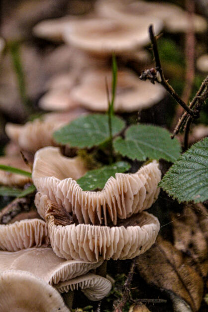
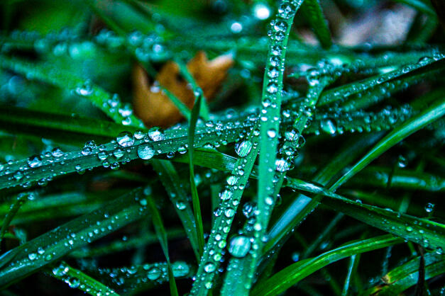
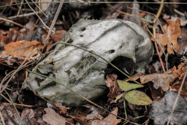
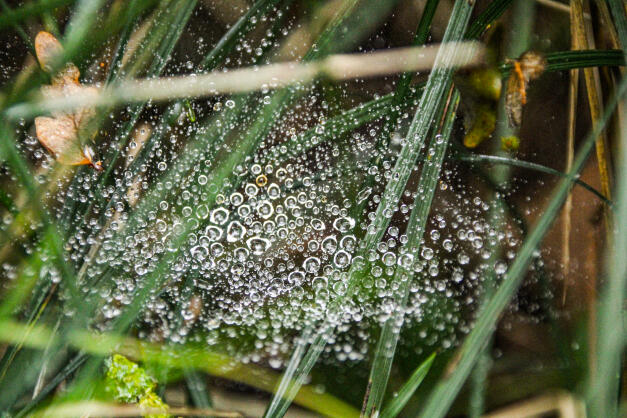
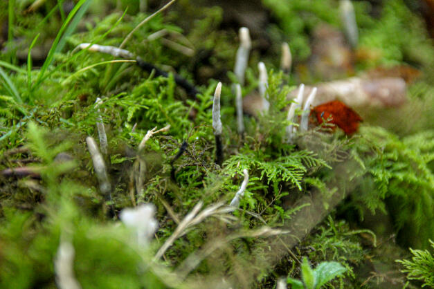
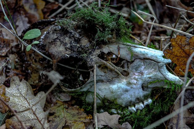
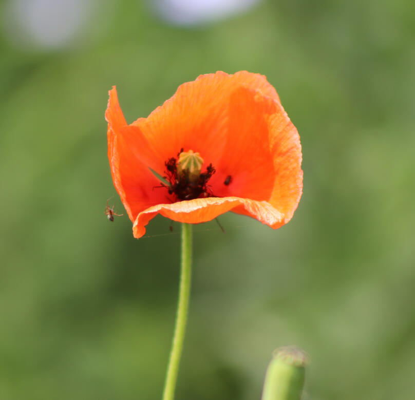
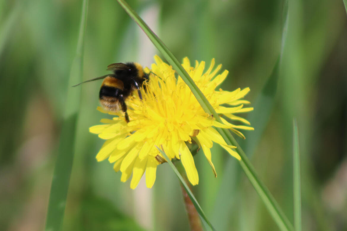
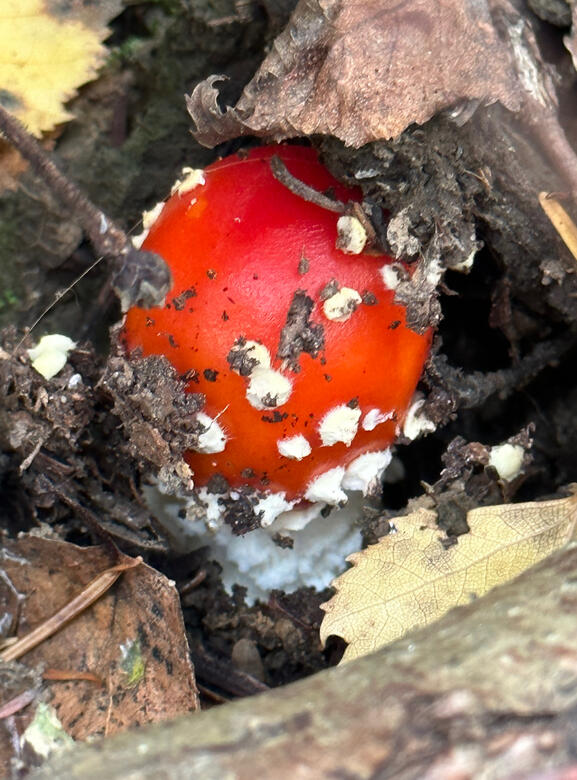
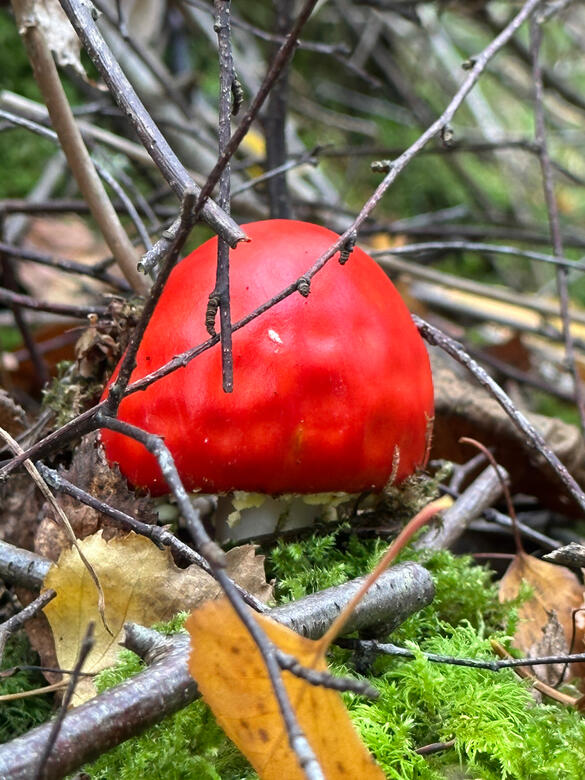
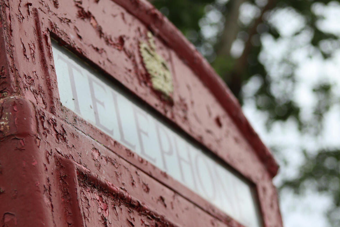
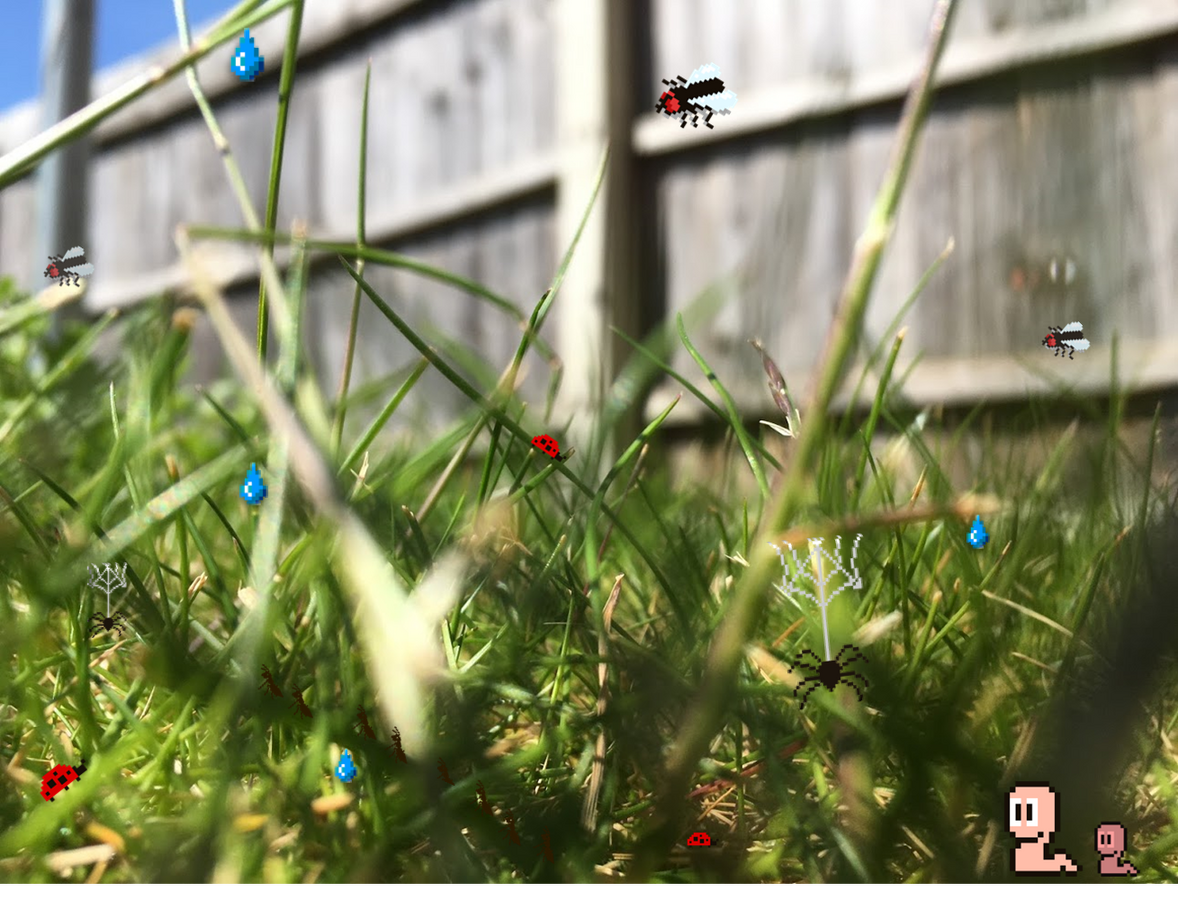
Photography Close-Up
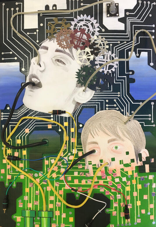
‘Evolution’
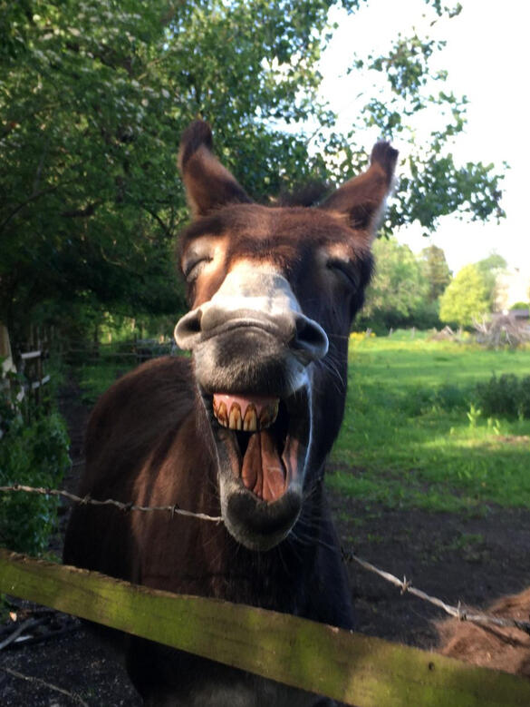
Captured In Moment
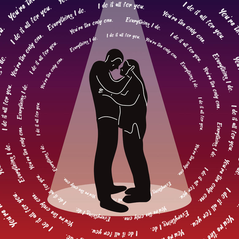
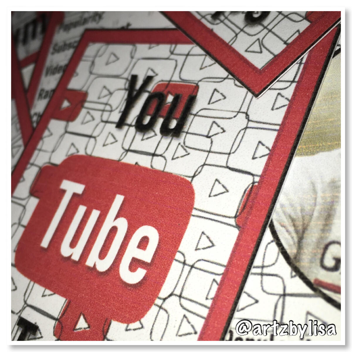
‘You’ By KSI
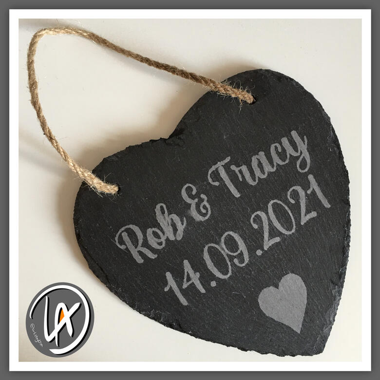
Custom Engraved Slate
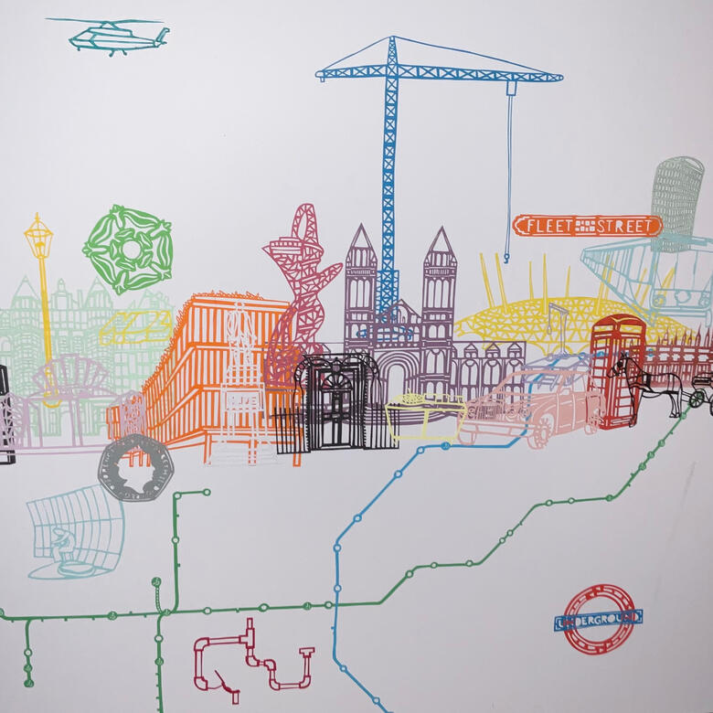
‘TIME’ - Utopian
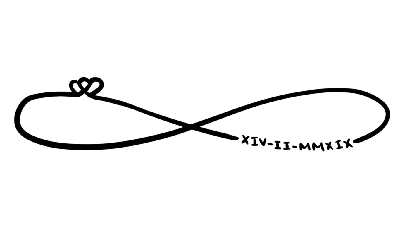
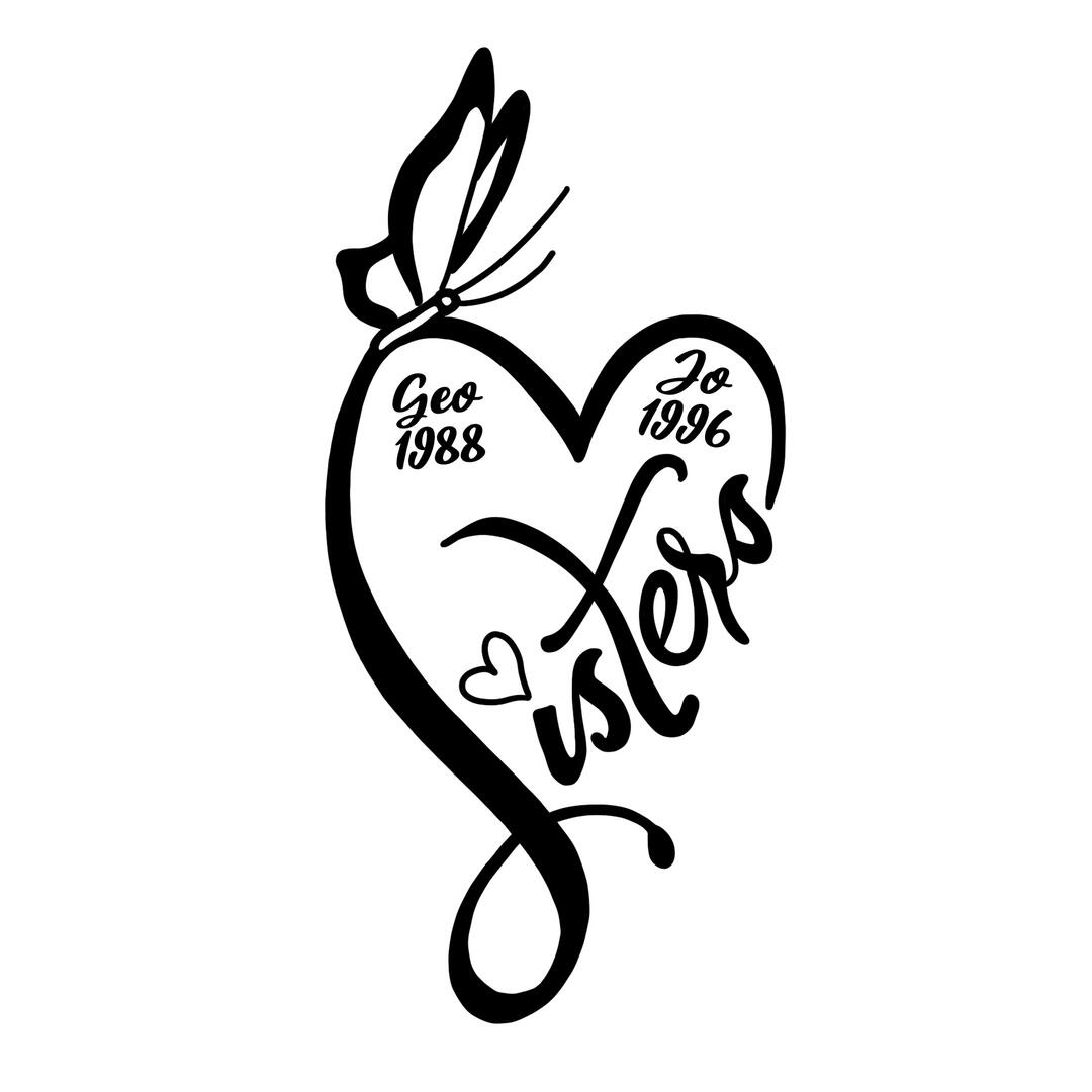
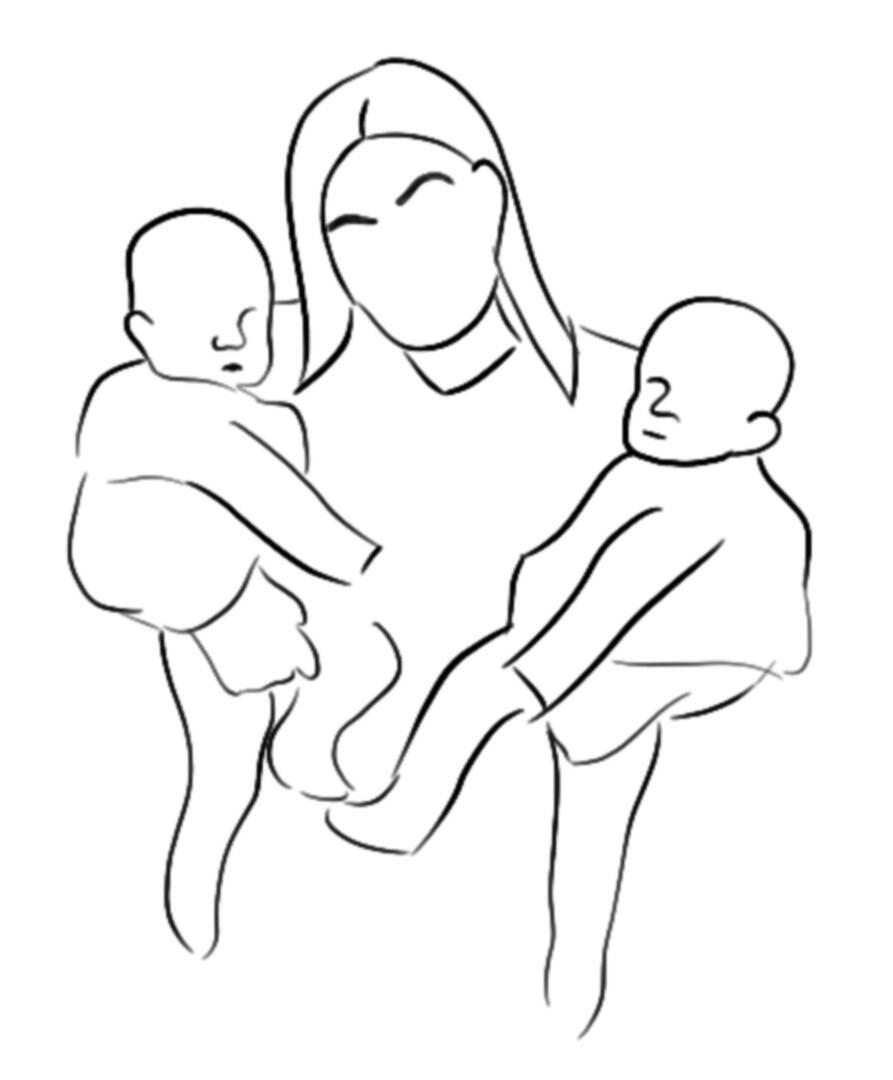
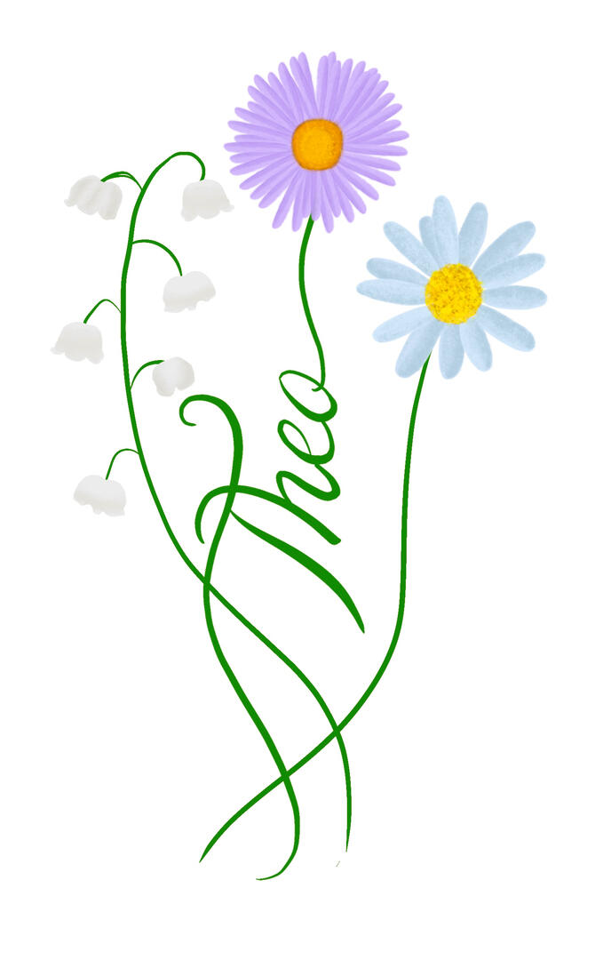
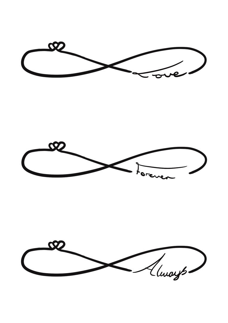
Tattoo Design
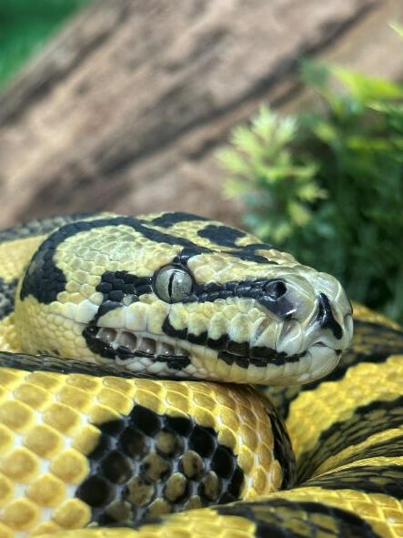
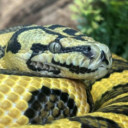
Snake

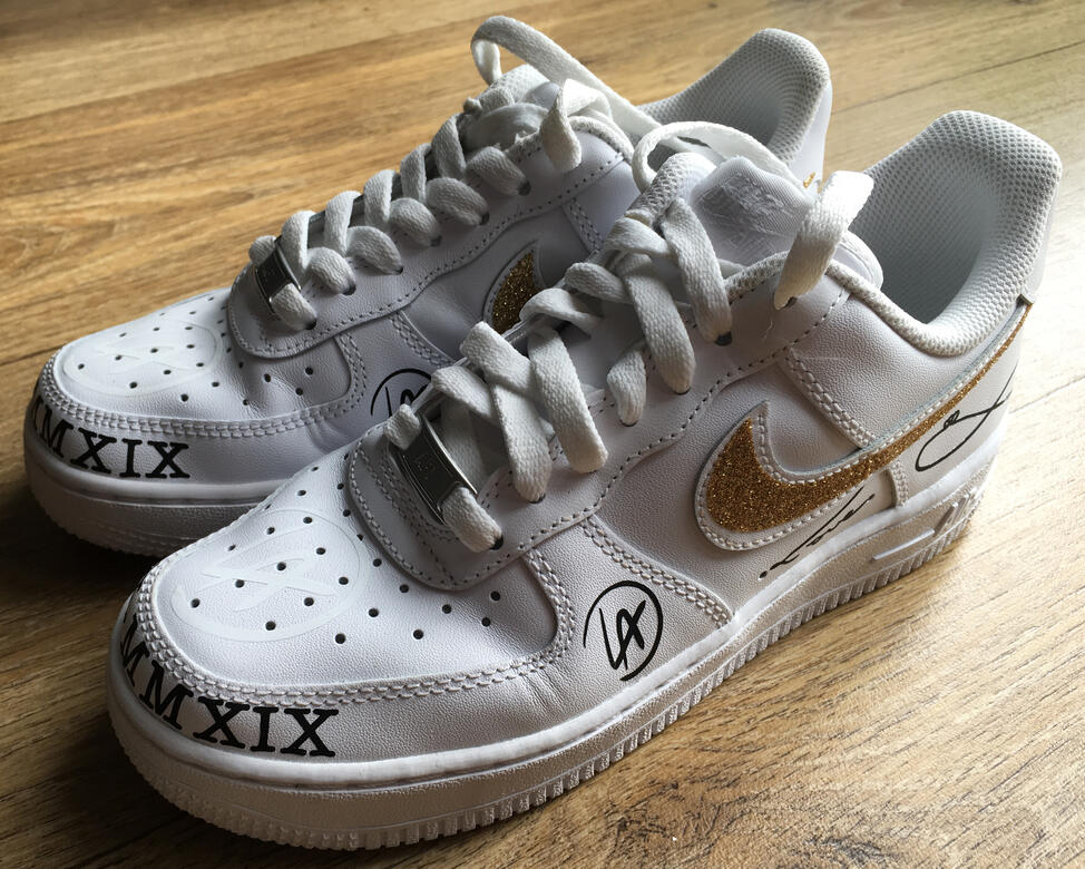
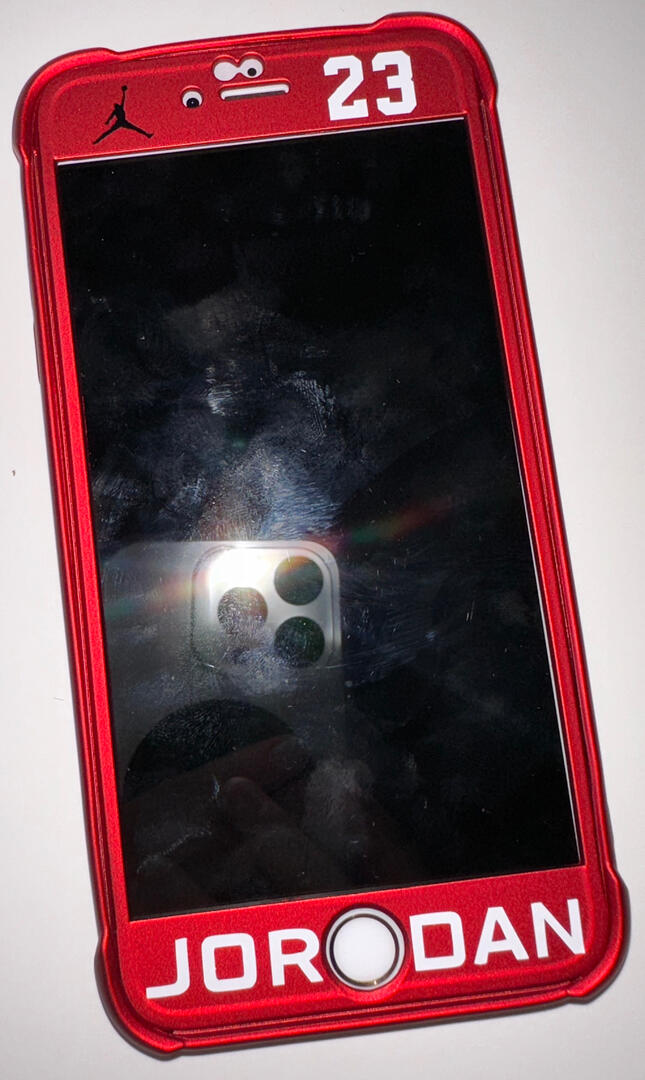
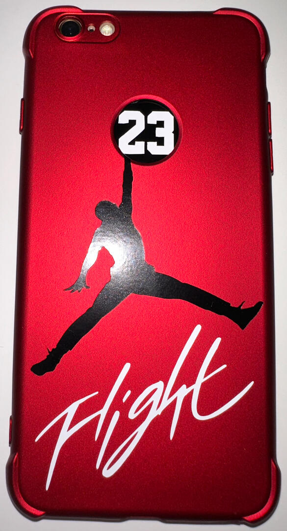
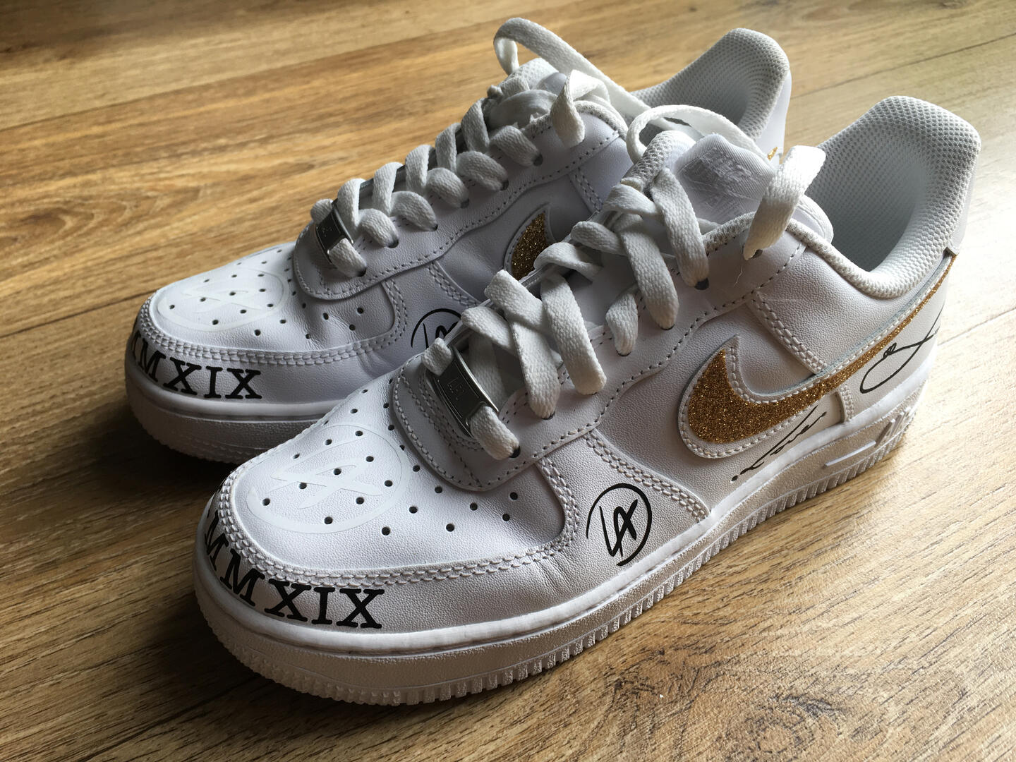
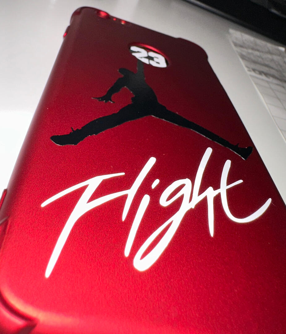
Customised Nike

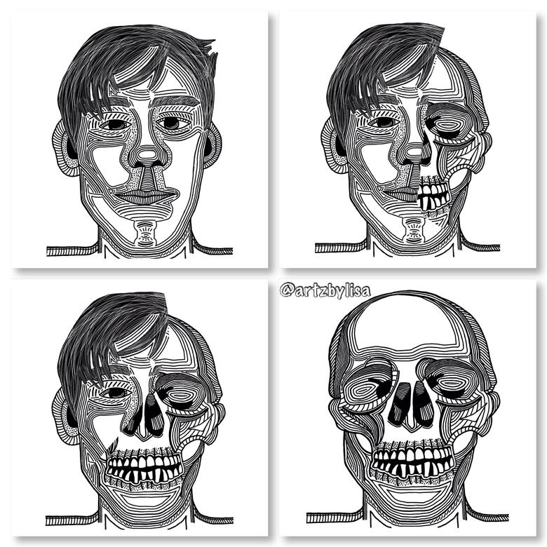
Human to Skeleton

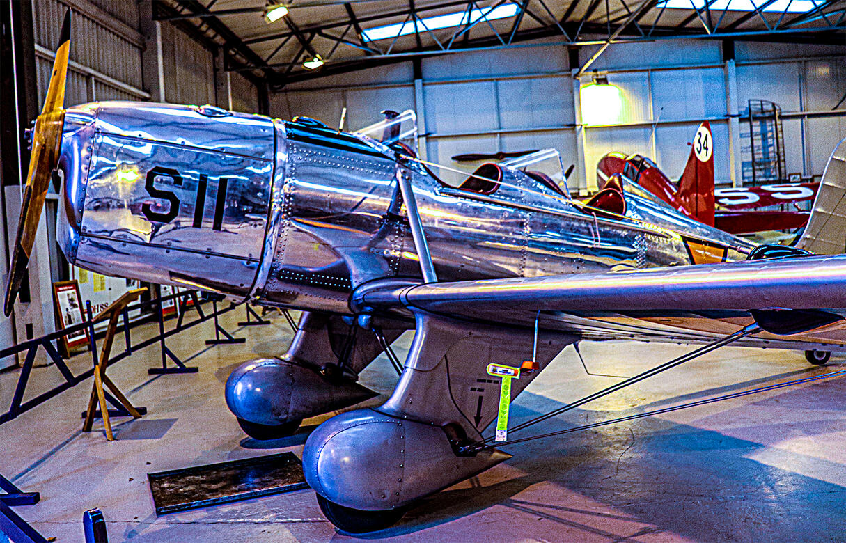
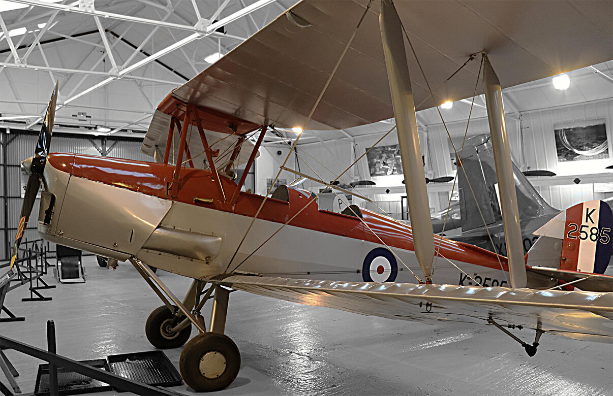
Shuttleworth
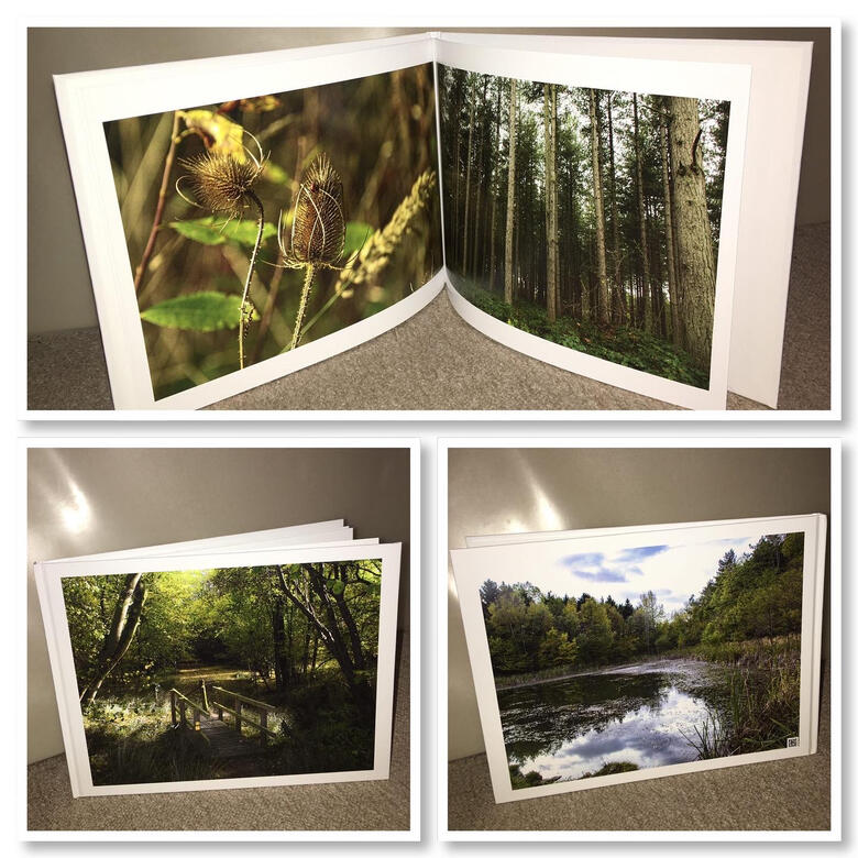
Photography Book
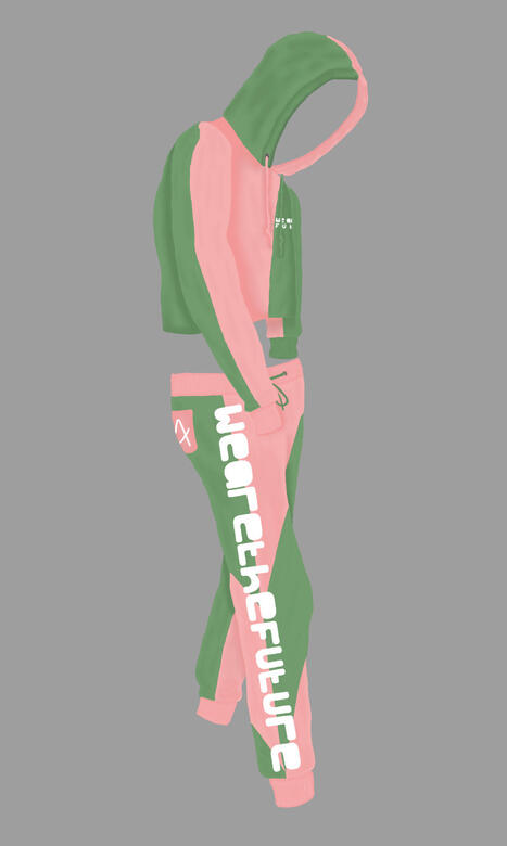
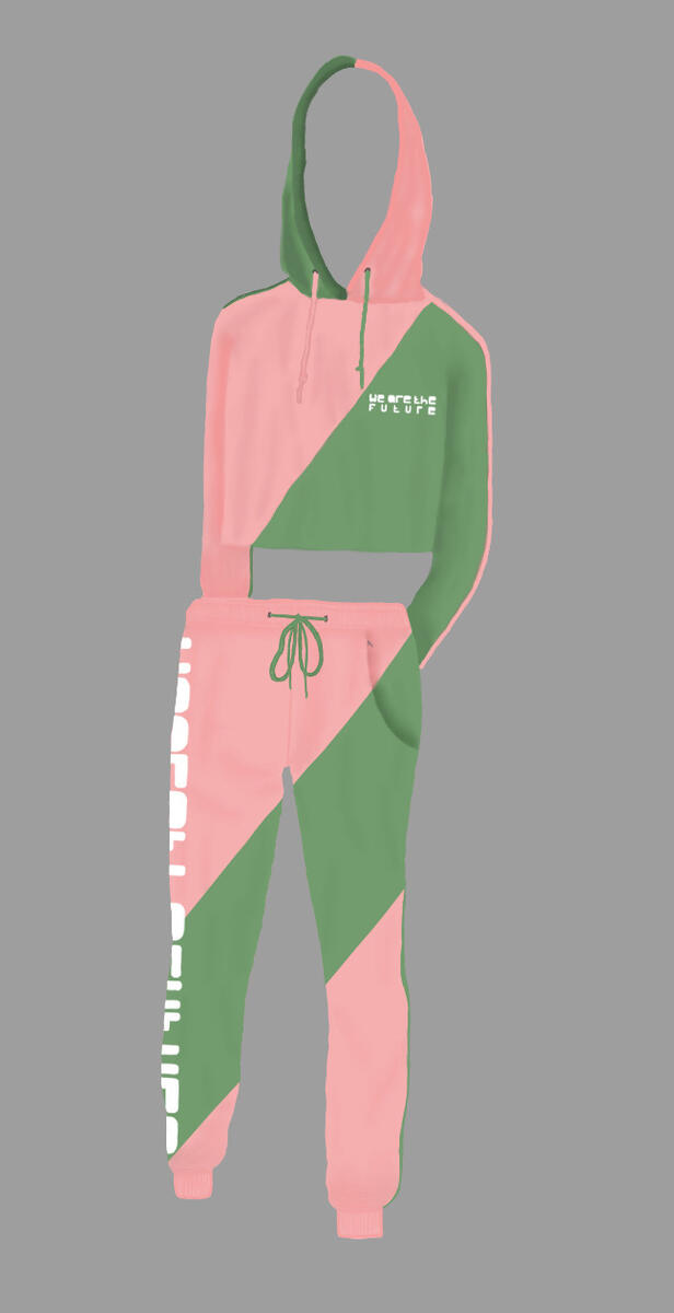
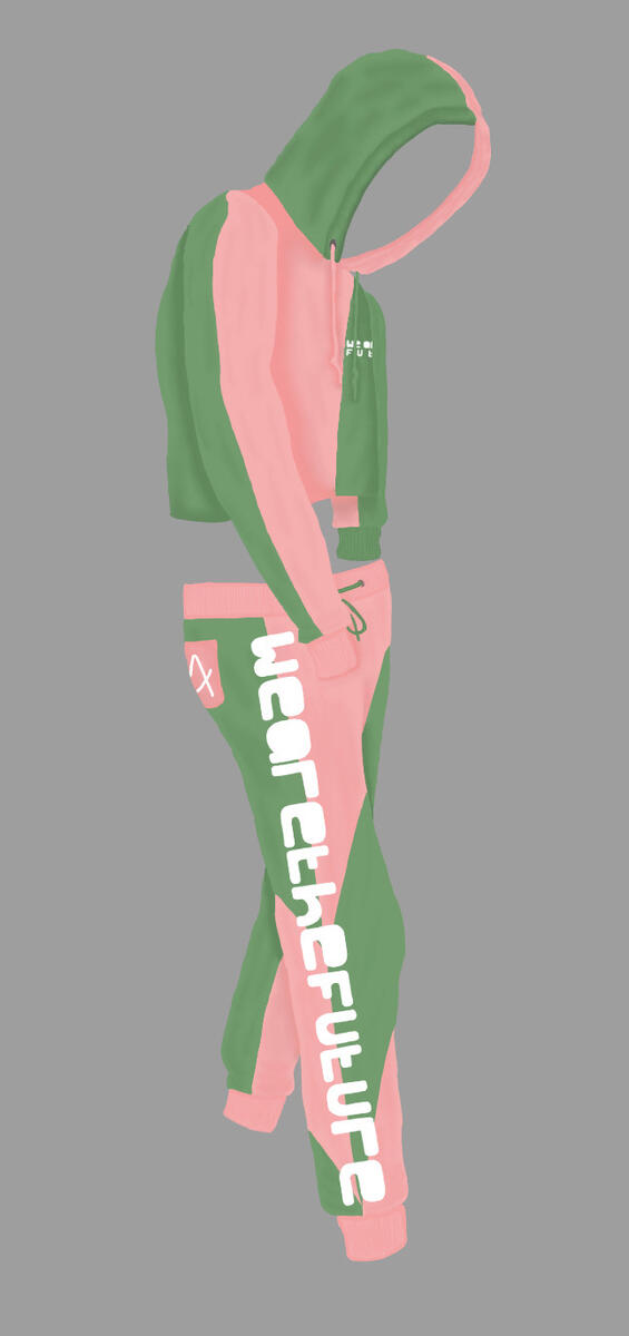
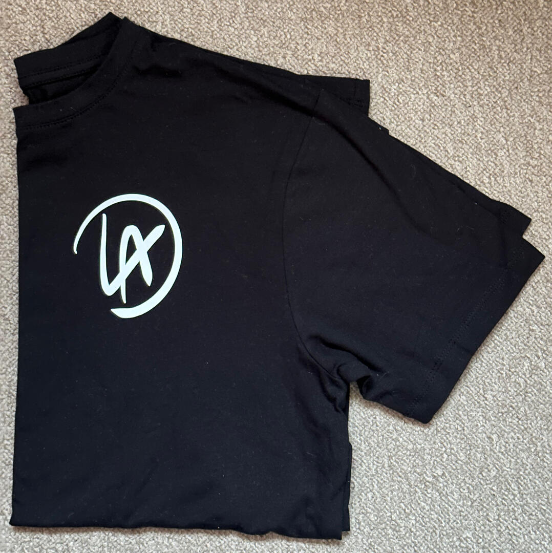
Clothing Design

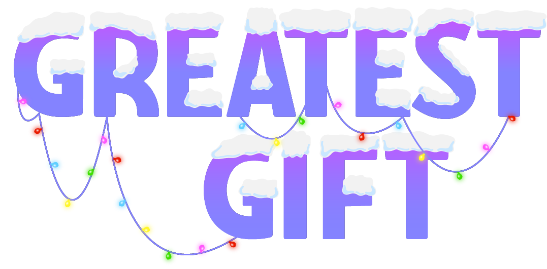
Game Design Logo
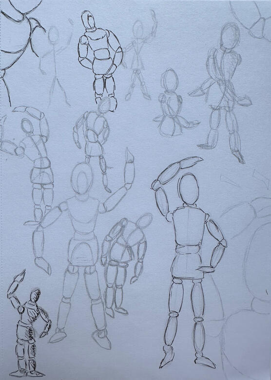
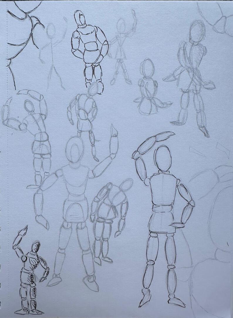
Drawing
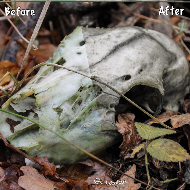
Editing

Home Resources
Artzbylisa Business Card
Lisa Abel
Multidisciplinary Artist
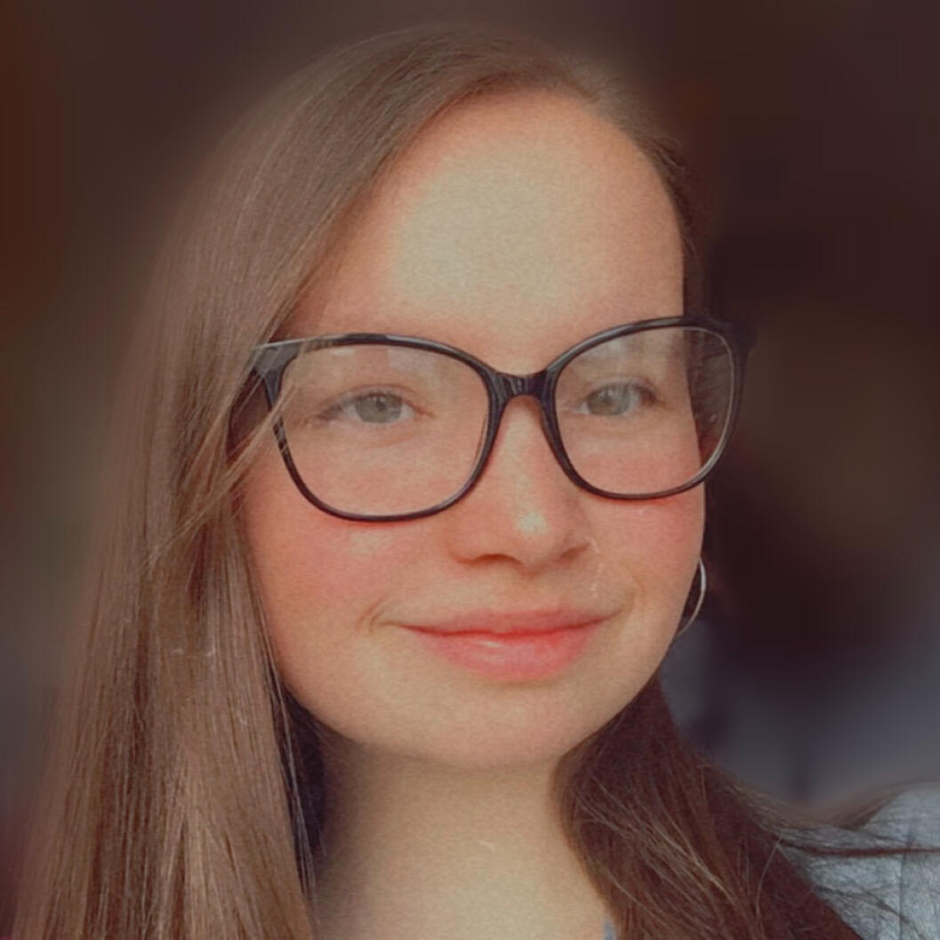
As a multidisciplinary artist I enjoy exploring physical and digital forms of art which I am seeking to develop further. My interests delve into photography and design where I am looking through different mediums. I am currently pursuing the Artzbylisa business.
I have recently completed my studies of Digital Arts at University Centre Peterborough.
In the near future I want to go into something design based, as well as expand my Artzbylisa business by using the skills that I have gained.
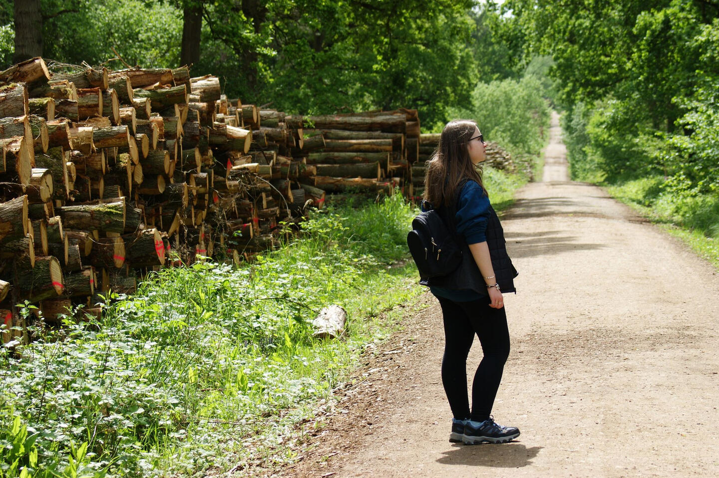
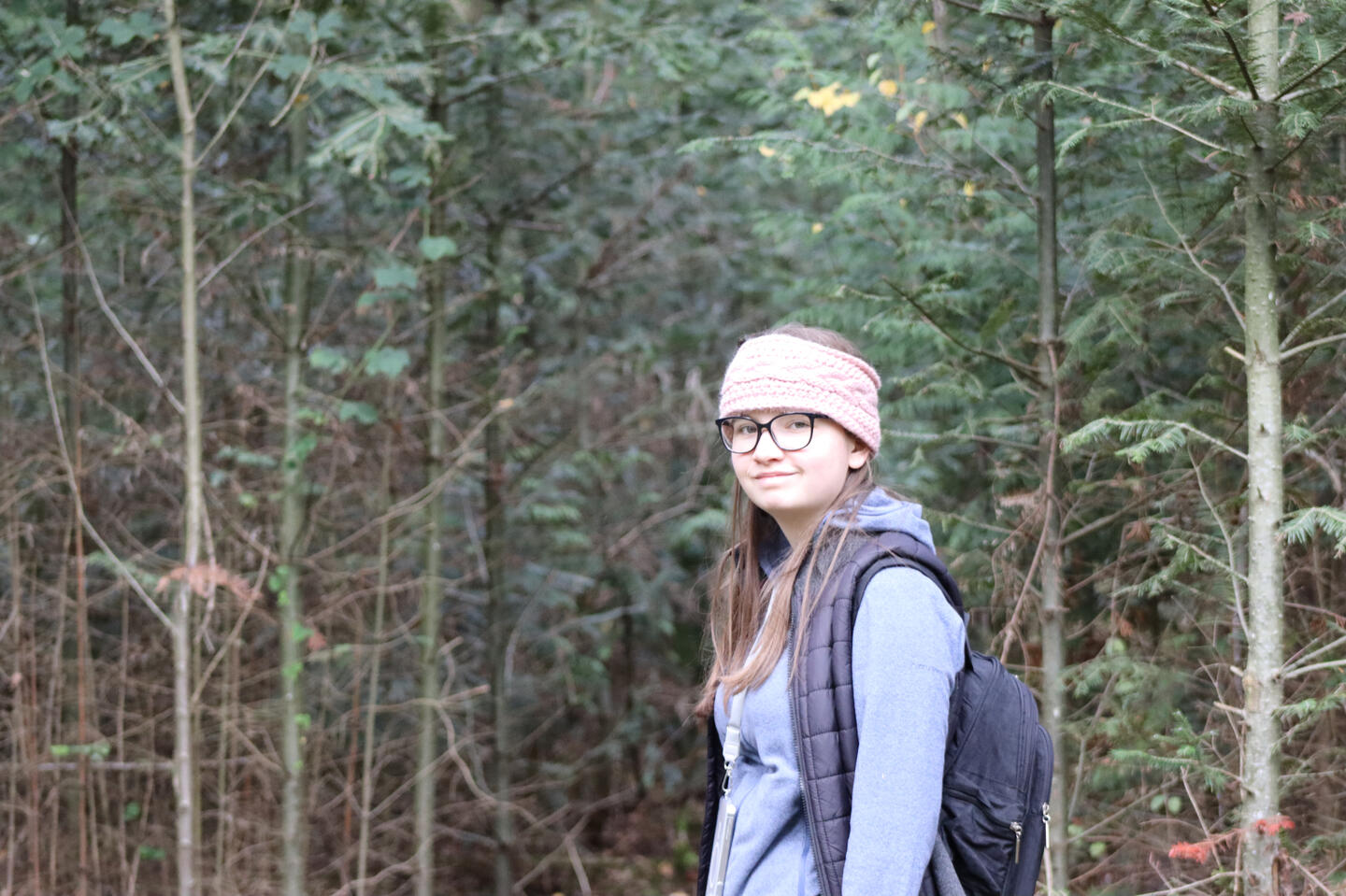
Digital art is a new path of art that I have been developing since 2021. Before this I loved getting my hands crafty by creating many unique art pieces in many forms, often mixed media pieces. I would like to take both of these further by combining them together.
Since picking up a camera for the first time whilst studying Photography, I have never put it down! As you can see on my Photography page, I like taking photographs that stand out to me, and I will continue this as a nice fun hobby.
Exhibitions
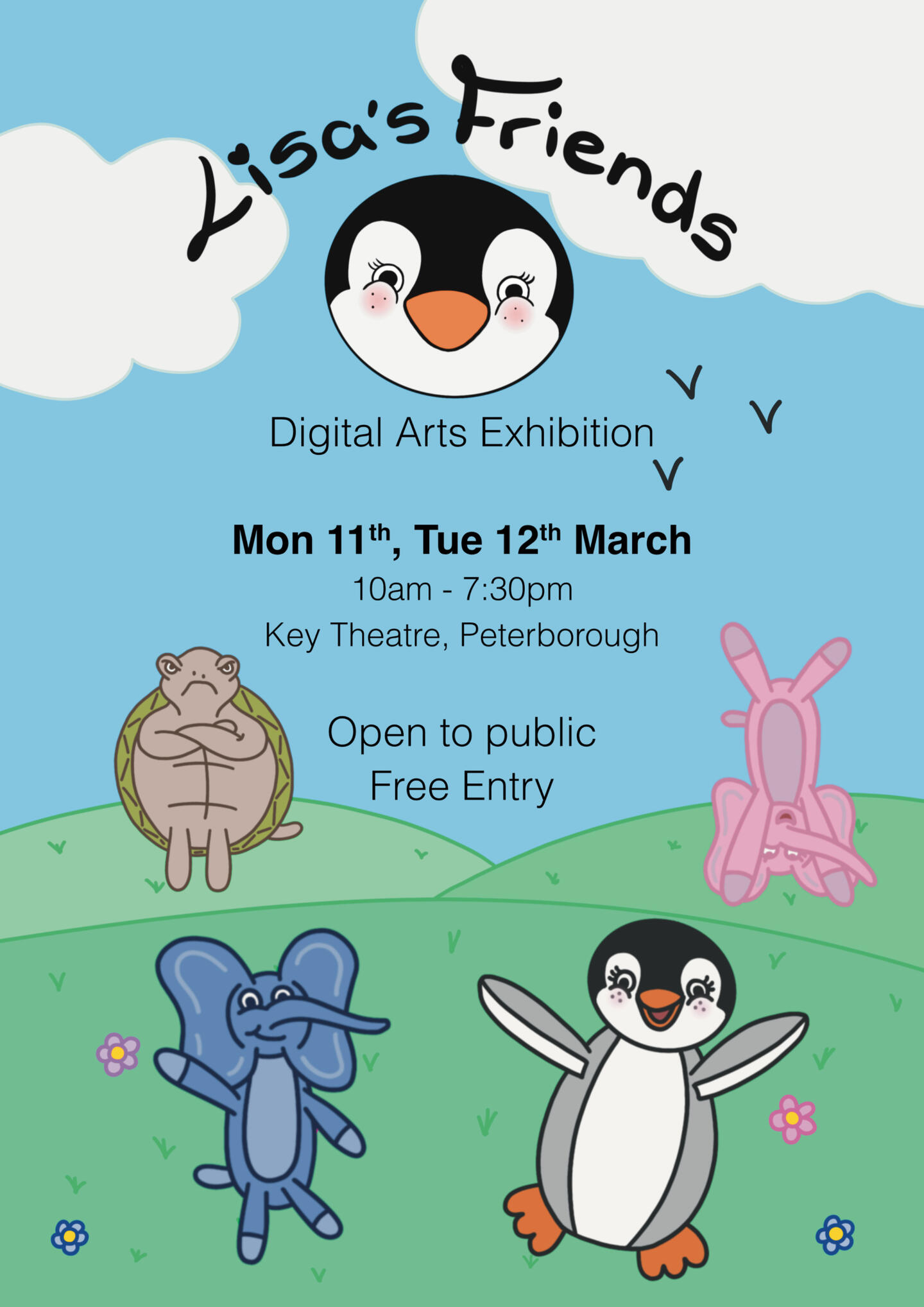
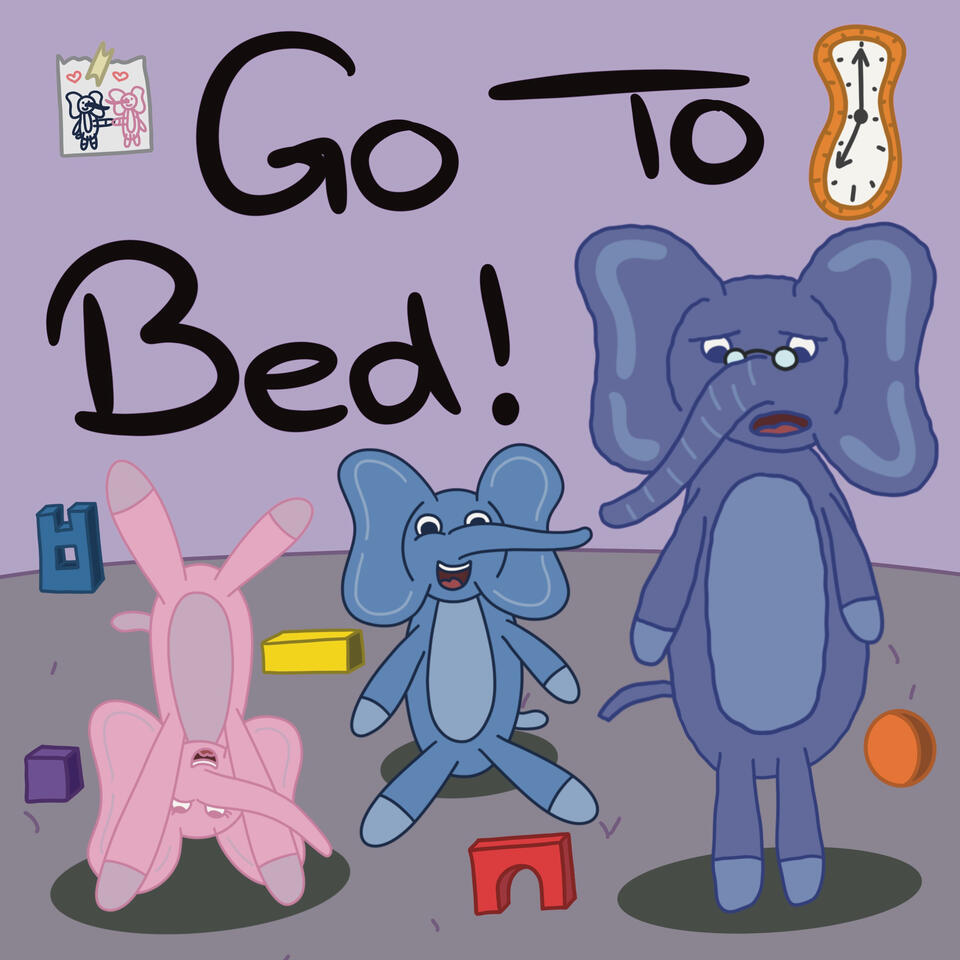
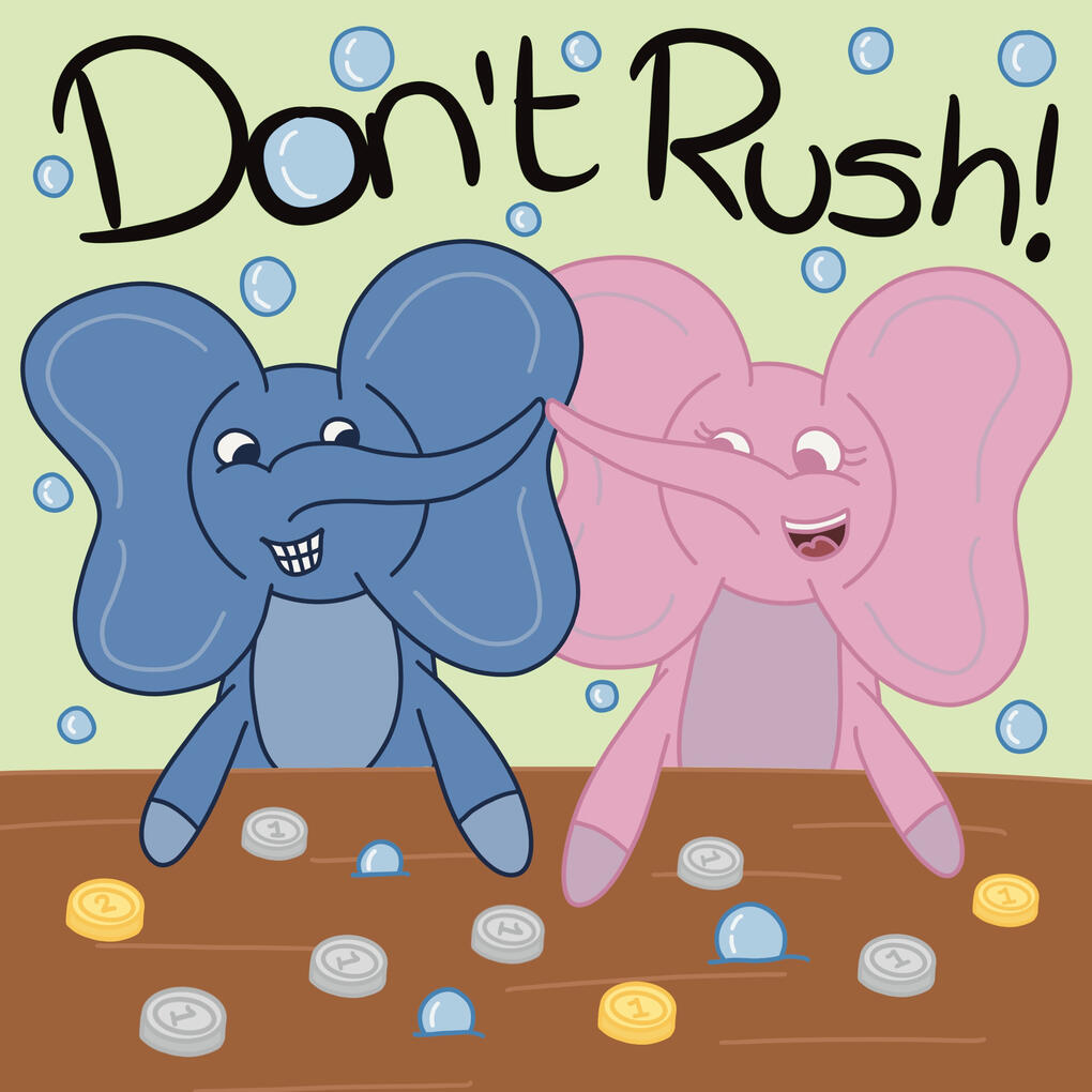
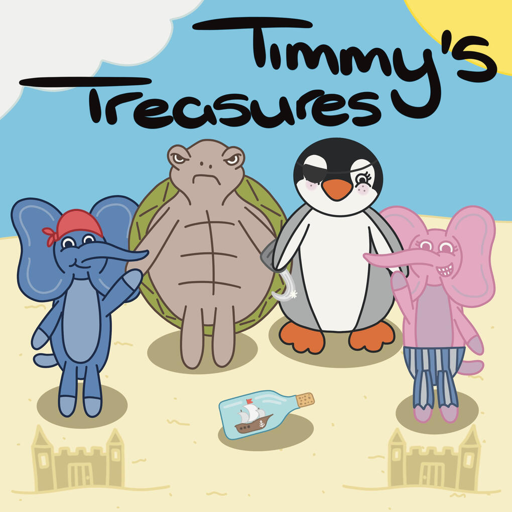
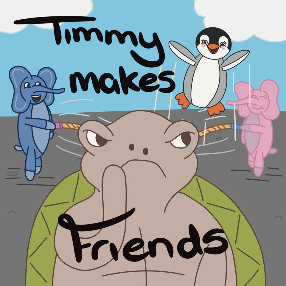
Undergraduate Major Project, March 2024: Lisa’s Friends
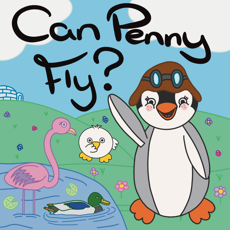
This project was undertaken during the final year at University. The idea was to bring aspects of previous modules studied and put skills to practice in form of a big project.‘Lisa’s Friends’ is a book series created for children to enjoy and escape from the real world.
The series is set out to explore how physical and digital can be combined whilst protecting the value of the book to young readers and their physical, mental, and emotional development. The role of the characters is to bring inspiration and creativity to kids of all ages.The exhibition was held at the Key Theatre, Peterborough in March 2024, open to everyone to enjoy.
Peterborough Cathedral, March 2023: The Record Shop Project
The Record Shop Project: As a class at University we decided to make an exhibition held at Peterborough Cathedral. The project was to make an art piece from a song - interpreted however you like. I created two pieces for this project.

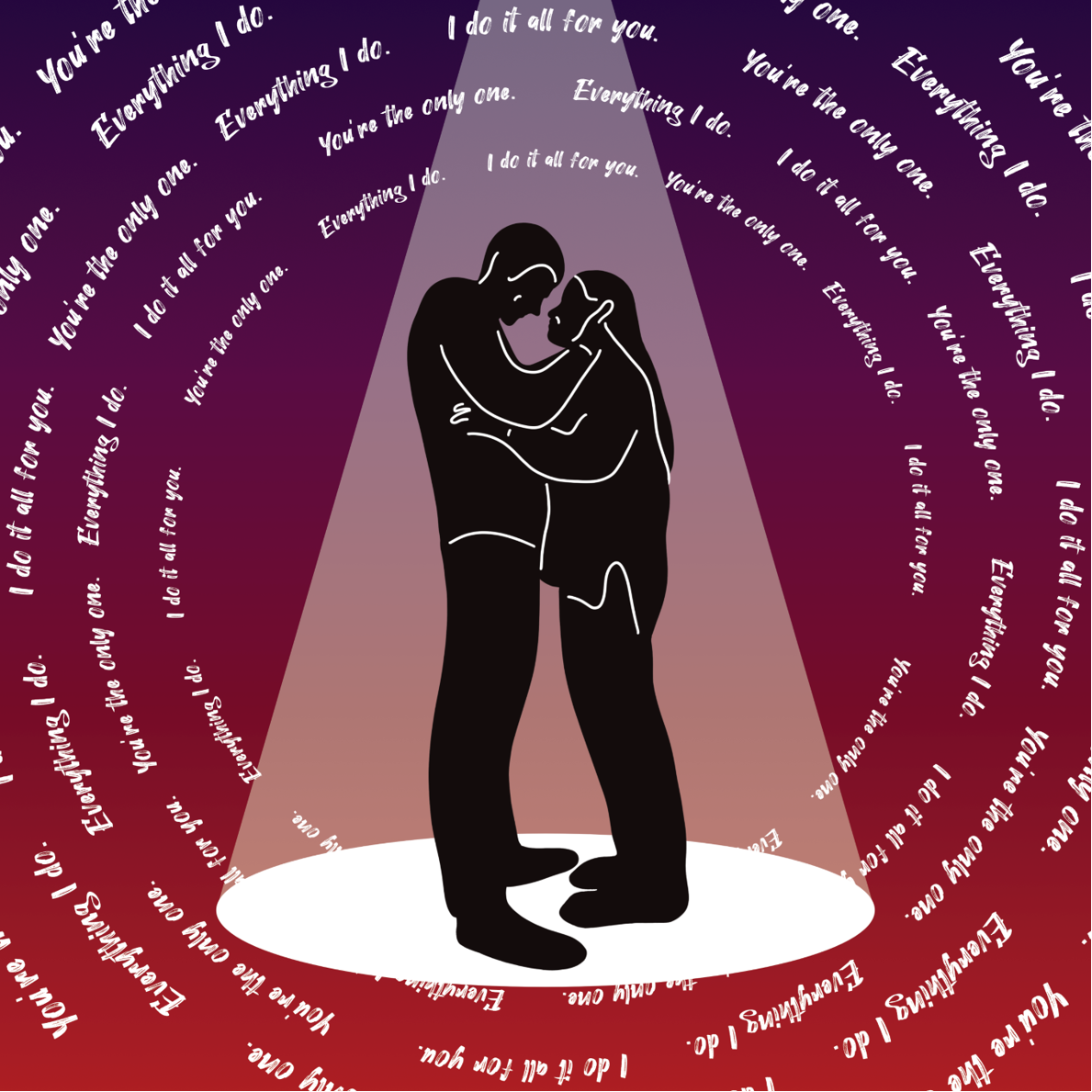
‘You’ - KSI
The aforementioned piece is dedicated to my partner. The song resonates with me through always being there for each other. This song simply speaks my language. I couldn’t have done anything without you!

‘Rockin’ Robin’ - Michael Jackson
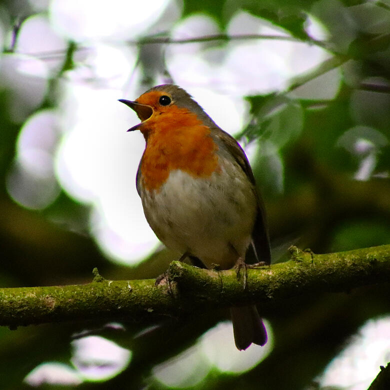
I wanted to display my Photography work within this piece. The image I chose fitted harmoniously with this iconic song.
Many tweets to you!
Shuttleworth 2022
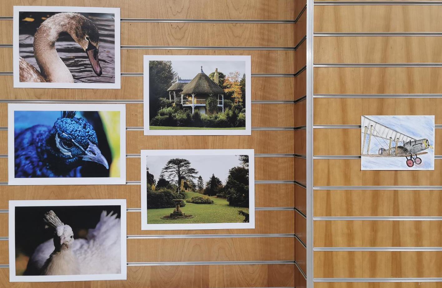
I had the opportunity to display some of my Photography work at Shuttleworth after being invited to take some shots for them. There was an exhibition for the light show that they had displayed. Later on, the daytime images were to be displayed to the public.
Corby Glen Art Show 2021
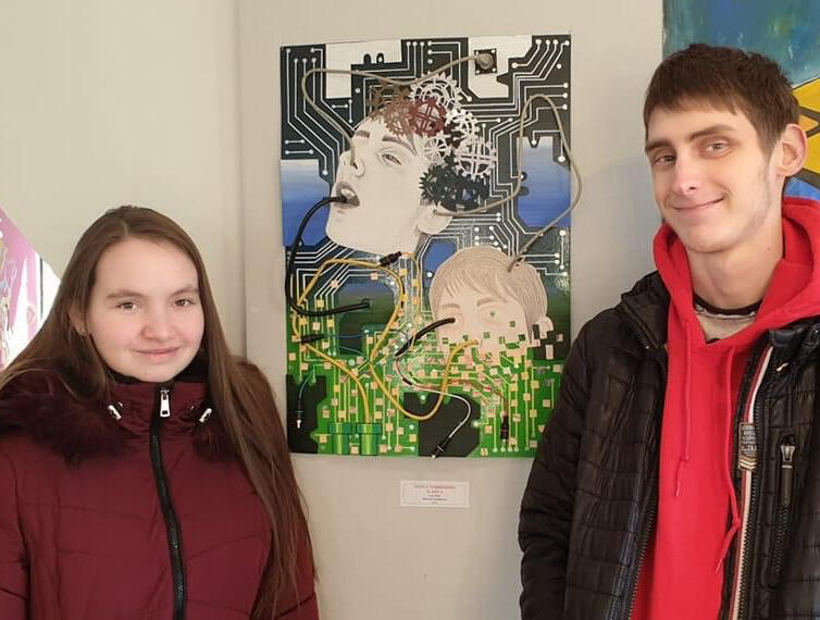
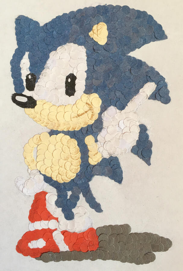
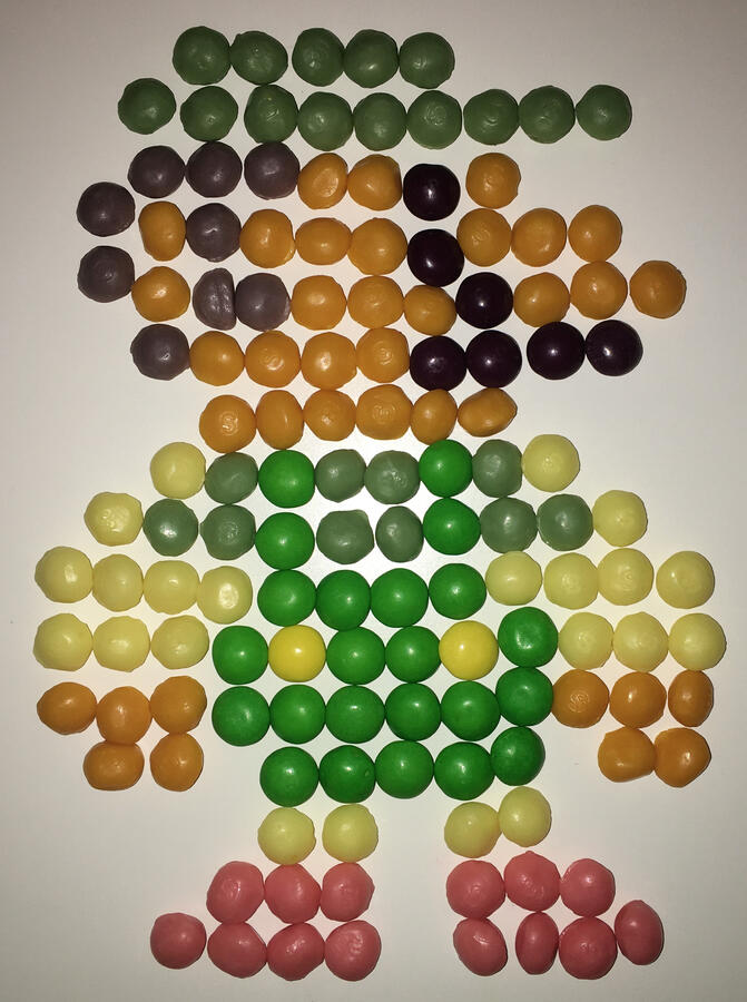
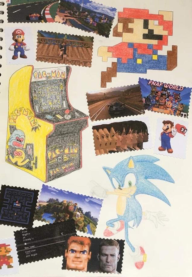
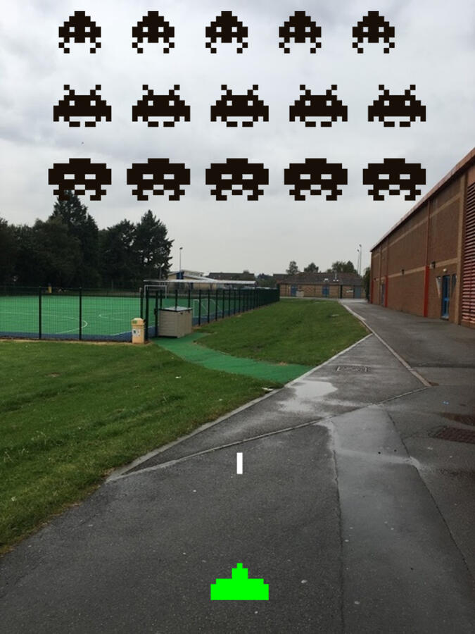
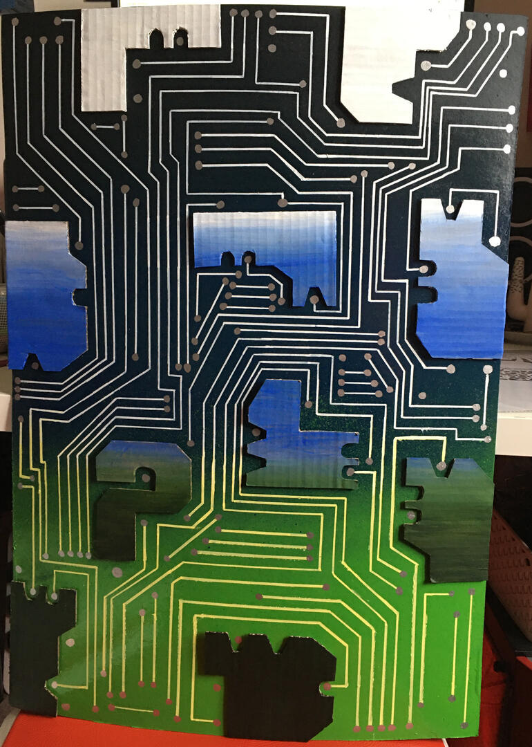
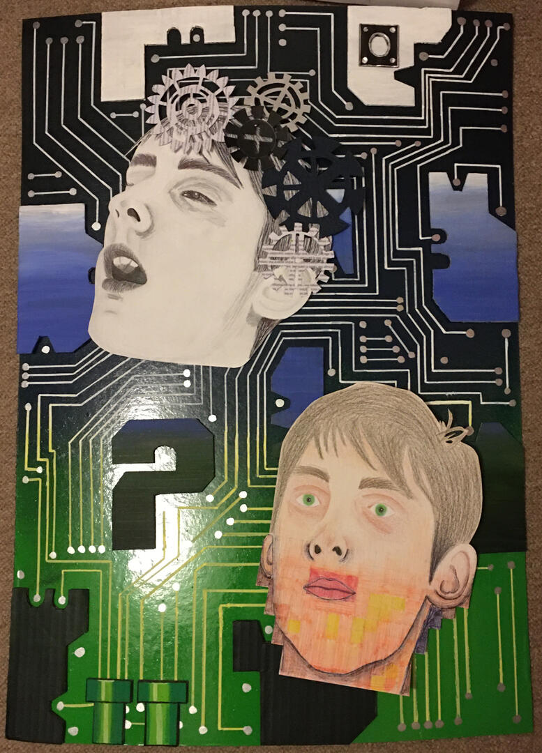
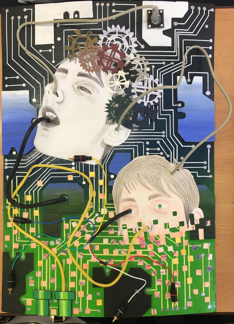
‘Evolution’ was a project I had worked on for several months. The topic that I decided to delve into was originally Video Games, which then developed into Dystopian Futures.
I created this final mixed media piece by combining these two themes and what I had created within the topic. The piece got chosen to be part of an art show held at Willoughby Memorial Art Gallery, Corby Glen. It got a ‘Highly Commended’ award.
‘Wild Nature’ Bourne Rotary Art Competition 2021
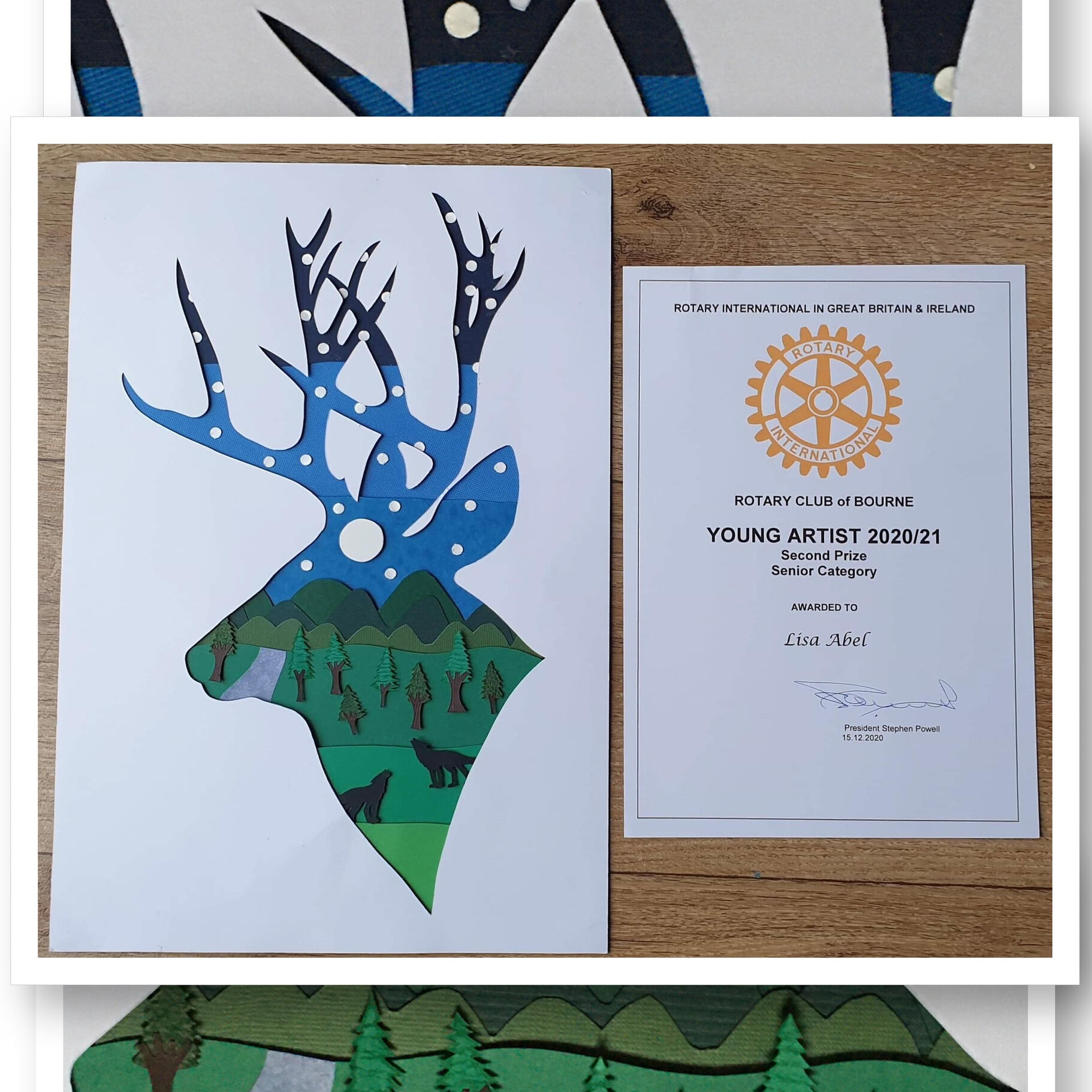
I took part in the Bourne Rotary Club art competition for Young Artist and the subject was ‘Wild Nature’.
I found out that I placed second within the competition.
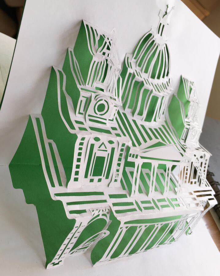
I decided to do an A3 paper cut consisting of a deer head and a night scene that has multiple layers which are slightly raised making it 3D.
Photography
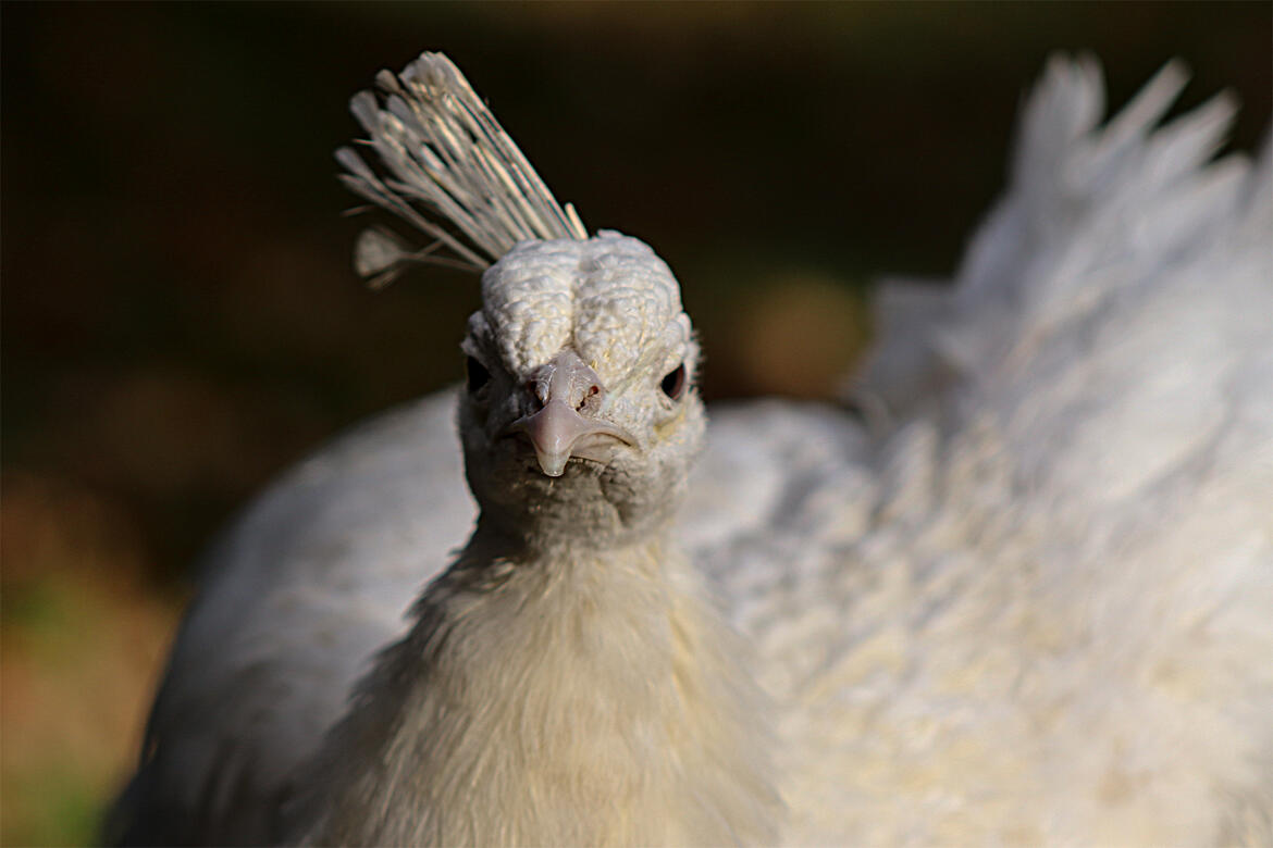
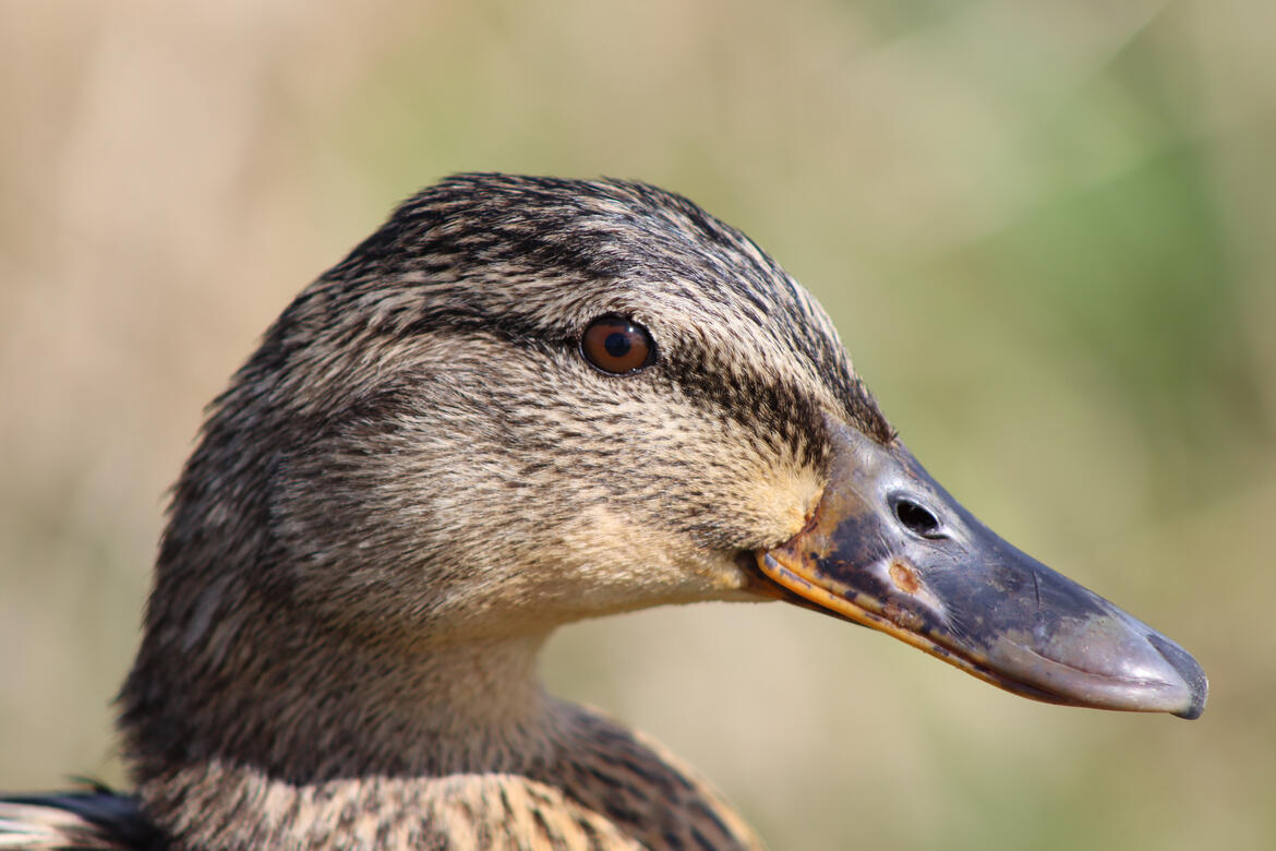
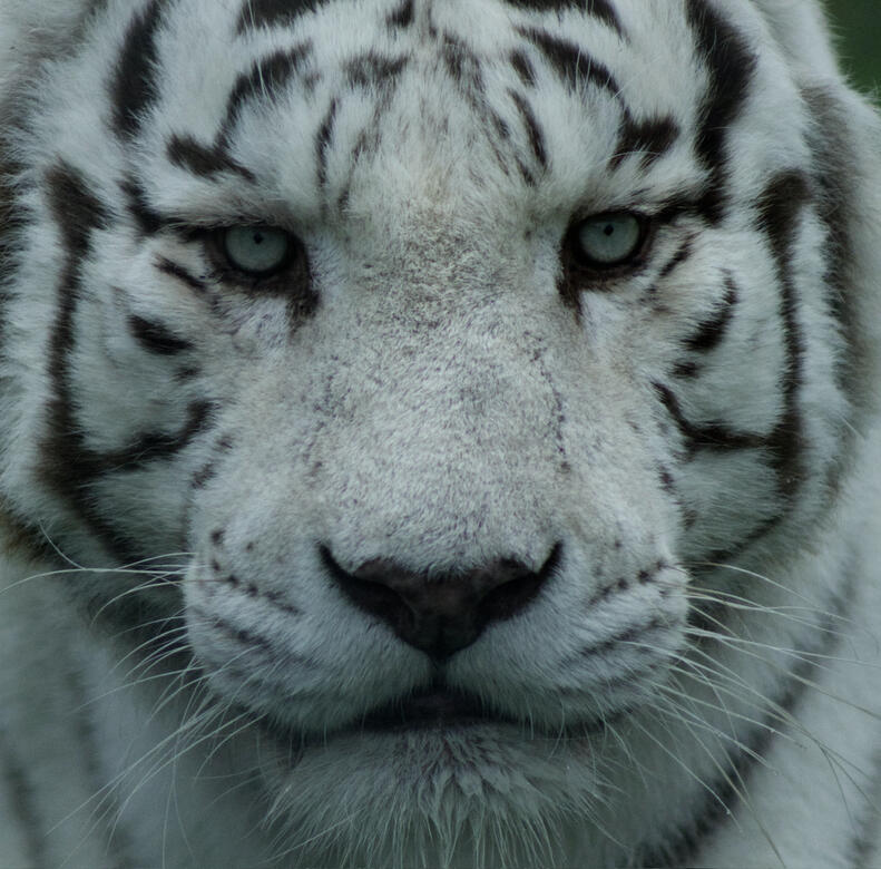
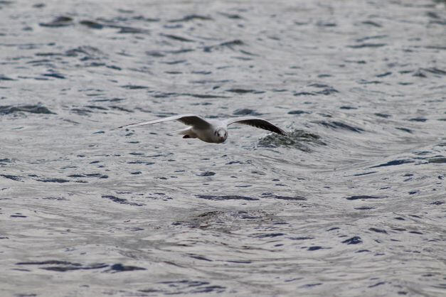
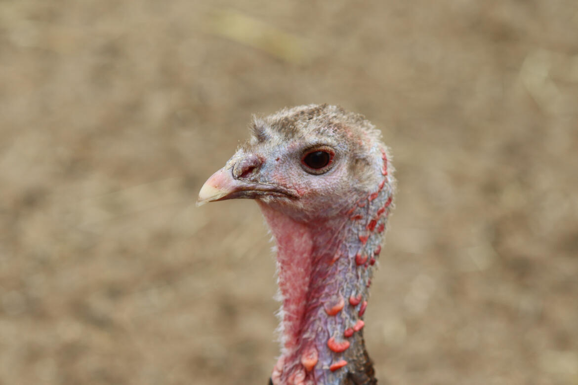
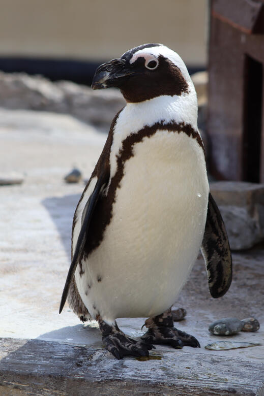
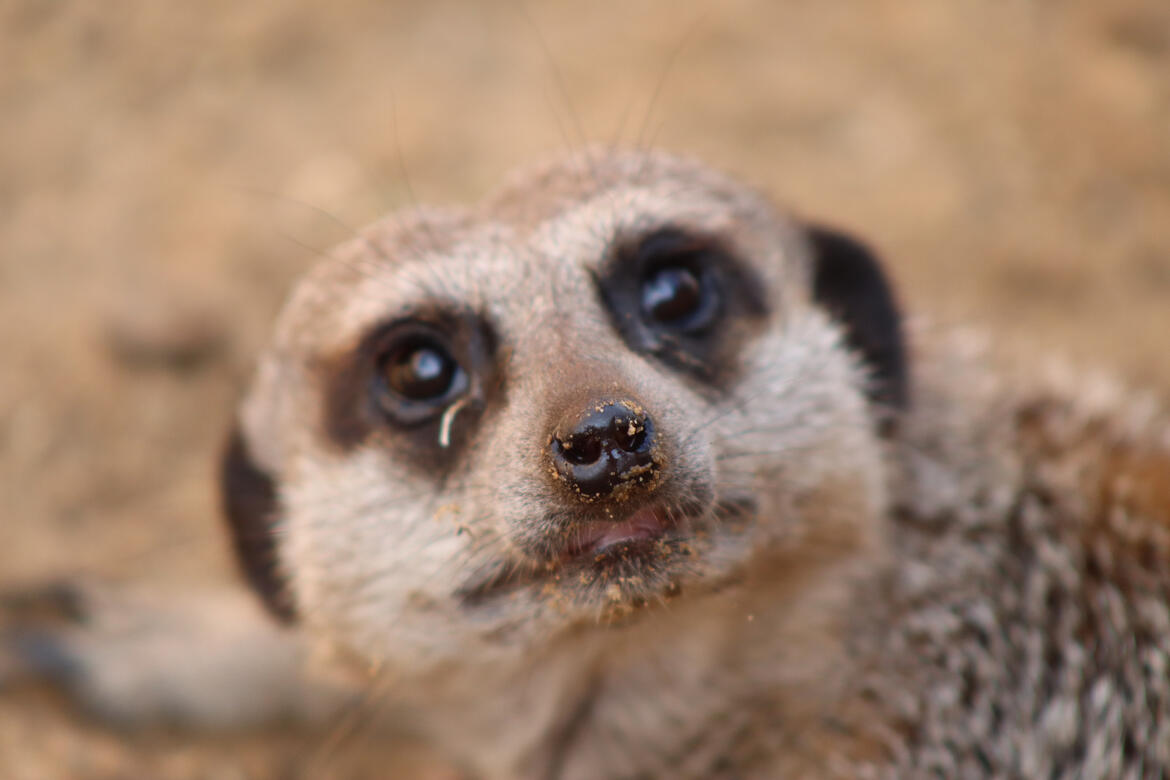
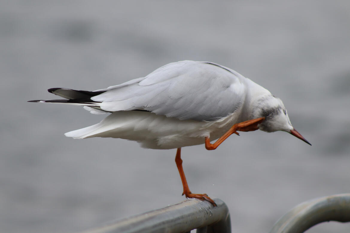
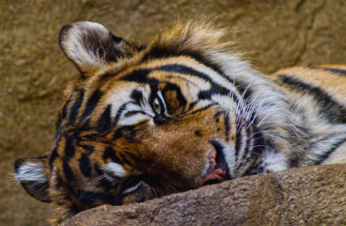
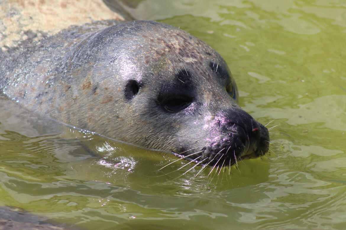
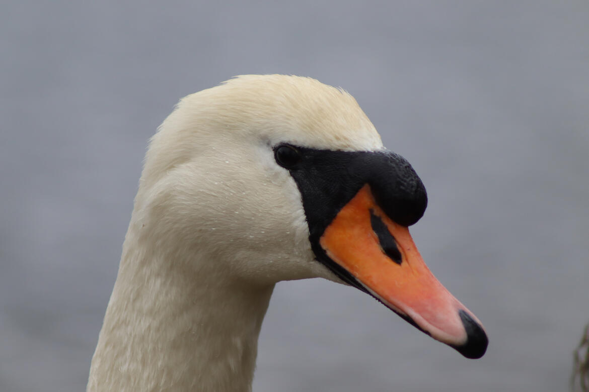
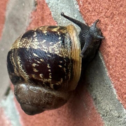
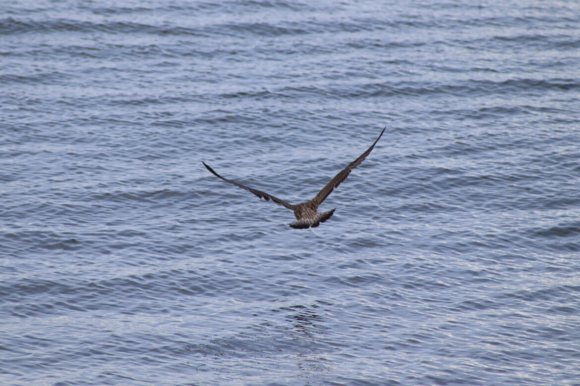
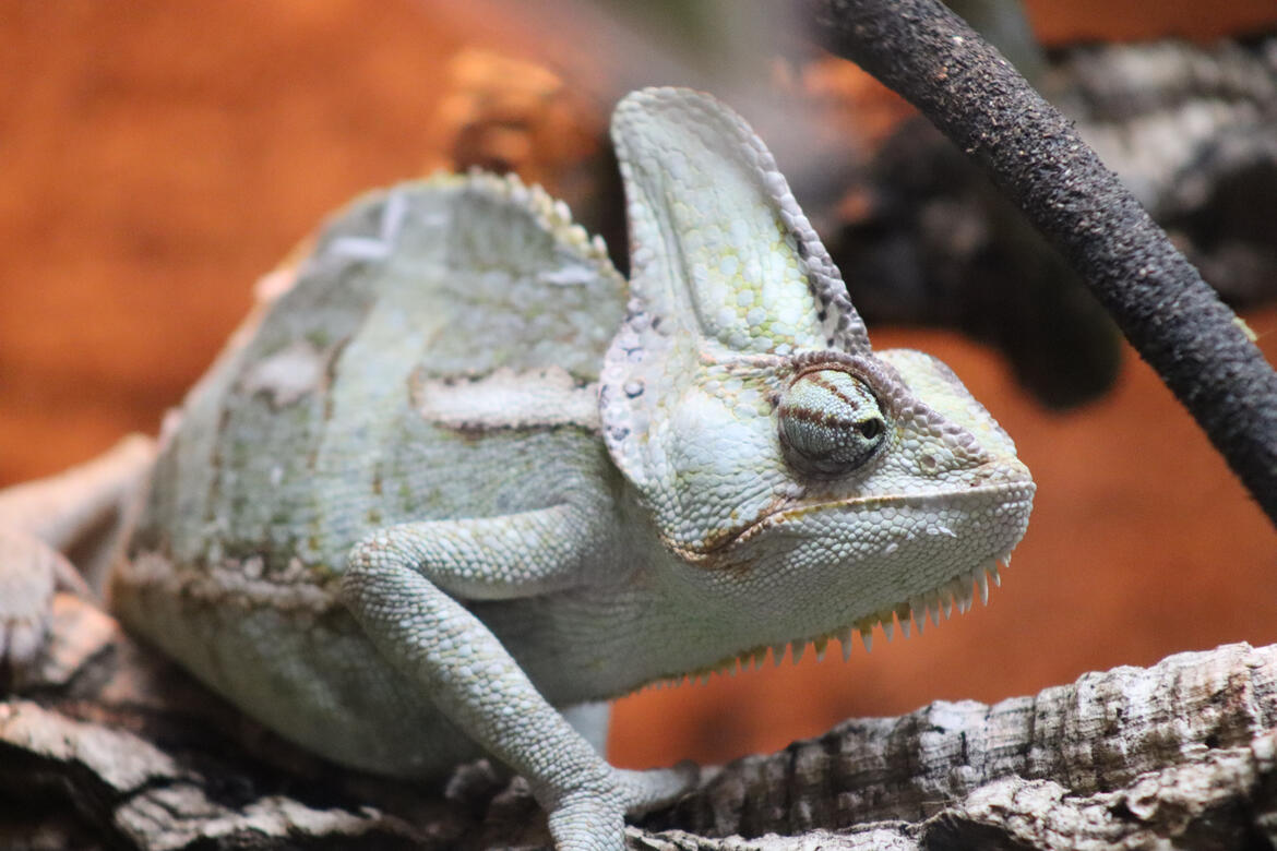
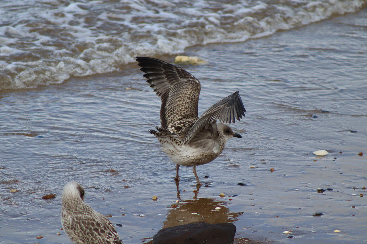
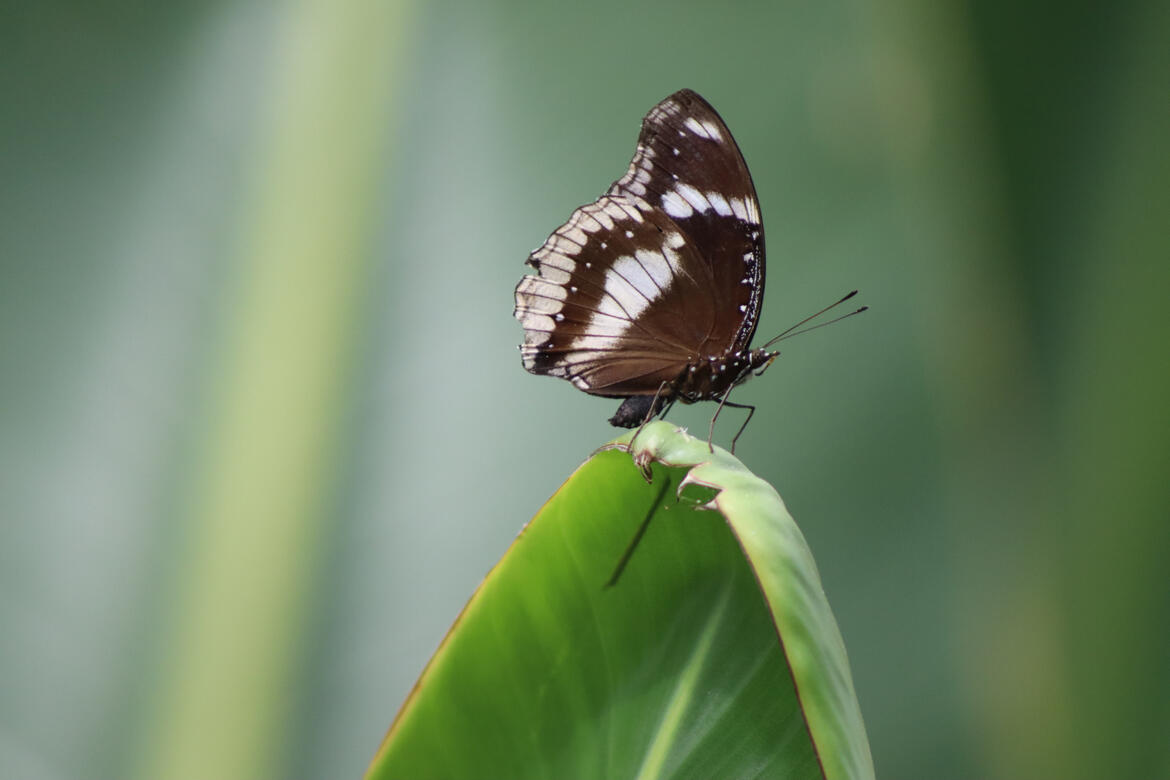
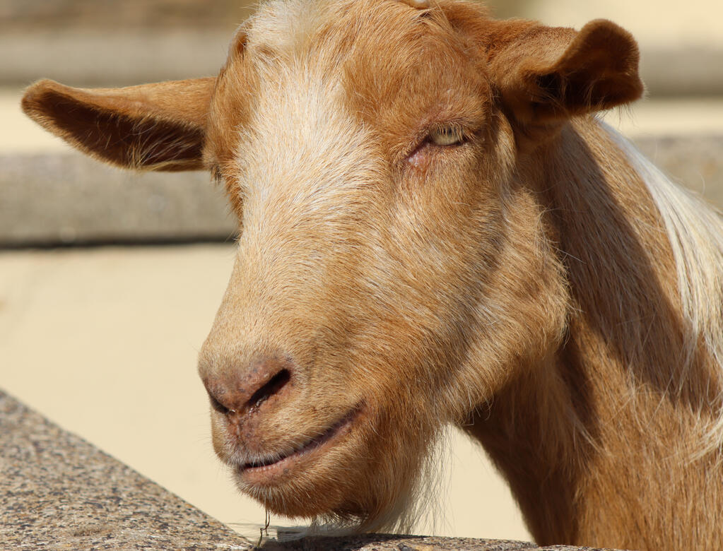
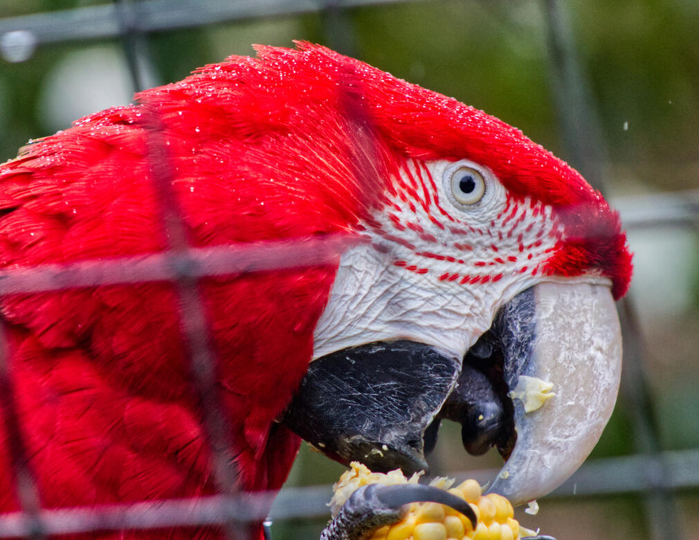
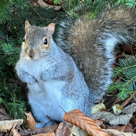
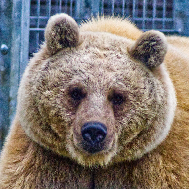
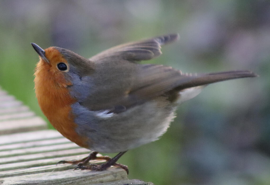
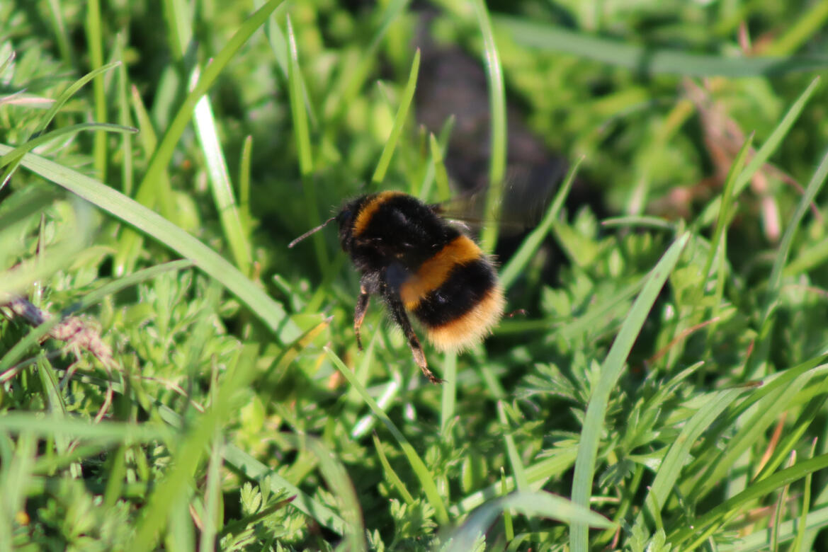
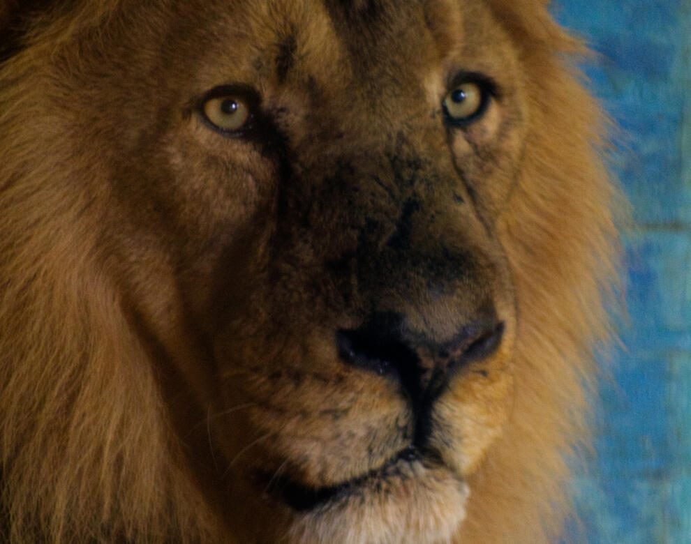
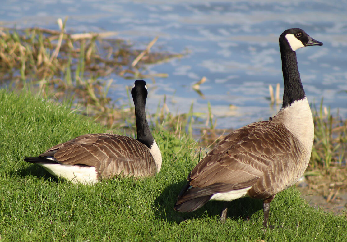
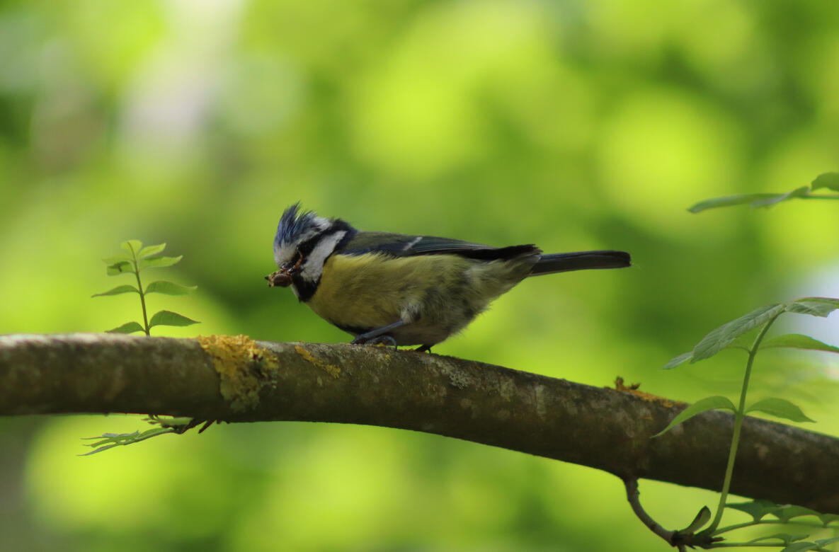
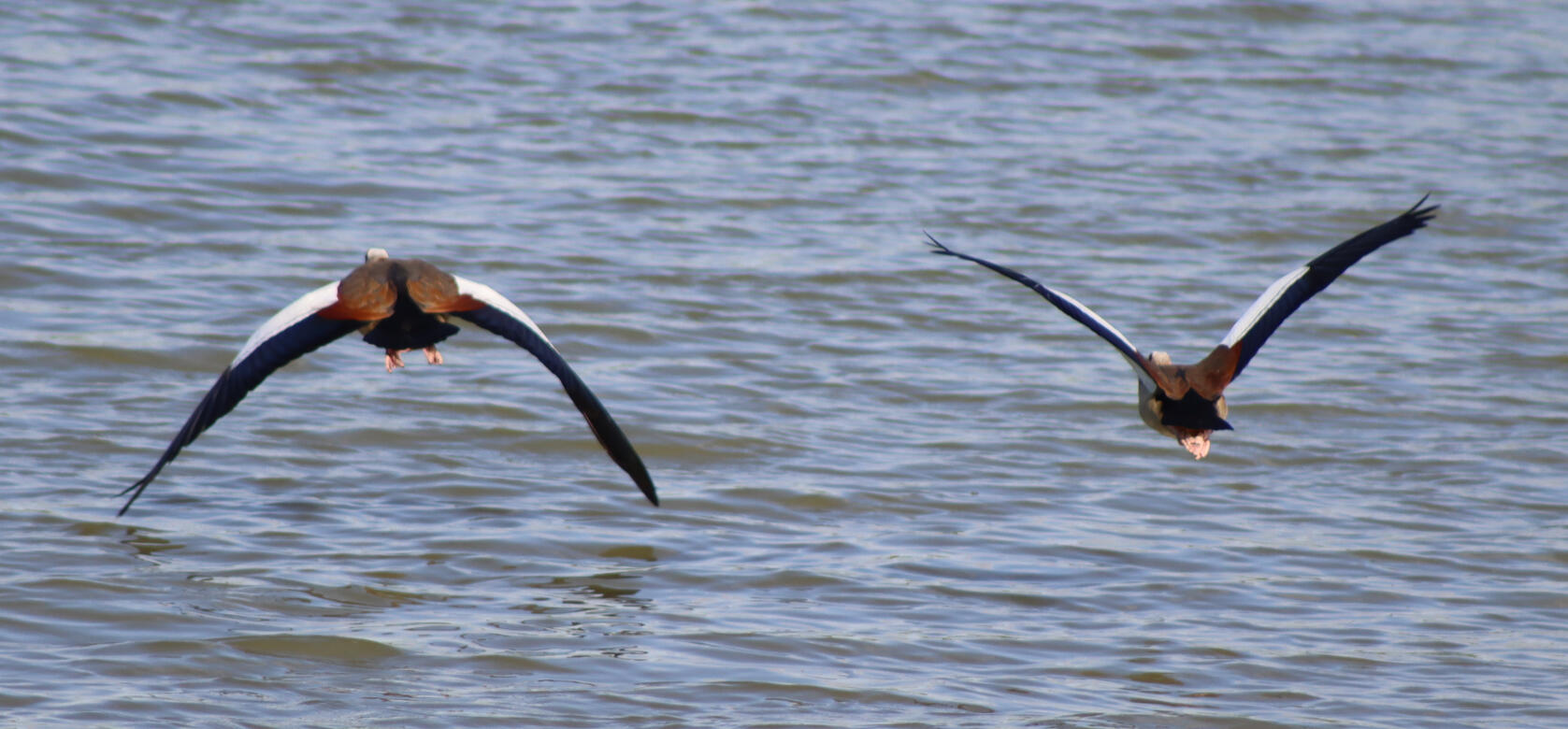
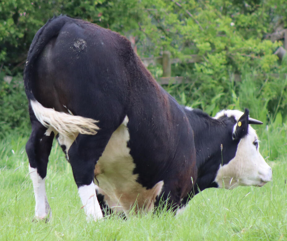
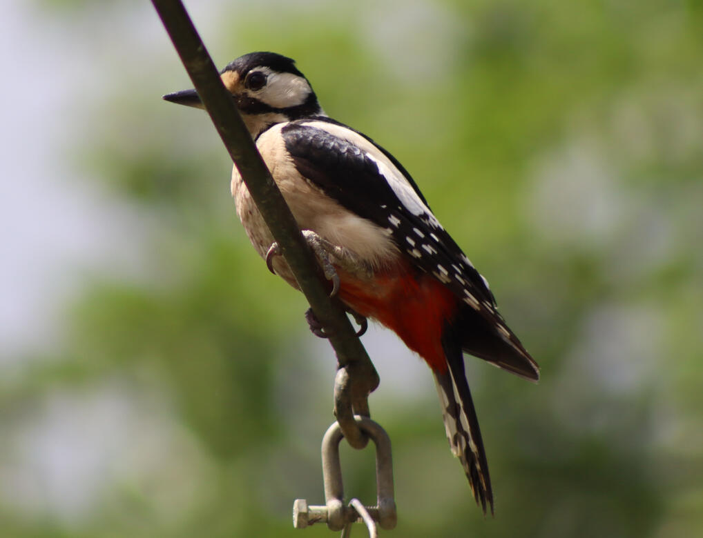
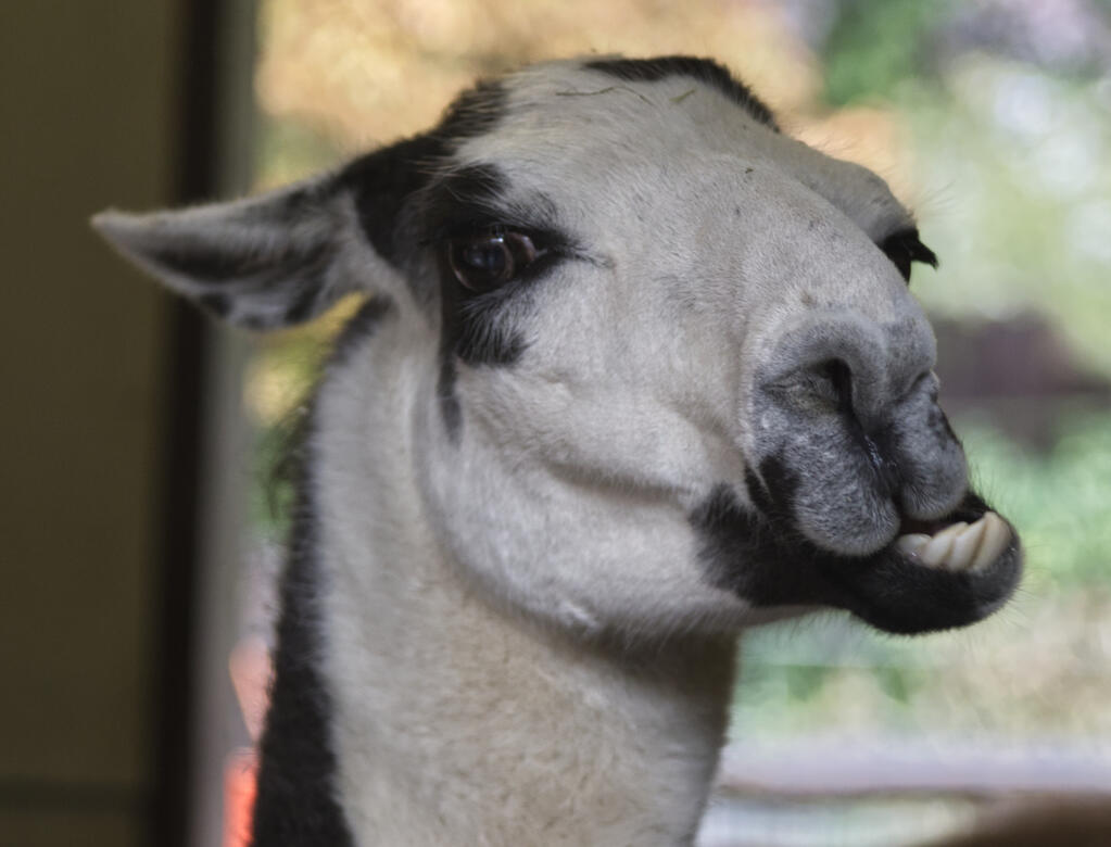
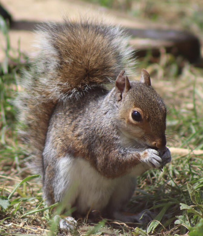
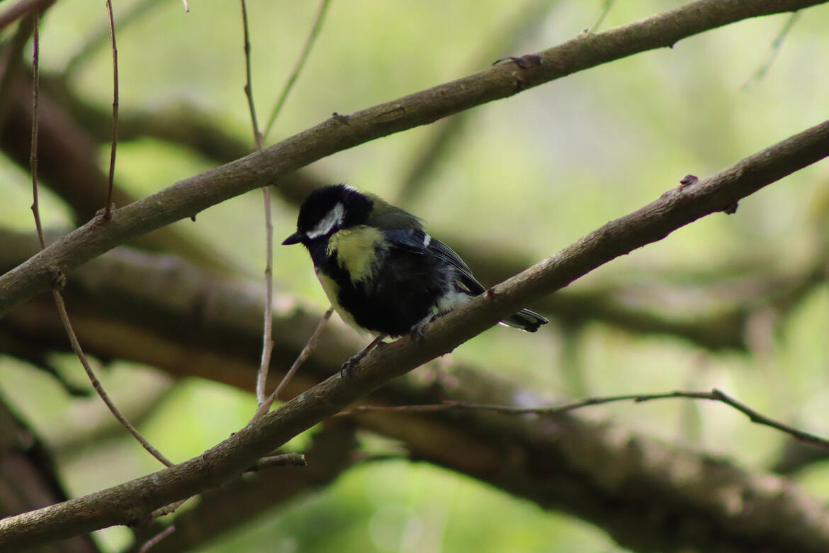
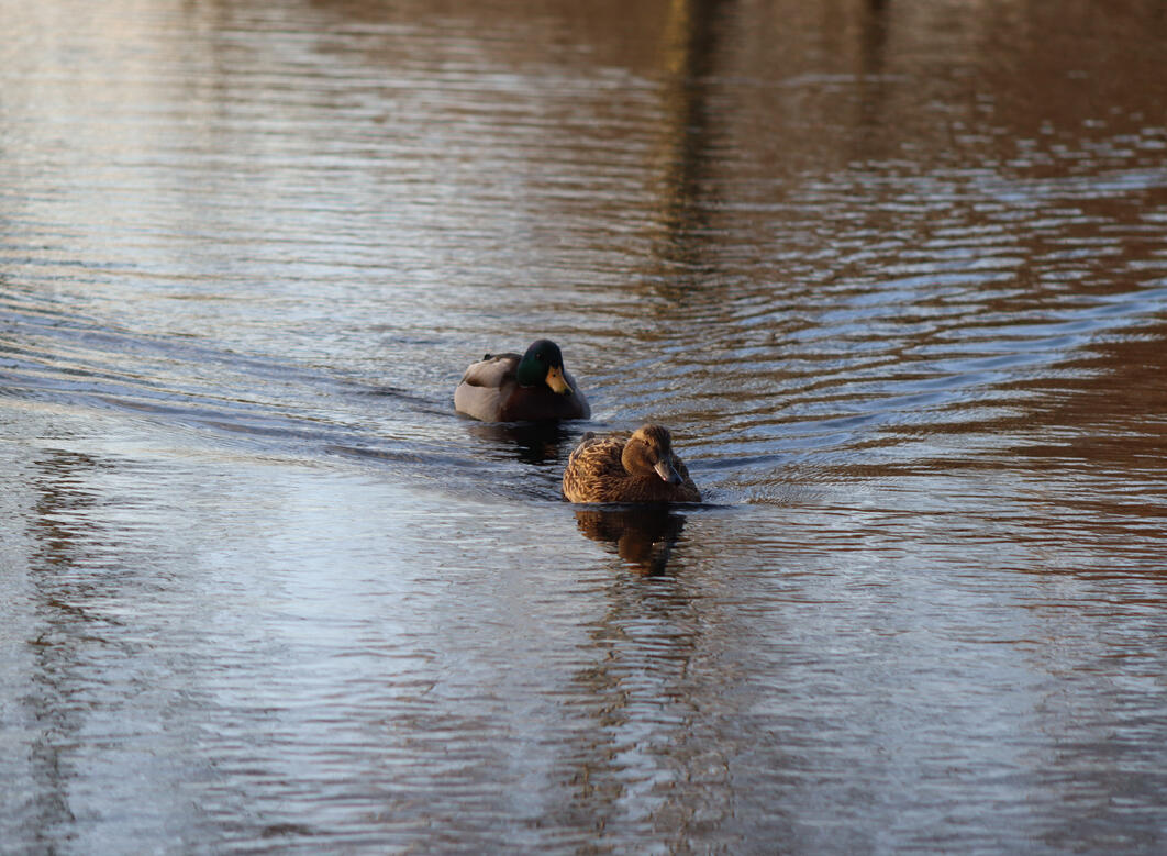
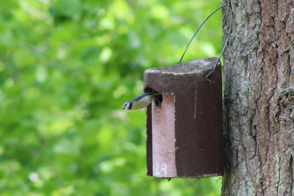
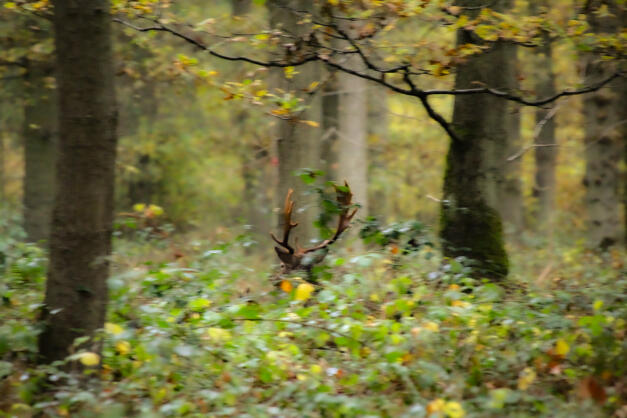
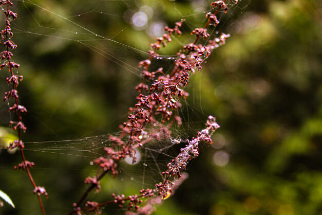
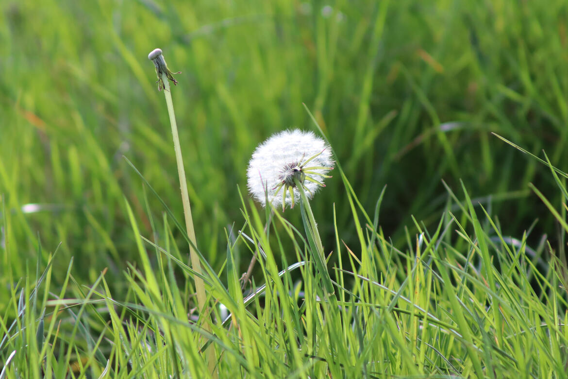
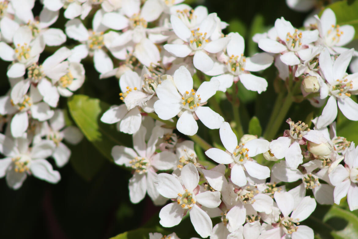
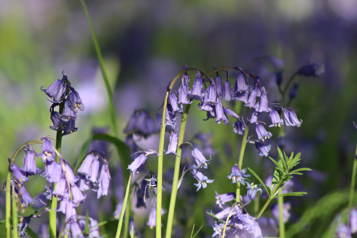
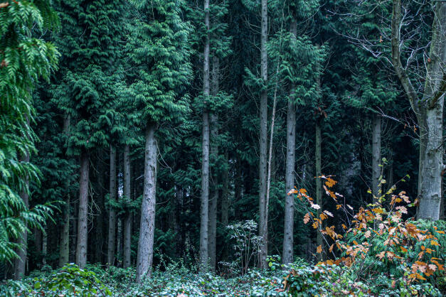
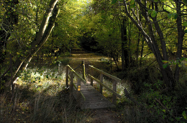
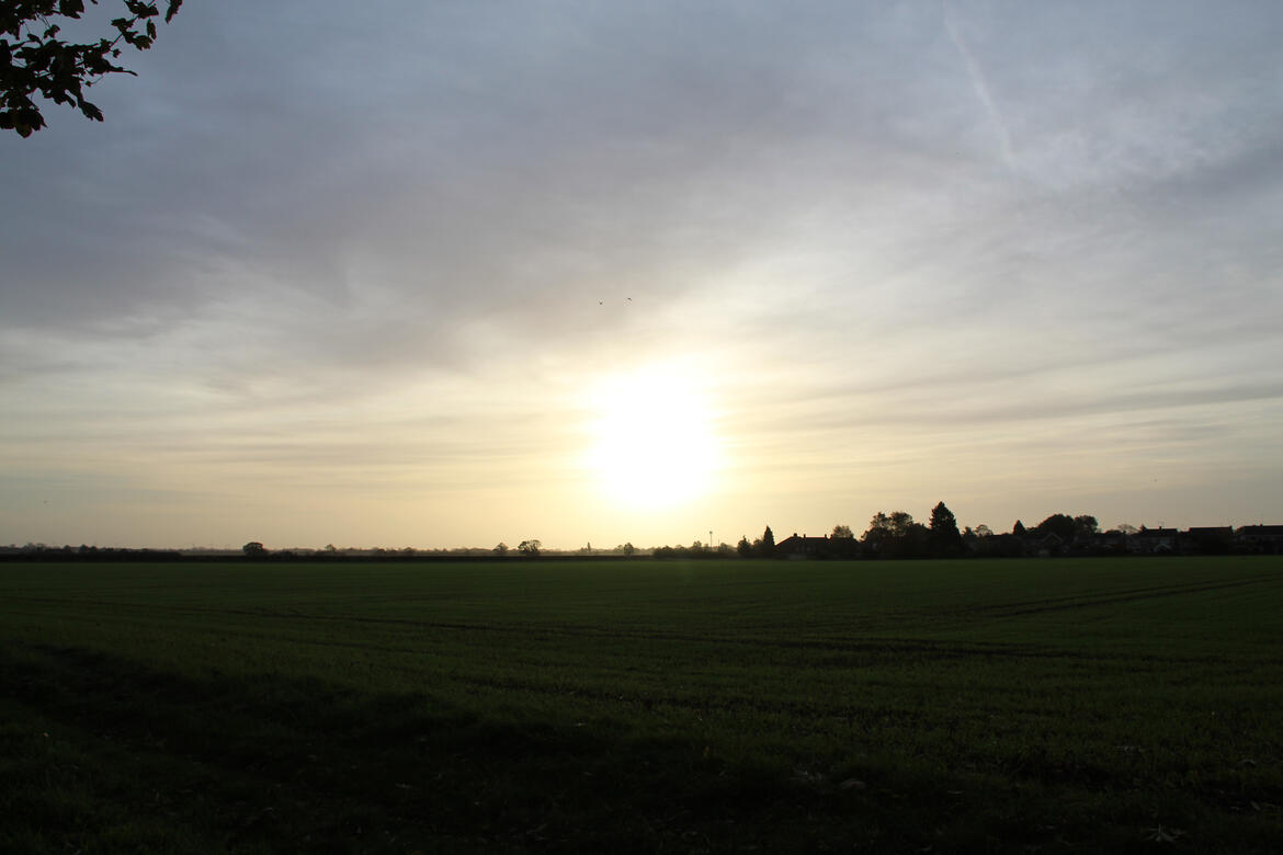
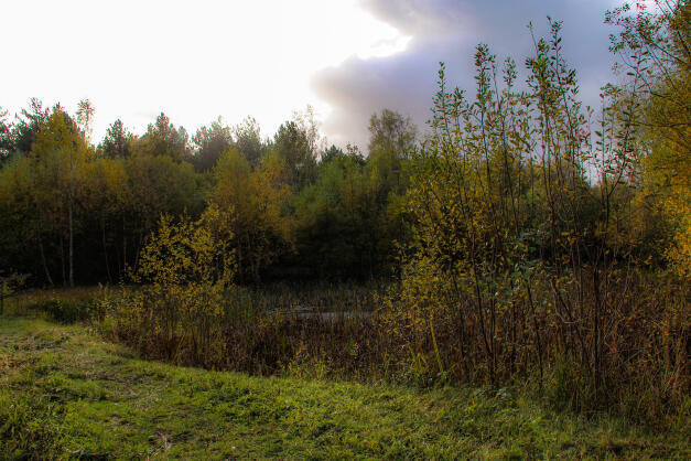
Photography has been one of my favourite hobbies since picking up a camera for the first time in 2021. As you can see, I enjoy taking many different types of images, and this is only a fraction of them!
Some have been edited, and some have not.I undertook a Commercial Photography project to use my photos taken at zoos to create commercial products.I have used a few different camera types; Canon 850D, iPhone 14 Pro Max, Canon 4000D.
Animals

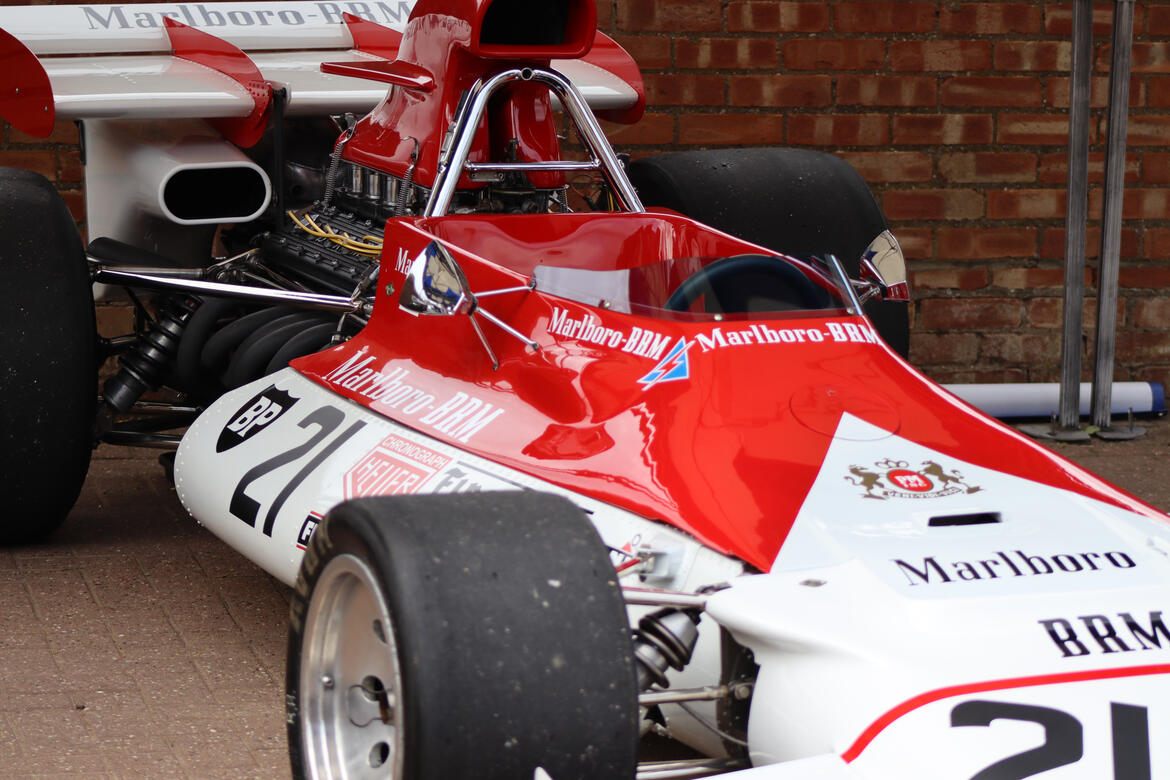
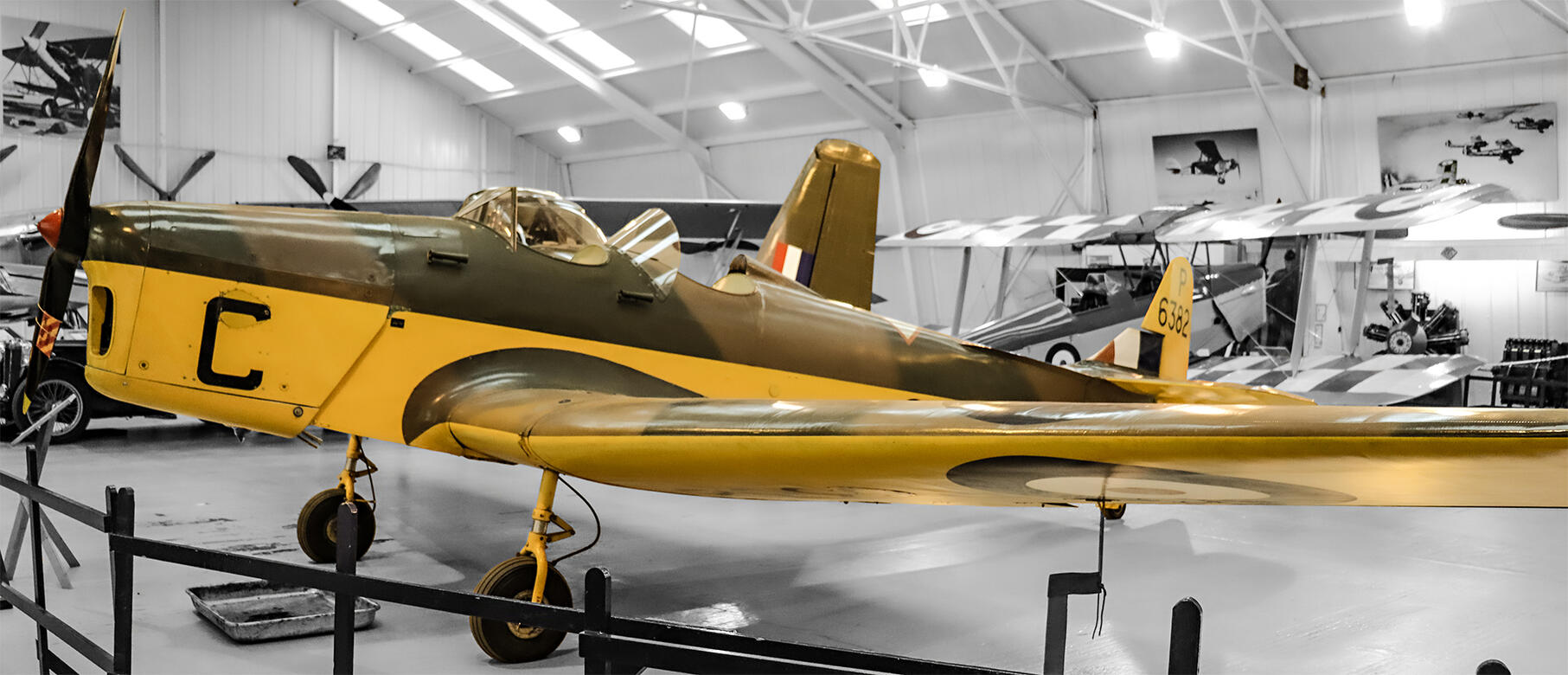
Shuttleworth

Natureland Seal Sanctuary, Skegness

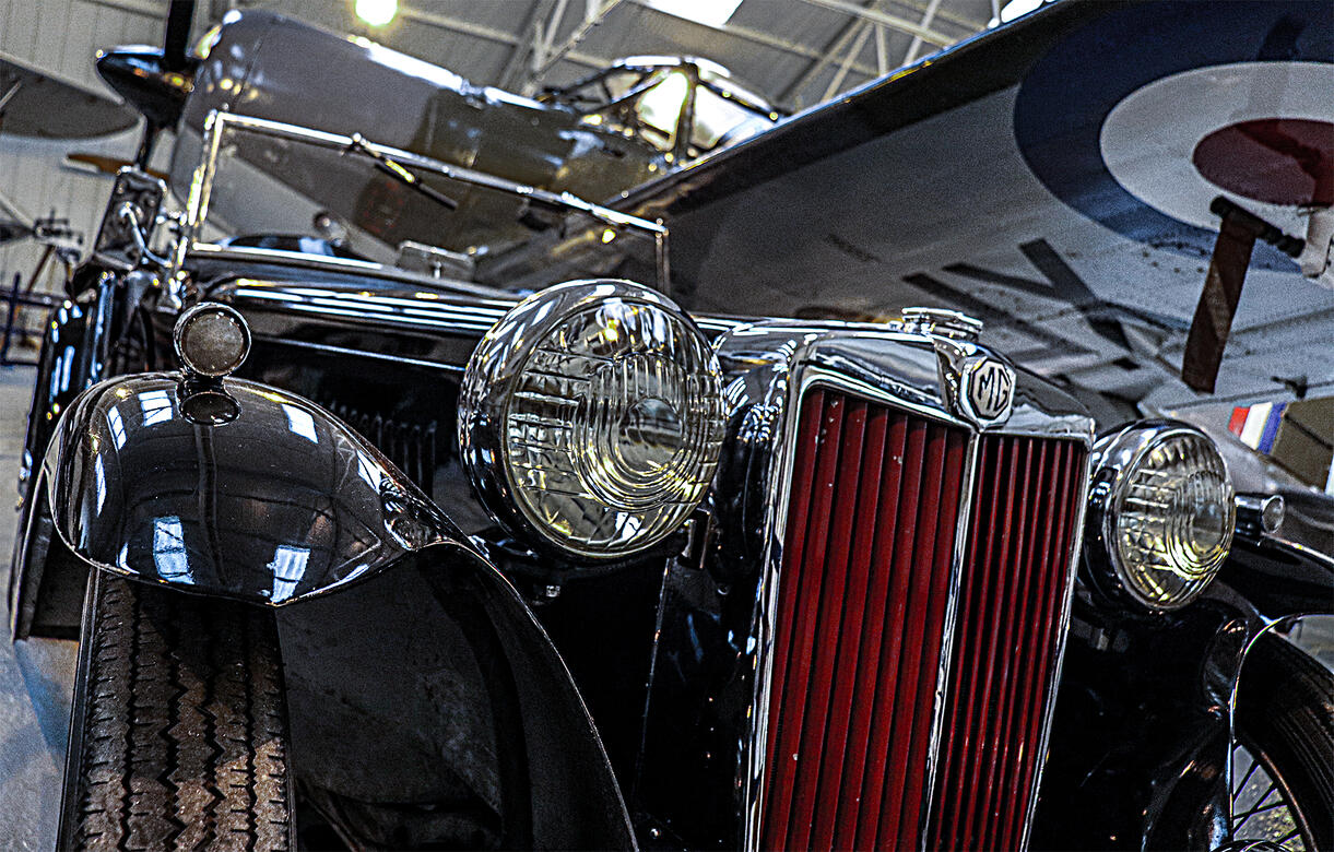
Shuttleworth

Home

Shuttleworth

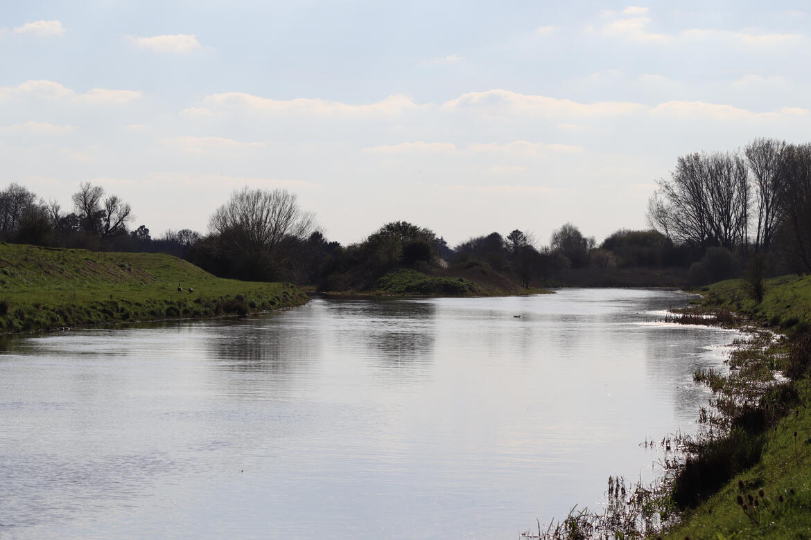
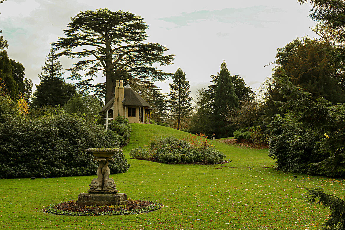
Ferry Meadows

Hamerton Zoo

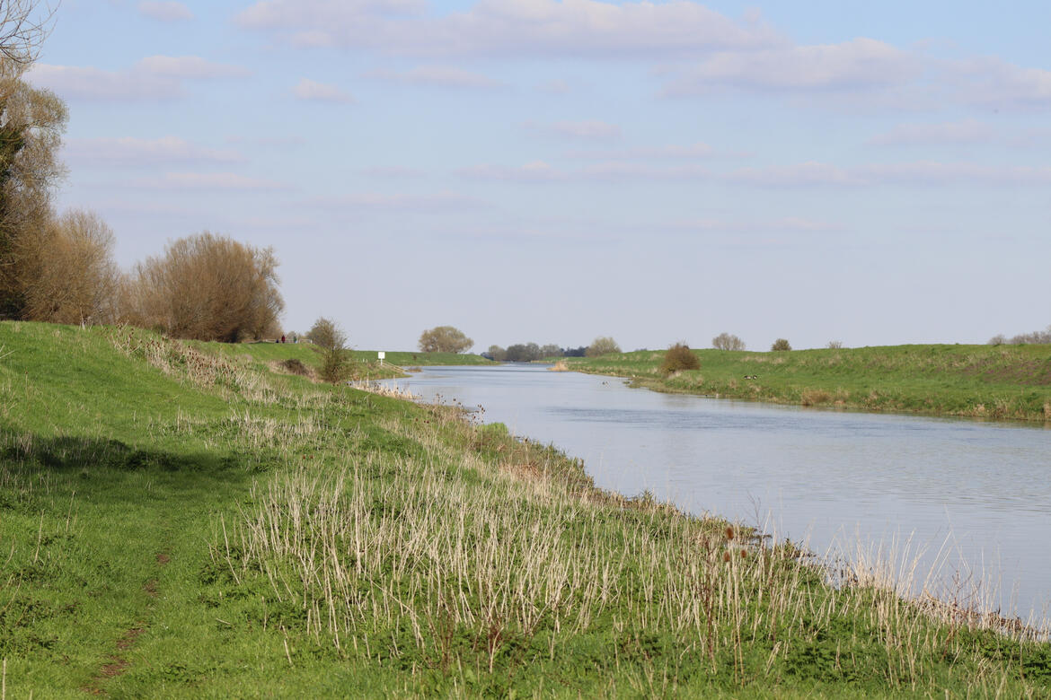
Bourne

Ferry Meadows

Natureland Seal Sanctuary, Skegness

Ferry Meadows

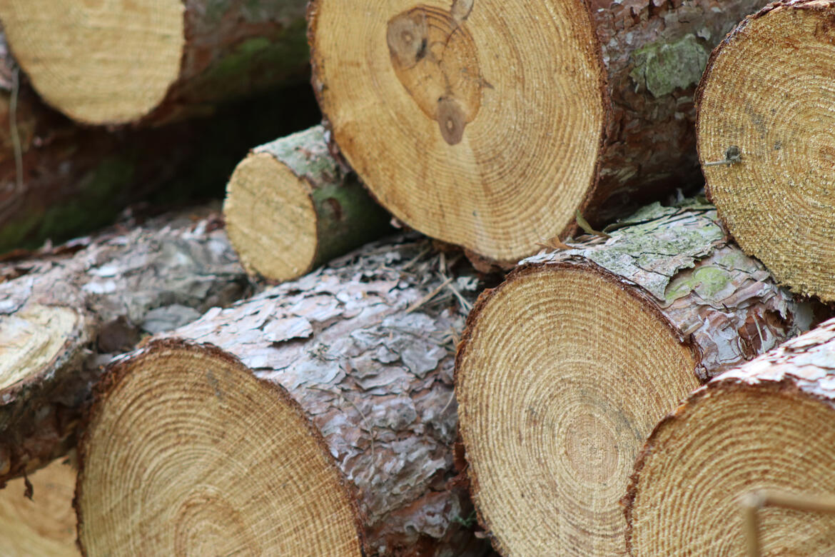
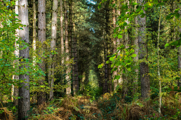
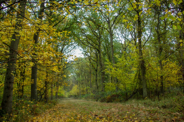
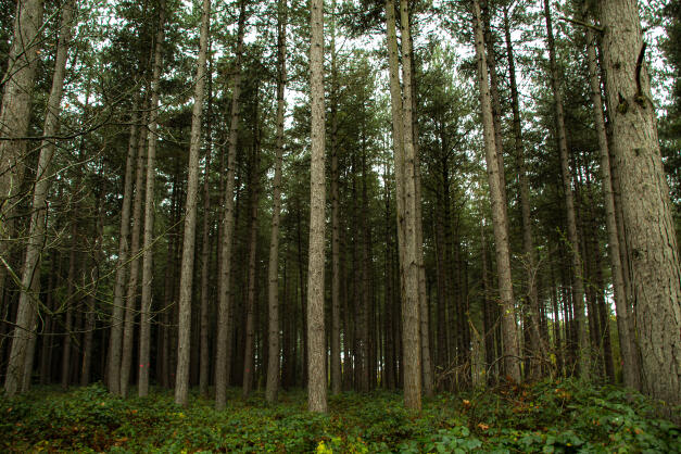
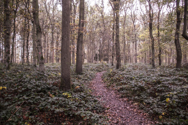
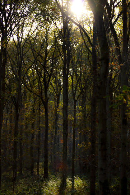
Bourne Woods

Natureland Seal Sanctuary, Skegness

Natureland Seal Sanctuary, Skegness

Natureland Seal Sanctuary, Skegness

Natureland Seal Sanctuary, Skegness

Ferry Meadows

London Zoo

Natureland Seal Sanctuary, Skegness

Ferry Meadows

Home

Hunstanton

Wherrys Spinney, Bourne

Natureland Seal Sanctuary, Skegness

Hunstanton

Natureland Seal Sanctuary, Skegness

Natureland Seal Sanctuary, Skegness

London Zoo

Central Park, Peterborough

Hamerton Zoo

Wellhead Park, Bourne

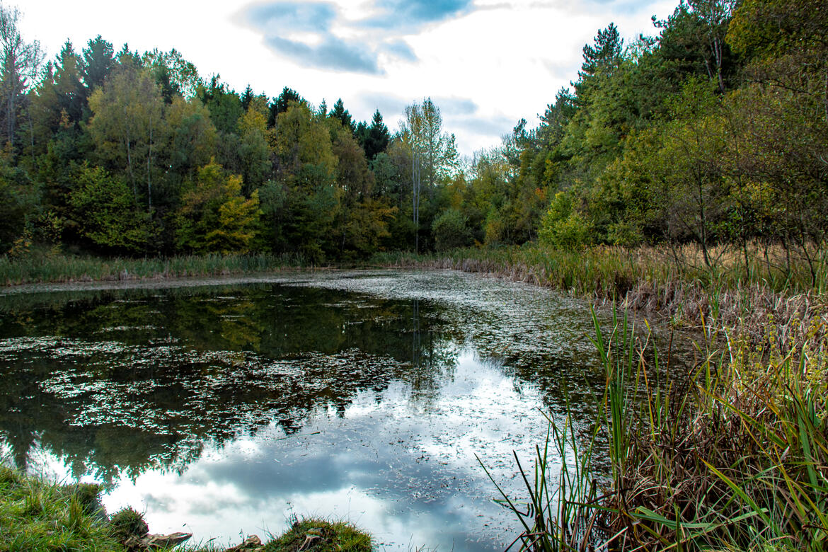
Deeping Lakes Nature Reserve

London Zoo

Deeping Lakes Nature Reserve

Bourne Woods

Deeping Lakes Nature Reserve

Thurlby

Ferry Meadows

London Zoo

Ferry Meadows

Wellhead Park, Bourne

Wellhead Park, Bourne

Bourne Woods

Bourne Woods
Close-Ups
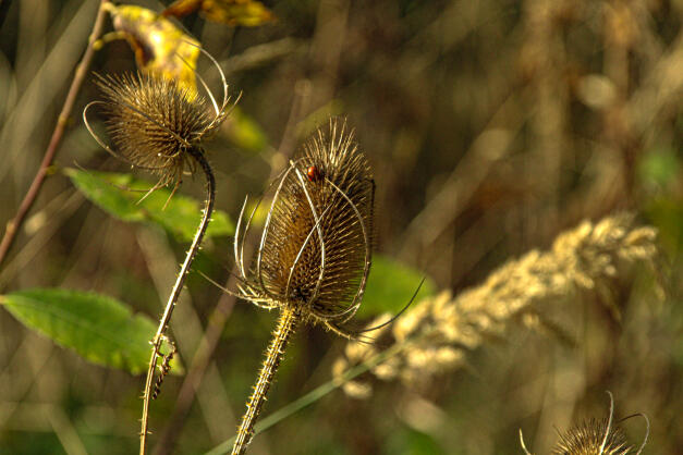
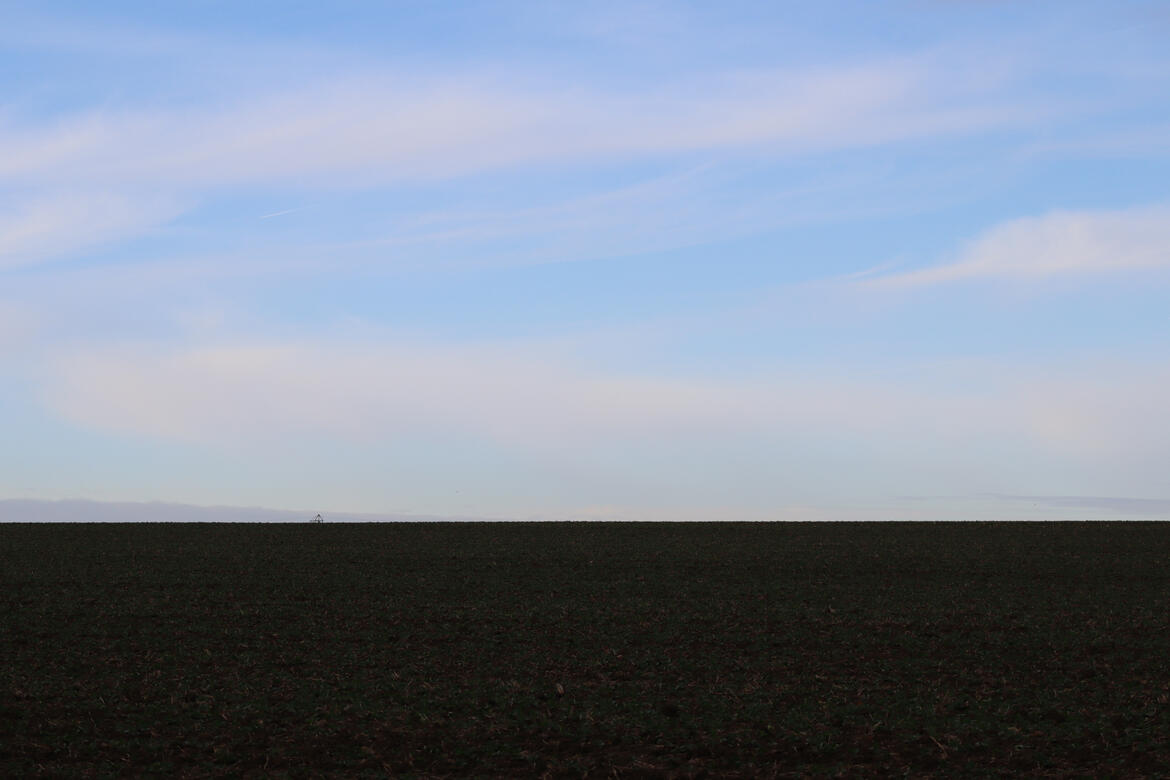
Nature
Landscapes
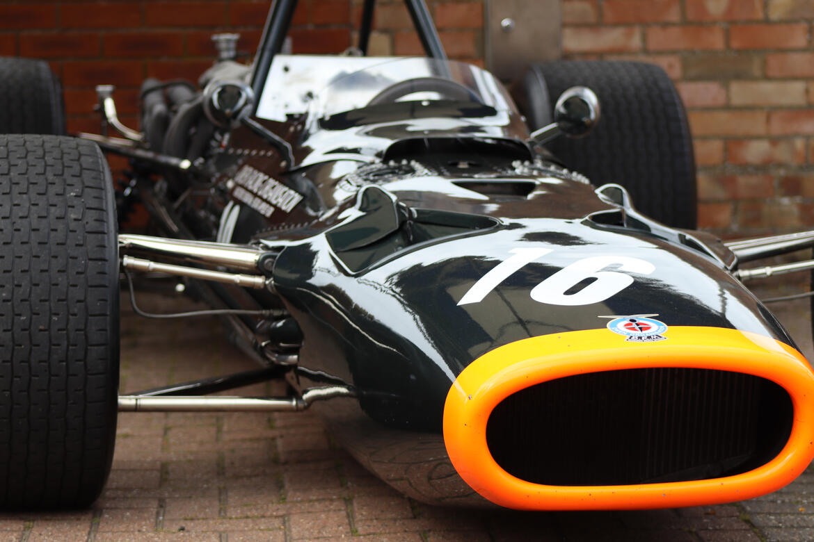
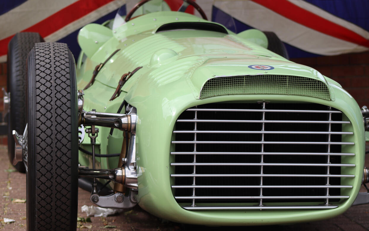
Automobile
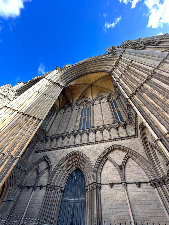
Architecture
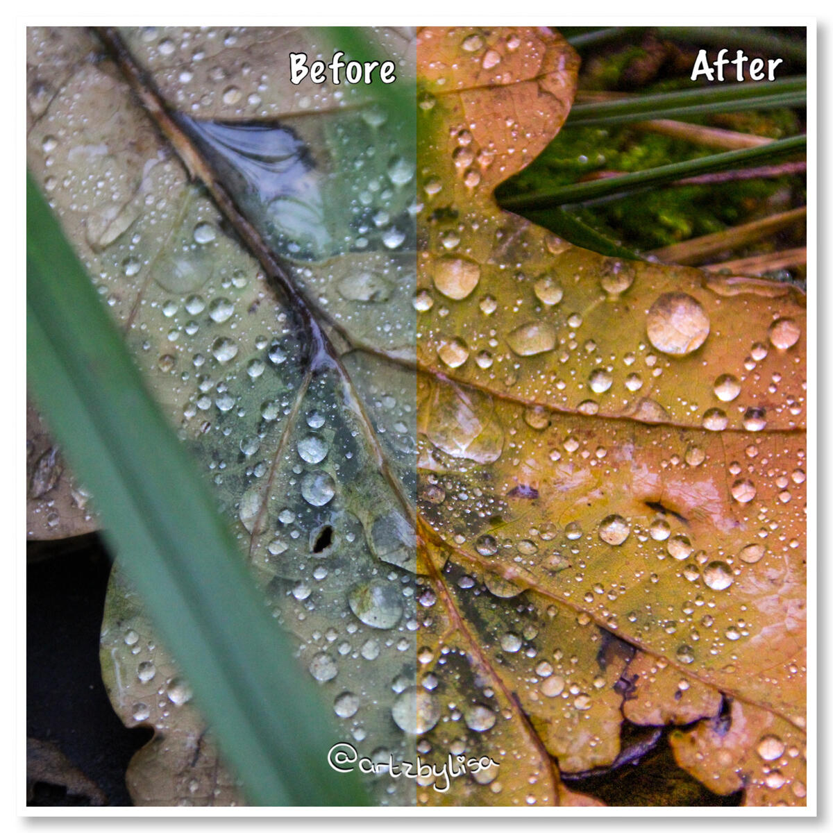
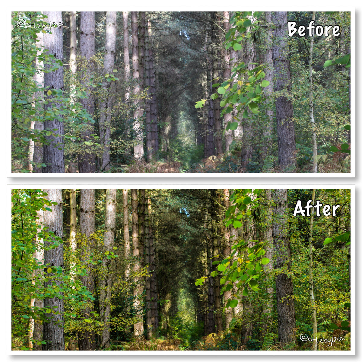
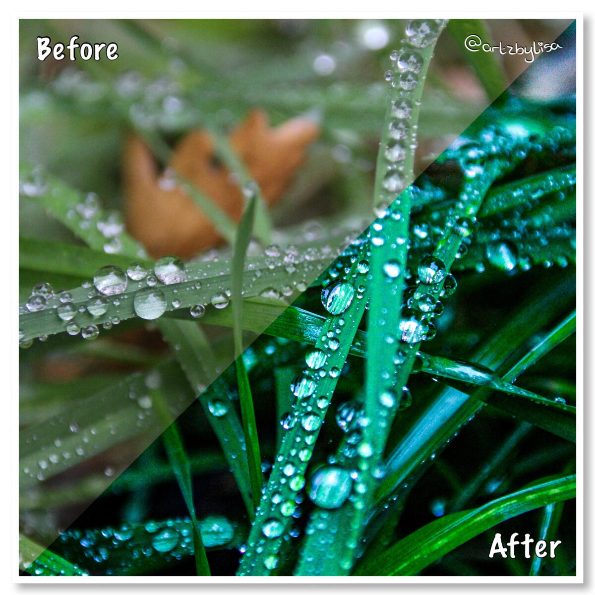
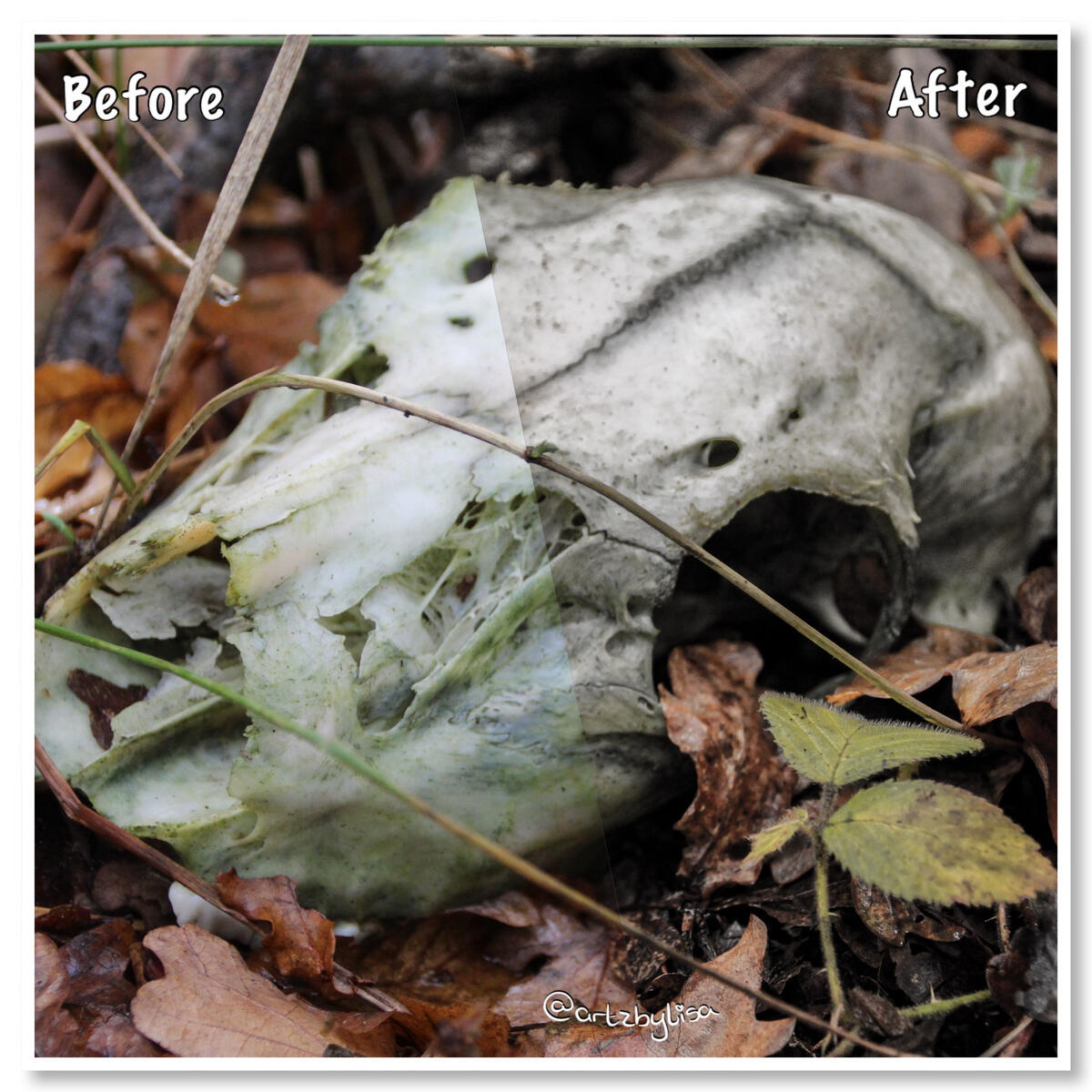
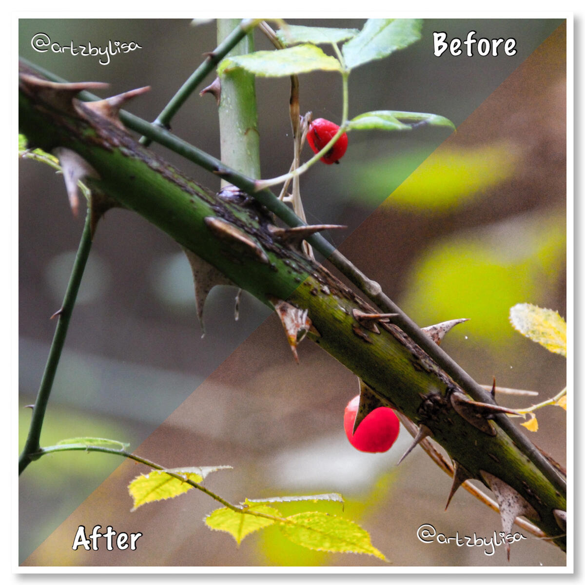
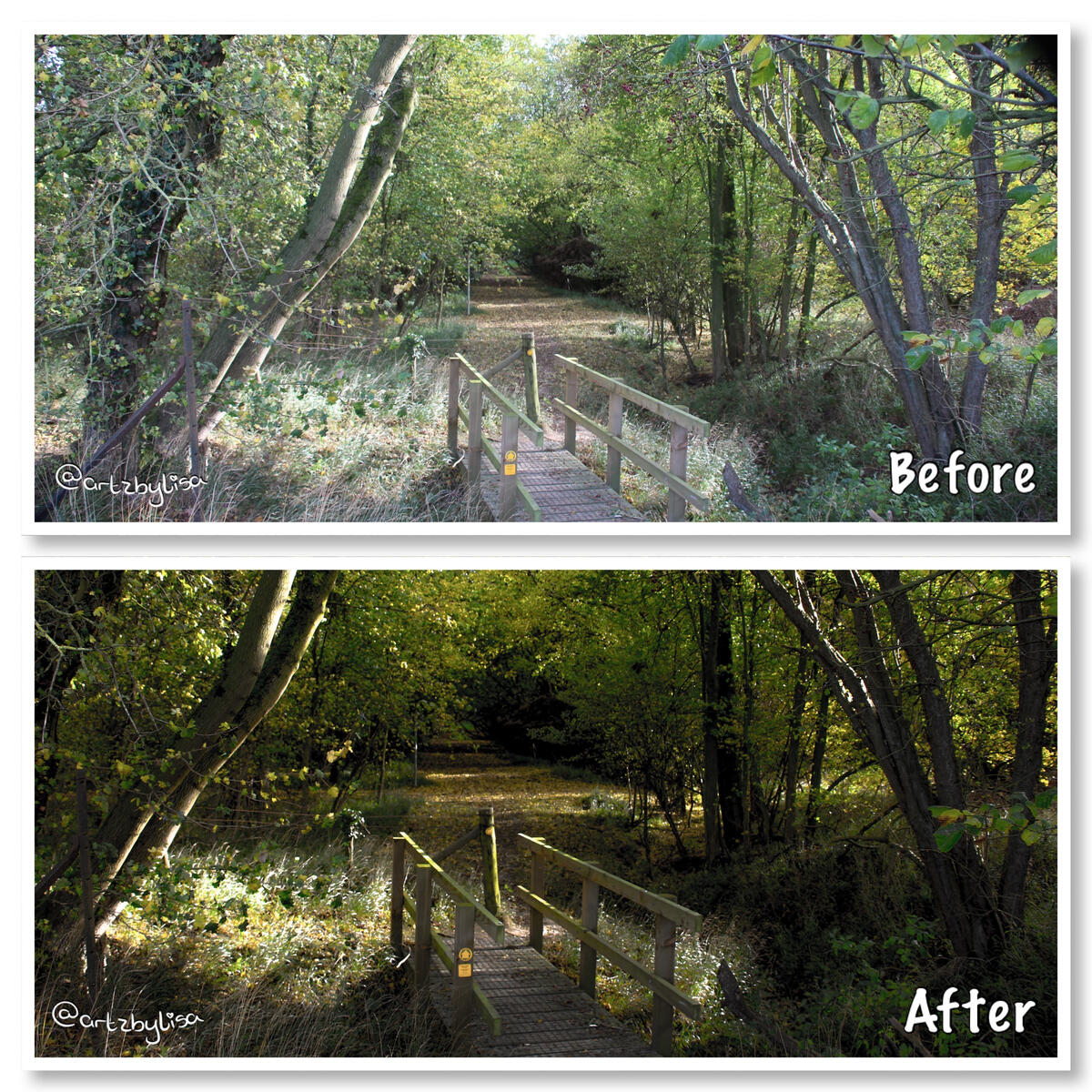
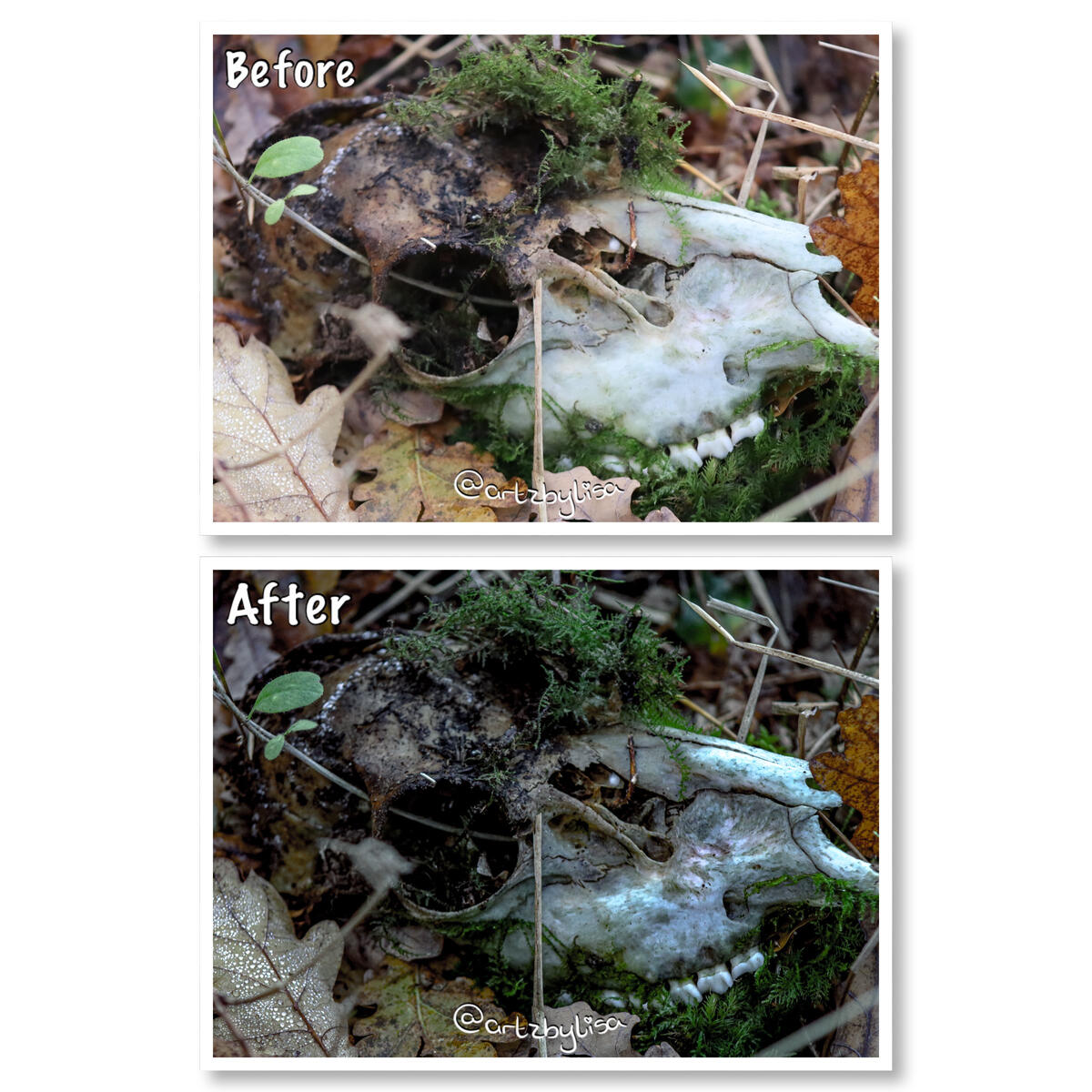
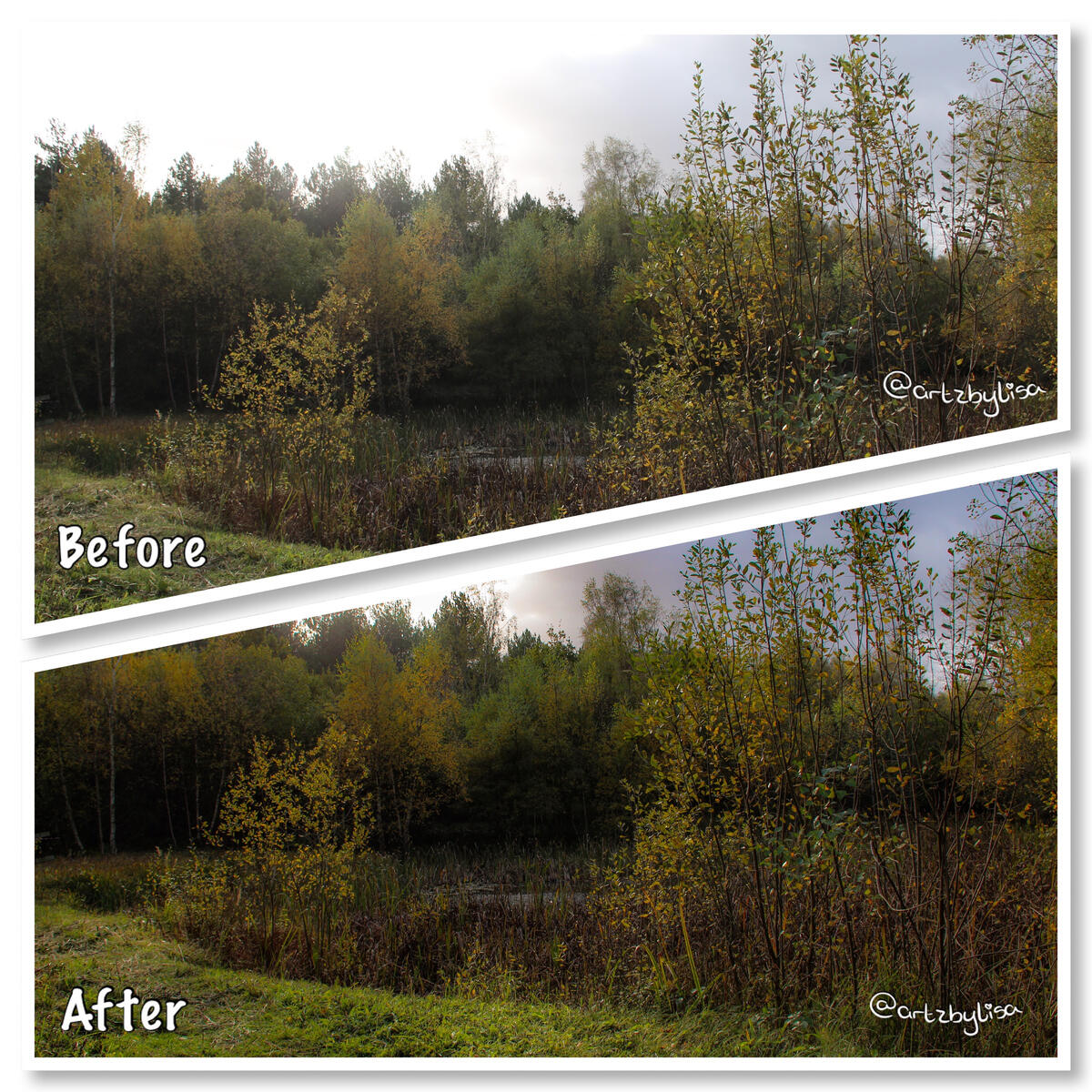
Edit Comparison
Once taking some photos, I like to play around with editing them, either using Adobe Photoshop or Affinity Photo. I love looking at the comparison before and after the results.
Some images I believe are perfect as they are whilst others I like to have a play around with.Here are some examples of the differences once edited!
Undergraduate Major Project
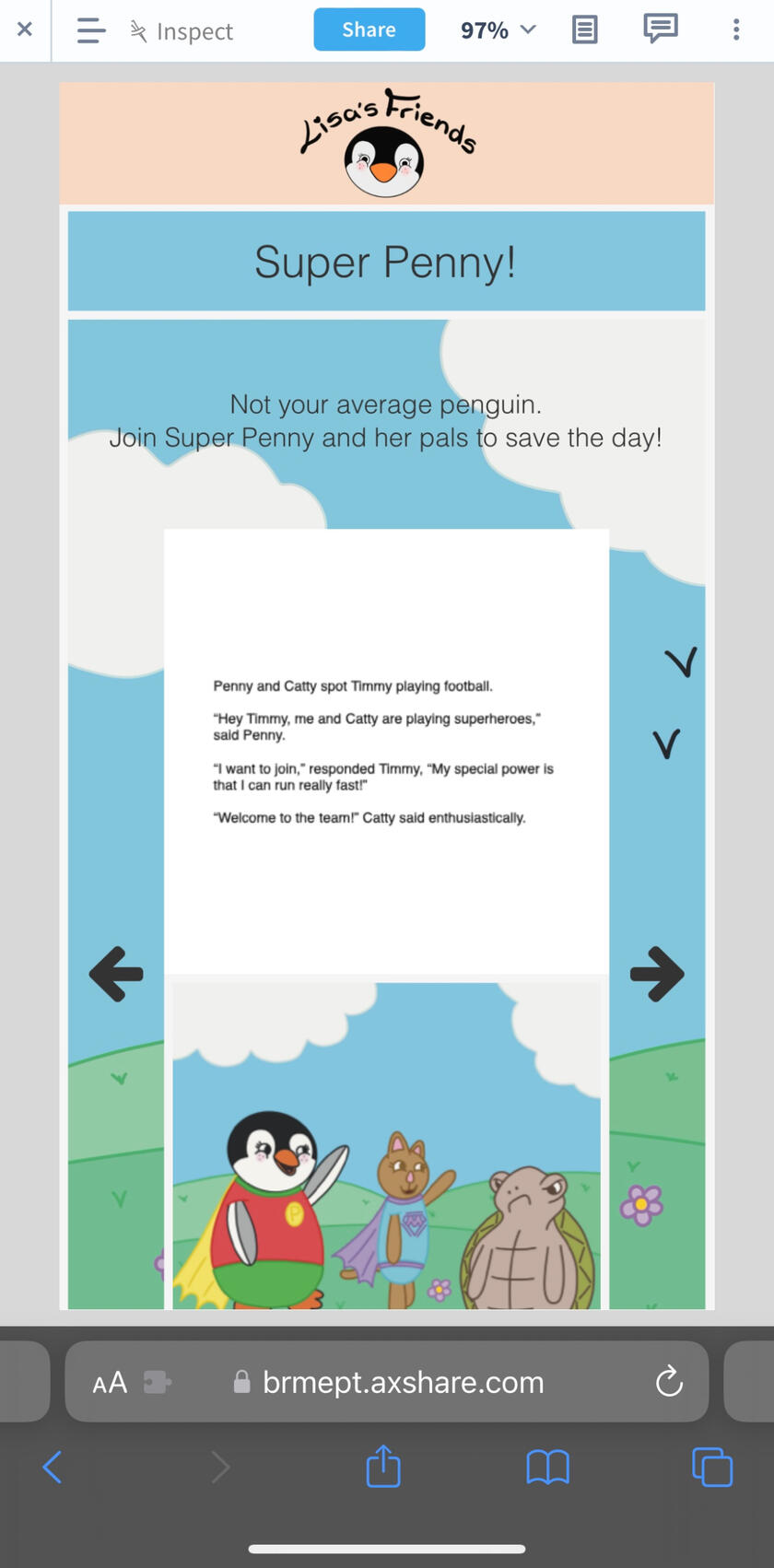
Lisa’s Friends
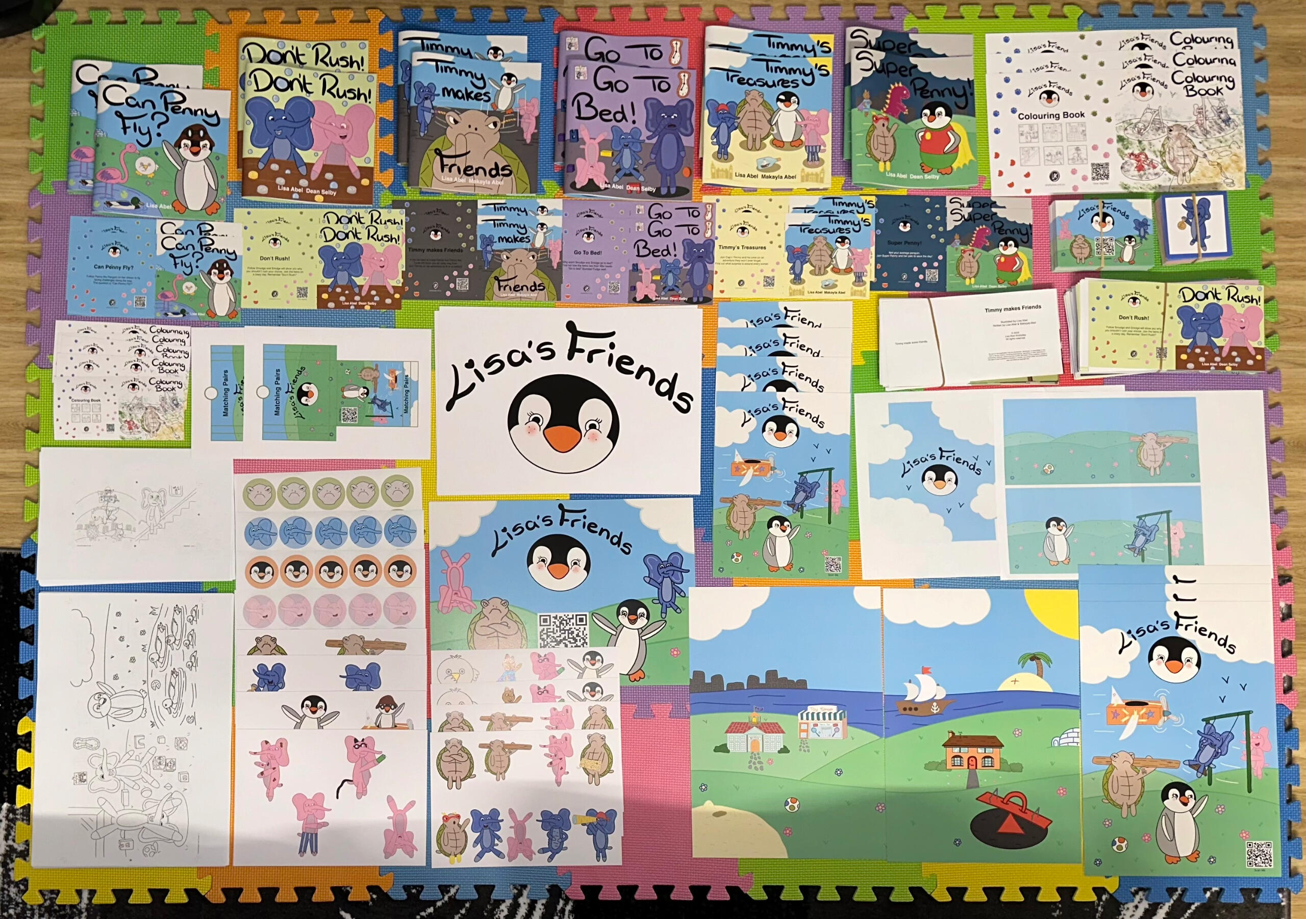
This project was undertaken during my final year at University. The idea was to bring aspects of previous modules studied and put skills to practice in form of a big project.‘Lisa’s Friends’ is a book series created for children to enjoy and escape from the real world.
The series is set out to explore how physical and digital can be combined whilst protecting the value of the book to young readers and their physical, mental, and emotional development. The role of the characters is to bring inspiration and creativity to kids of all ages.The characters were inspired by plushies which were then recreated into an illustrative form.
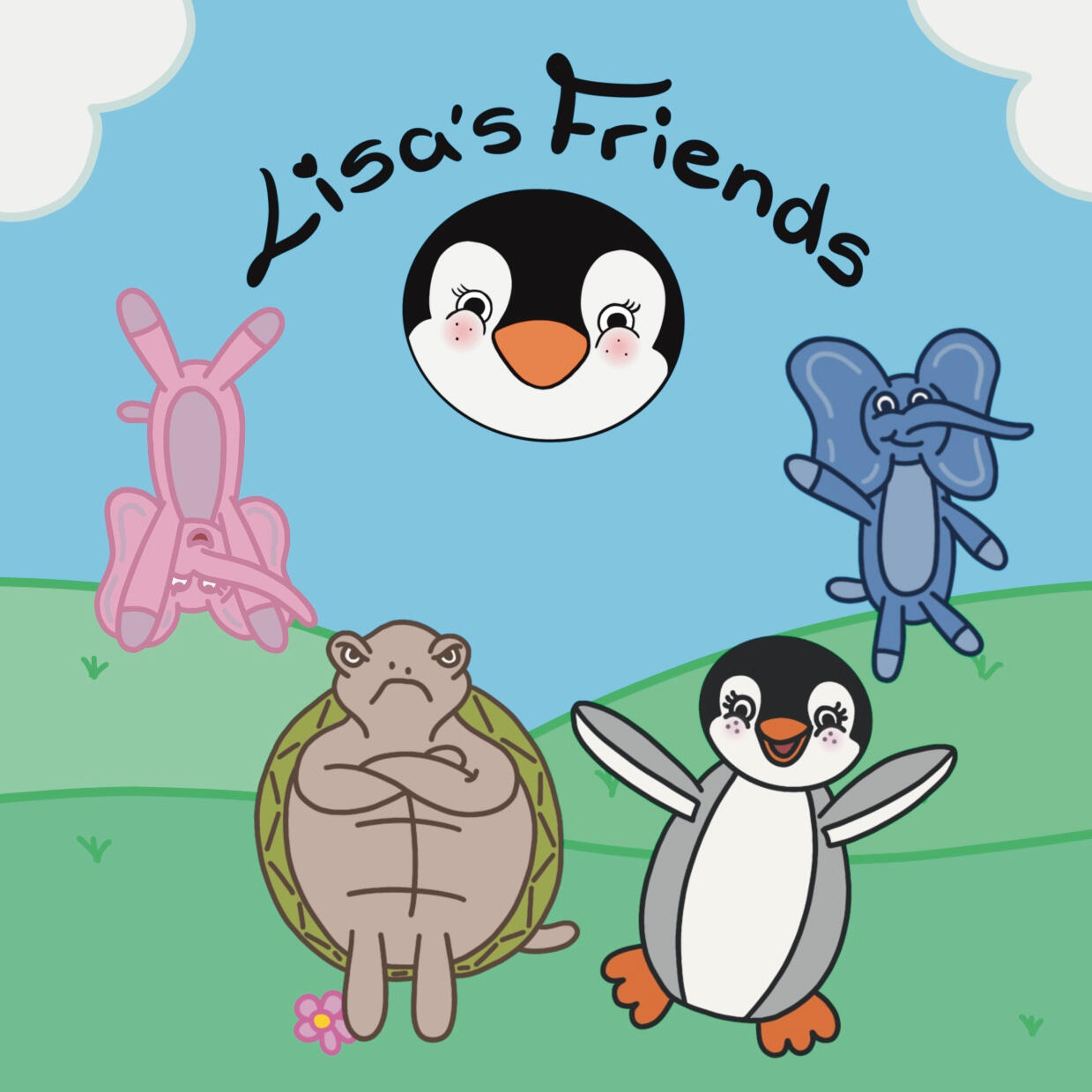
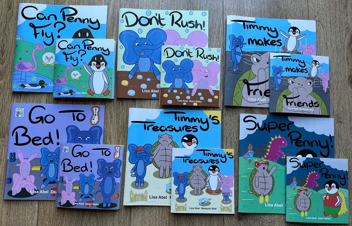
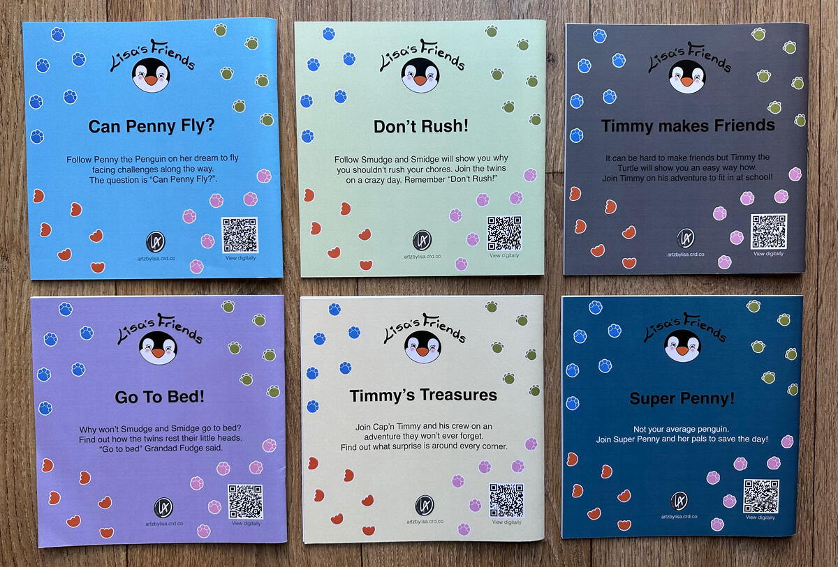
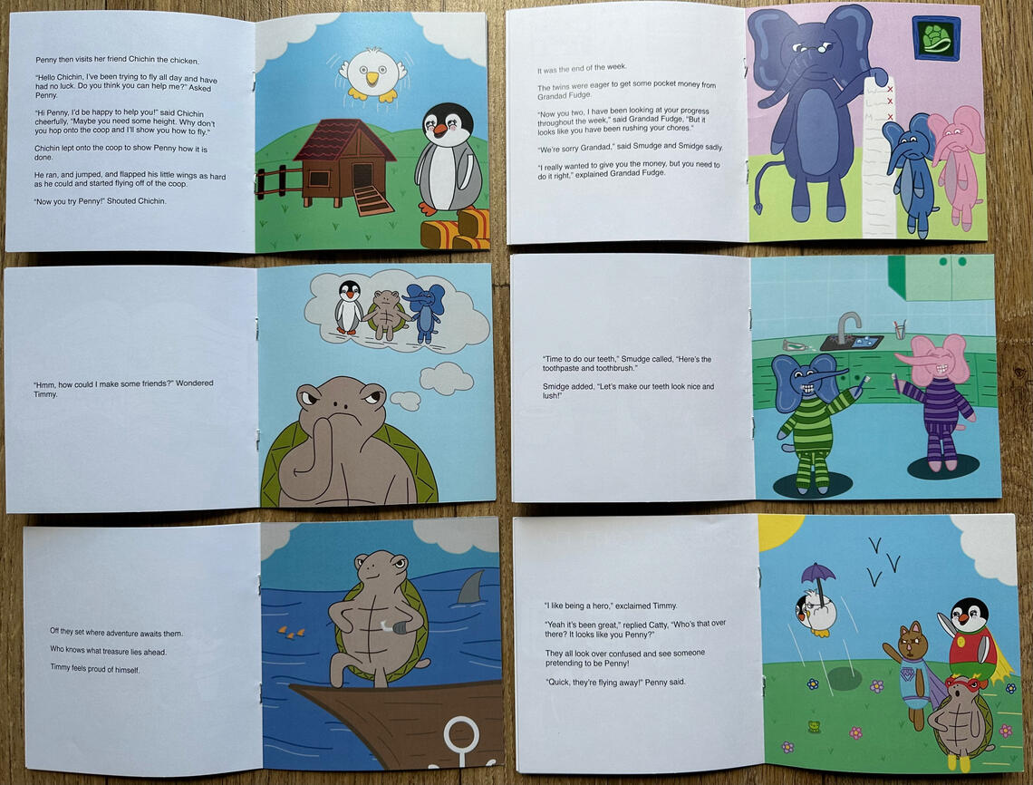
This series has great potential to branch out into a TV show, merchandise, and great education resources that parents, carers, and teachers can use. The characters and their personalities play a big part within the books to represent people in the real world with different personalities, this is an example of what I want to portray within the books to create lessons relating to real life situations.
Assets
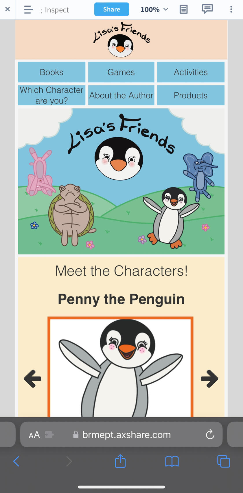
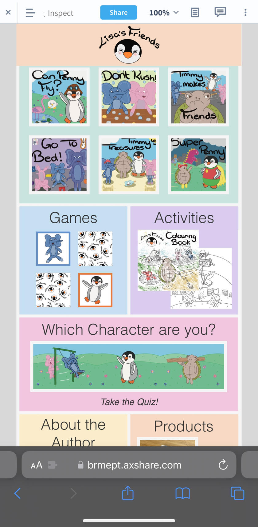
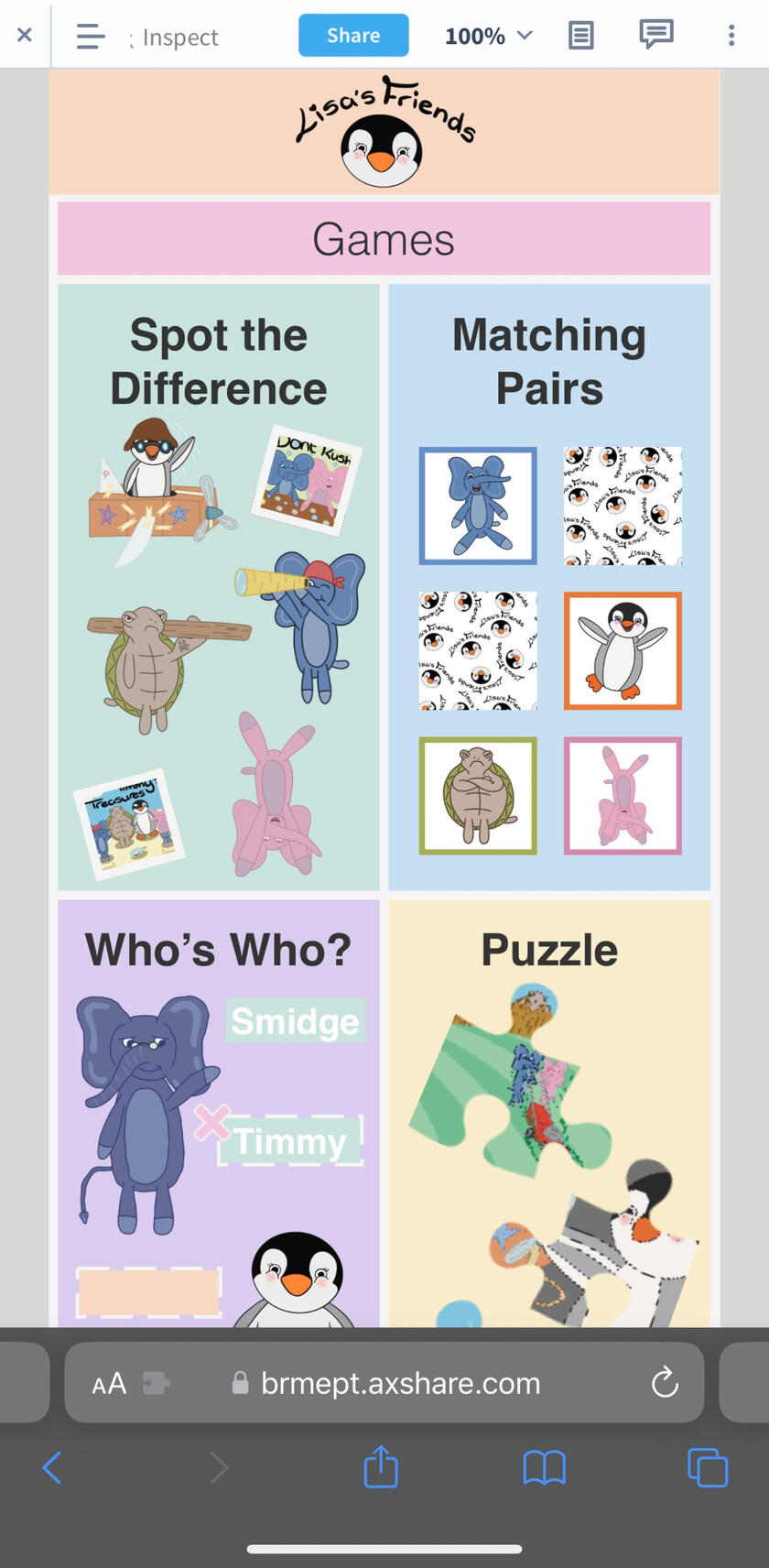
Prototype Website
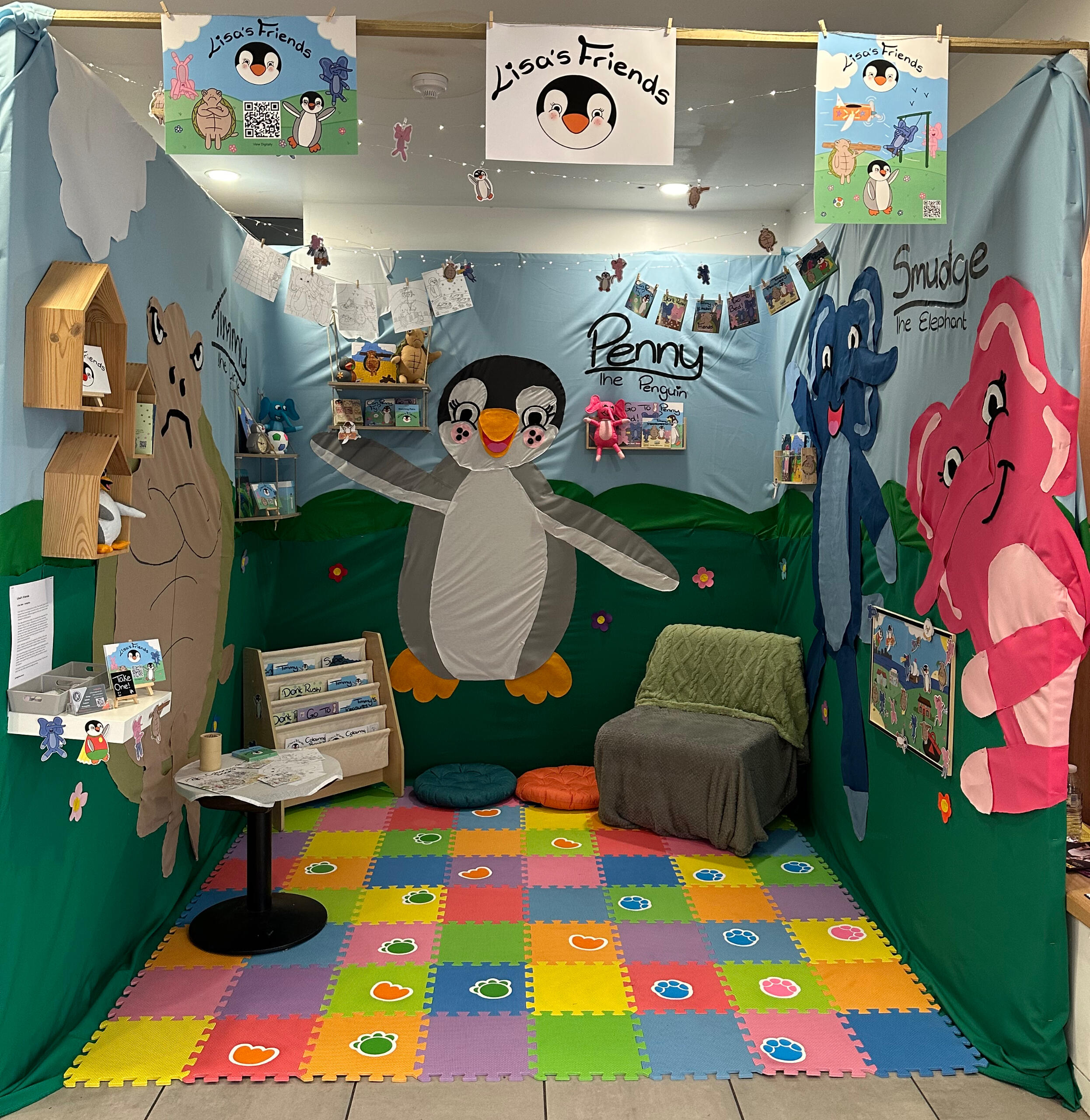
Exhibition Space
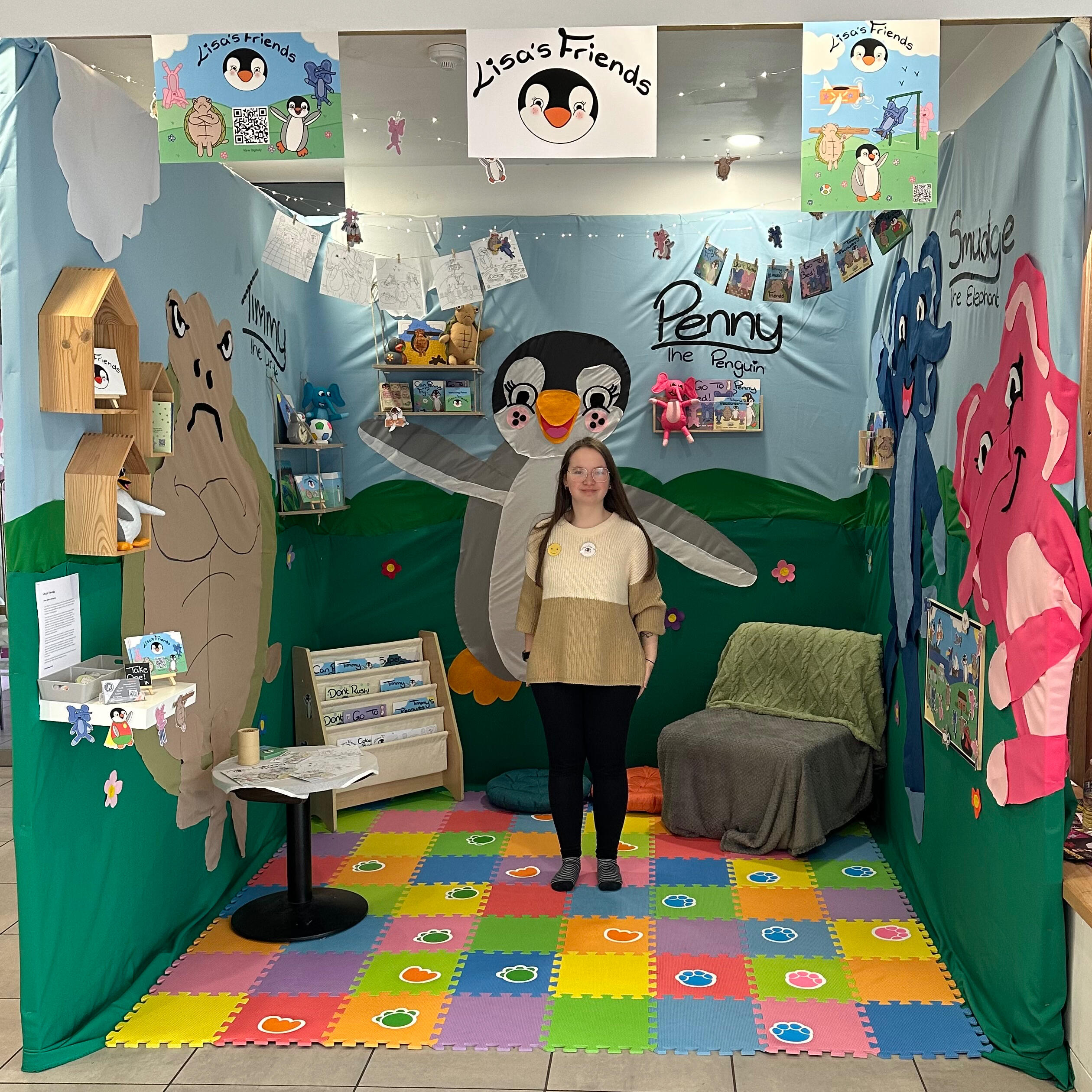
The exhibition was held at the Key Theatre, Peterborough in March 2024, open to everyone to enjoy.
Graphic Design
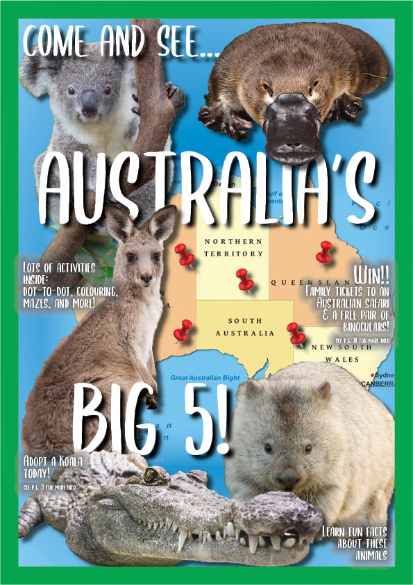
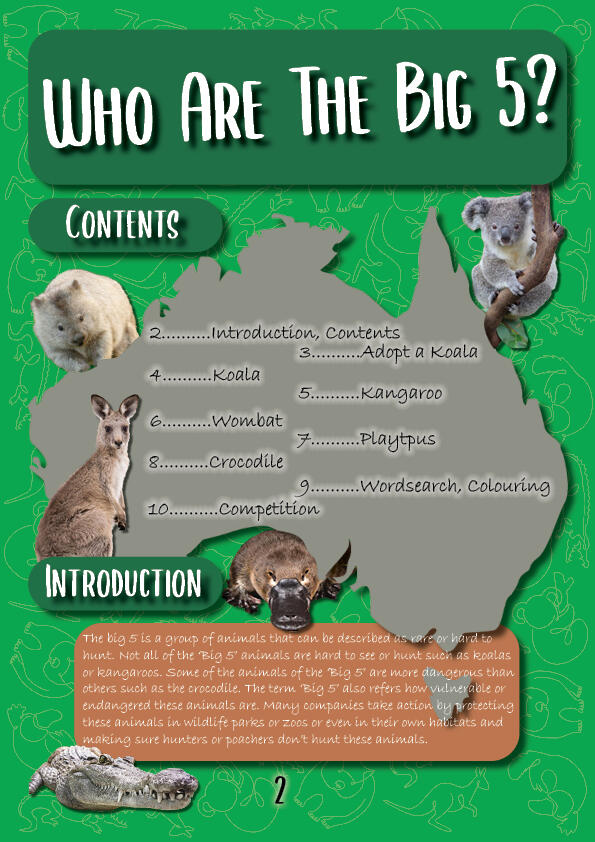
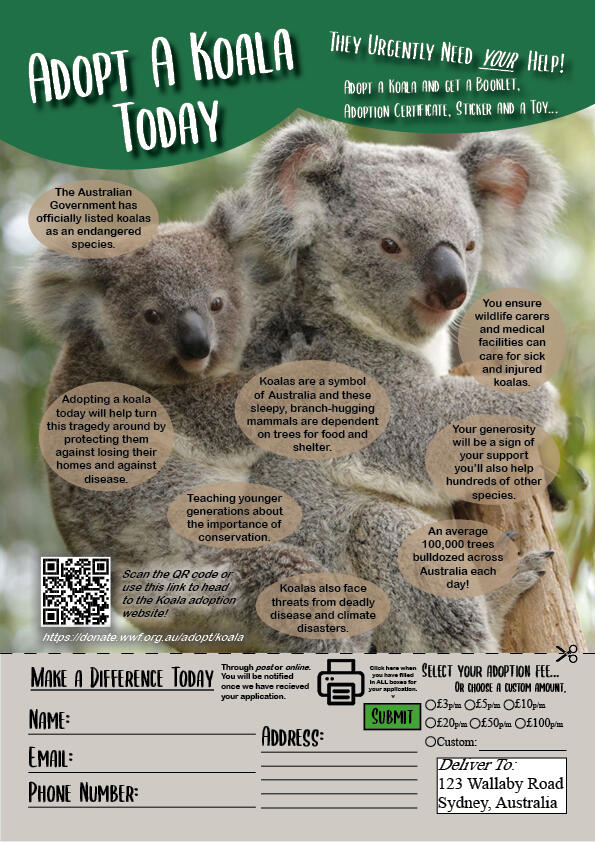
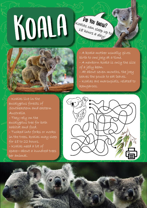
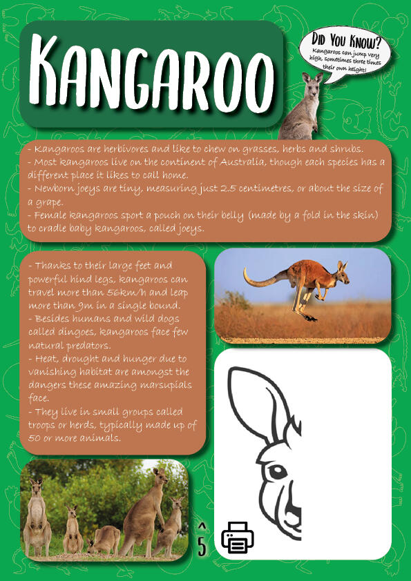
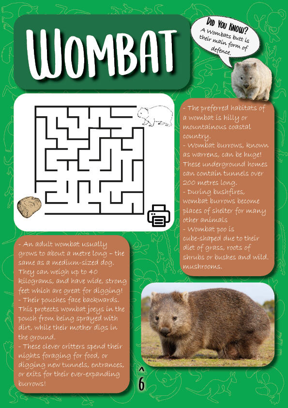
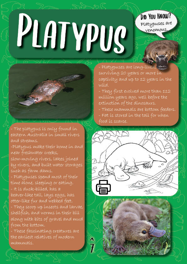
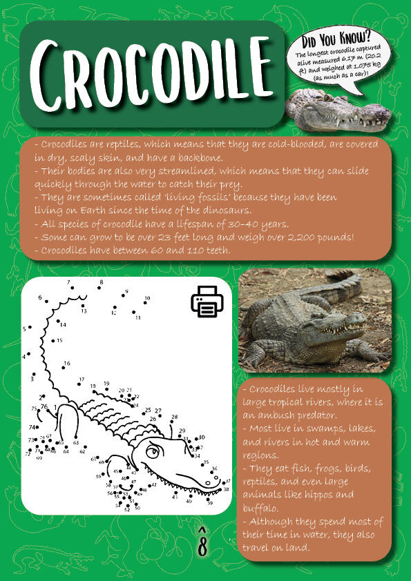
The Big Five
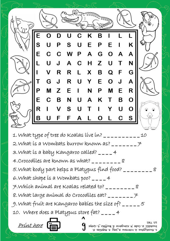
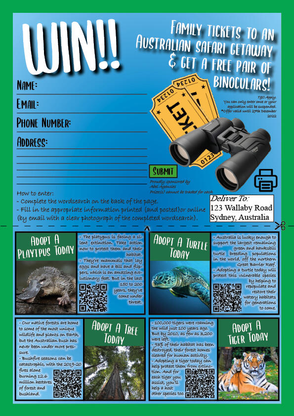
The Big Five refers to the five biggest animals of a continent. In this project I had to create a magazine with a target audience of choice to present The Big 5 of a chosen continent. The magazine had specific requirements such as 10 pages in total, contents and relevant information etc, which I had to consider whilst developing the project. There are two versions of the booklet; an interactive PDF and a print format ready to be viewed. Therefore, some of the elements may be different to one another.My chosen continent was Australia with children as being the target audience which played a big role on how the magazine looked, and the content inside.
I feel like I fitted the target audience perfectly with use of bright colours and activities relevant to their age range. I wanted to use real animal images to give a clear image of what they look like, which is what I think makes this booklet unique.
My Hero
‘My Hero’ was a Graphic Design project to create three assets towards a meet and greet event for an individual (hero).
Assets: Business card sized souvenir, social media ad, and a billboard poster.
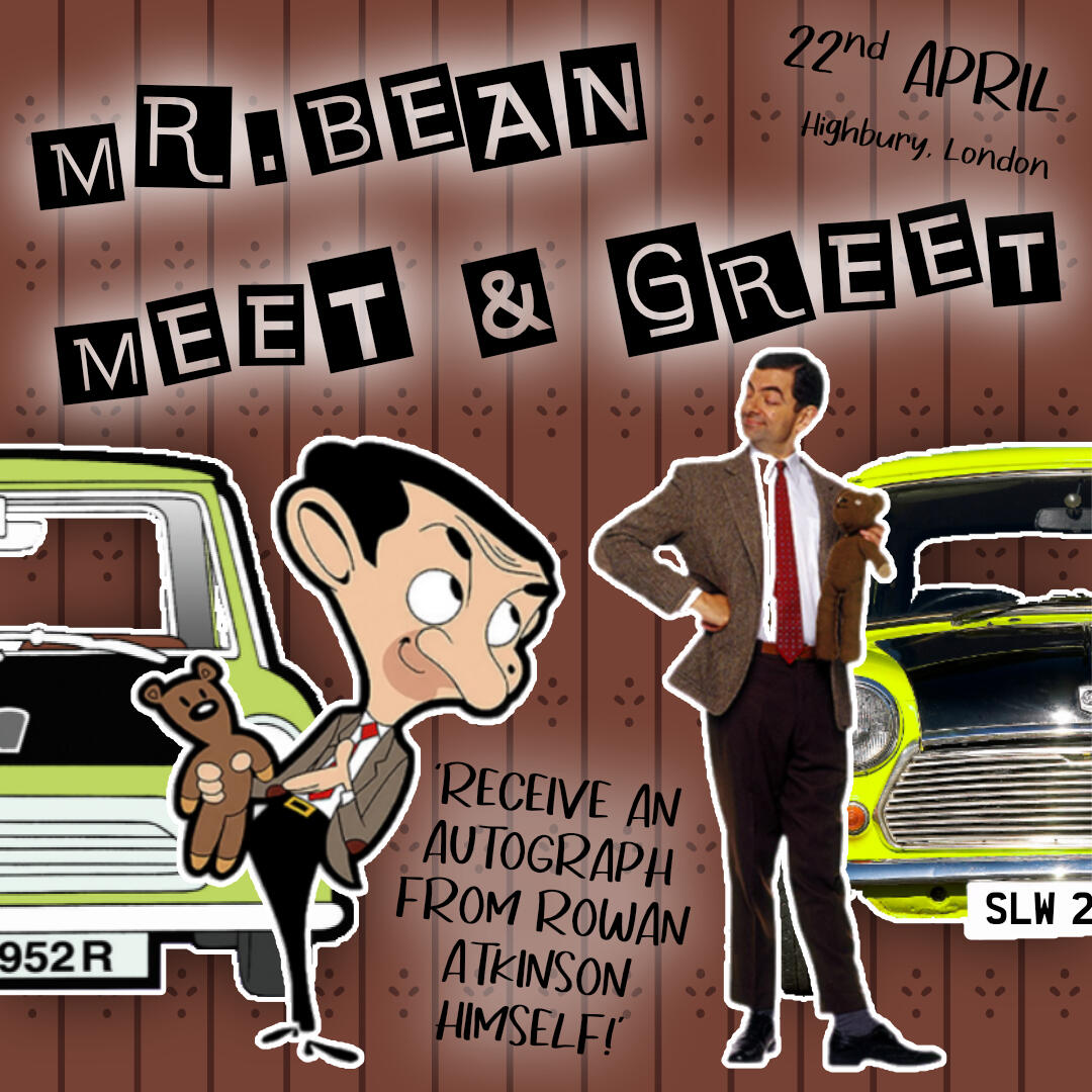
I chose to have a meet and greet event for Mr. Bean, but with a twist by combining the his cartoon and real self to capture his audience as much as possible.
Souvenir
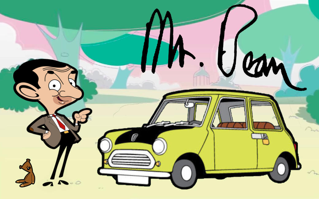
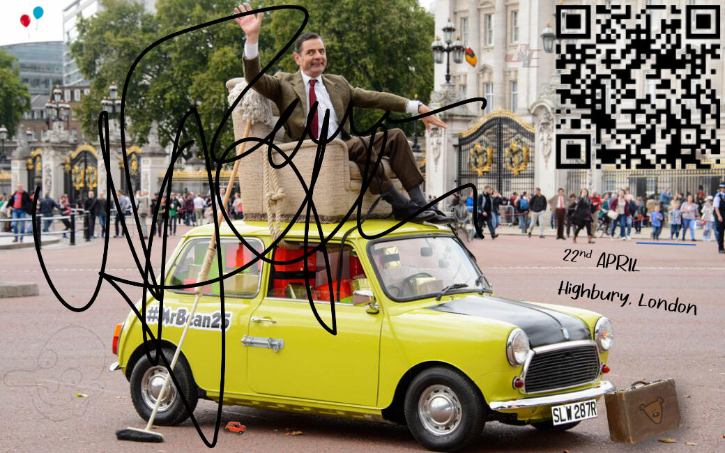
This business card-sized souvenir is to be handed out at the event once the individuals have met Mr. Bean himself. I wanted to make full use of the front and back by splitting the two versions of him as I feel that some audiences might like one more than the other to suit their needs. I feel that a signature is most important for an event like this as it gives a connection towards the individual. I included ‘Easter eggs’ for the true fans who know all of the episodes to make it amusing for them.
Social Media Ad
The social media post is designed to advertise the event through social media. I made the post square as this is a common type for socials, especially Instagram. I thought that this platform would have a wide range of the chosen audience than another platform.
Billboard Poster
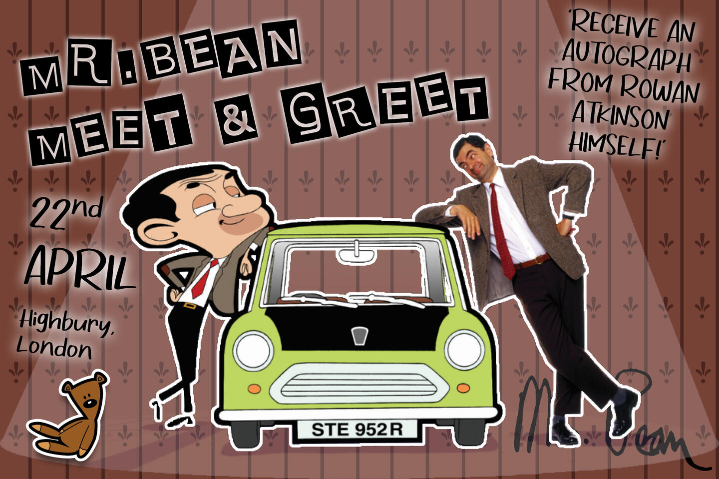
The billboard poster is designed to be at the event itself. This is what everyone would see before seeing the man himself. I wanted to carry the theme across from the social media post which is why they look similar.
Penguin Slide
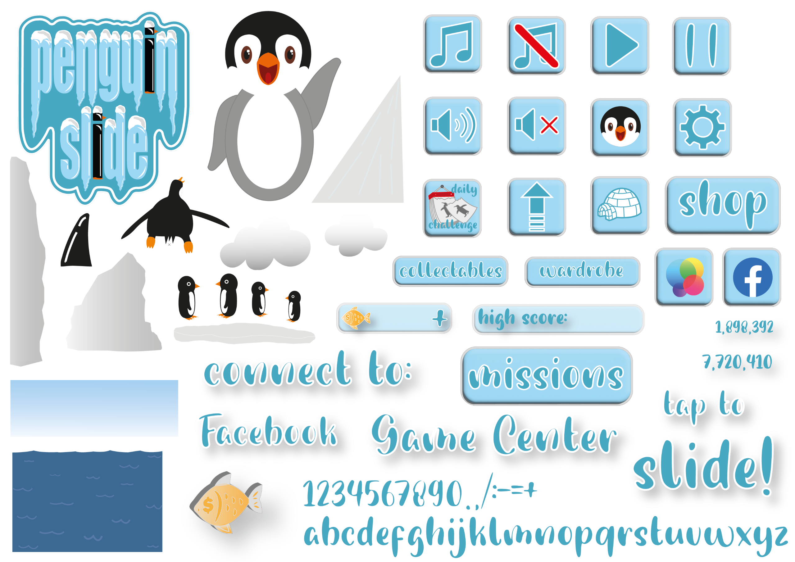
Penguin Slide is a custom mobile game idea during my digital asset development project.I needed to make the assets for outside of game such as: Logo, Icon, Ad banners, Mock-up, and 3D assets.
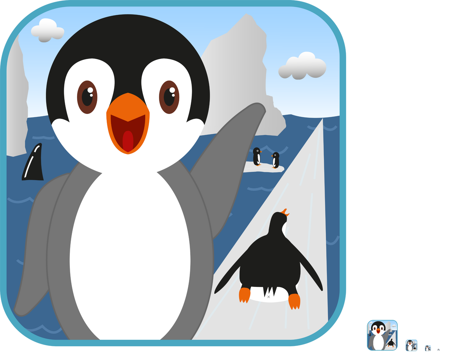
Penguin Slide is an endless runner idea where you can collect characters and try to survive for as long as you can!The target audience is mostly aimed at children but can also appeal to adults because of the game type.Here is the Penguin Slide icon, followed by the logo above.
Sprite Sheet
Illustration
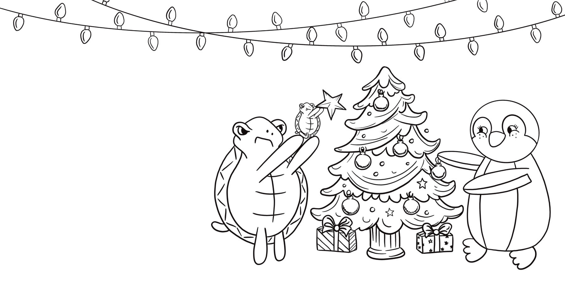
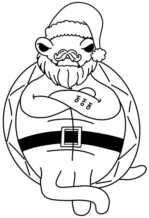
From studying physical art to digital art, I have had a good interest in illustration from both forms. I want to develop this further with new practices and combining other mediums such as Photography.After drawing these different types of illustration it’s inspired me to create colouring books and activities in the future.Here are some of what I have produced.
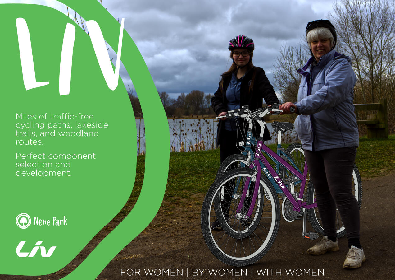
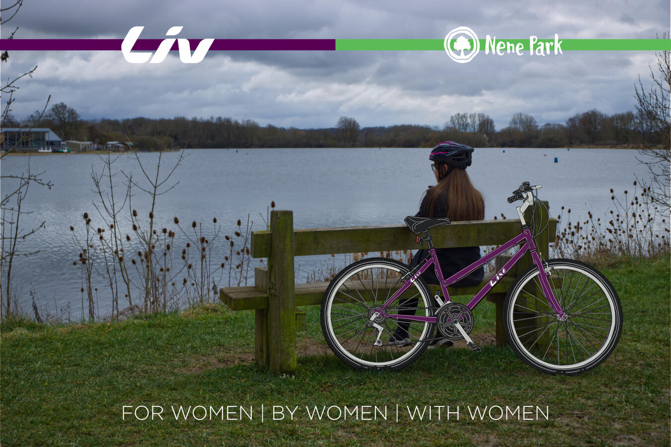
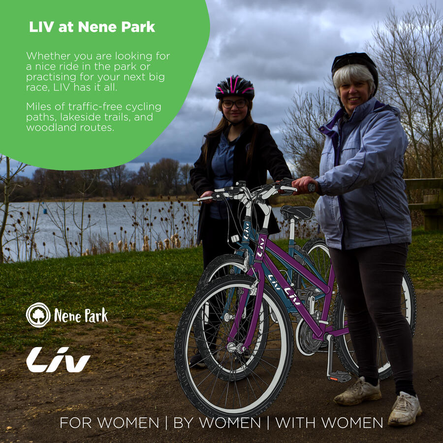
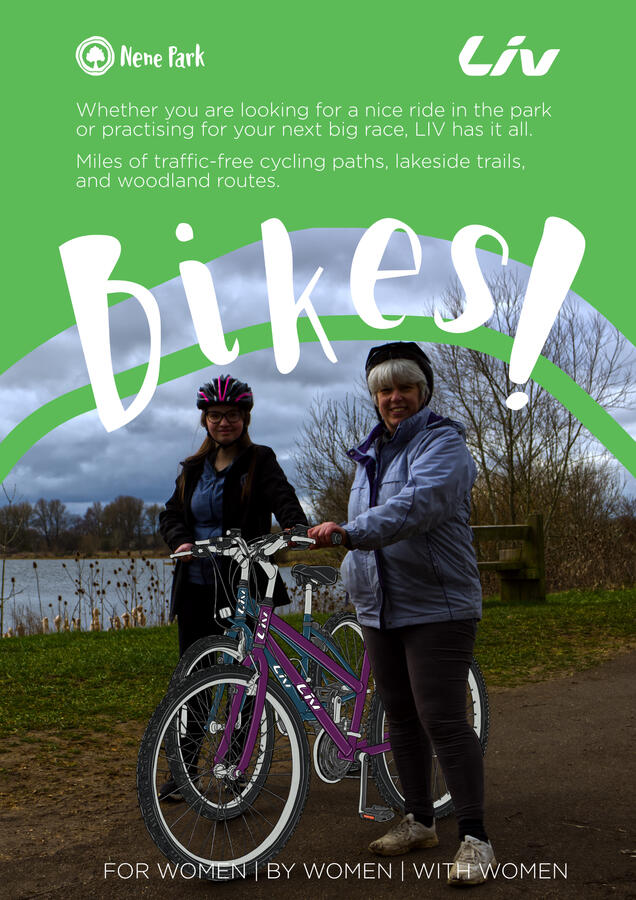
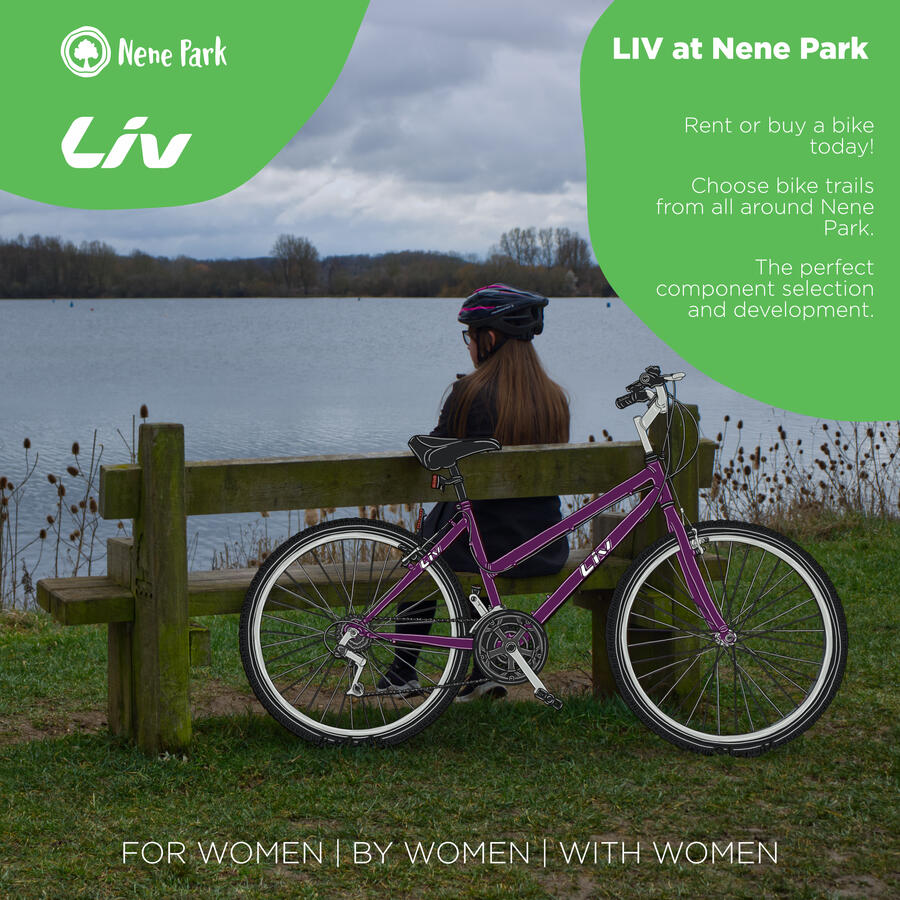
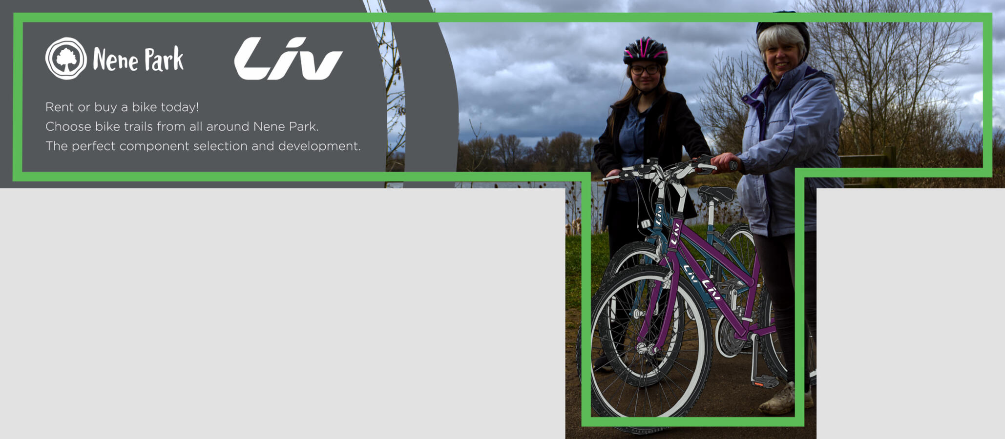
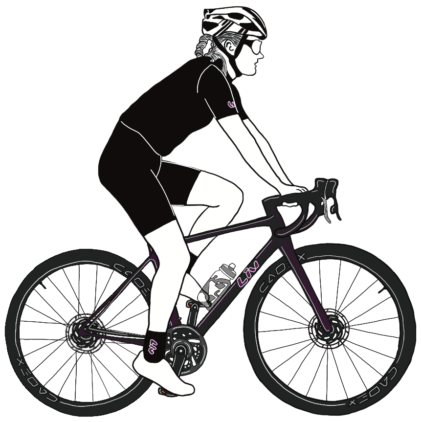
Nene Park X LIV
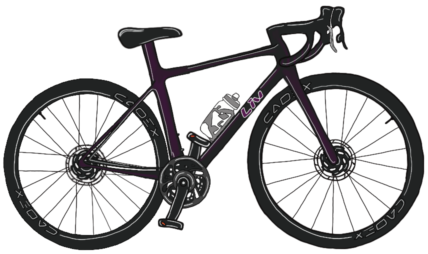
This project was to make some marketing material for Nene Park to advertise Liv bikes being available to rent or buy.
I wanted to approach the advertisements by drawing the bikes on top of imagery as a way to make it eye catching for their audience. I drew these bikes digitally on Procreate.
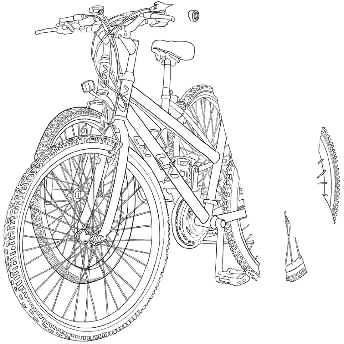
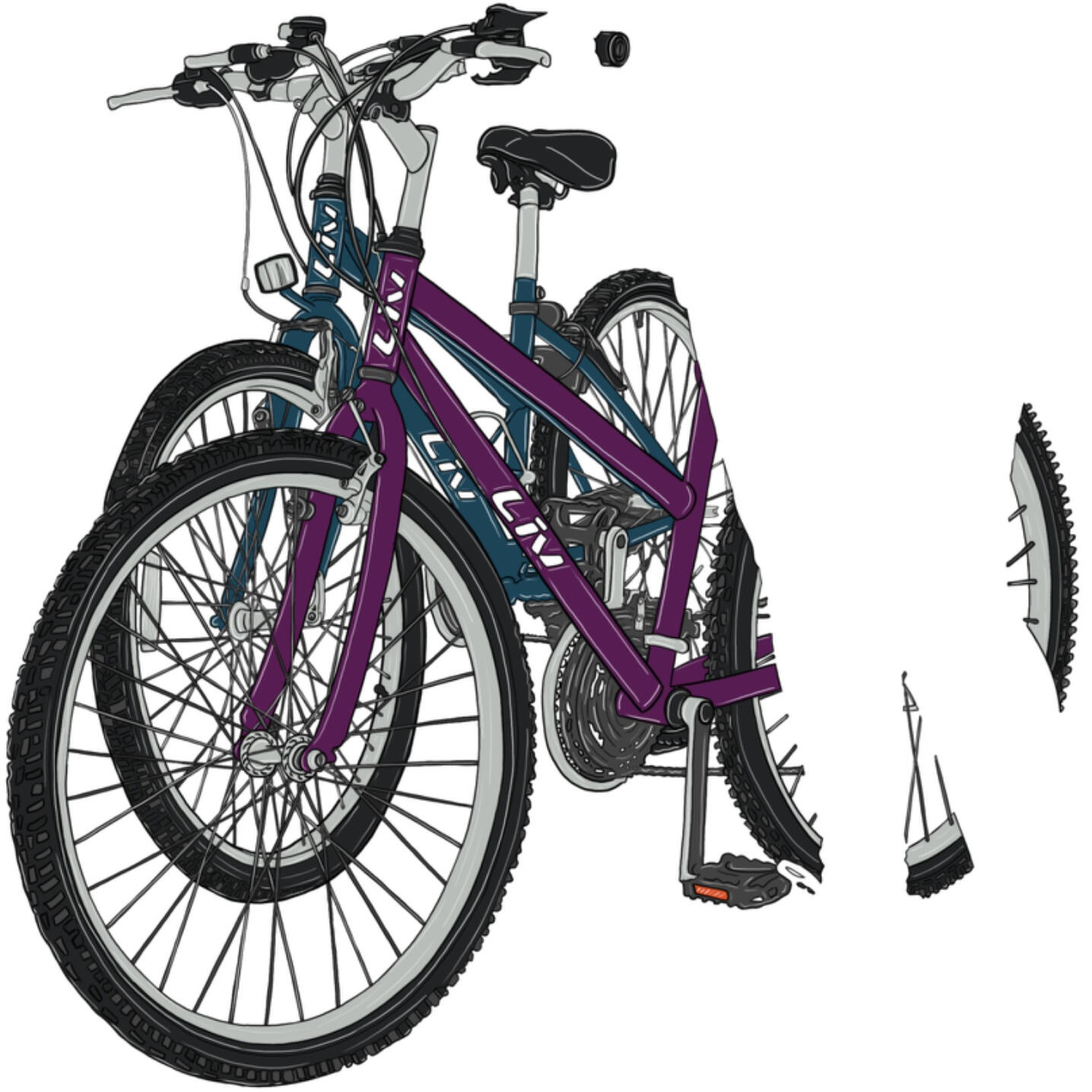
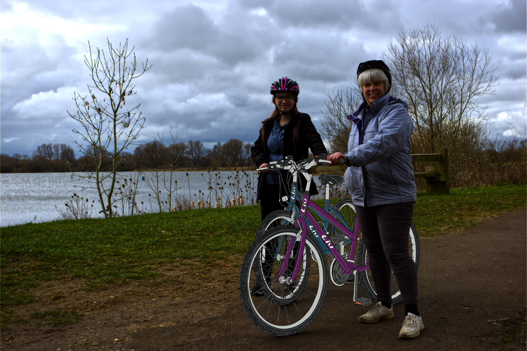
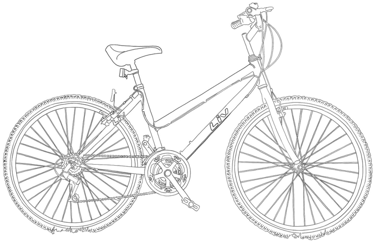
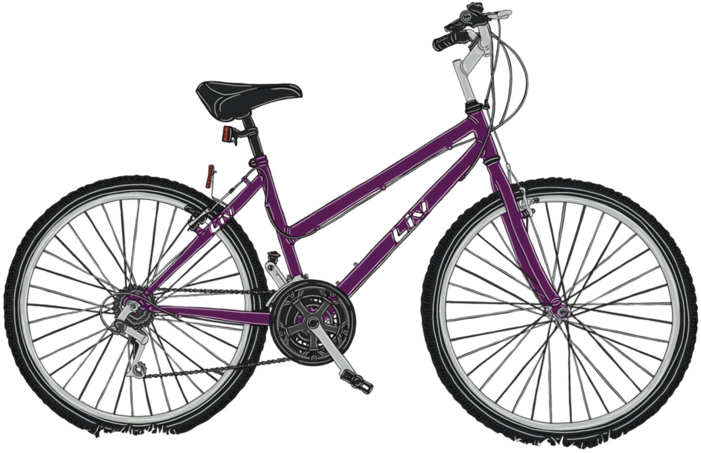
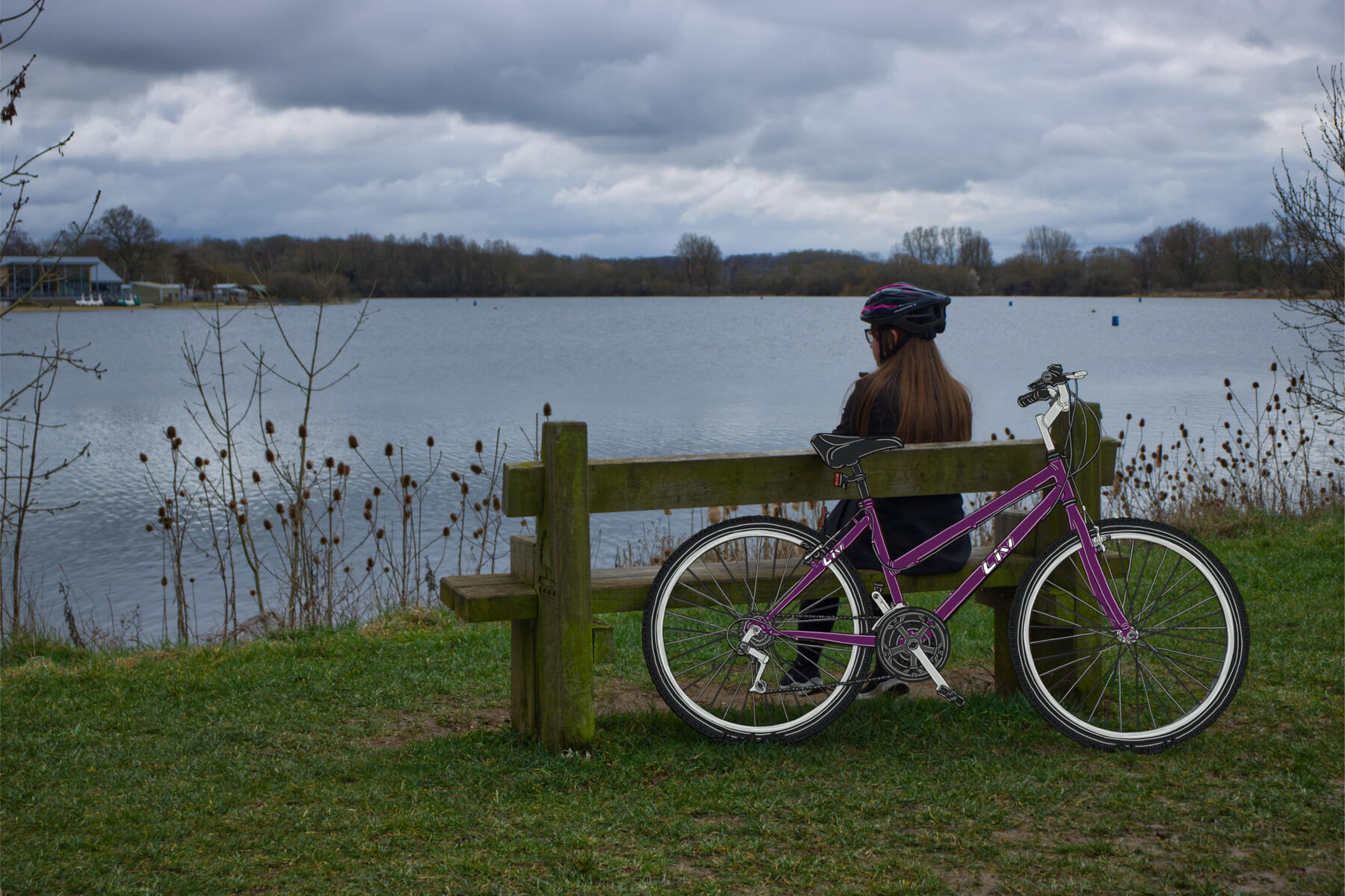
I drew this bike first with a person to be animated for the video advert as you can see below.
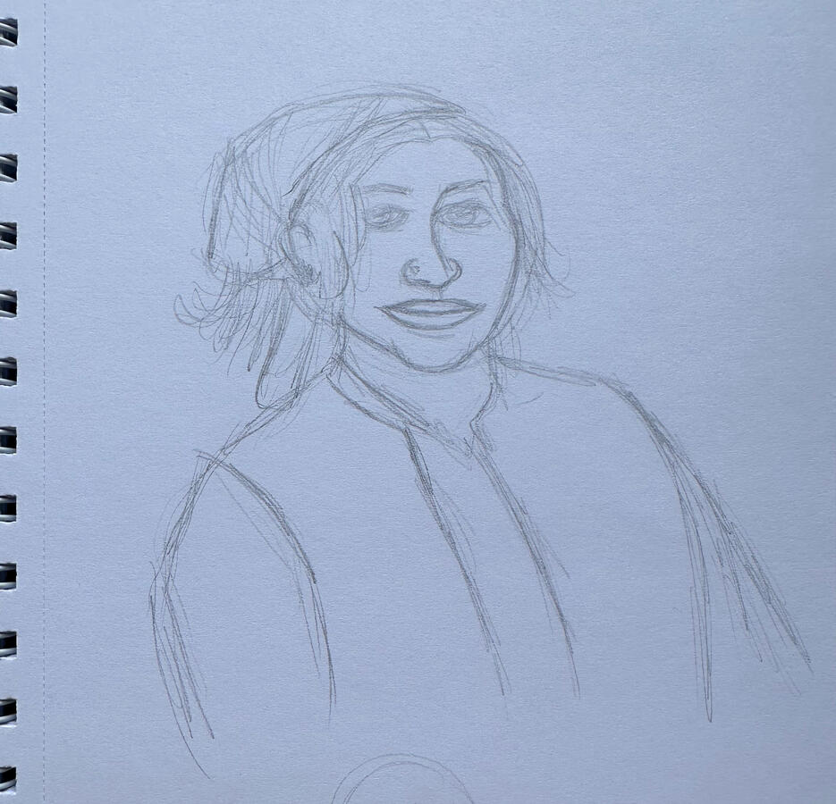
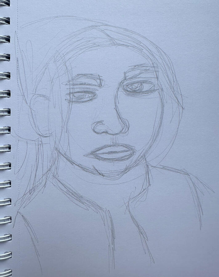
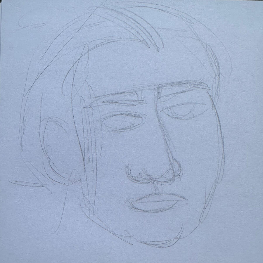
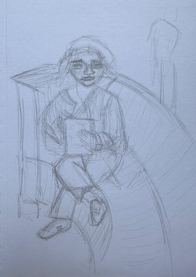
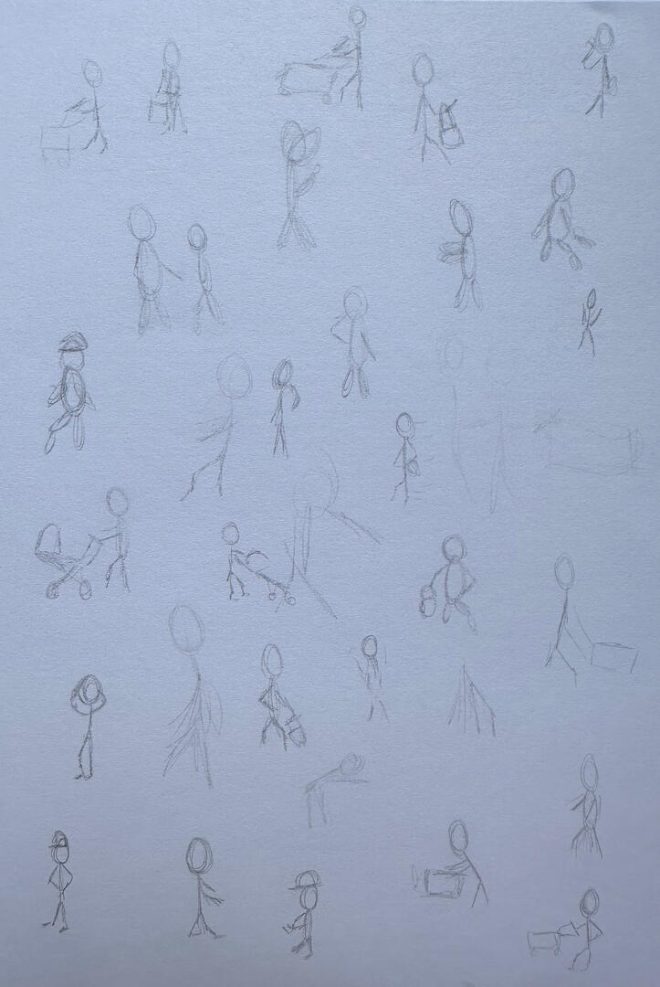
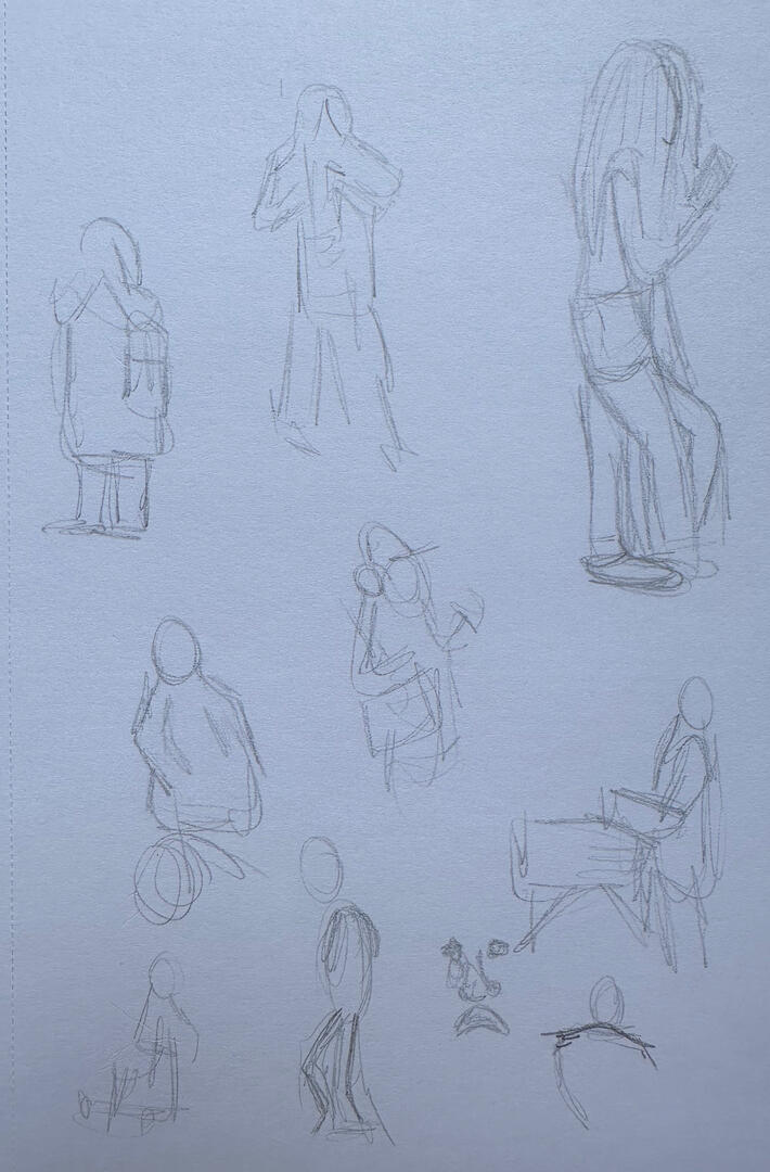
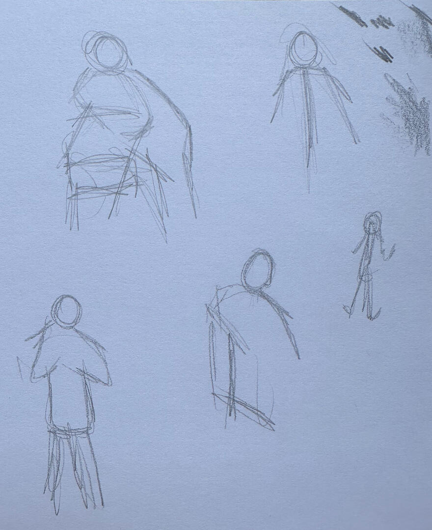
Observational Drawings
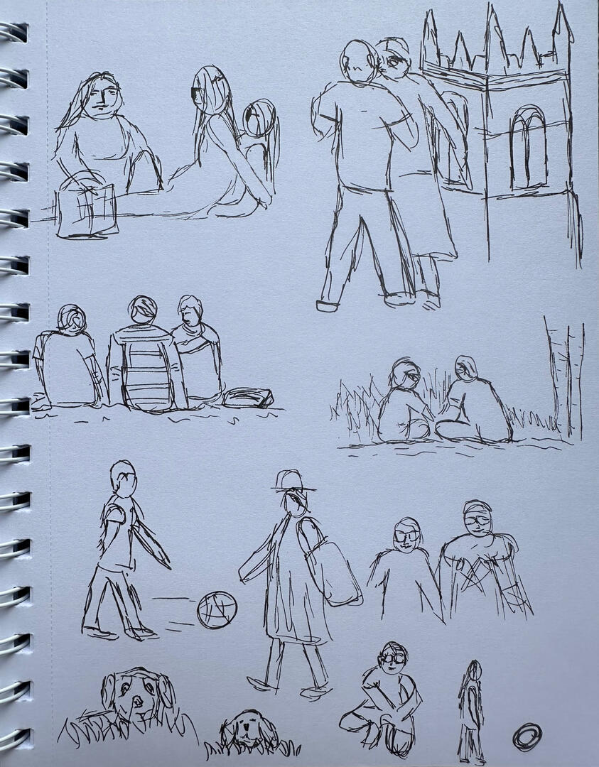
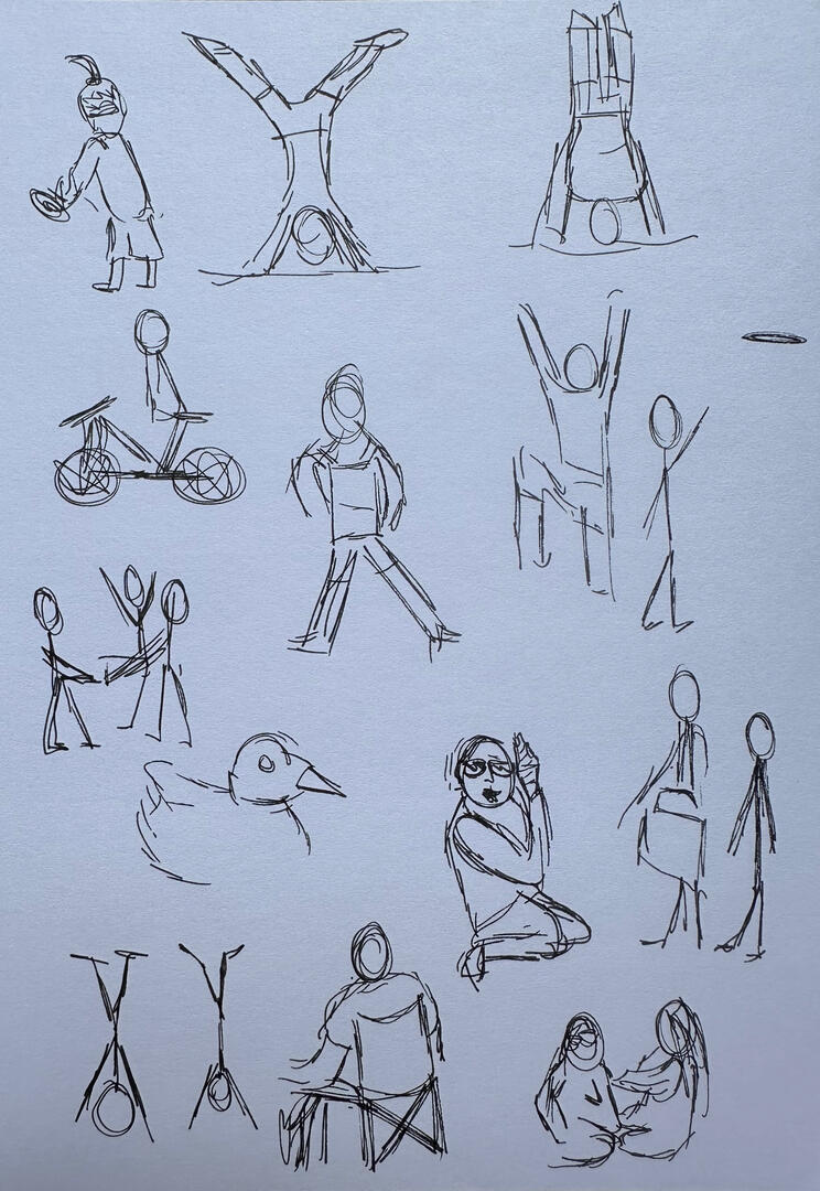
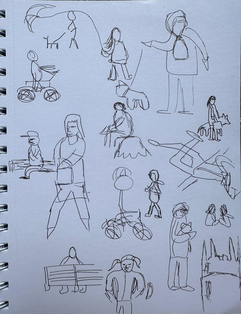
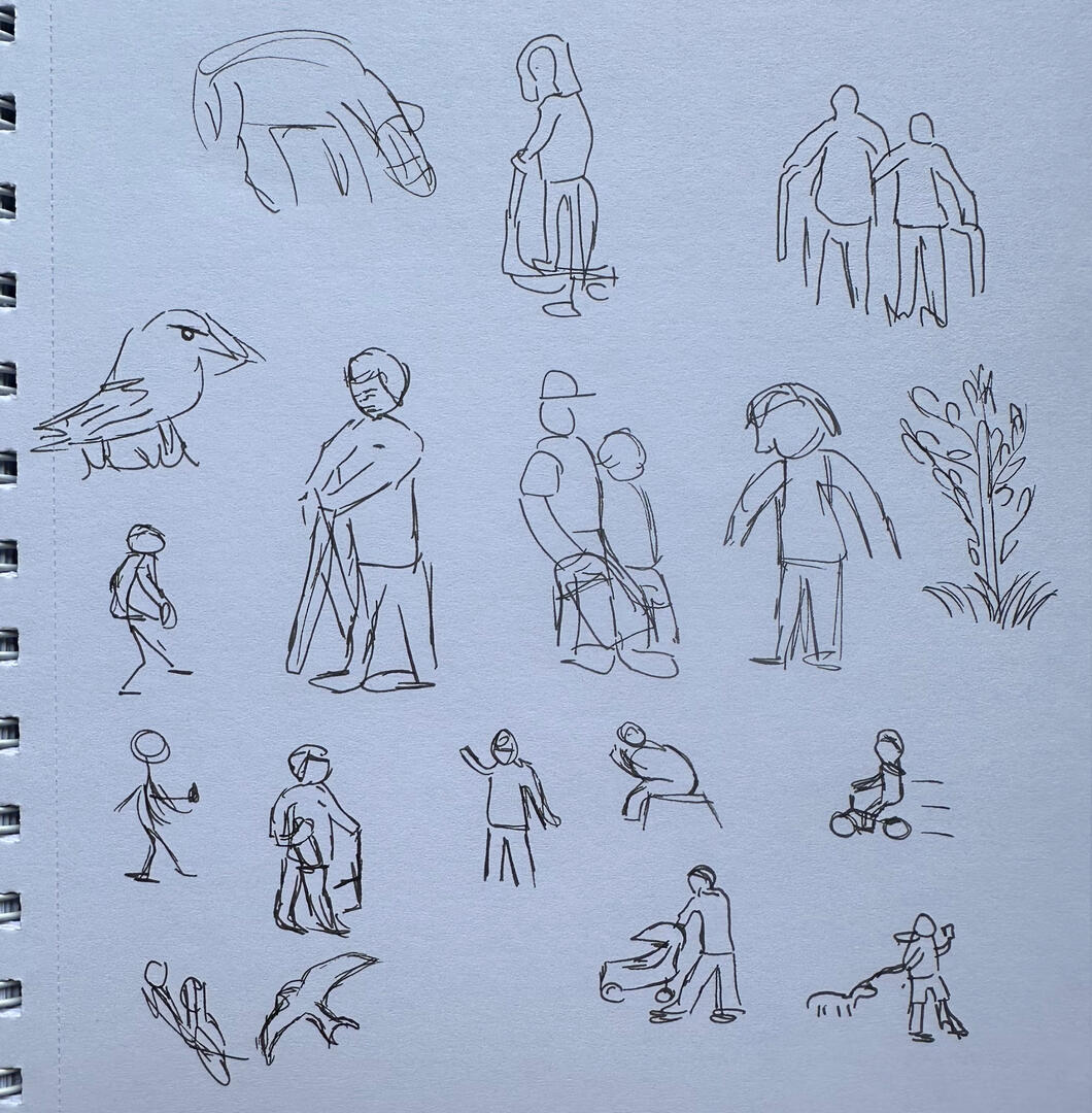
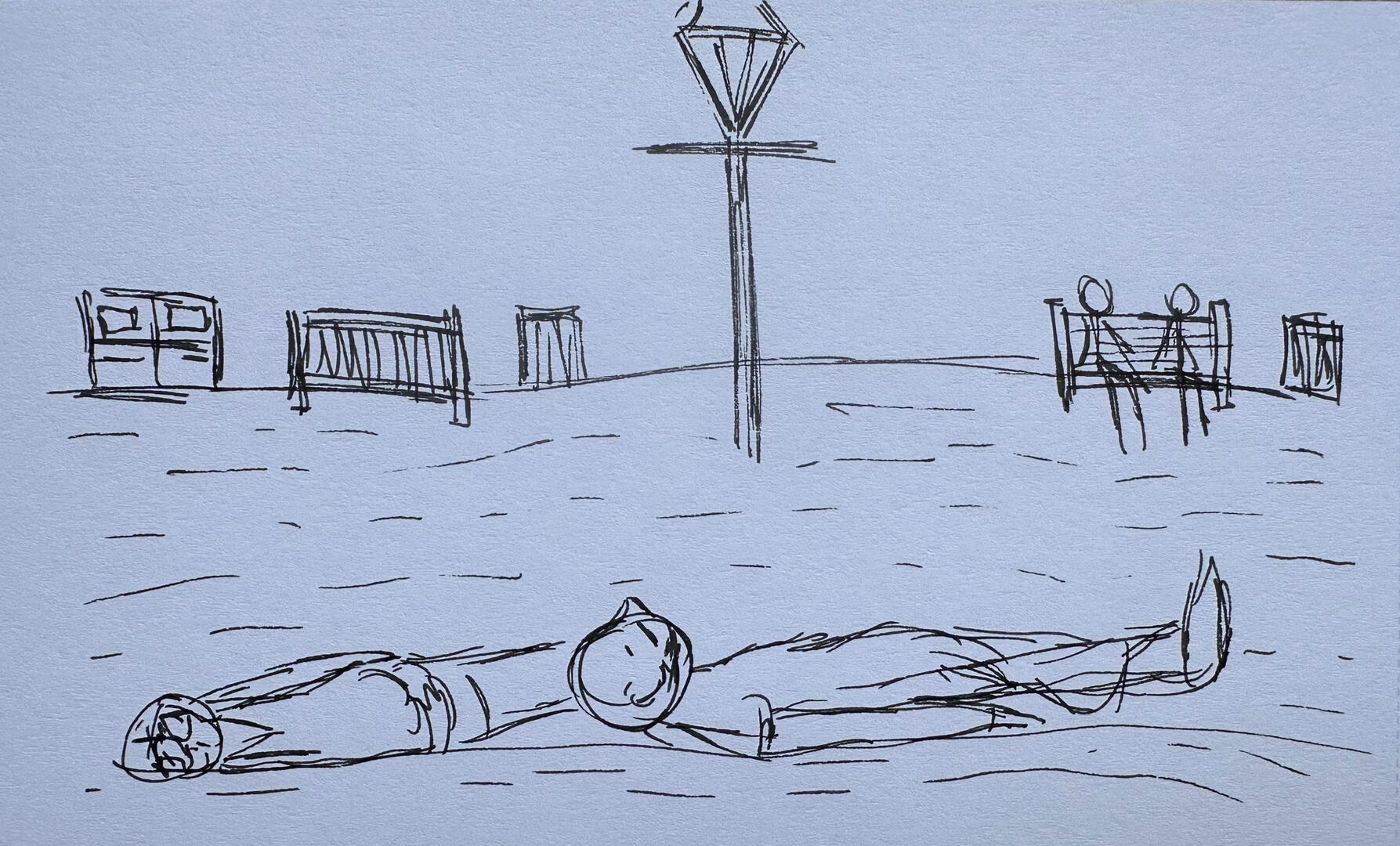
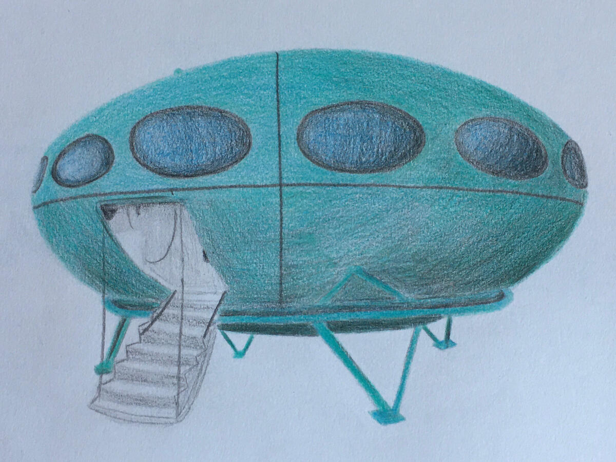
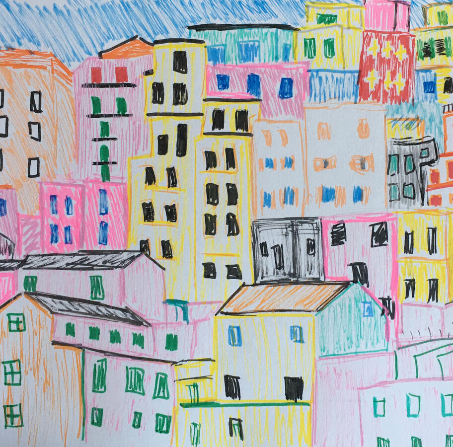
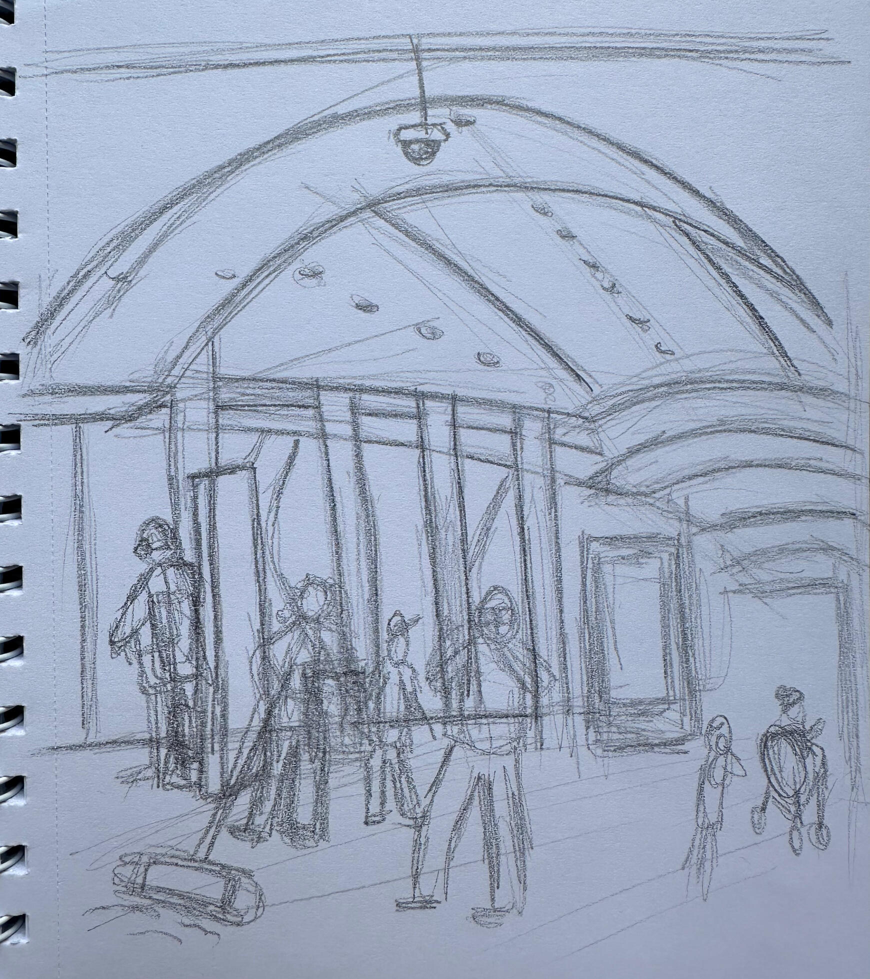
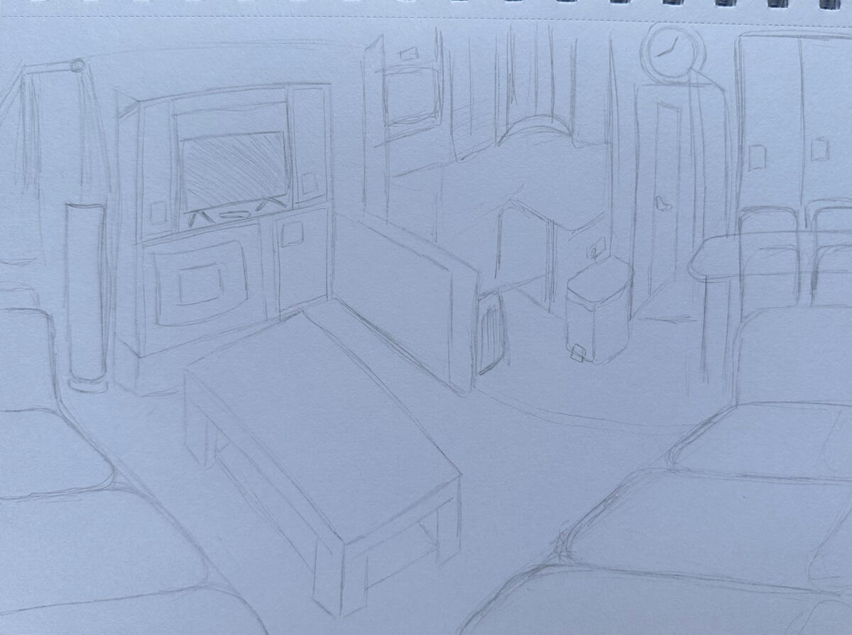
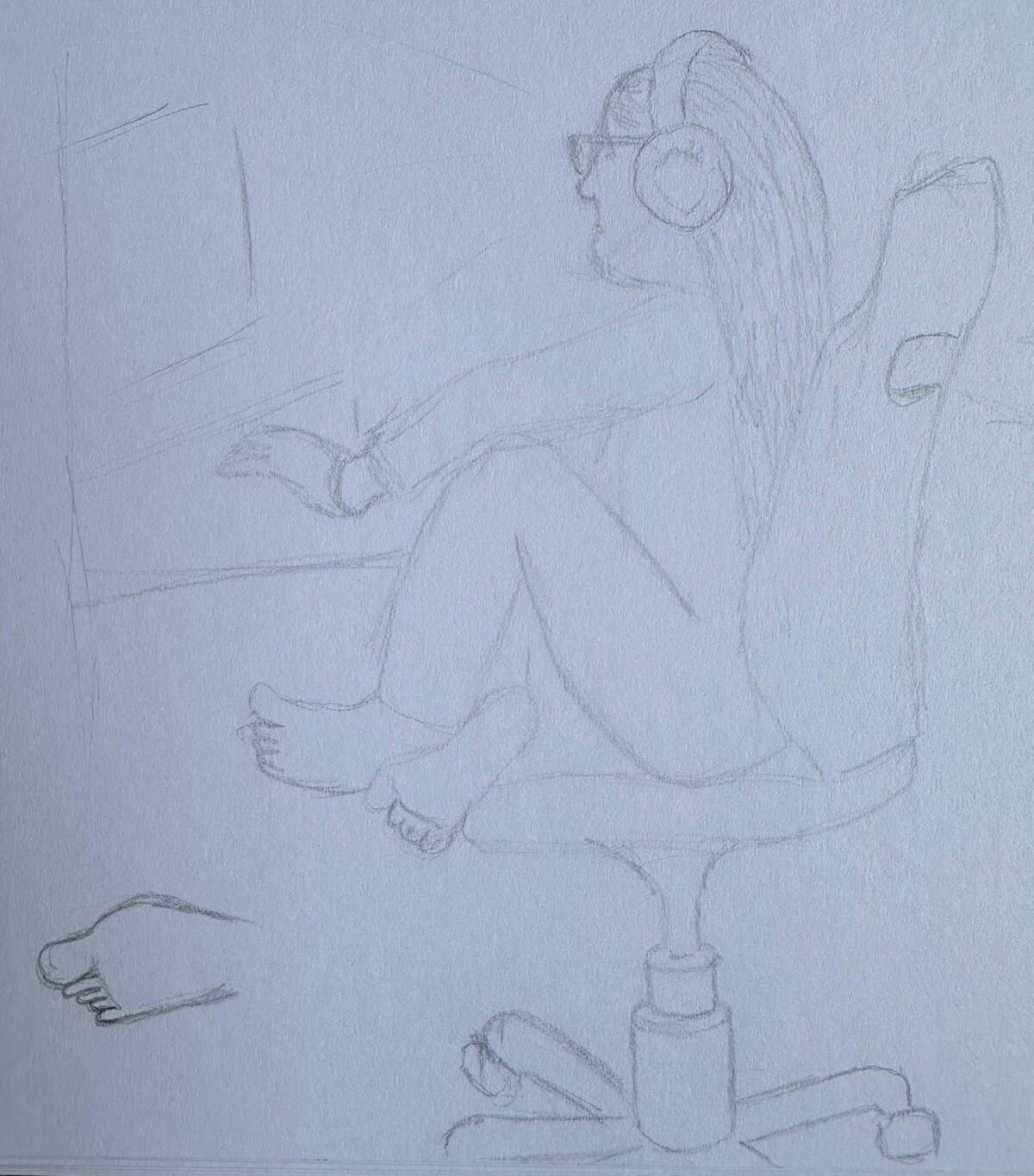
Observational drawing is a more recent interest of mine that I have started. I am looking to improve by continuing drawings in different environments and by using different mediums such as adding watercolour or coloured pen.I have used pencil, fine liner, graphite pencil.
Park
Setting
Tattoo Design
I designed a custom tattoo for myself, after many different and similar designs this one was the chosen design.
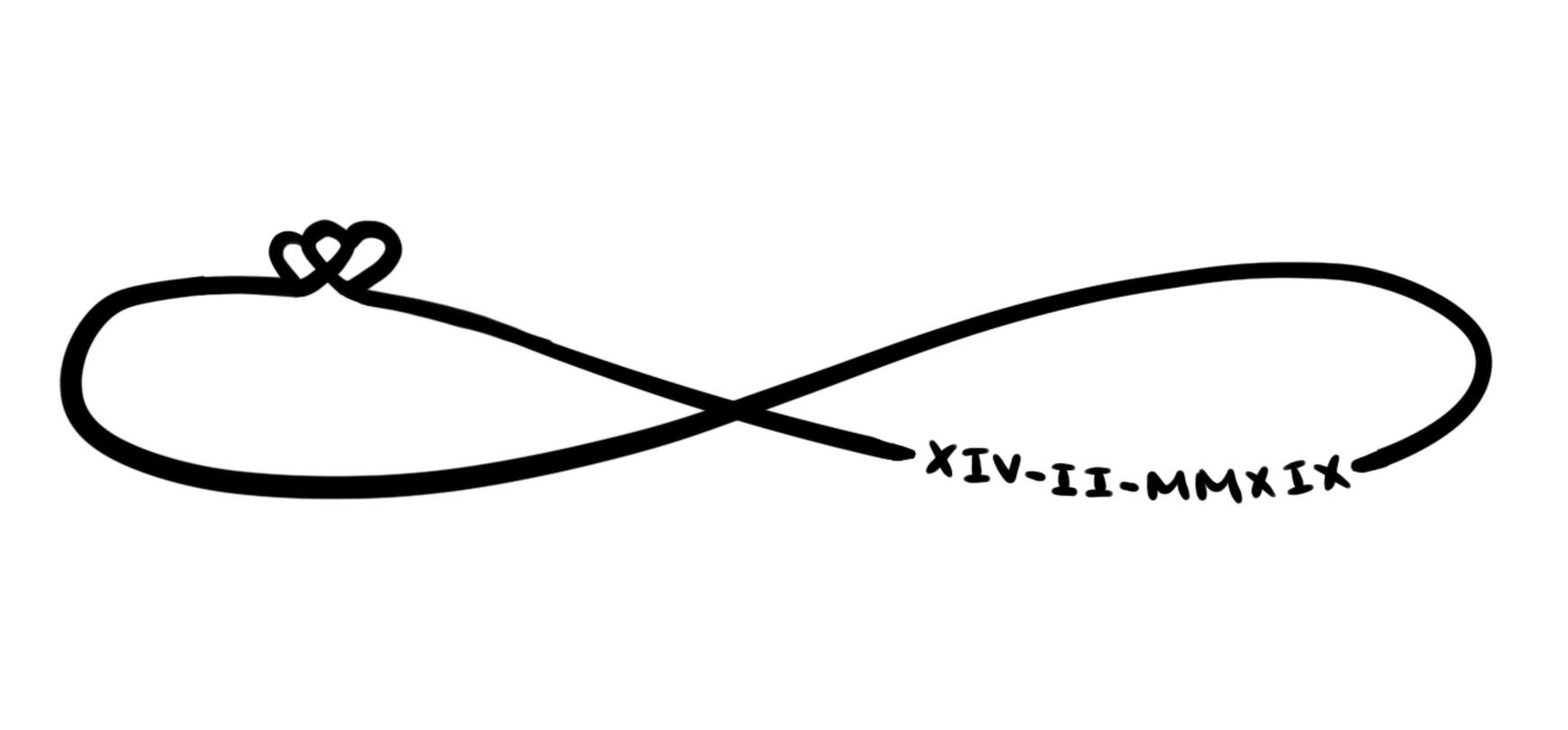
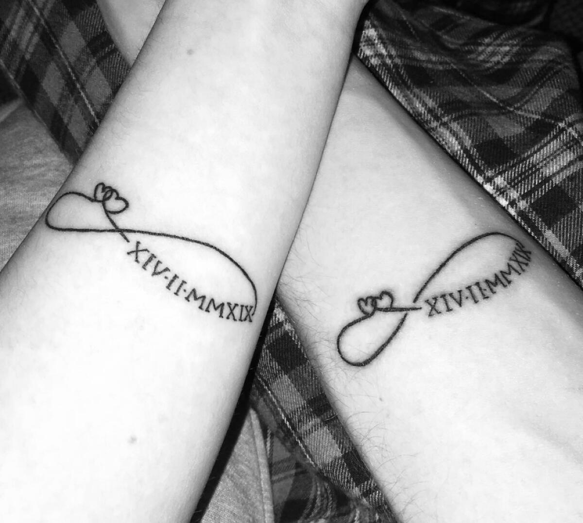
Here are some designs I have created for some individuals.
Stickers
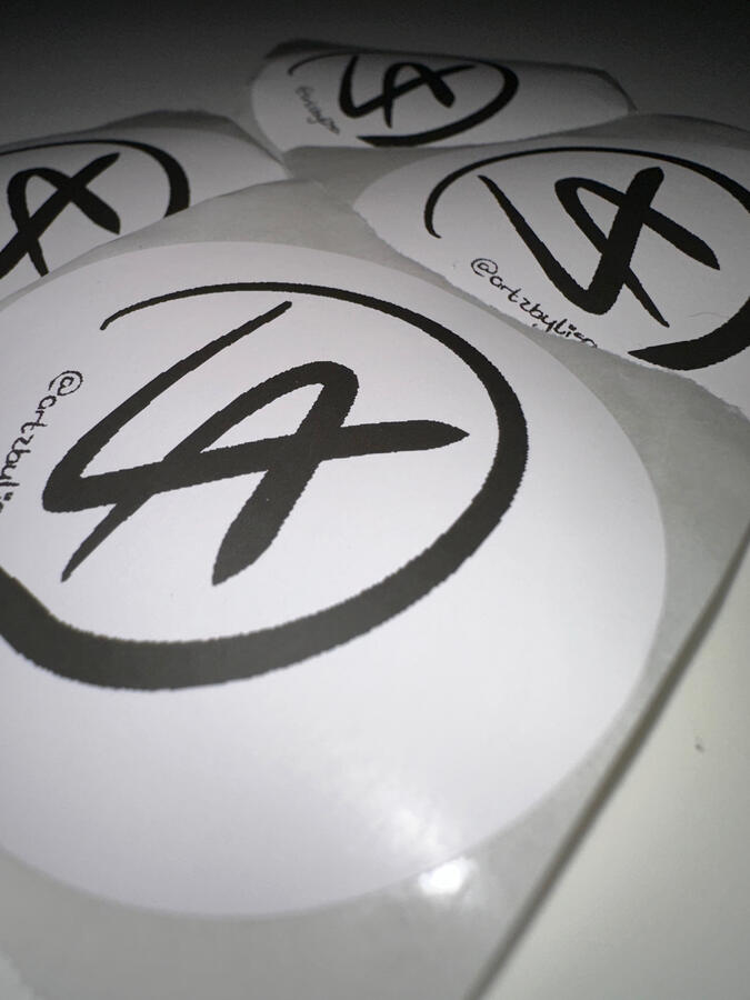
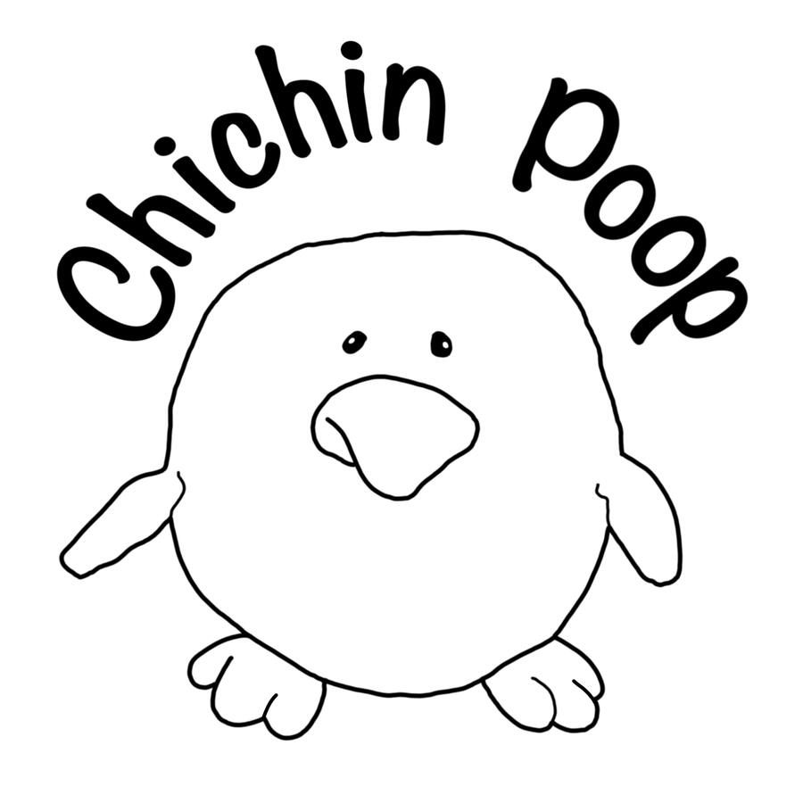
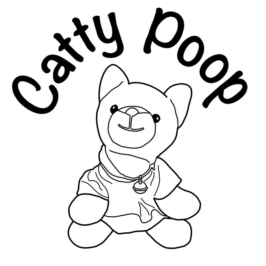
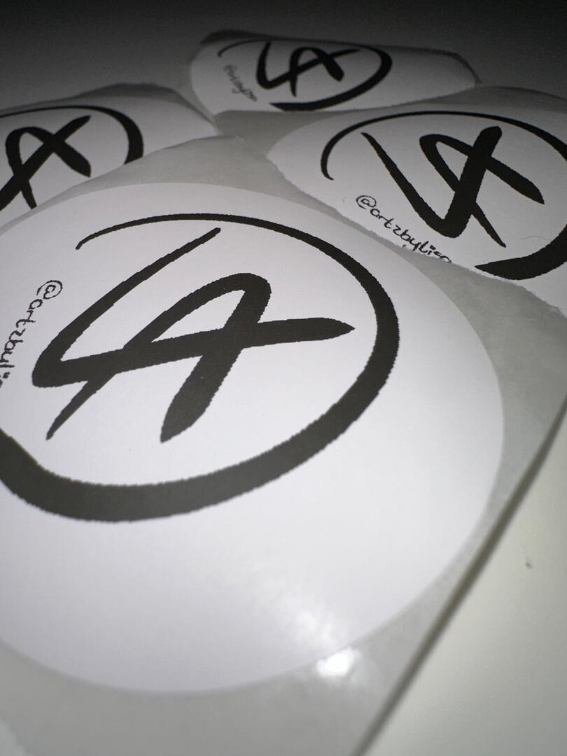
I have used some of my illustrations to create stickers - perfect for birthdays and events!
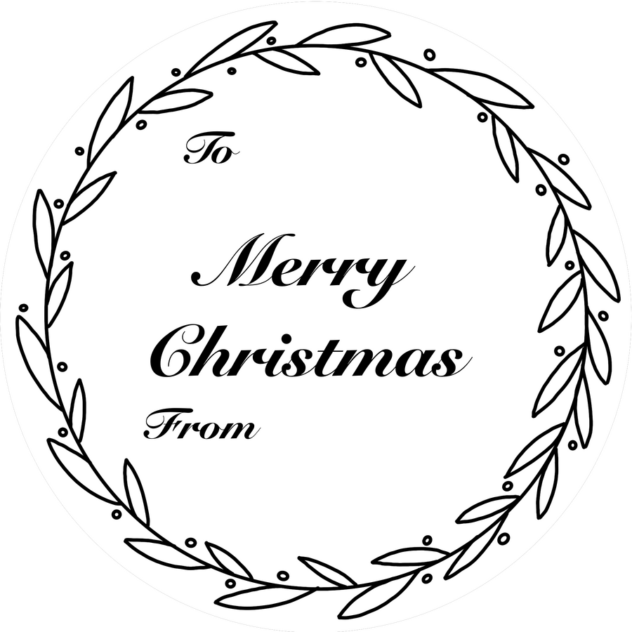
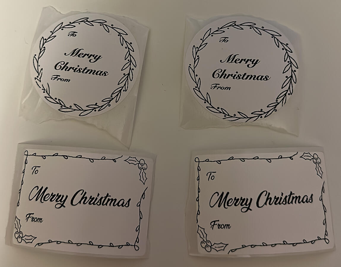
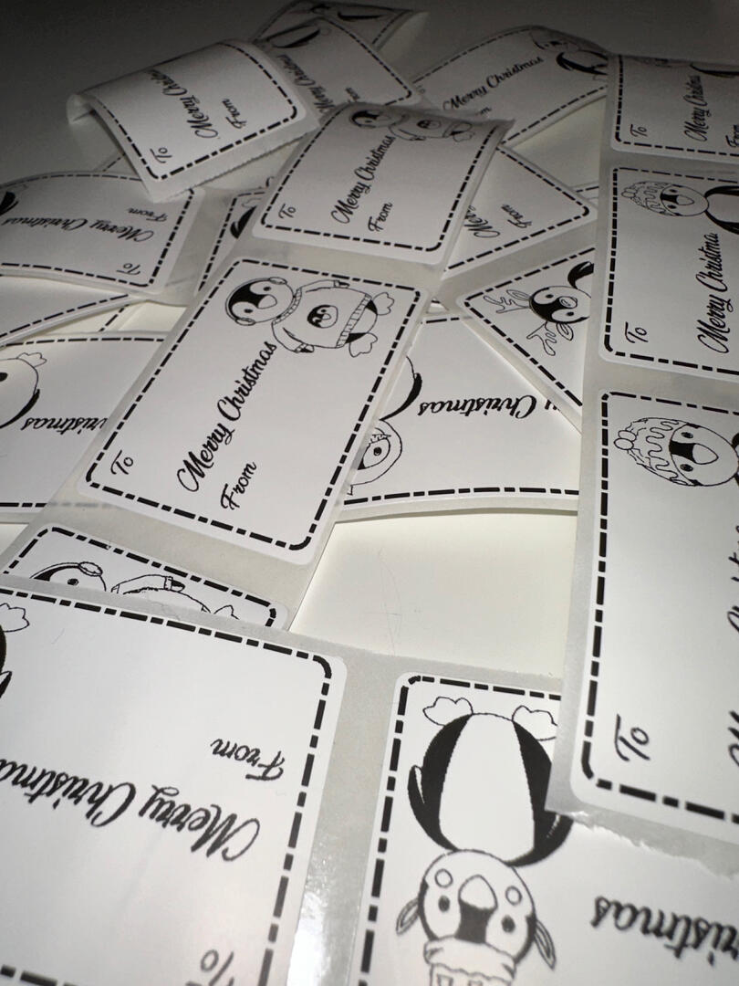
I also use these to create labels which comes quite in handy at Christmas, and a fun project to work on.
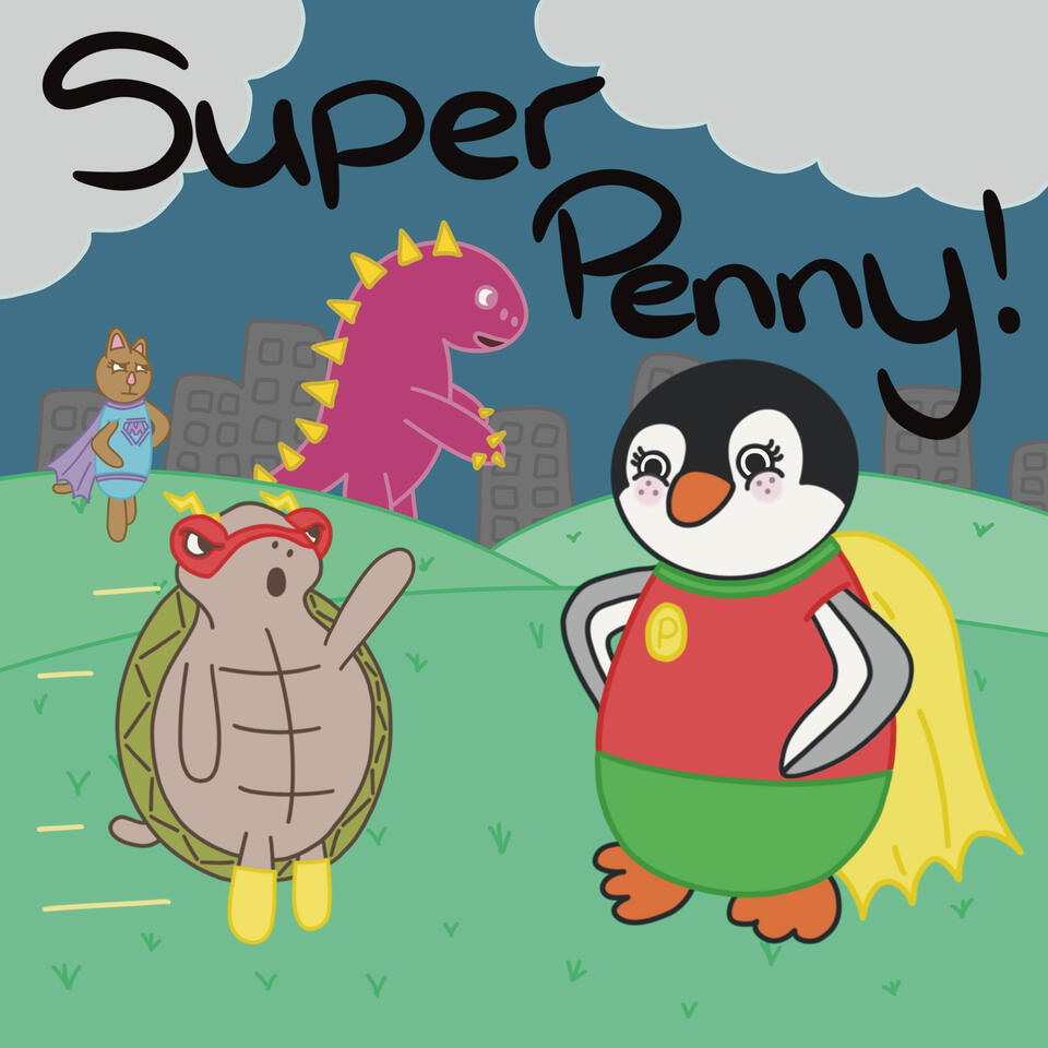
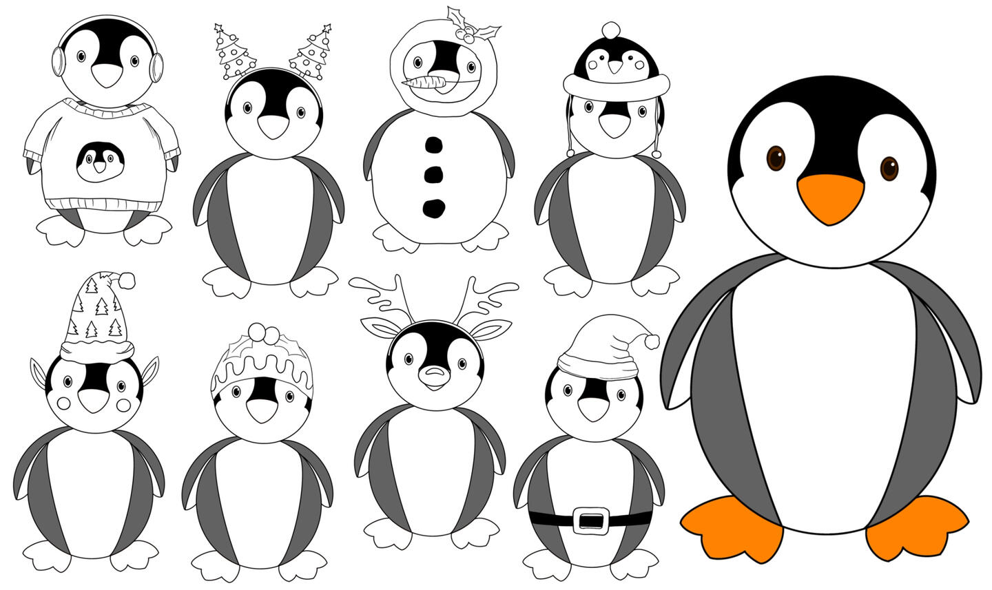
Penny the Penguin
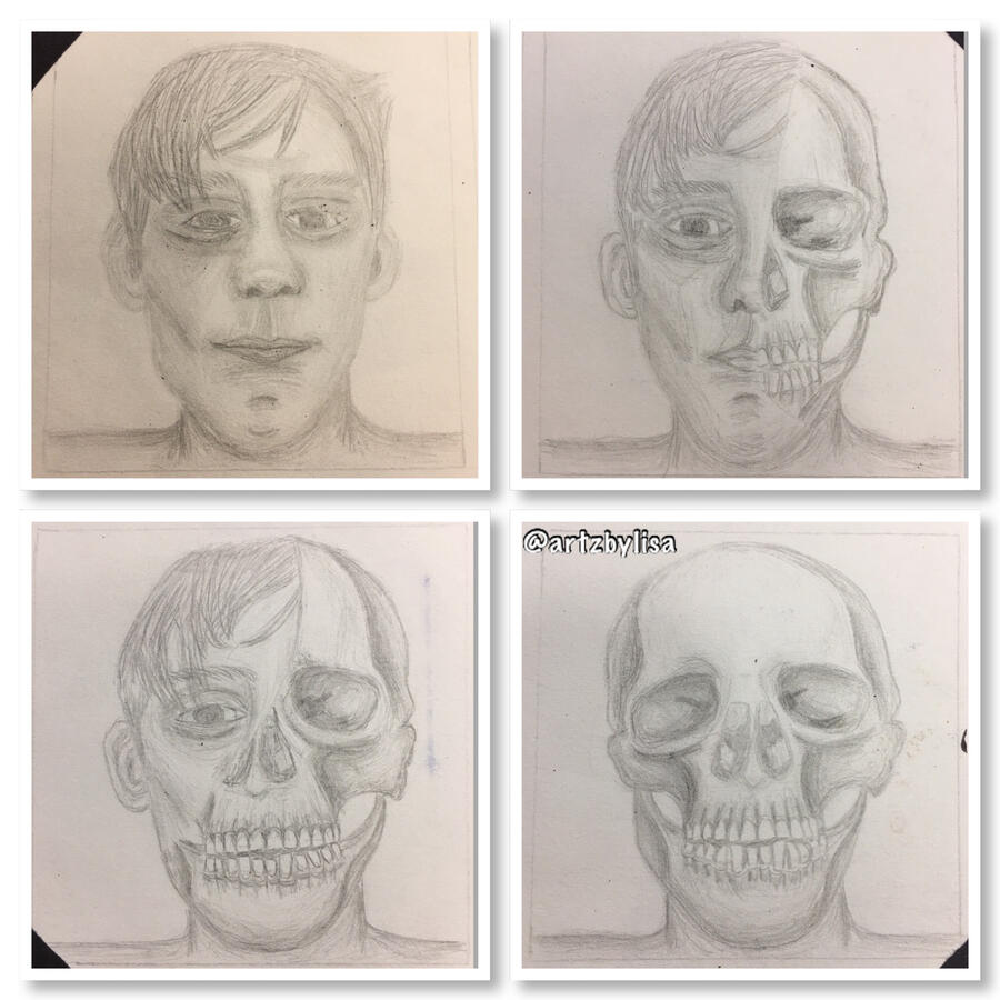
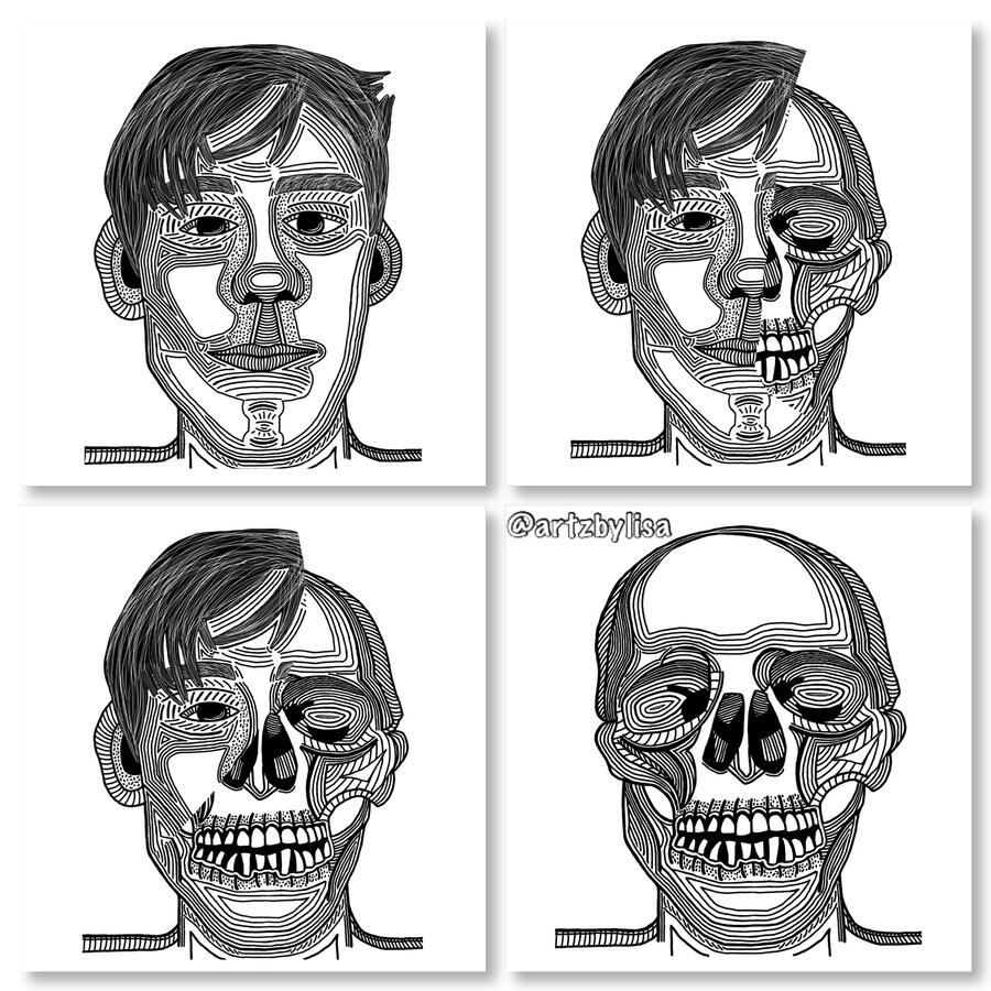
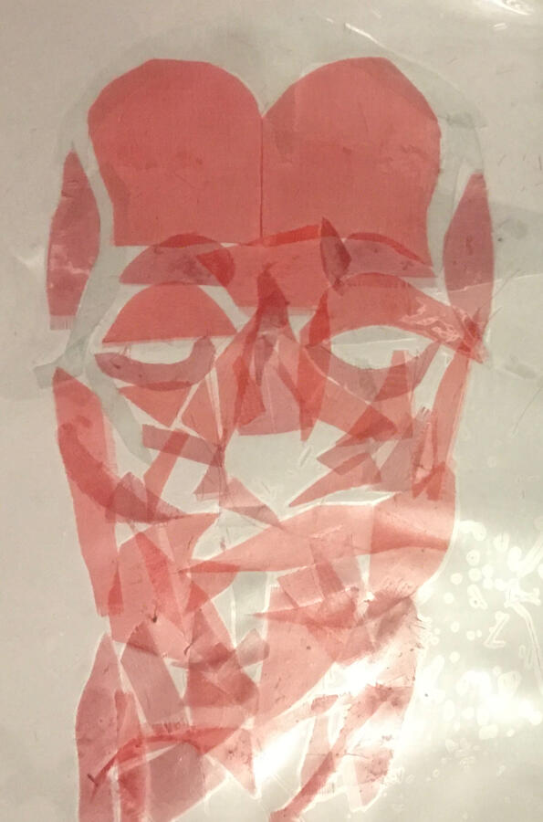
Human to Skeleton
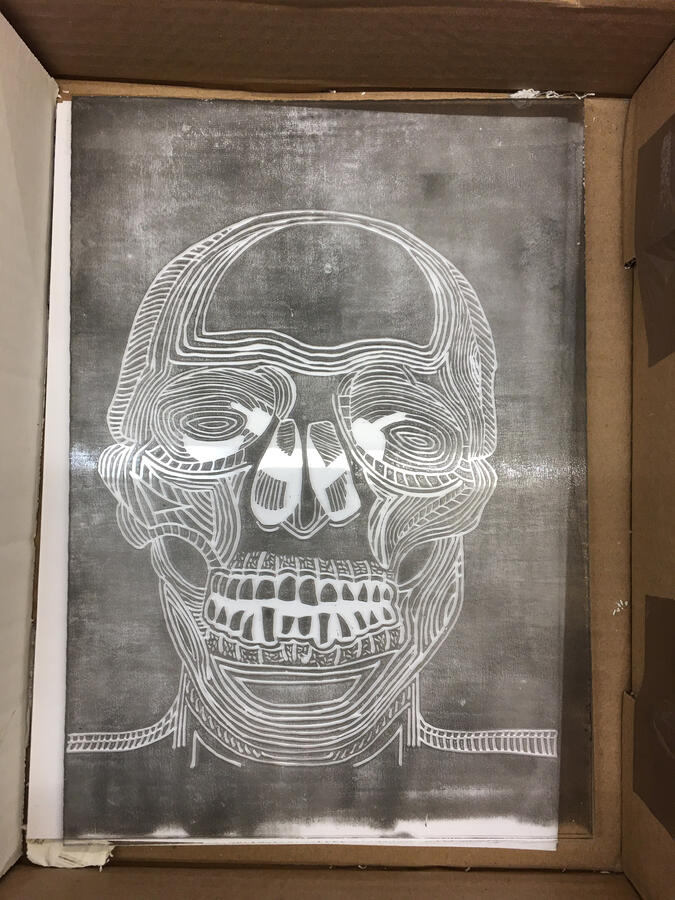
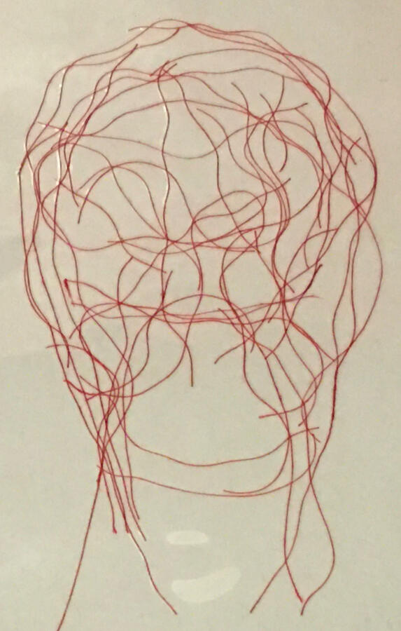
This piece was done for a project called ‘Beneath the Surface’ so I decided to delve into the human anatomy. This piece was part of the project as an artist study.
(Created in MediBang)
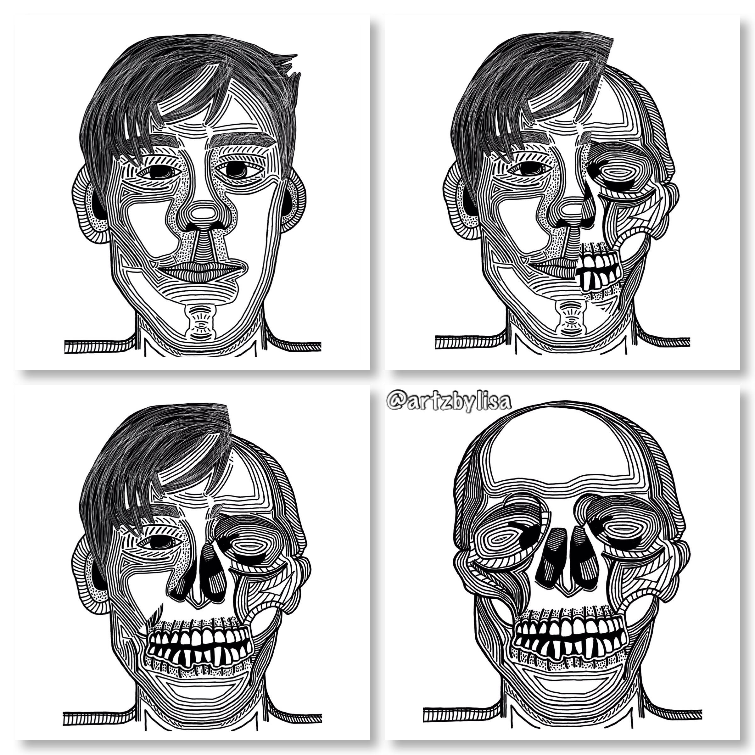
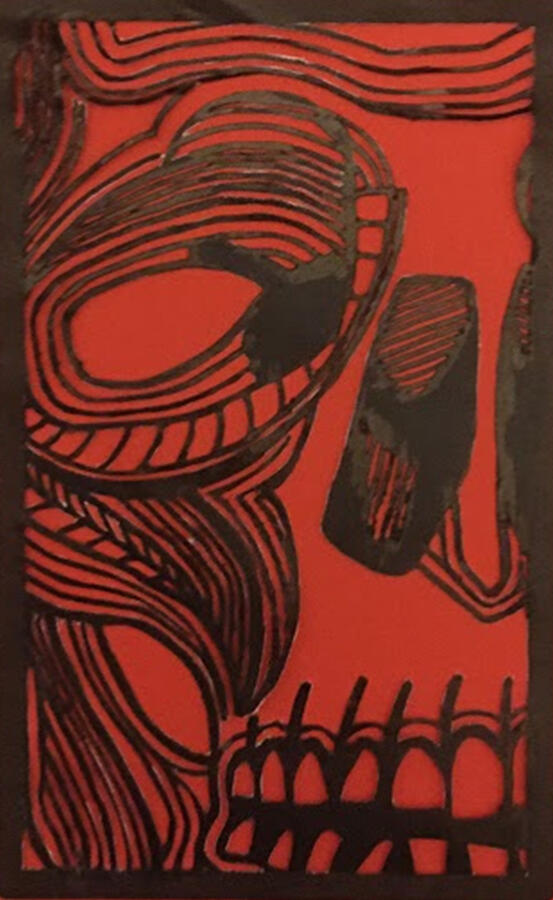
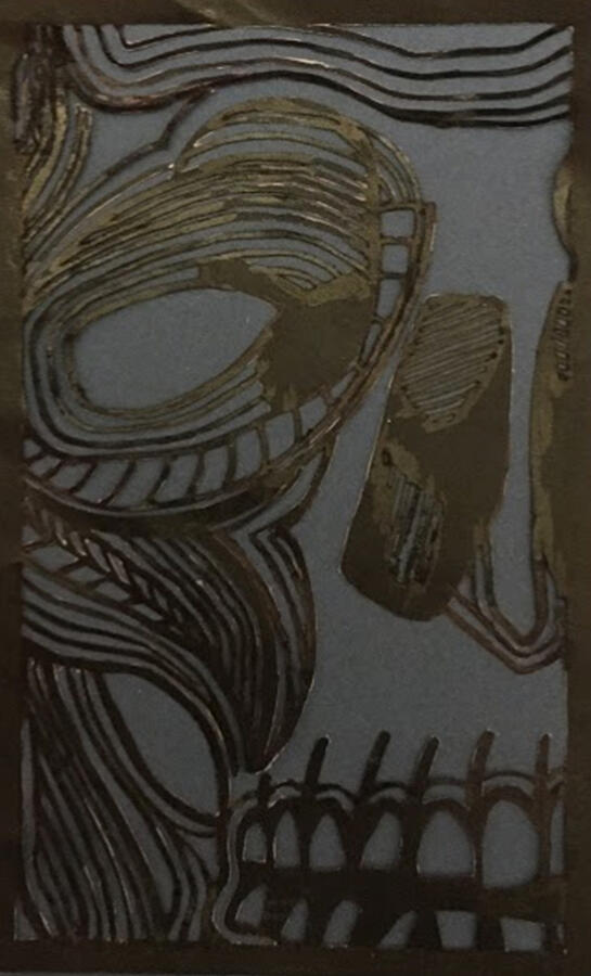
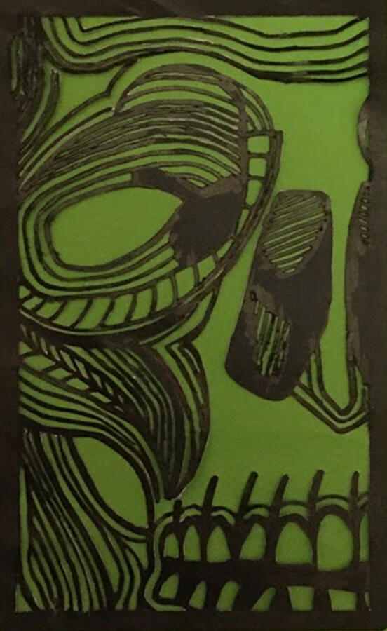
Following on from this piece, I created a lino print using the skeleton image. (See more below)
More Works
UX & UI - Website & App Design
Website Design - Funnybones Website
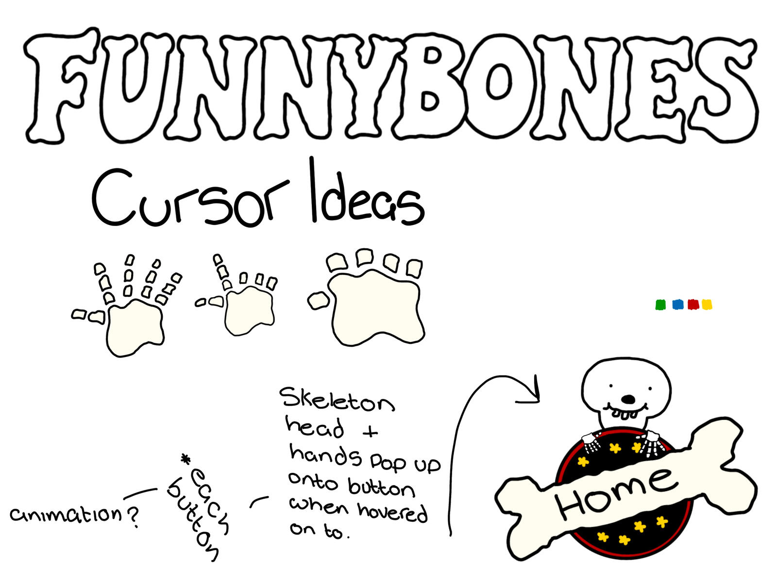
This is a brief overview of the steps towards making the prototype website. There are many other elements that went towards making the final project such as gathering research, and the fine details to making the site functional.
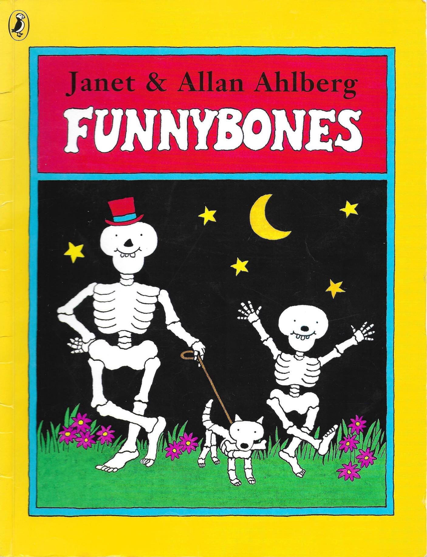
This was a project to create a prototype website in Axure of a chosen children's book. I decided to choose the iconic ‘Funnybones’ by Allan Ahlberg as this was one of my favourite books growing up.
There were endless possibilities of what could be created, but with some requirements such as at least ten separate pages, an ‘adult section’ and most of all to make it safe and appealing for children.From never knowing anything about websites or the software Axure I grew to love this project from start to finish, as I believe that this was successful to meet the criteria.
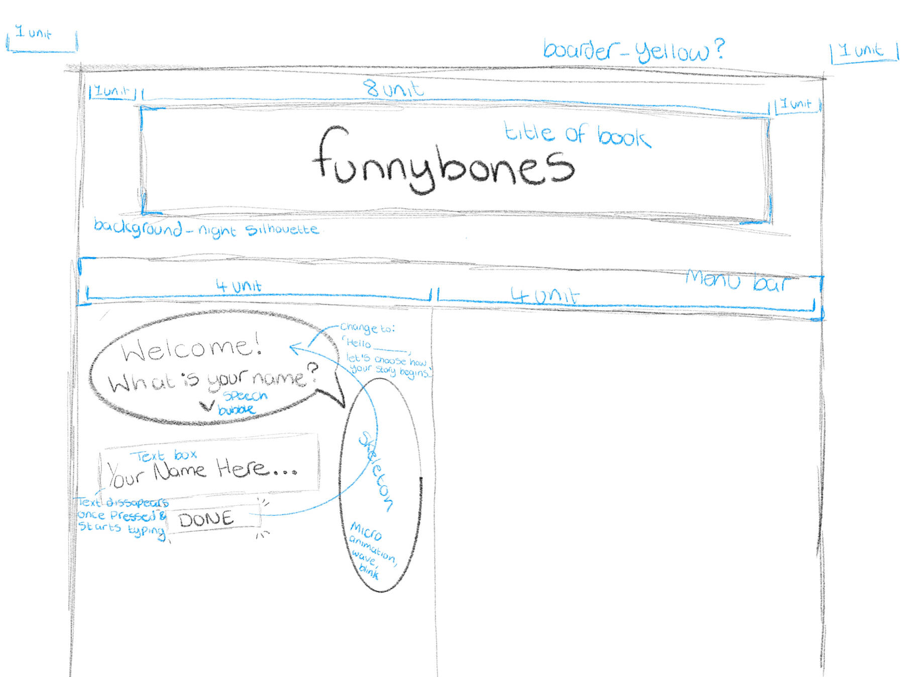
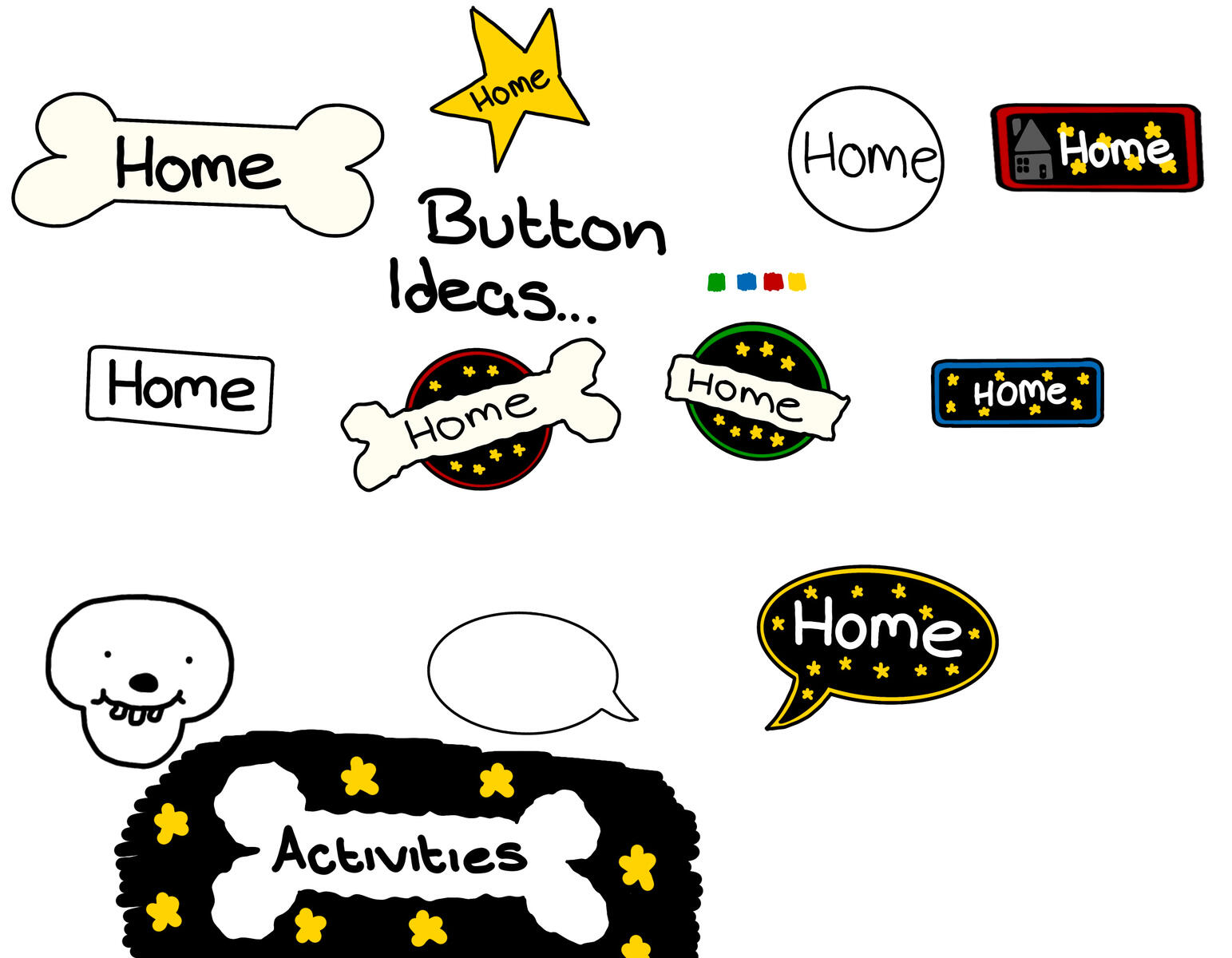
Using Procreate I created some initial designs and research on website types and layouts. This helped me know know where to place the assets as well as to gather together what assets i required.
This helped me to know what parts of the software I needed to research about, as well as the ‘coding’ elements in order to make it interactive.
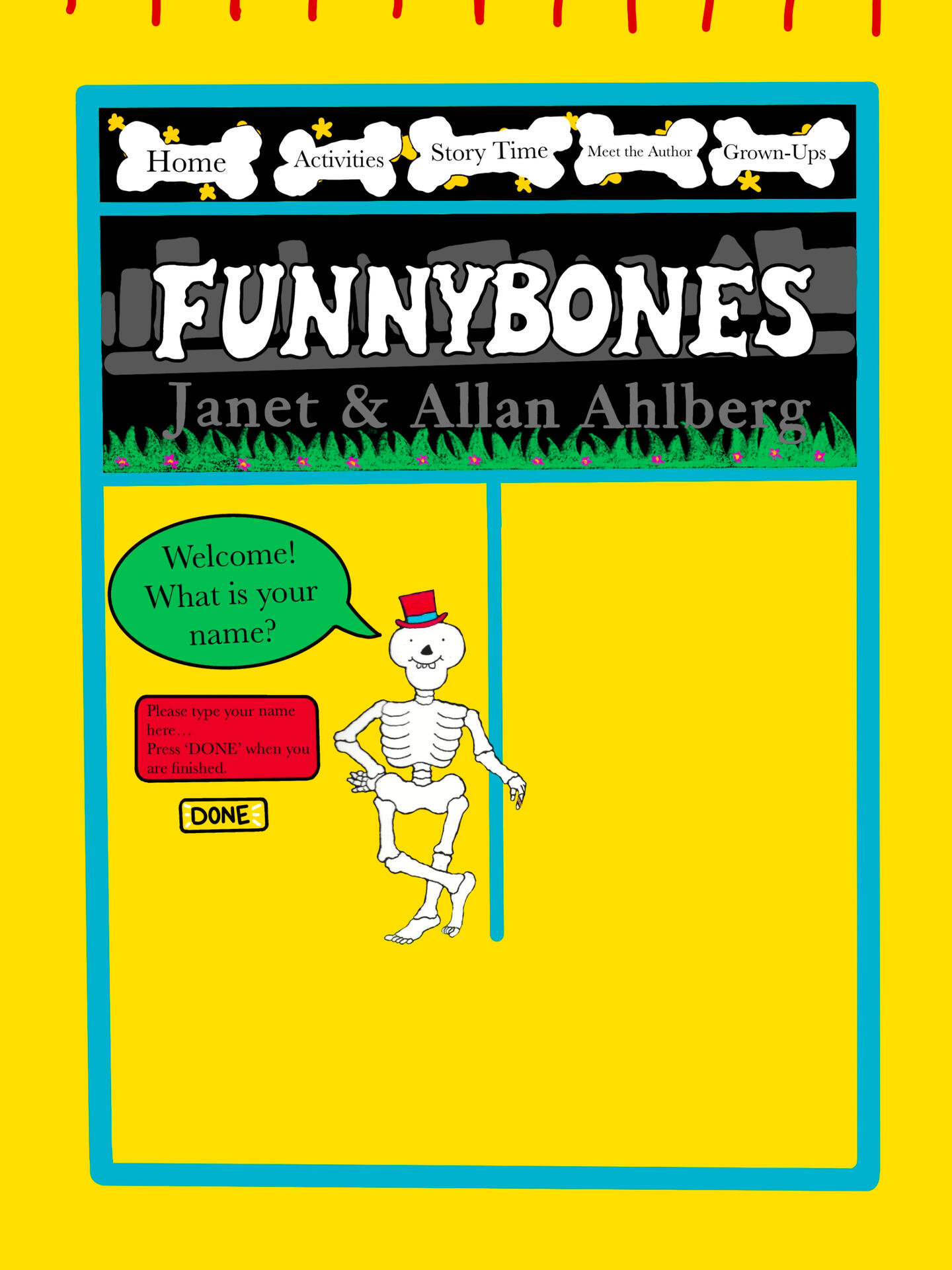
I added colour to the design once I had an idea for buttons and design layout to see how it would look like with the colours together. This helped me to then replicate it onto Axure so that I could then carry on with the design style throughout the site.
I found it easy to play around with the assets within the software so that I didn’t have to plan everything separately.
I scanned the books so that I had the iconic assets, as well as creating some of my own. I brought these assets to life by animating them into a gif to make the site more eye catching for my audience.
I designed these ‘Home Resources’ using Affinity Designer. They are located in the ‘Grown Up’ section of the site to appeal for the primary and secondary target audience.
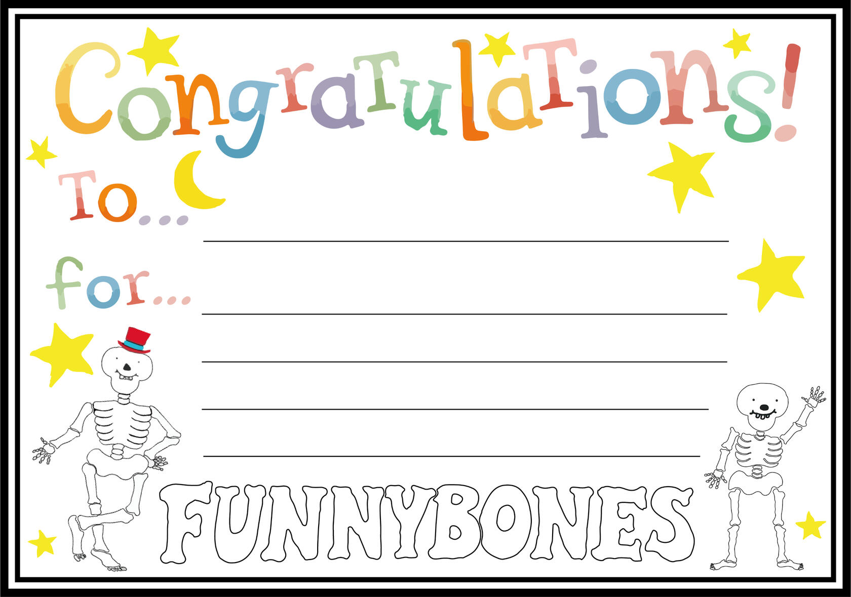
I also created some assets to be coloured in which is located on the ‘Activities’ section of the site. I wanted to include these to make it appealing to the audience as well as a way for them to enjoy the book off of screen.
screen recordings of the prototype
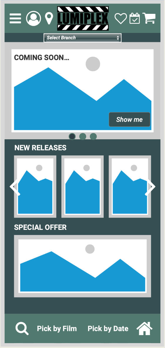
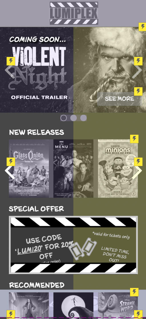
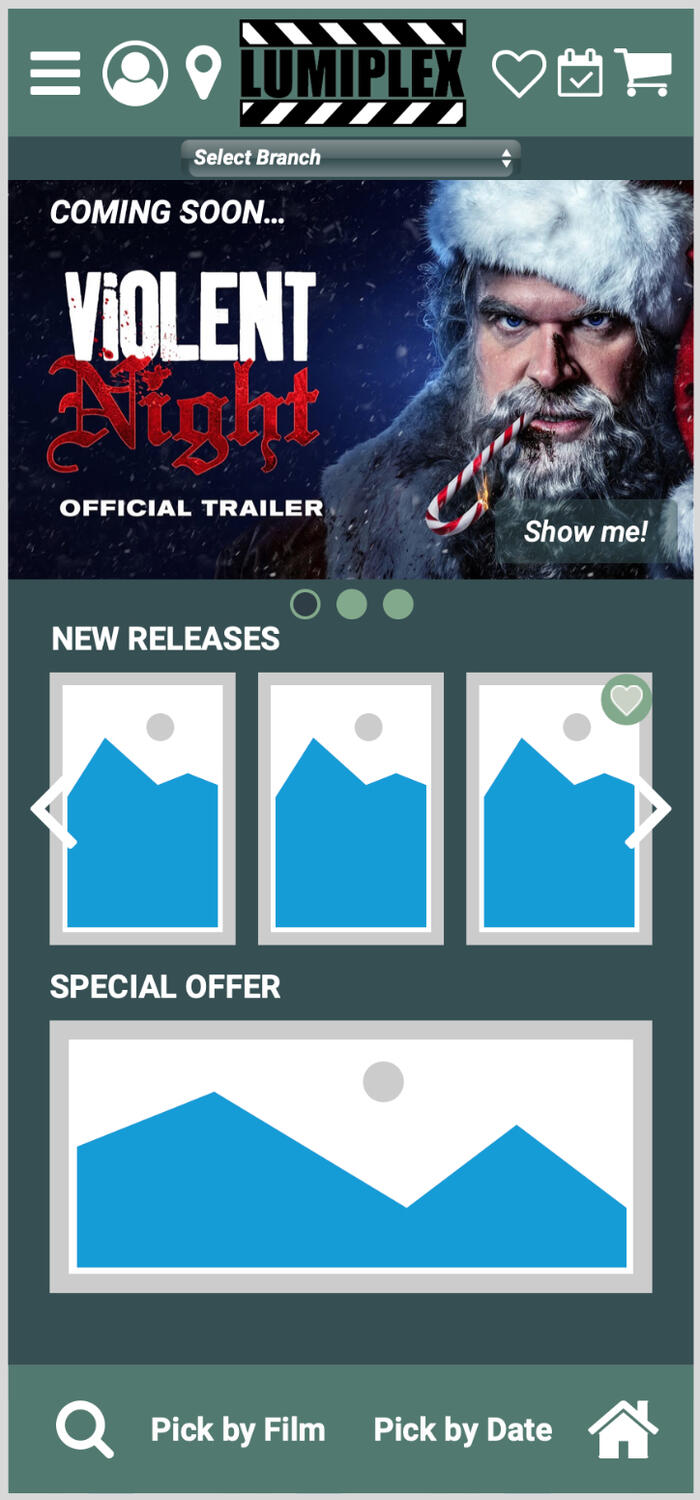
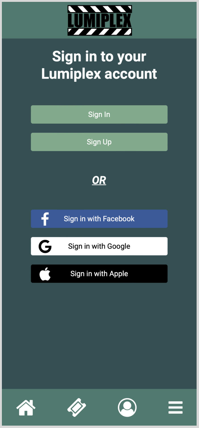
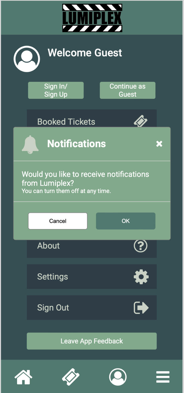
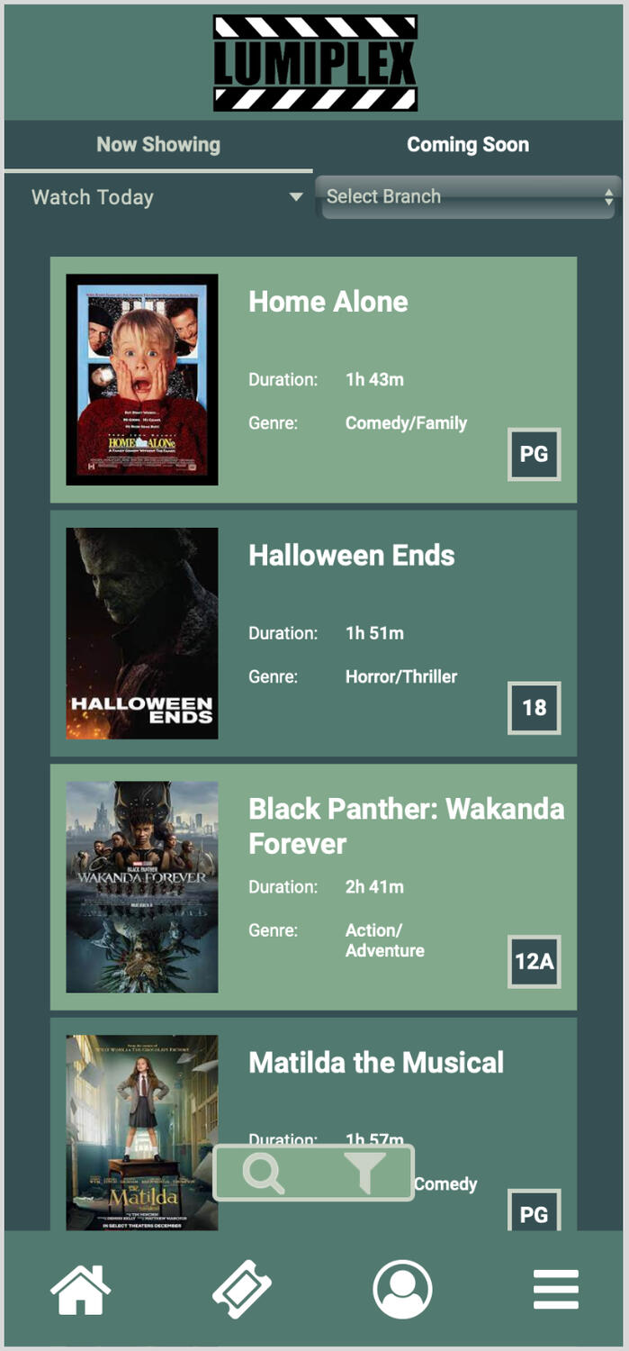
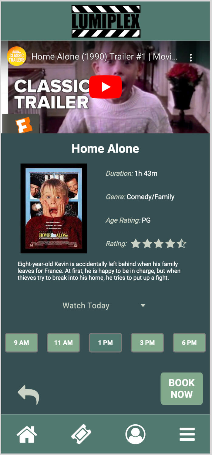
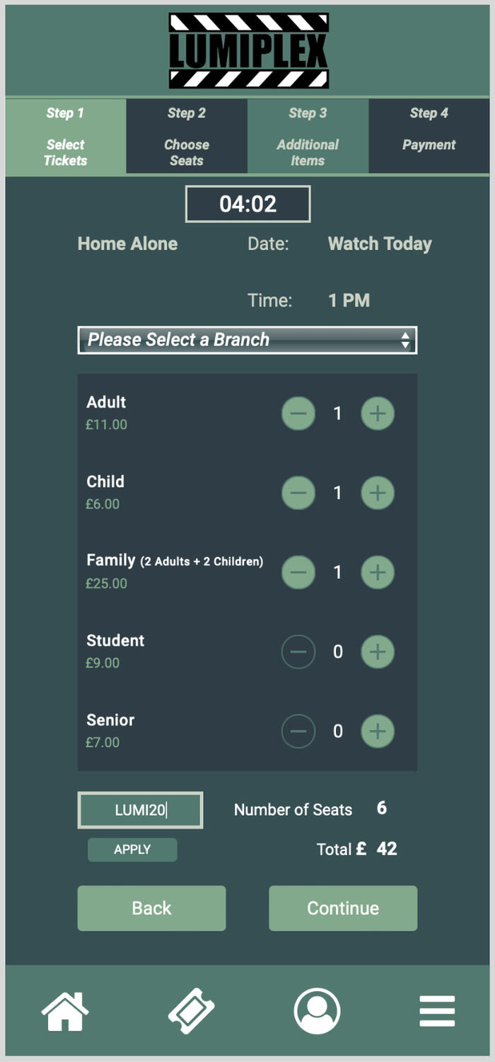
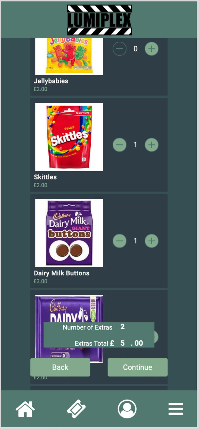
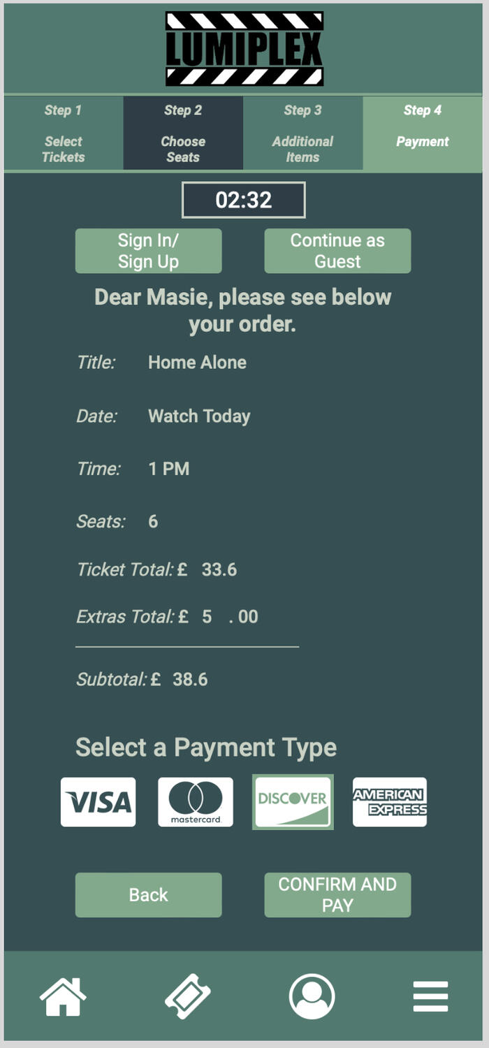
App Design - Lumiplex Cinema App
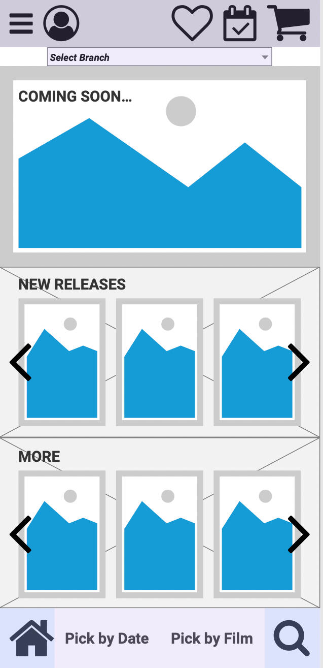
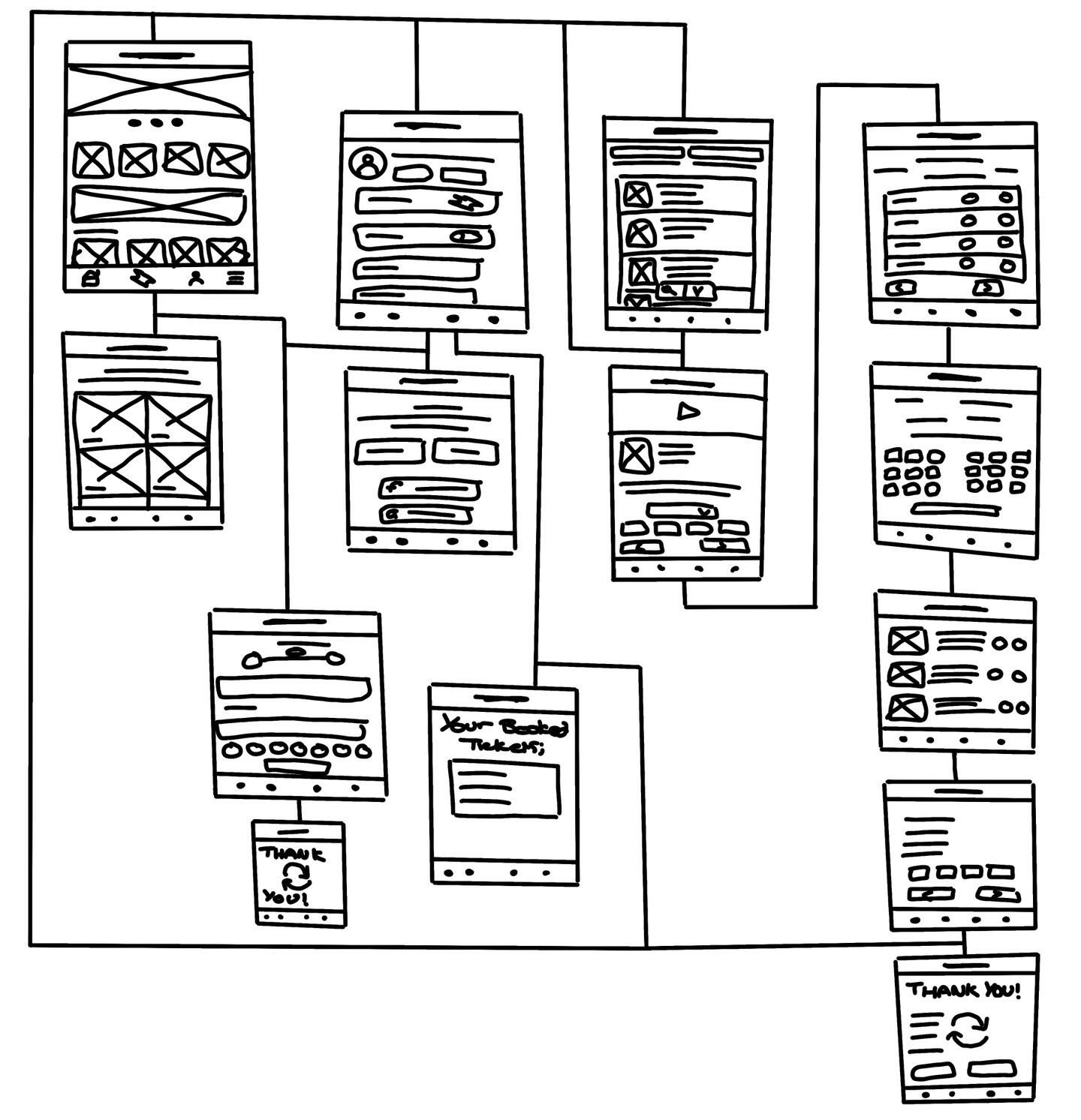
This project was to make a cinema app for a company called Lumiplex with a new branch opening in Peterborough. The app needed to be created in Axure and fully functioning.This is a brief overview of the process towards making the app. There are many other steps such as research, qualitative and quantitative data capture, and mind maps that also wen towards this project.
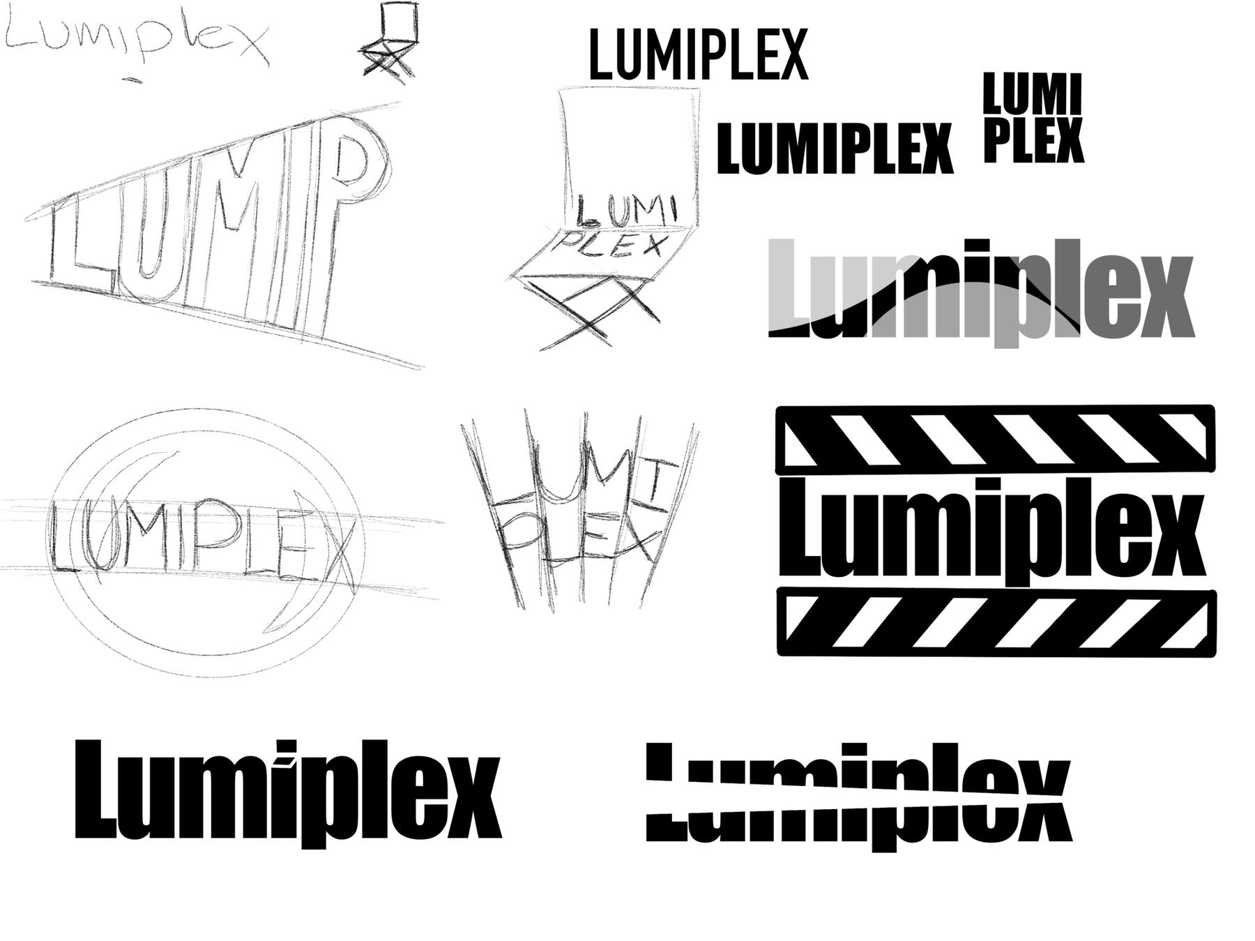
Whilst thinking of the logo, i wanted to link it with the production of a film by the use of spotlights, director chairs, and clapperboard.I decided to choose the logo towards the bottom right as it stands out to me the most and is simple but effective for capturing peoples attention.
I also created an app icon to go with it.

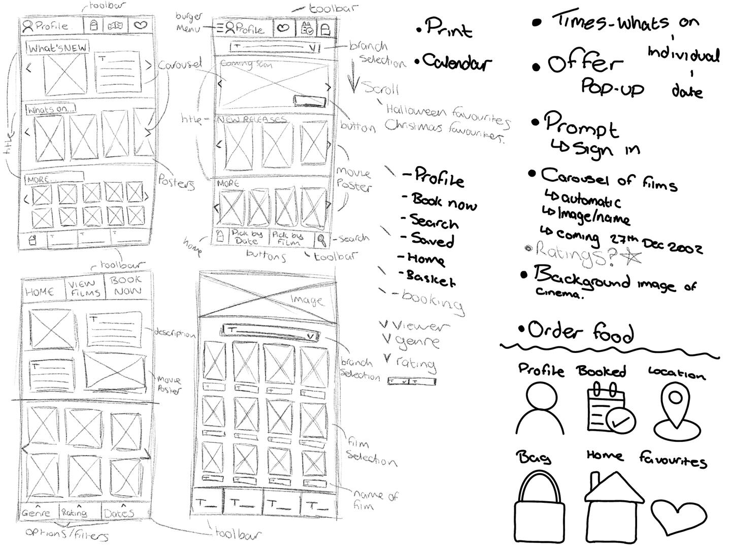
Scamps and Wireframes
Final App Pages
Film
Visual Effects Project
This project was set out to explore editing techniques using the Adobe Suite. Edited in Premier Pro and After Effects.
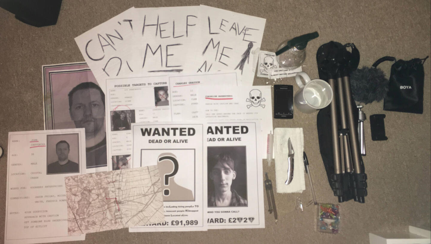
Call to Kill - A thriller opening of a film
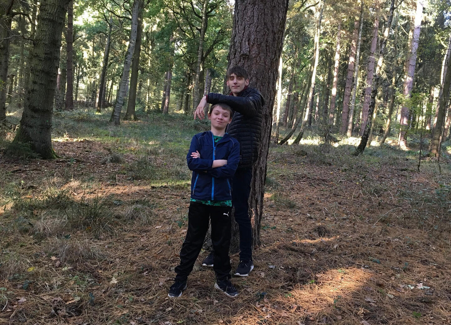
Call to Kill is an opening to a thriller movie. I thoroughly enjoyed creating this movie with my fellow actors and it turned out to work really well. Edited in iMovie.
Look out for the references!
Equipment and assets used
Call to Kill (tap to unmute!)
Call to Kill - Bloopers!
Life in Lockdown - A short documentary
Life in Lockdown was created towards the end of the COVID-19 pandemic in 2020. It was created for practice before creating the thriller opening (above) so that I was familiar with the software. Edited in iMovie.
I enjoyed creating this mini documentary, and I would like to make more in the future.
Life in Lockdown (tap to unmute!)
Animation
These are animations that I have made using Adobe Animate. I created these to grow my skills within this area of digital art.
Game Design
Game Design was a team project to create an idea for a game from scratch, and then to pitch our ideas along with the gameplay of the game.
My role was to create imagery of the mechanics through animation to get the idea across to the audience.
I used a combination of the 3D background image provided by one teammate and the drawn assets from the other teammate. I edited the background image by adding a filter layer on top in Photoshop so that it matched the theme of the game. I imported these assets into Animate and changed the sizes and positions of the assets accordingly.
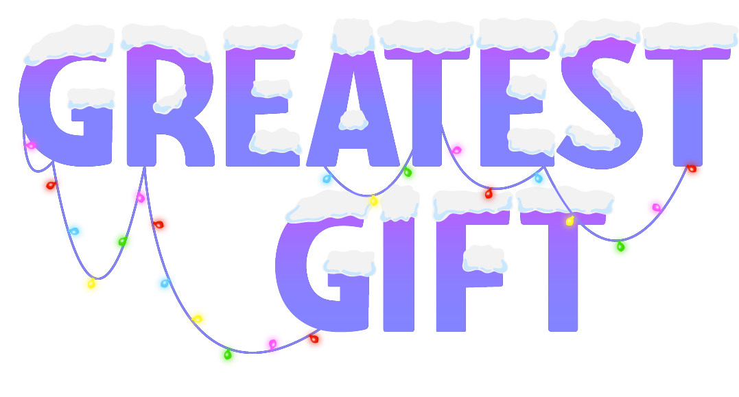
I used Adobe Illustrator to design the logo, and Animate to animate these assets to make them look like a game.
Greatest Gift is a 2.5D mobile platform game. The game follows two twin children enacting their plan to escape from an orphanage on Christmas night to meet Santa.
Players can switch between both twins as they make their way through different floors of the orphanage in search of the items they need for their escape while avoiding the watchful eyes of The Caretaker.
There will be other children in the orphanage that players can interact with during the stages. Some of the children will be open to assisting the twins during the levels or trading items with them for candy.
The goal of the game is to successfully escape the orphanage on Christmas night and reach Santa's sleigh located on the roof of the orphanage.
Tap to unmute v
This animation represents the player collecting apples to gain more hearts and candies as we see this being added to their bag.
This animation represents the player switching between the two main characters; Iniko and Keon (whilst collecting candies). This is also a glimpse of one of the levels we plan to have within the game.
Tap to unmute v
This clip shows a power up which gives a temporary speed boost. This is just an example of one of the power ups that we decided to include within the game.
Storyboard for phone mockup
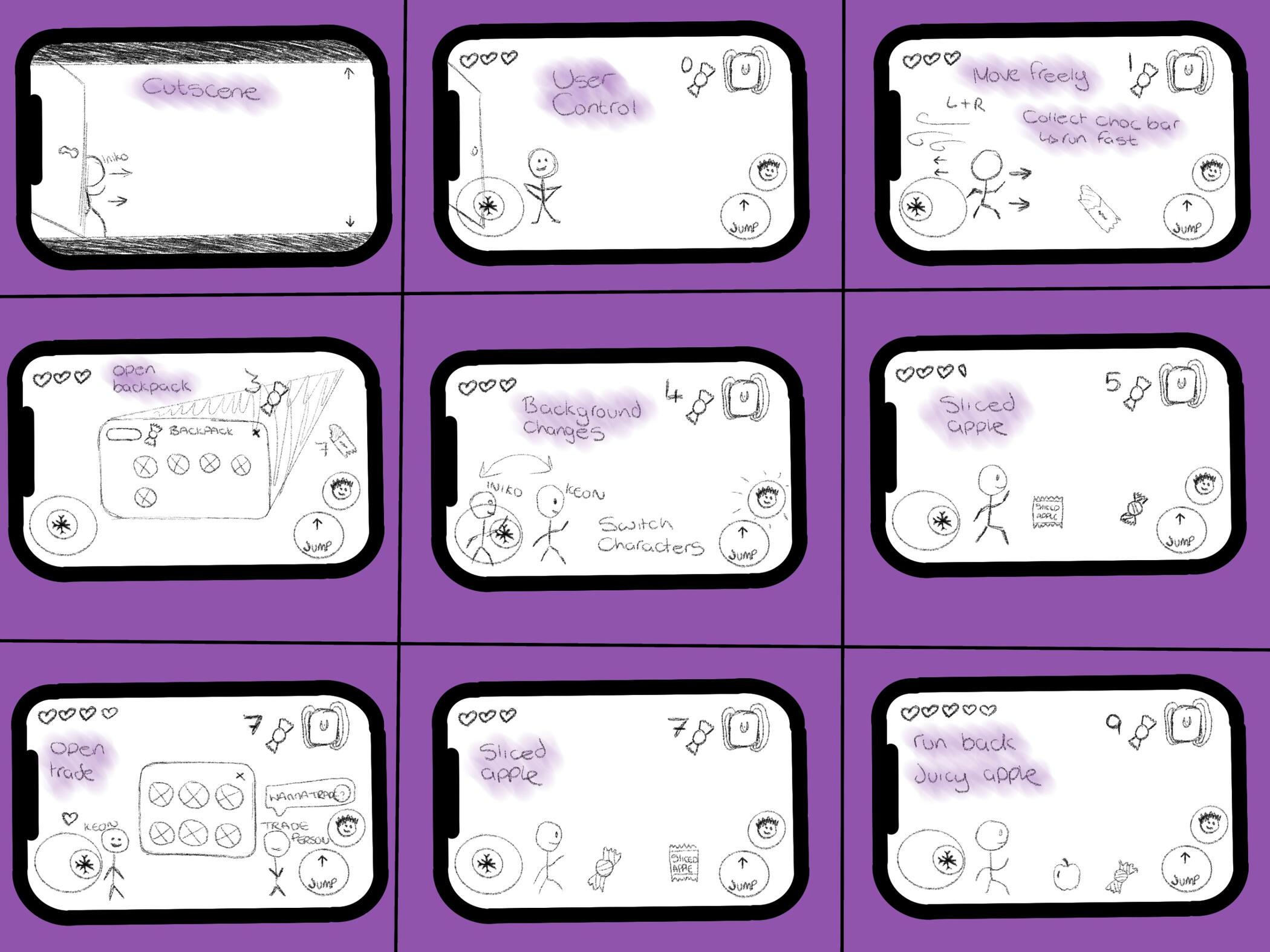
This gameplay animation was created using Adobe Animate. It is a combination of the previous power-ups and collectables to represent what it looks like on a phone screen.
This clip is different to the rest as it has the controls on the screen as this shows the player movement in first person. This helped to see the spacing of the controls along with stationary assets.
Animated Logo
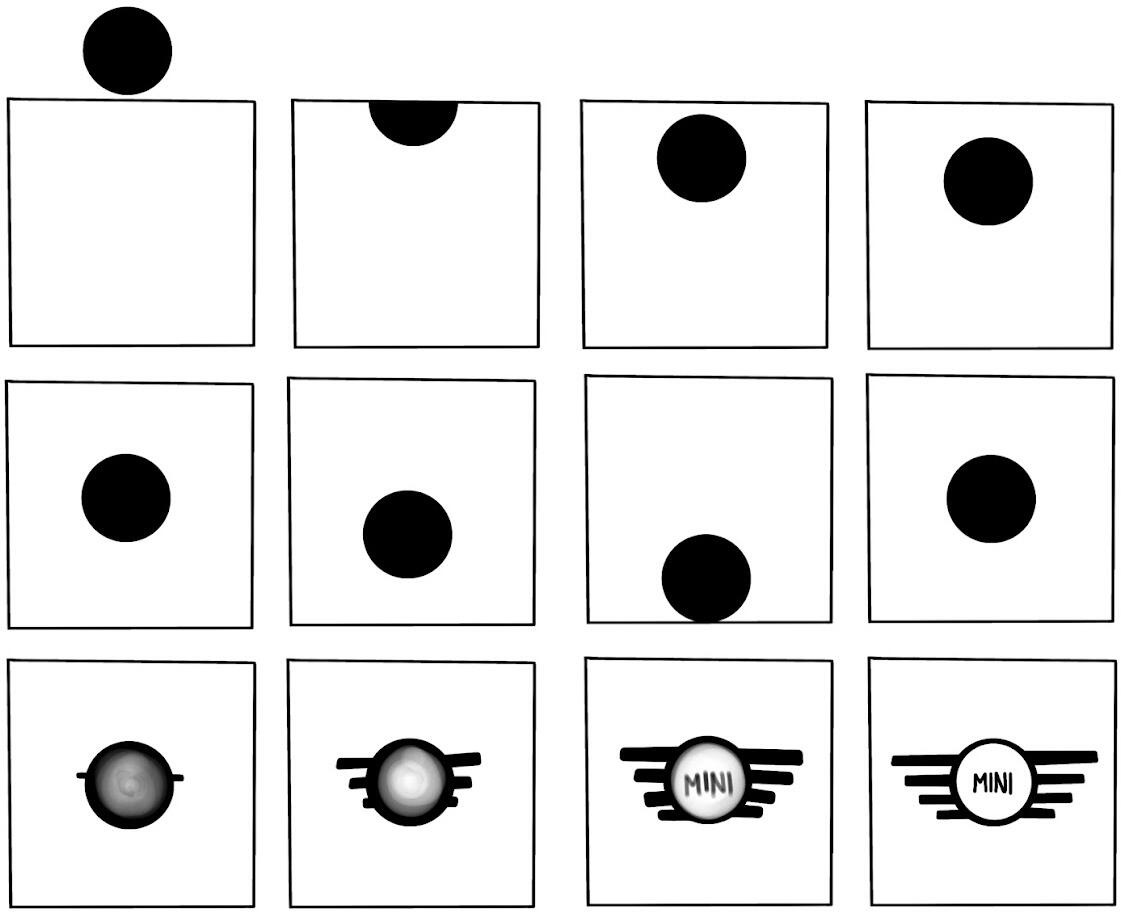
My first animation: To create an existing logo animated.
Walk Cycle
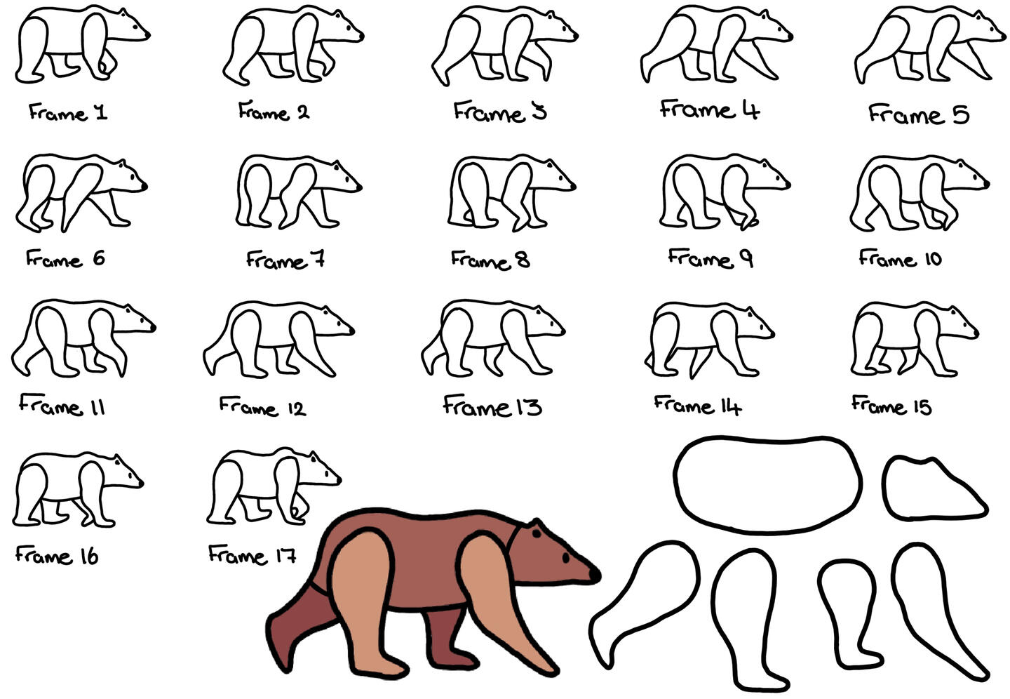
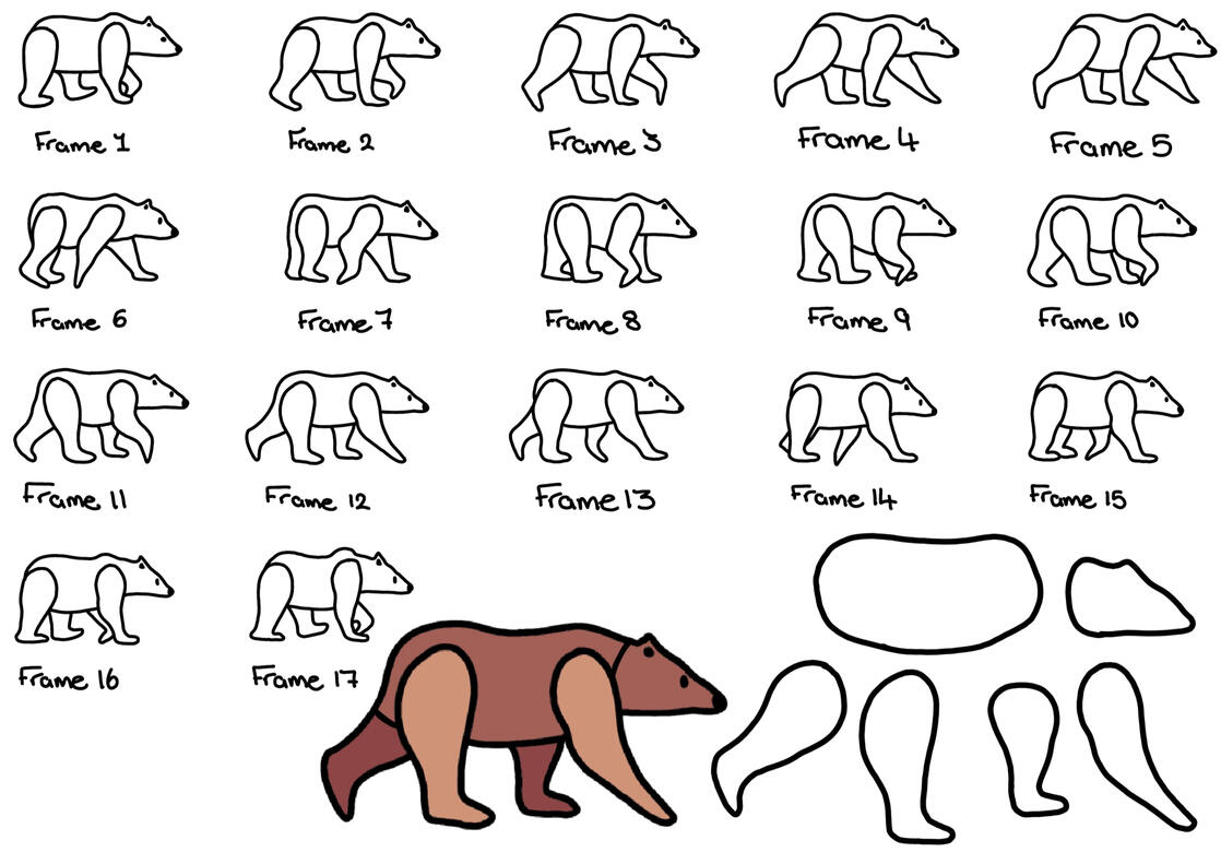
A simple walk cycle created with assets combined together onto individual frames using Adobe Illustrator and Animate.
I created the limbs of the bear separately so that I could move them frame by frame in Animate.
Create an Emotion
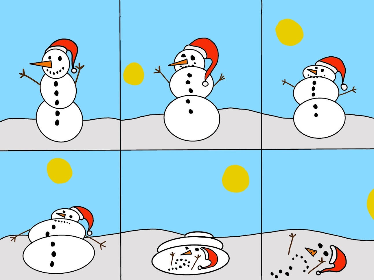
A short animation to give the viewer an emotion whilst watching.
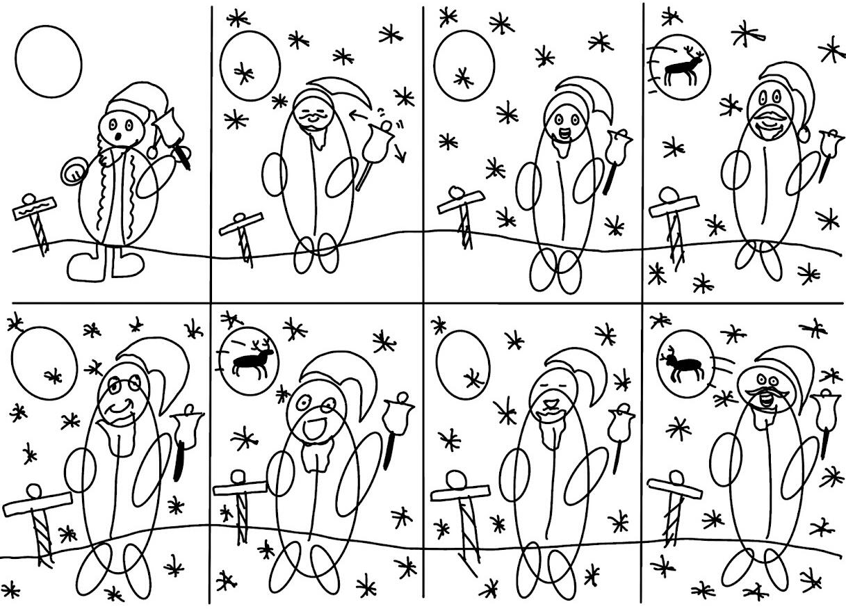
Lip Sync
V Tap to unmute
A well fitted theme with chosen audio to lip sync it with.
This consisted with creating the assets and mouth shapes using Adobe Illustrator and combining them together to match with the audio.
After I had completed this, I played around with the assets to create a nice Christmas message.
V Tap to unmute
One Minute Story
V Tap to unmute
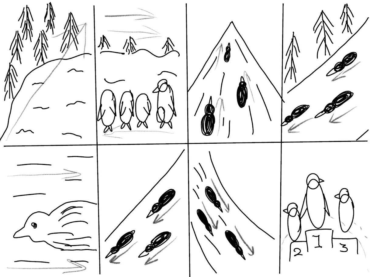
My objective was to make a story in one minutes only using imagery.
The story I decided to make was penguins racing each other until the end.
Marketing
Nene Park X Liv
This project was to make some marketing material for Nene Park to advertise Liv bikes being available to rent or buy.
I wanted to approach the advertisements by drawing the bikes on top of imagery as a way to make it eye catching for their audience. I drew these bikes digitally on Procreate.This is only a brief overview of the process before creating the final outcome.
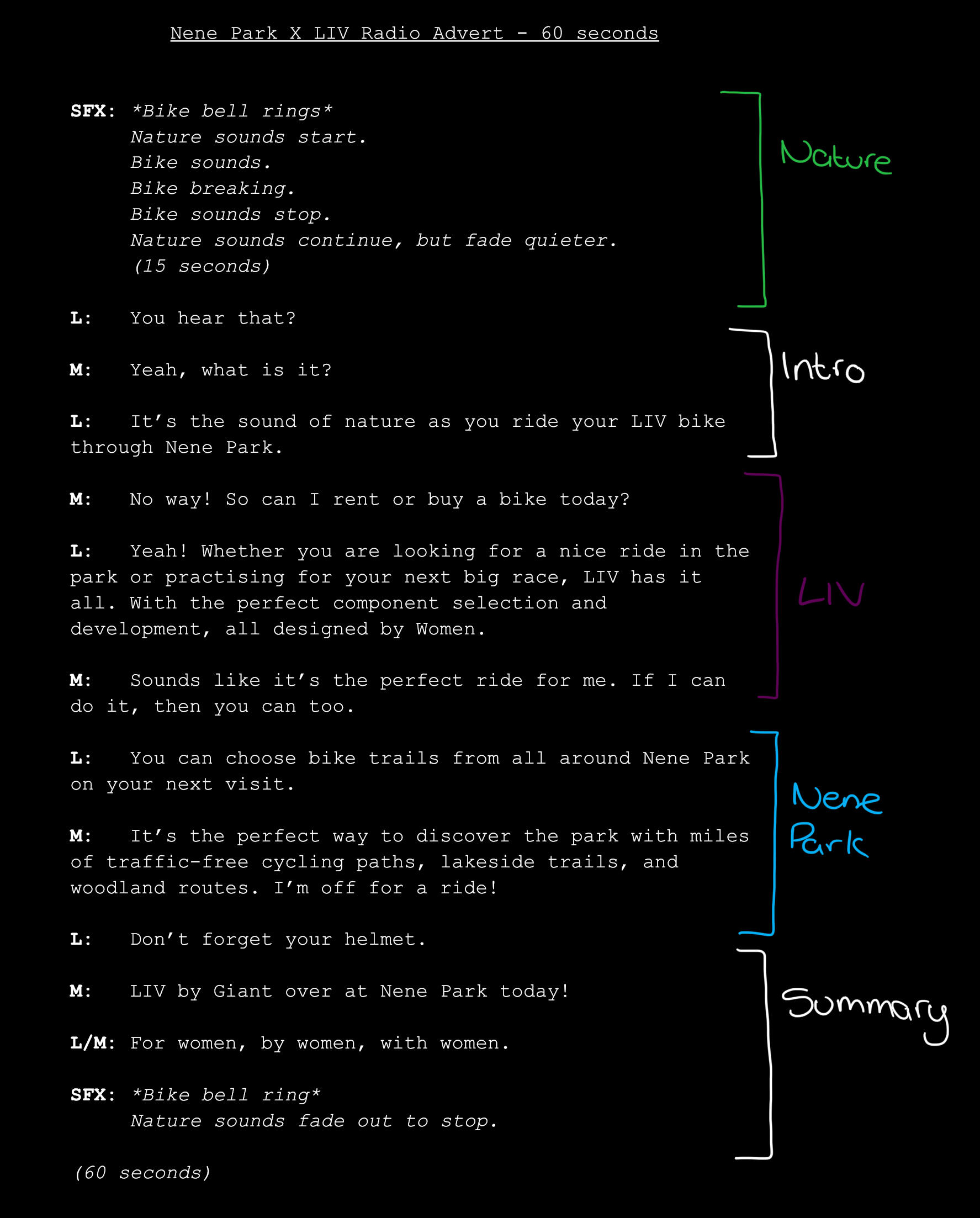
Another type of material required was a radio advert.
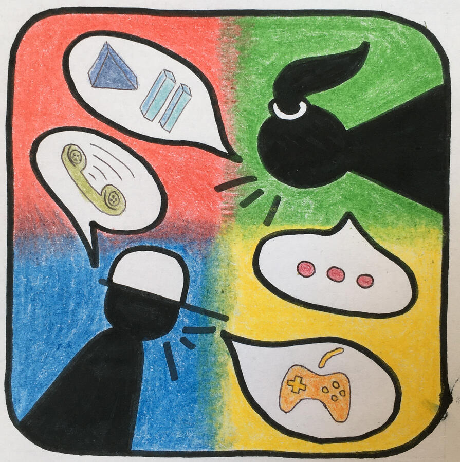
Through this advert I want the audience to feel like they are listening into a conversation between two people about Liv bikes now being available to hire at Nene Park. I wanted the advert to be clear of what it’s promoting as well as each of the brands having an equal part so that one doesn't overpower the other.
Listen Here v (tap to unmute!)
Mobile Game Ad Banners - Penguin Slide
Digital Asset Development is a topic with the project to create the assets for a mobile game.
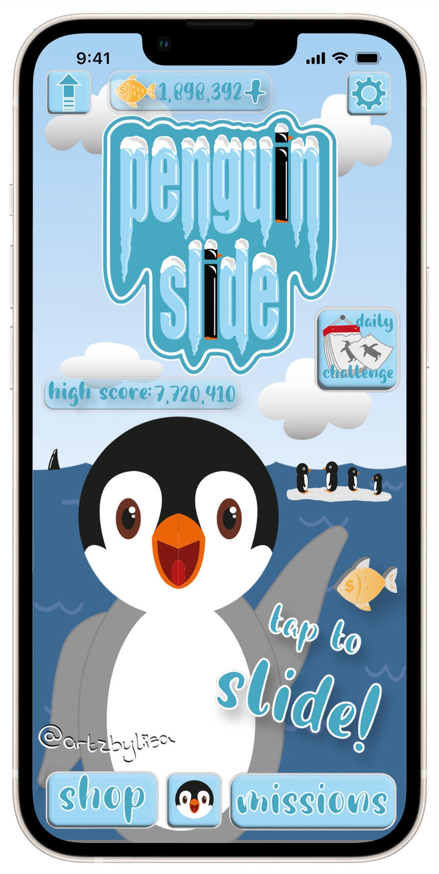
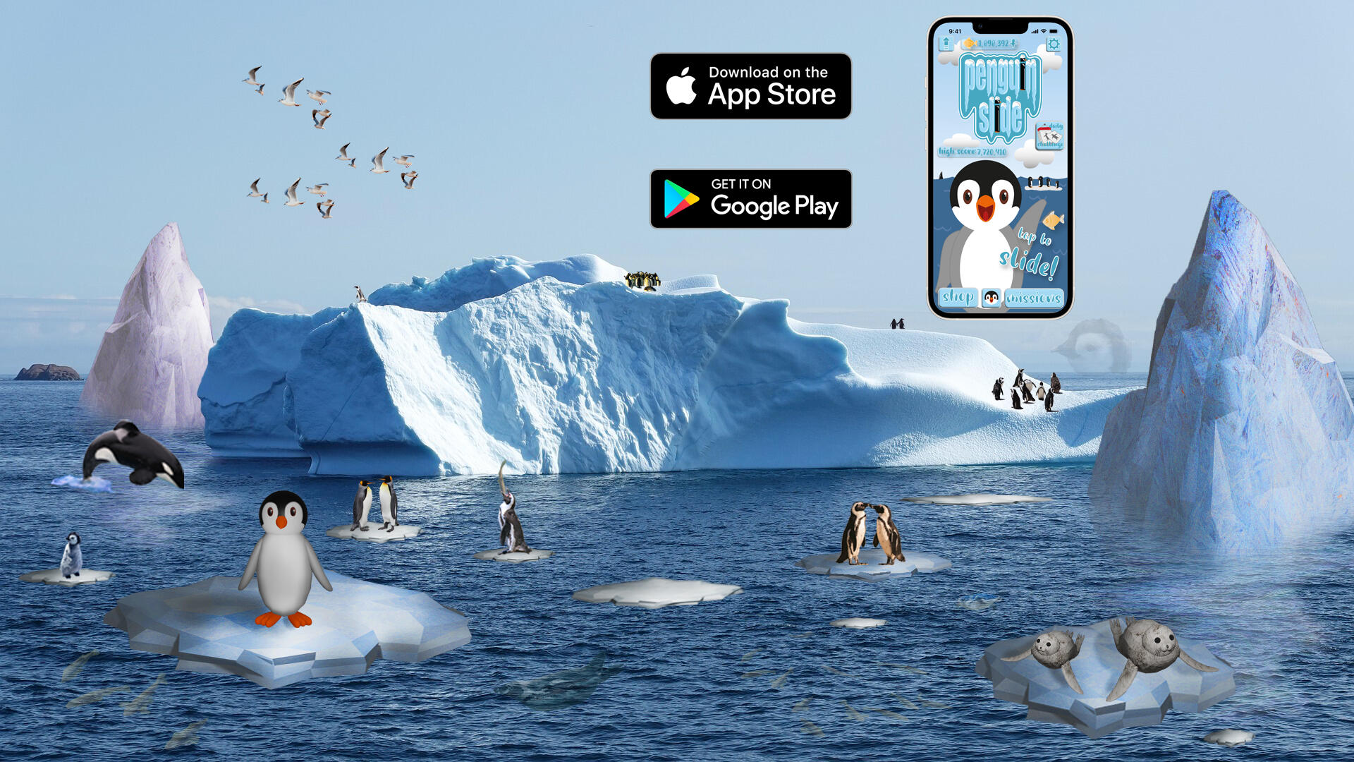
I chose to create an endless runner game called Penguin Slide inspired by the popular mobile game Subway Surfers.I created a realistic poster, phone mock-up, and some ad banners to go with the game.See the ad banners for penguin slide below.
I created different size banners to fit in with different types of advertisement.
3D assets in Blender
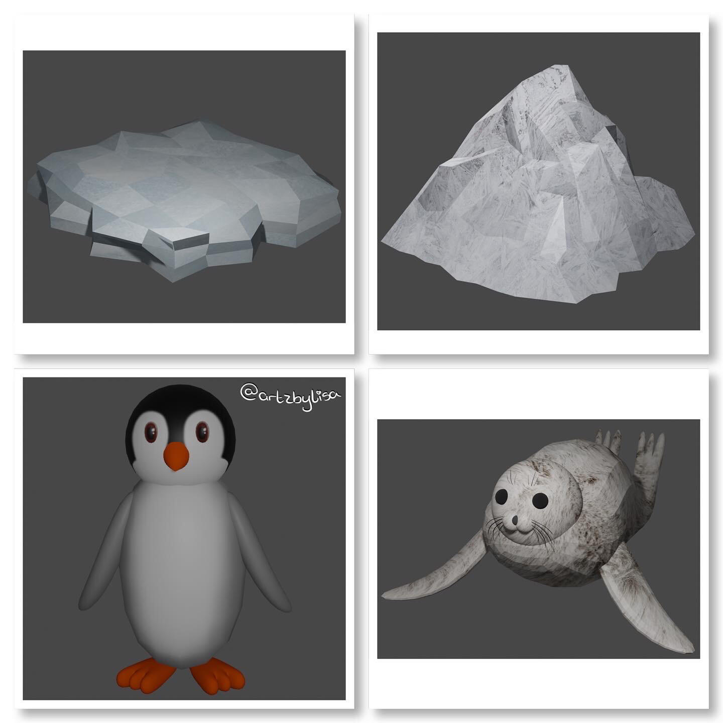
I created these 3D assets in Blender. I used these assets for the realistic poster and banners for the game.



Artwork
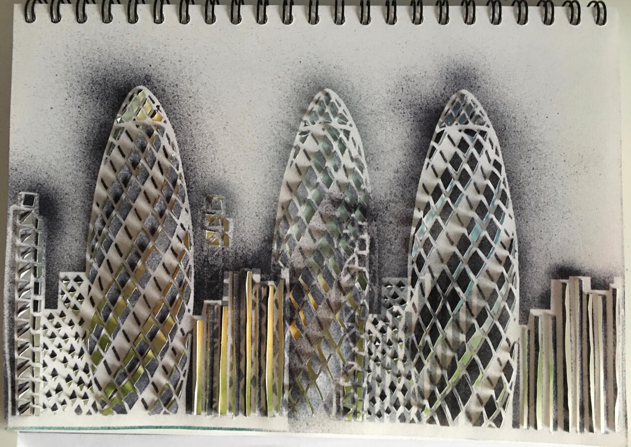
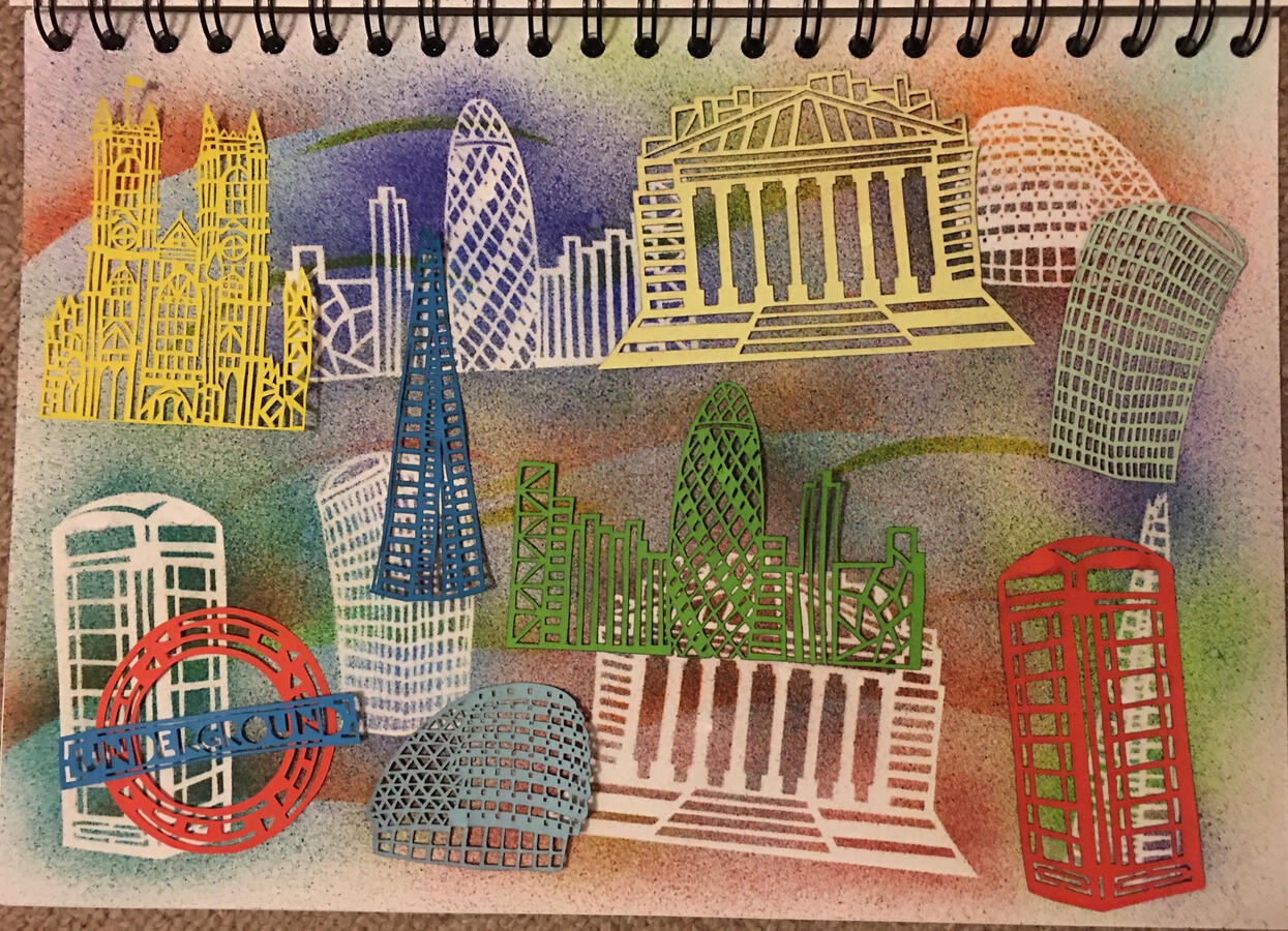
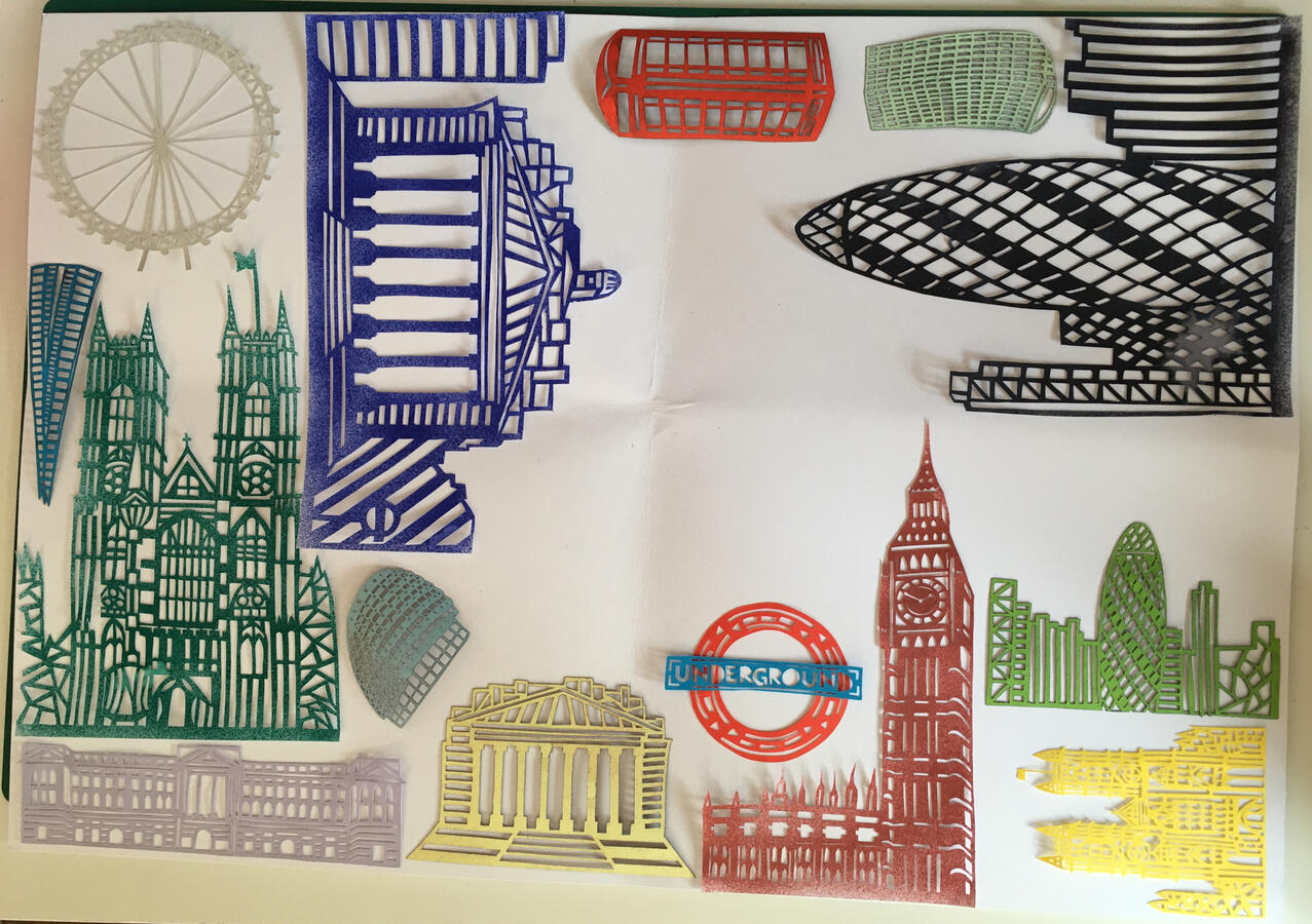
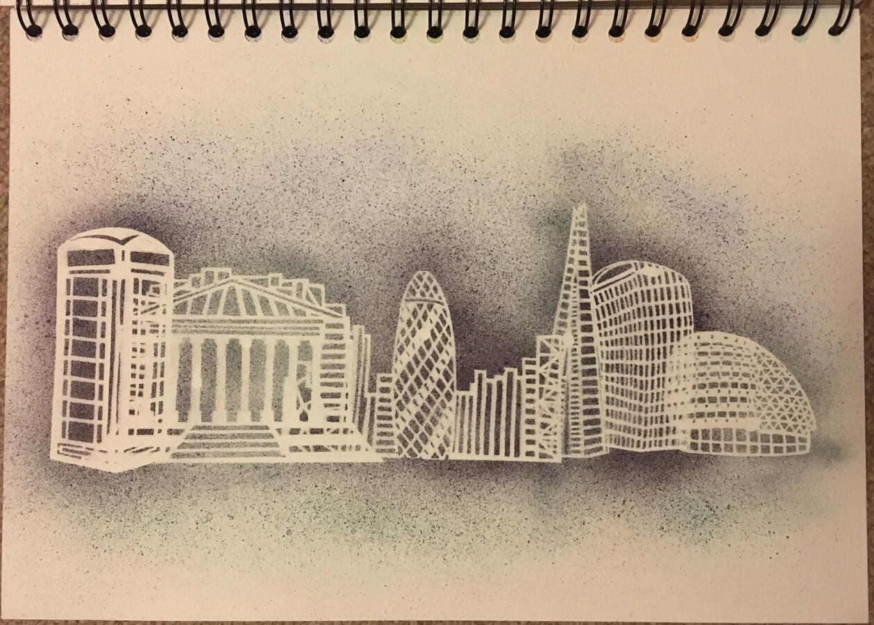
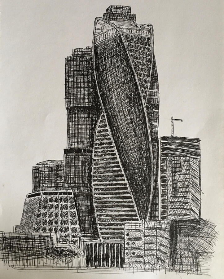
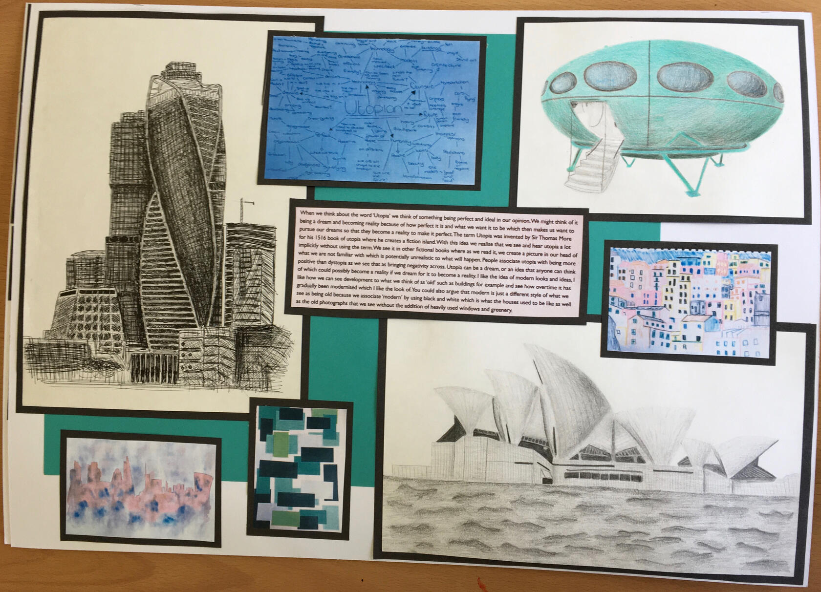
Utopian
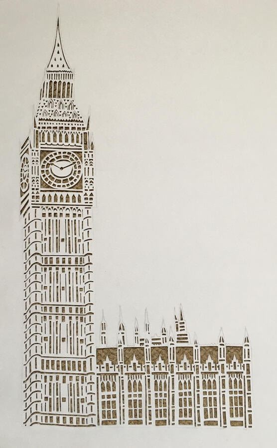
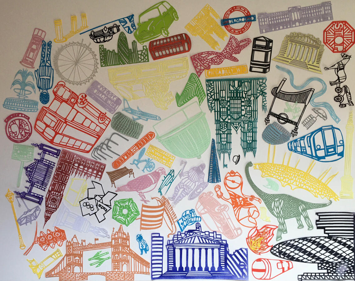
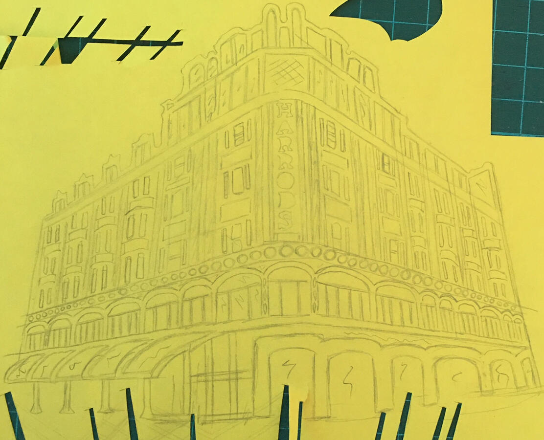
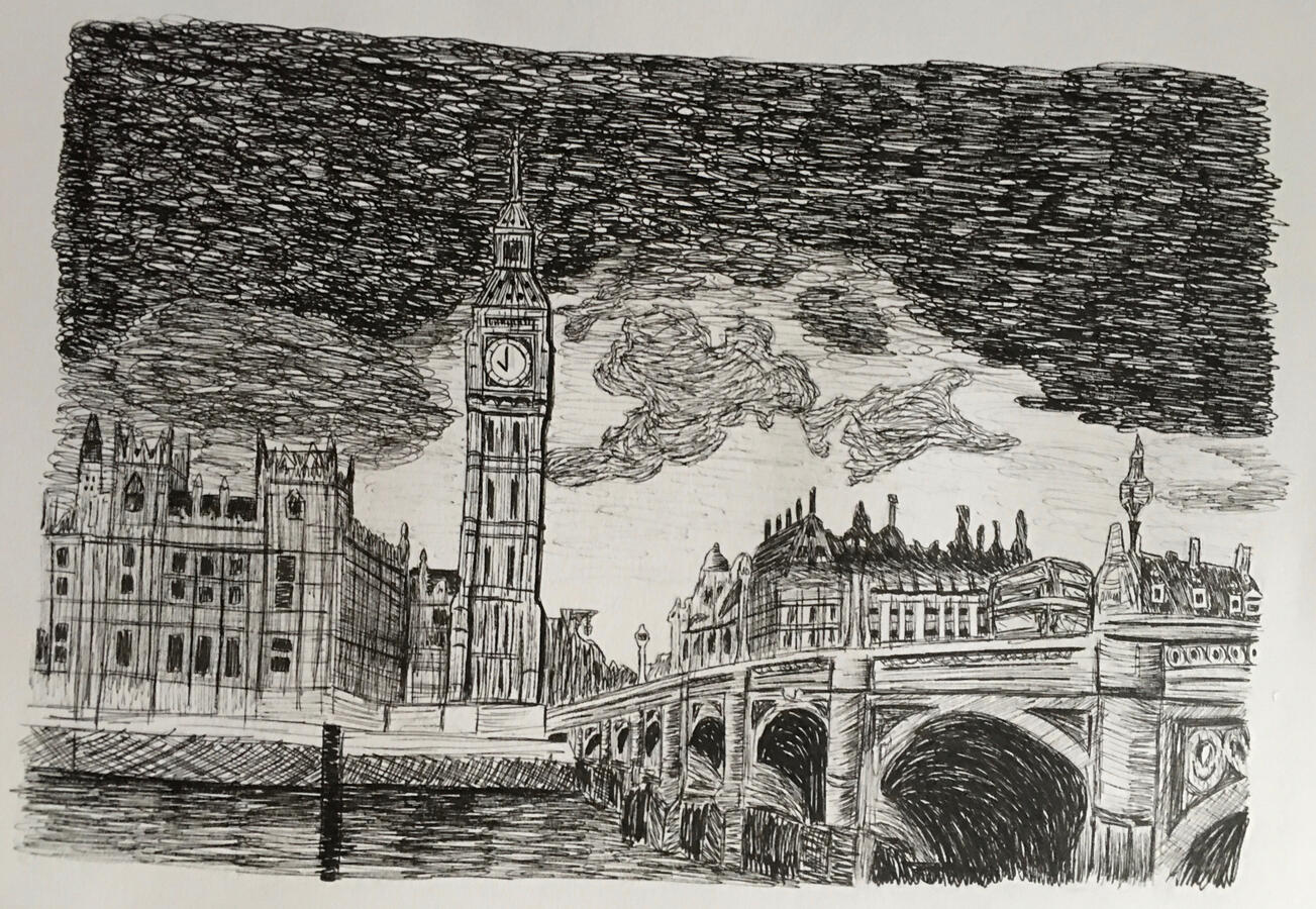
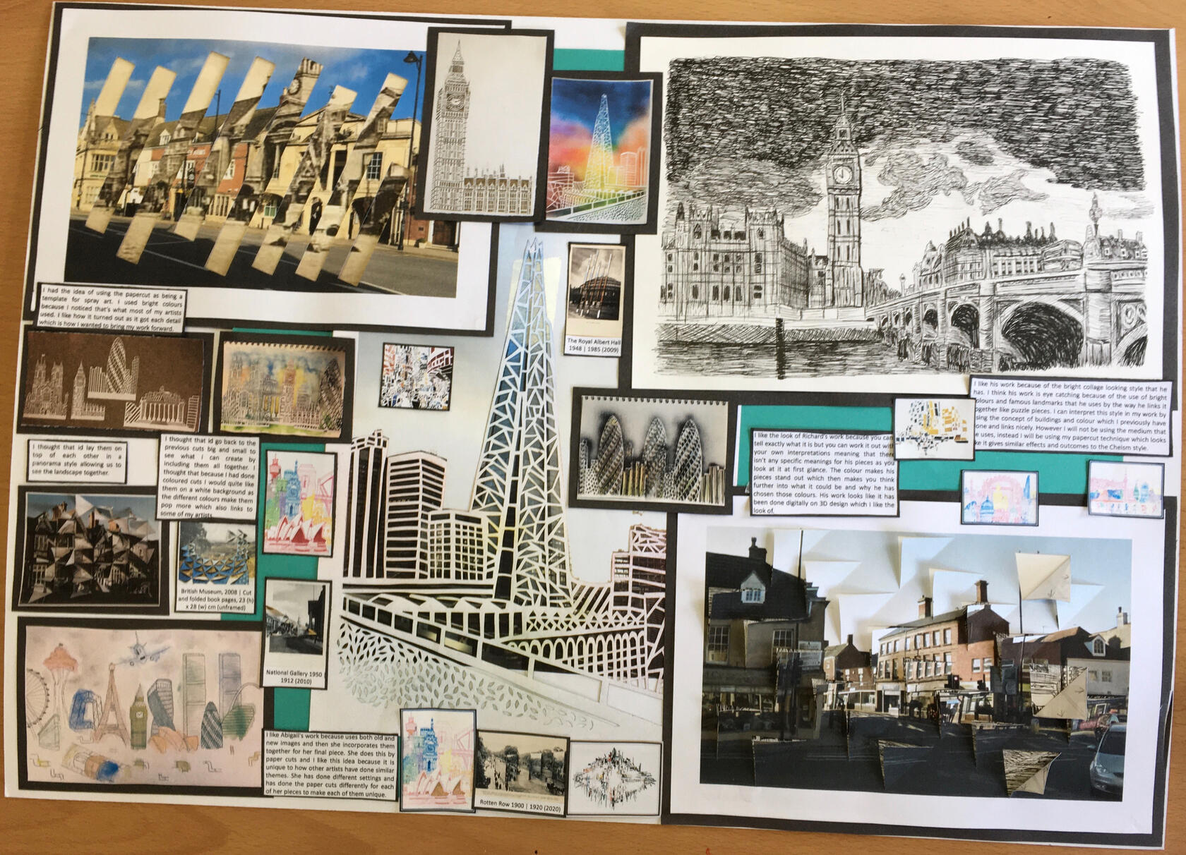
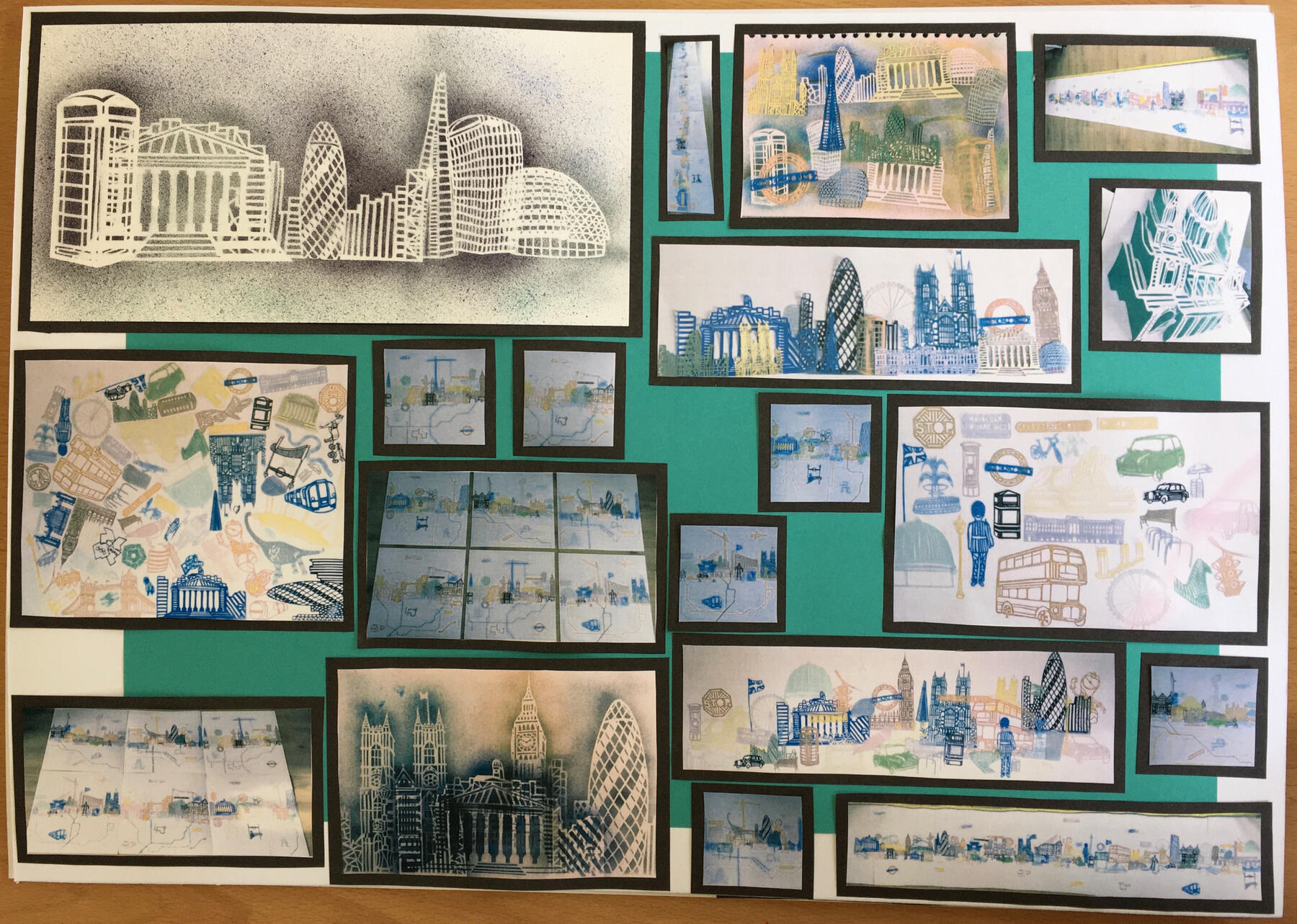
As the theme was ‘UTOPIAN’ I decided to look into buildings and their unique forms at the start of the project and developed from drawings to end up making papercuts towards my final piece.
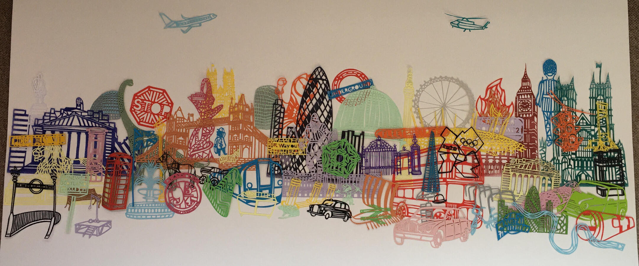
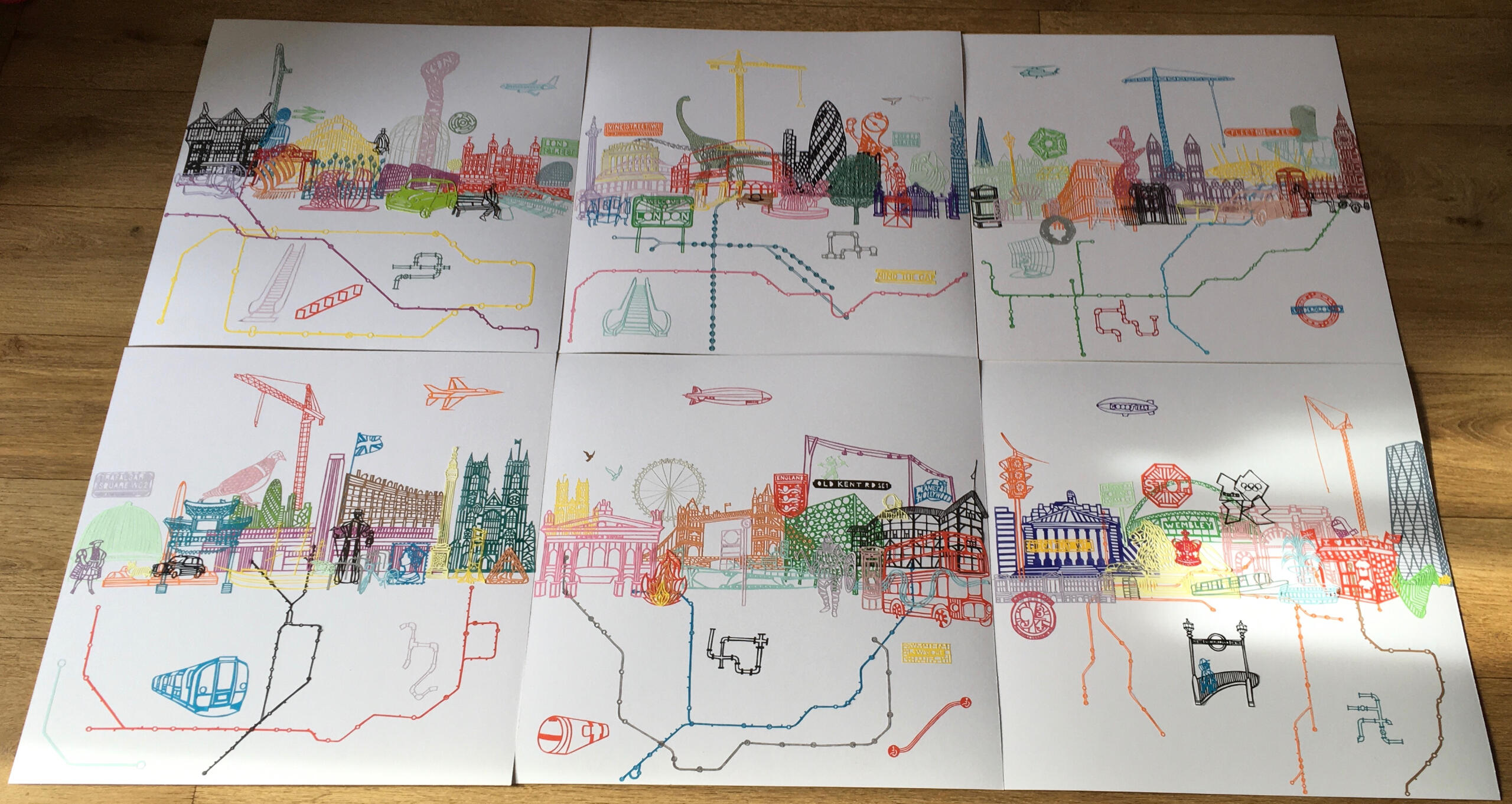
Final Piece - ‘TIME’ 2021
6 boards/panels
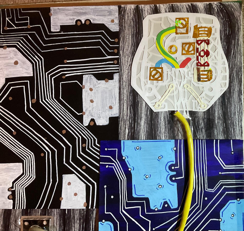
174 papercutsThese are boards of intricate papercuts created entirely by me from detailed drawings of London. When they are all laid out like a panorama it is 3m 30cm long! - each board is 55x55cm.If you look closely at the boards you may see easter eggs and other meanings that might not be seen at first glance.I particularly like how you can arrange the boards in many different ways, including keeping them separate. This allows to move them around however you like to make it look different to reveal new cuts that you might not have already seen.To link back to the theme and the explanation to why I made this piece is that this is my world of Utopia in London. Represented by a cityscape in a form of papercuts where the objects are randomly placed and not to scale.Making this took over 2 months but little did I know I would be making this from the start of the few cuts that I made.
I decided to call it ‘TIME’ because of not only the time it took to make altogether but London over time in which I have presented this way in my own unique way.
Evolution
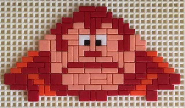
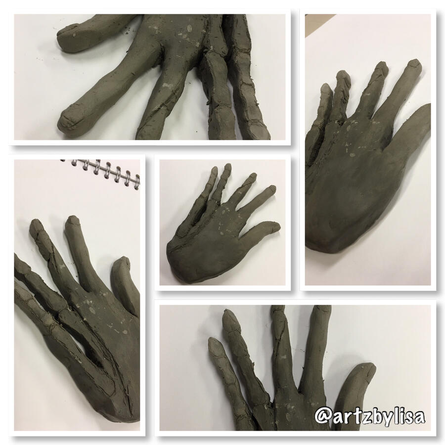
These are some of the pieces for my Evolution project. I chose to look into video games which turned into a dystopian theme where I looked at the artist HR Giger.
The final piece combines these two topics to create a mixed media piece.This is a portion of what I created within the project.
Final Piece
Beneath the Surface
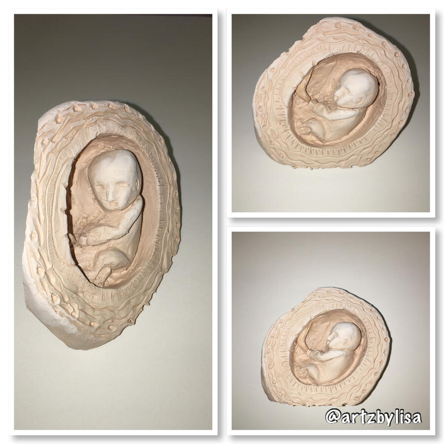
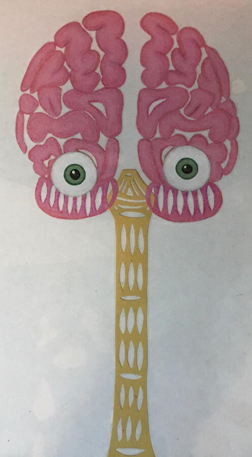
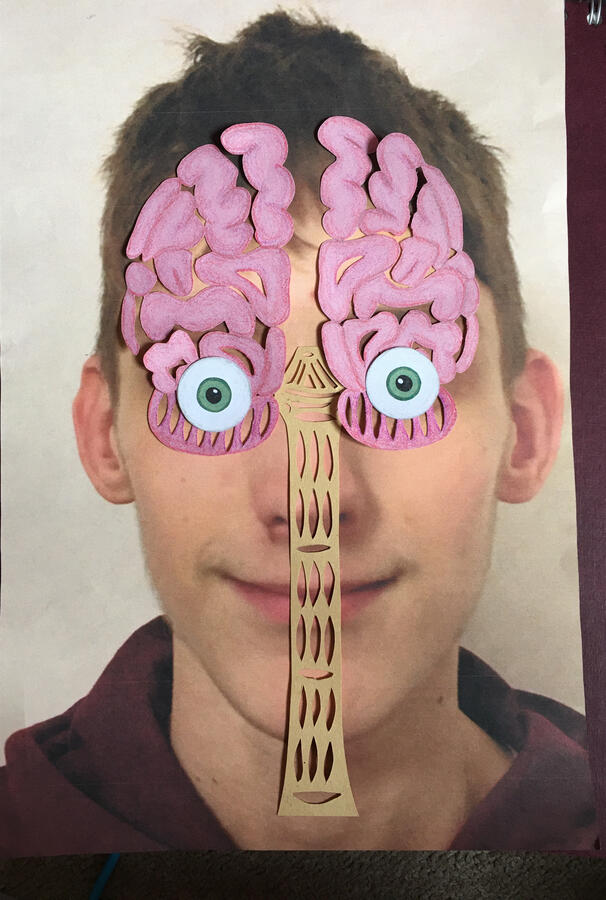
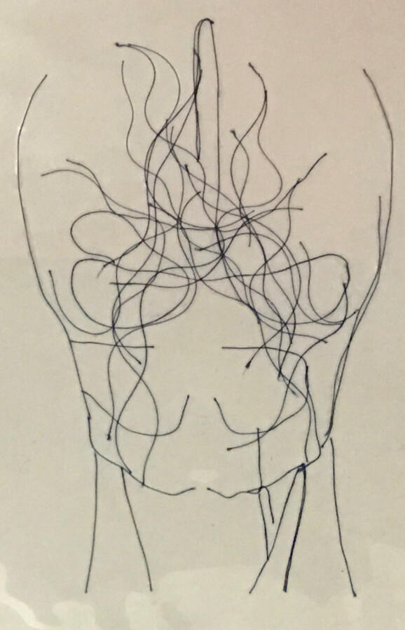
This project was ‘Beneath the Surface’, I decided to delve into the human anatomy.I looked into different types of art to end up creating a mixed media piece with multiple layers that lit up from the back of the box.
Final Piece
More Works

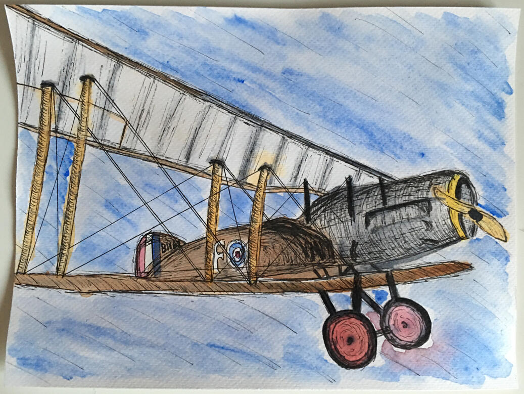
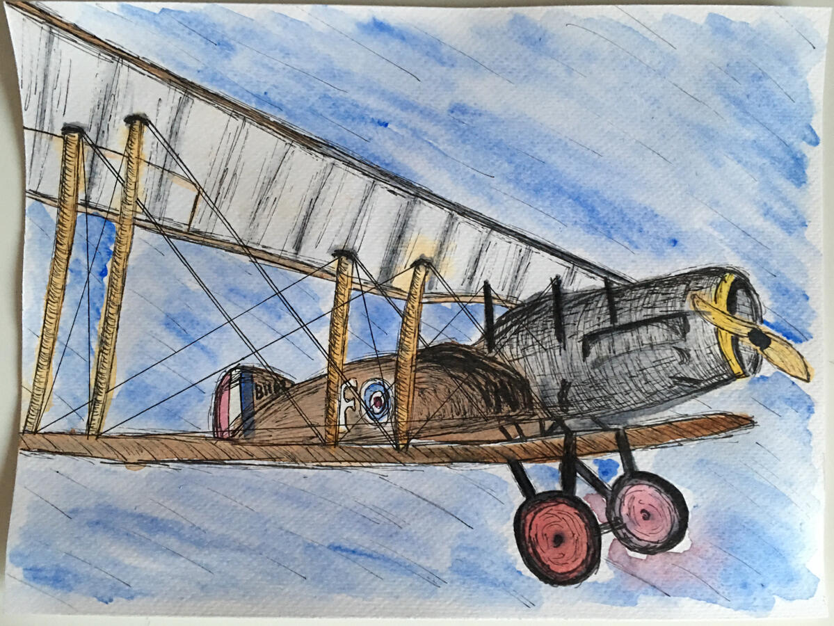
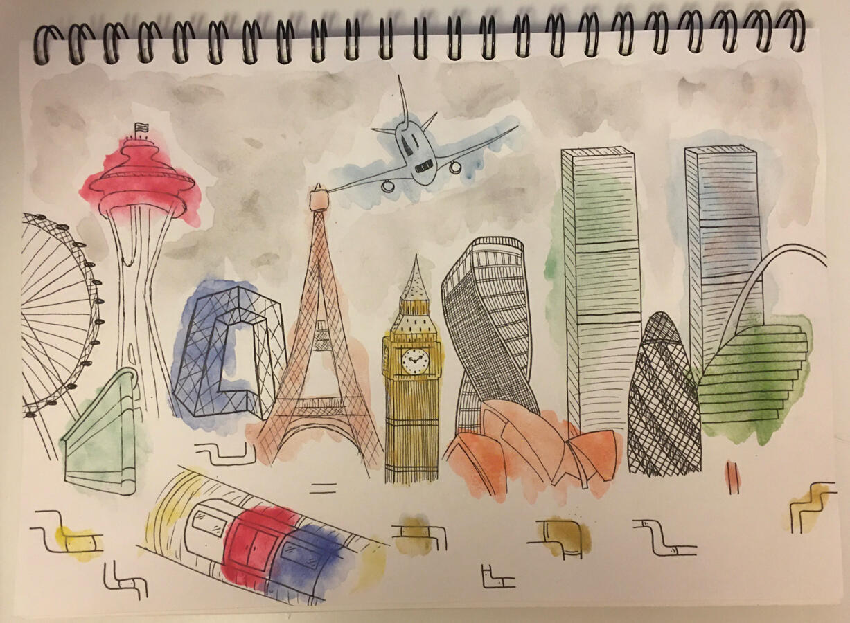
Shuttleworth Watercolour and Fine Liner painting

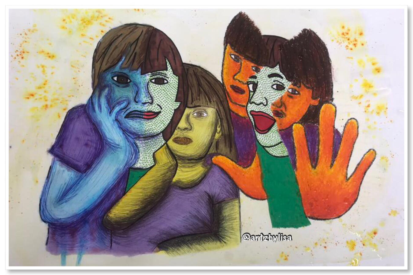
Project: Emotion - Final Piece

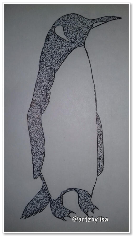
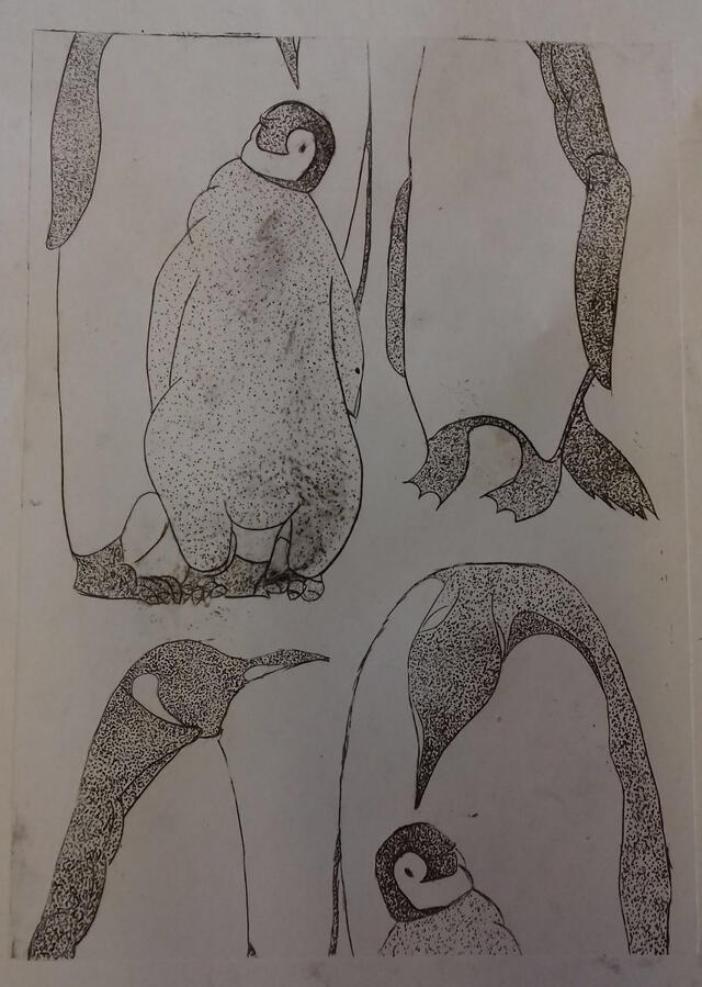
Penguin Drawing - Pointillism

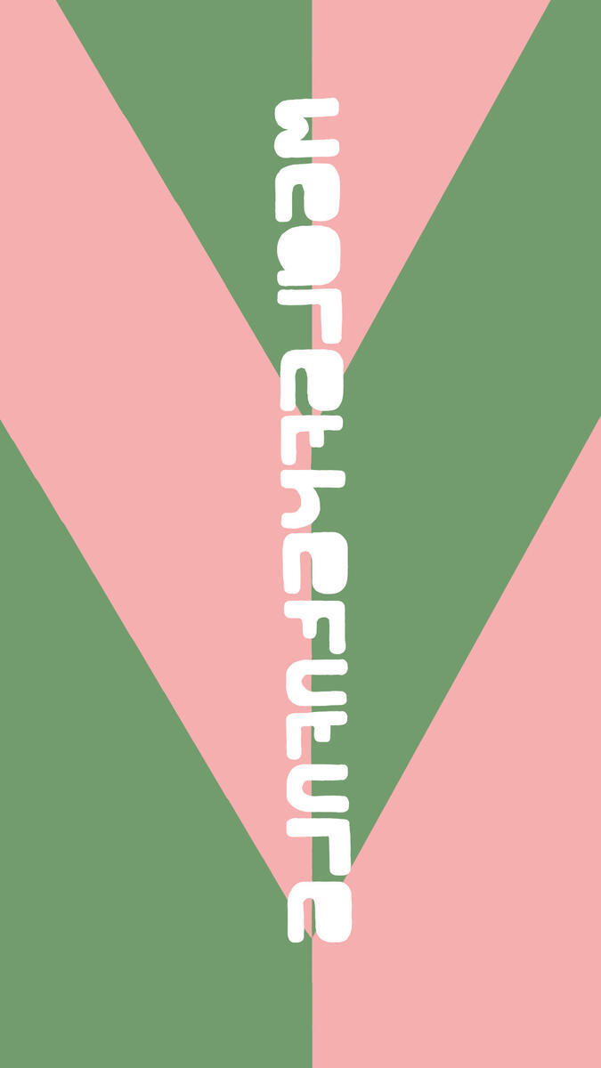
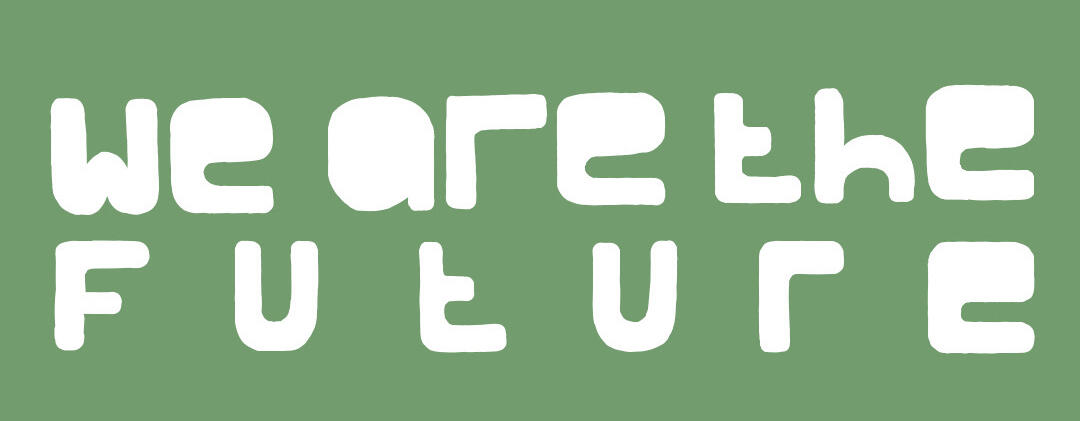
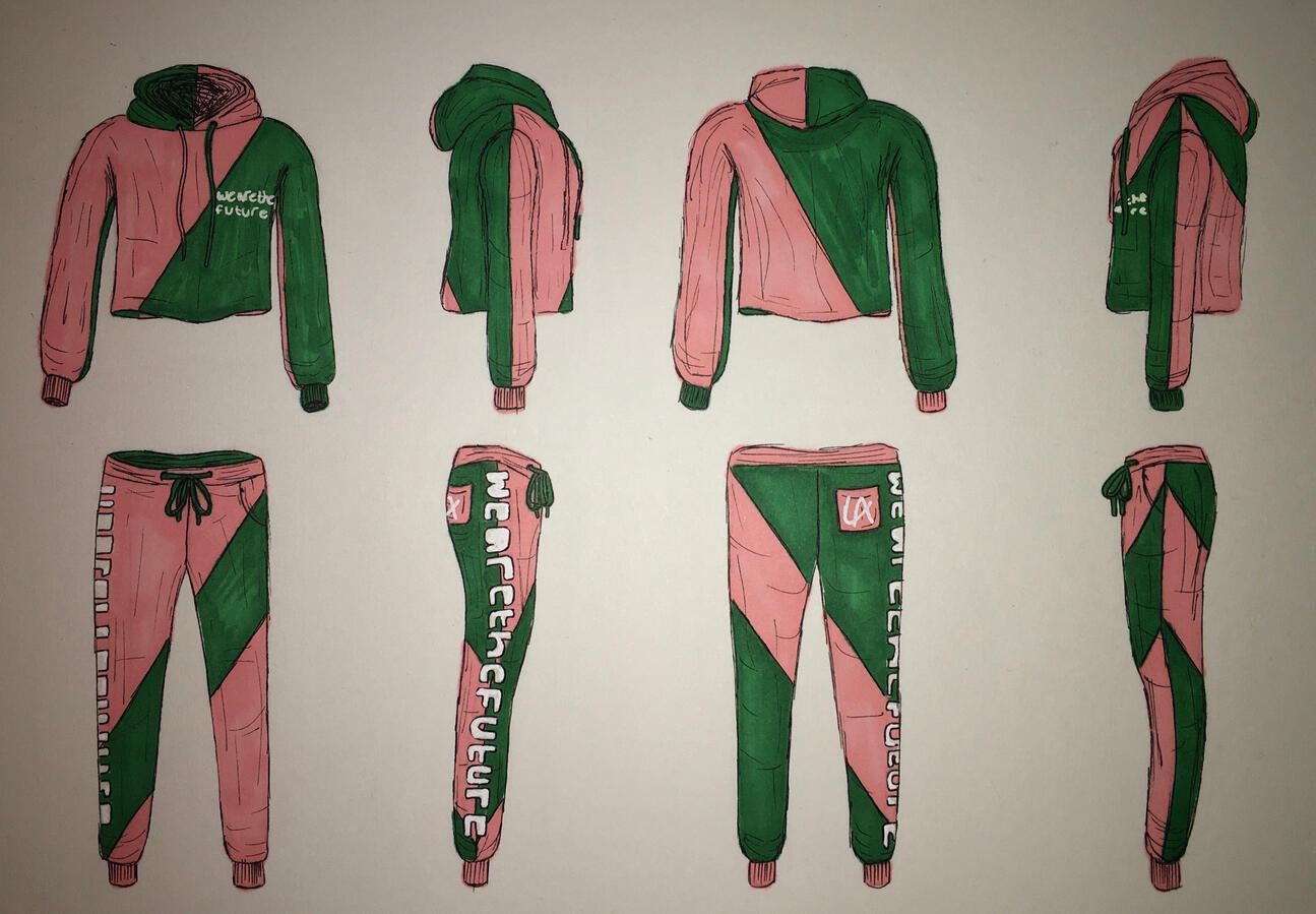
‘We are the Future’ Clothing Designs

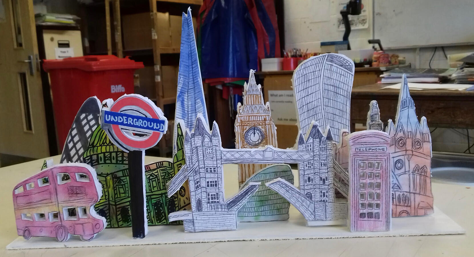
Mixed media - London mounted on foam boards

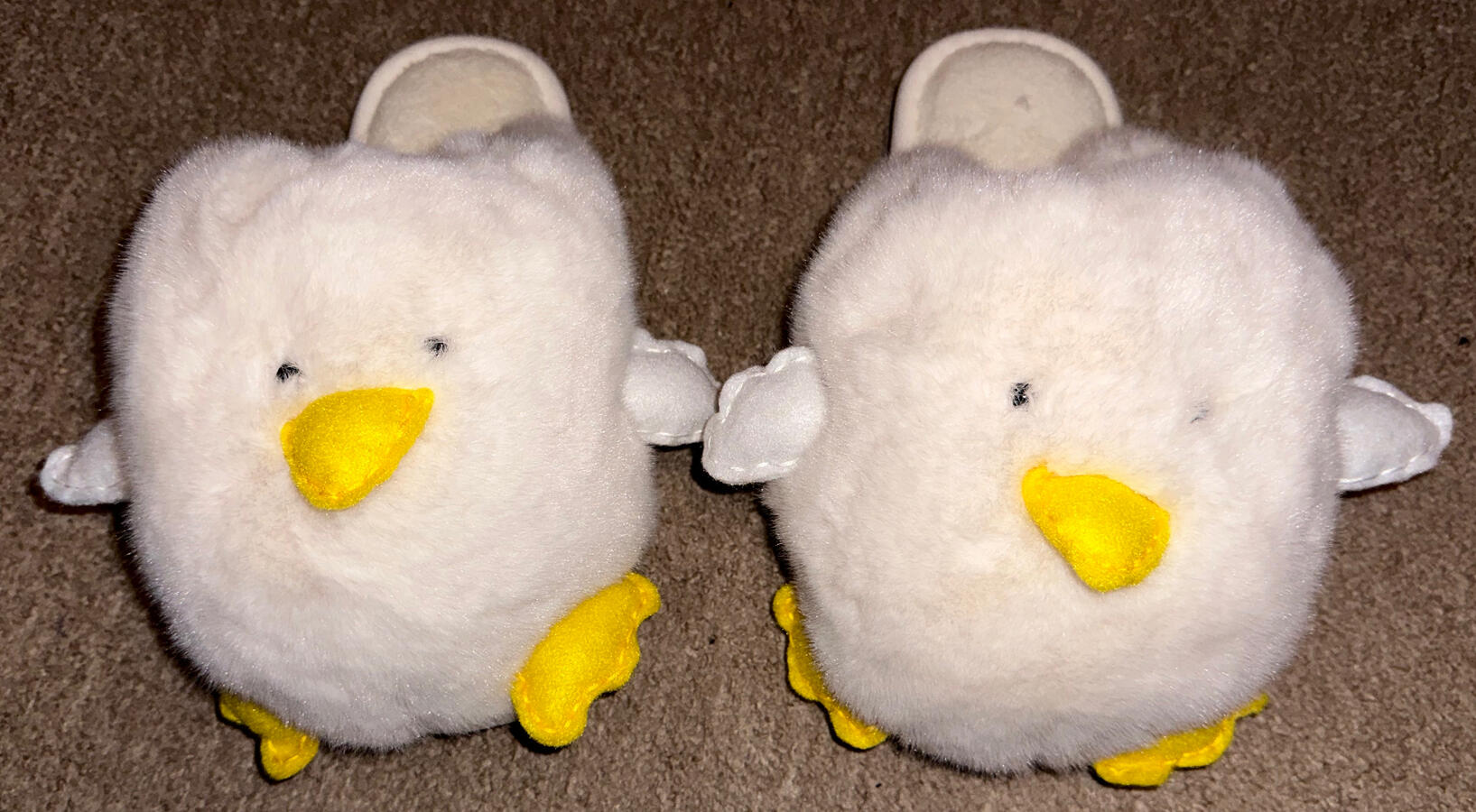
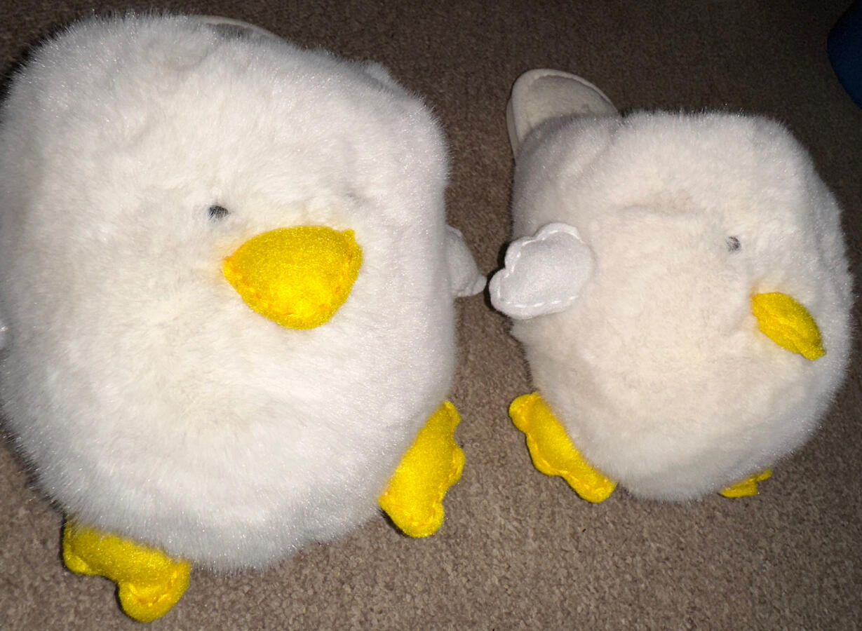
Custom Chicken Slippers

Etching Print

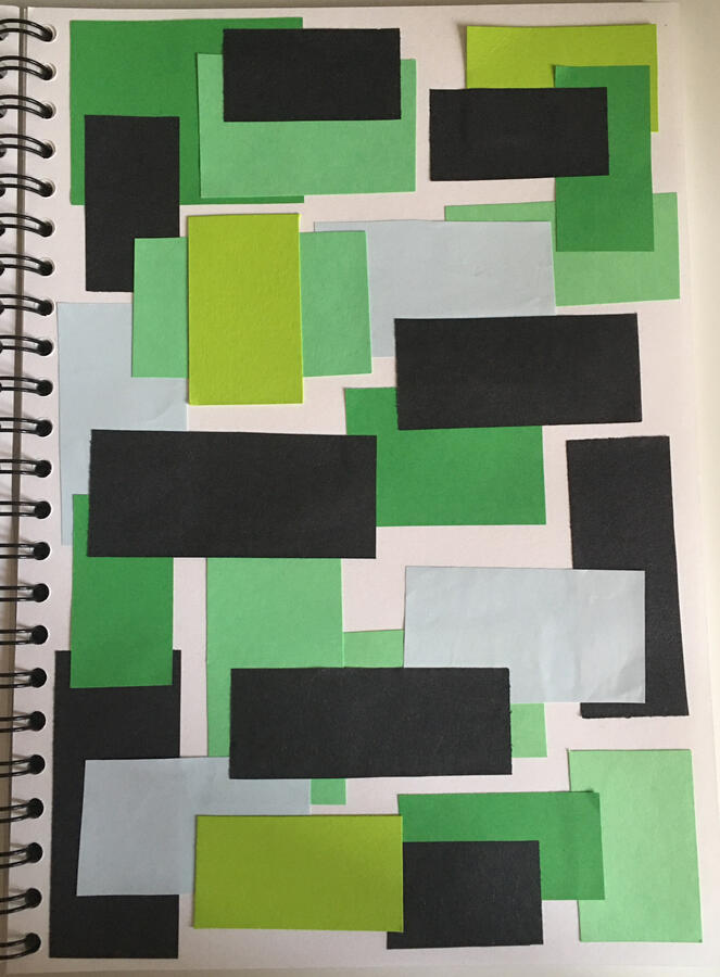
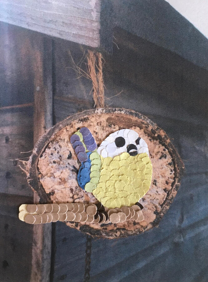
Paper Collage

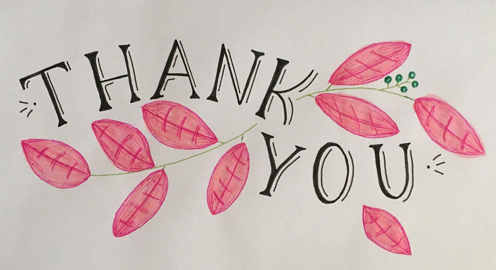
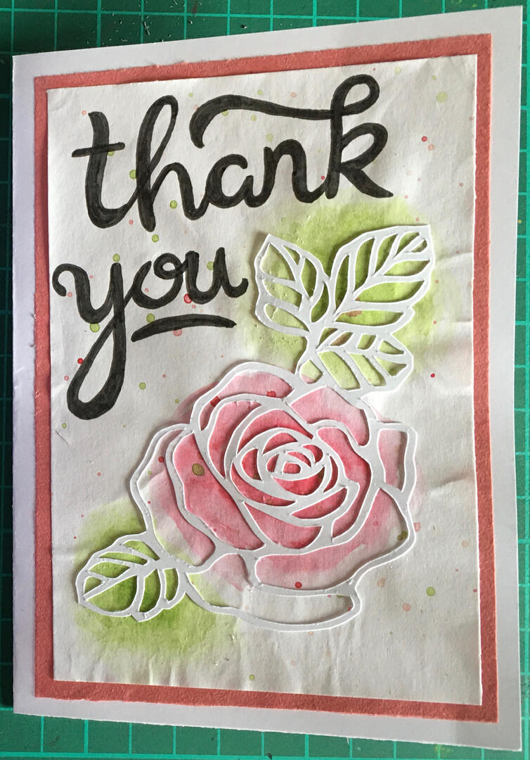
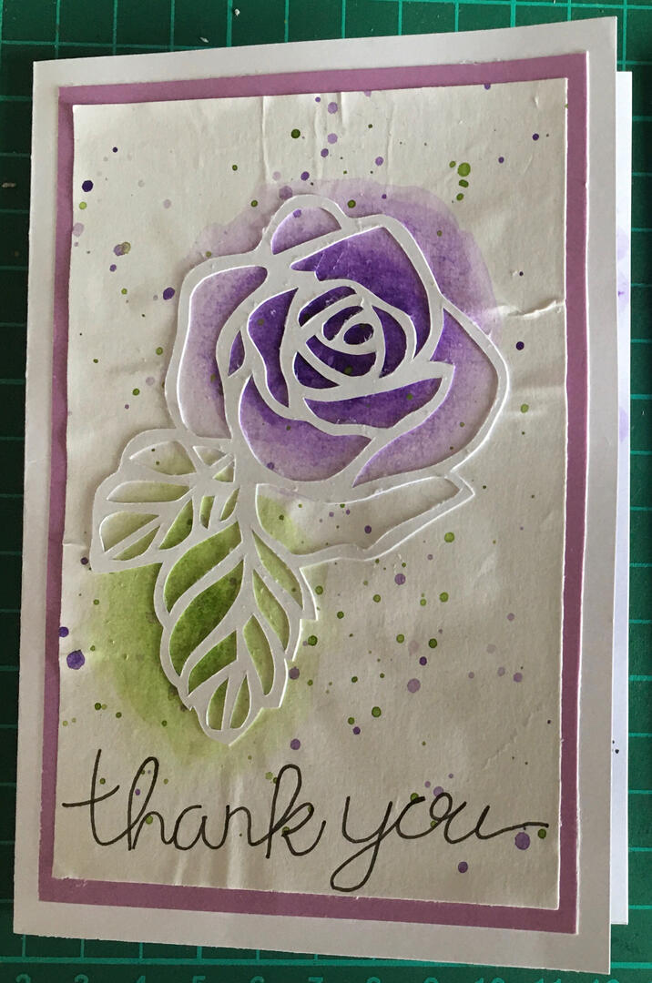
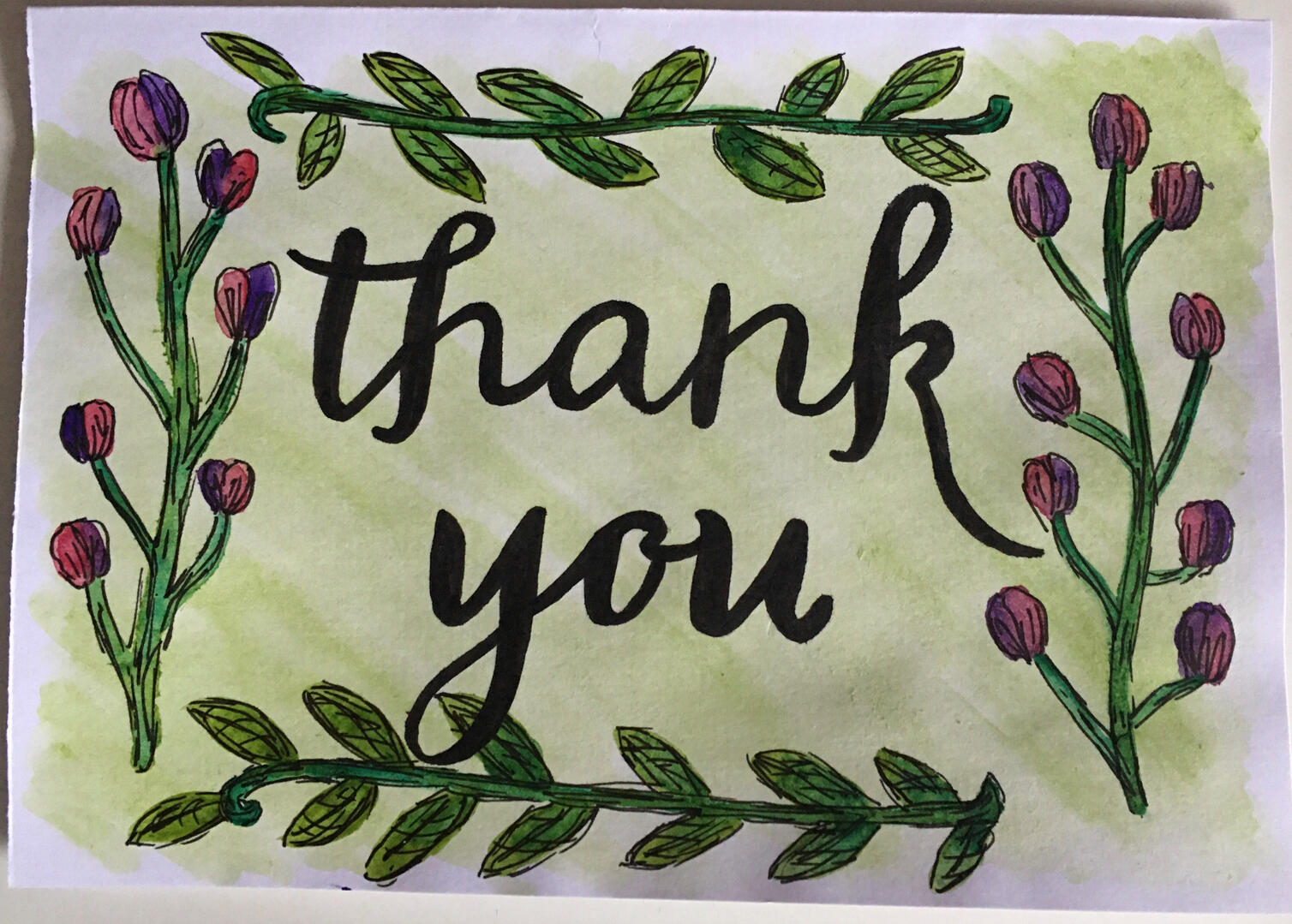
Thank You Card

Stephen Wiltshire Artist Copy

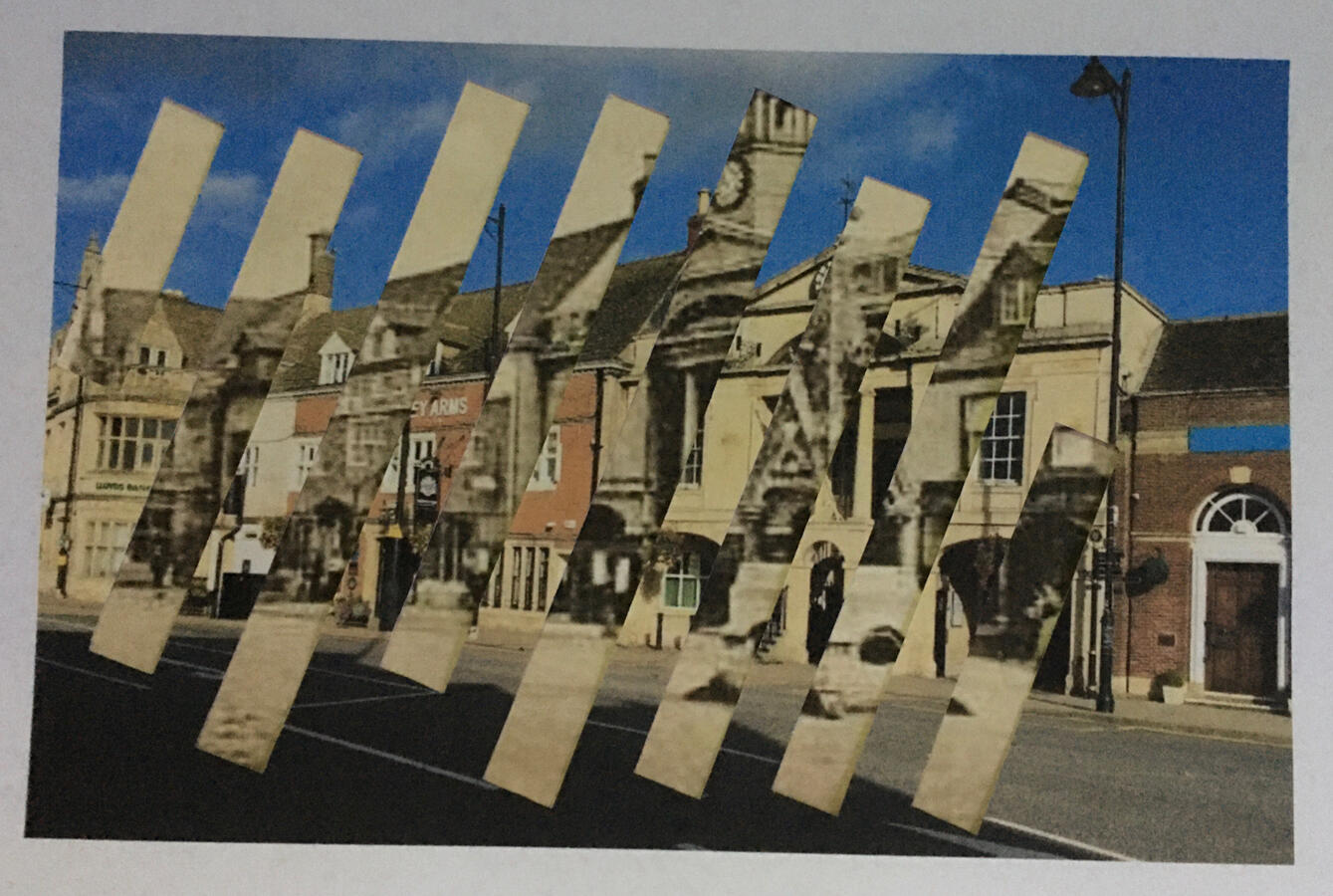
Old to New

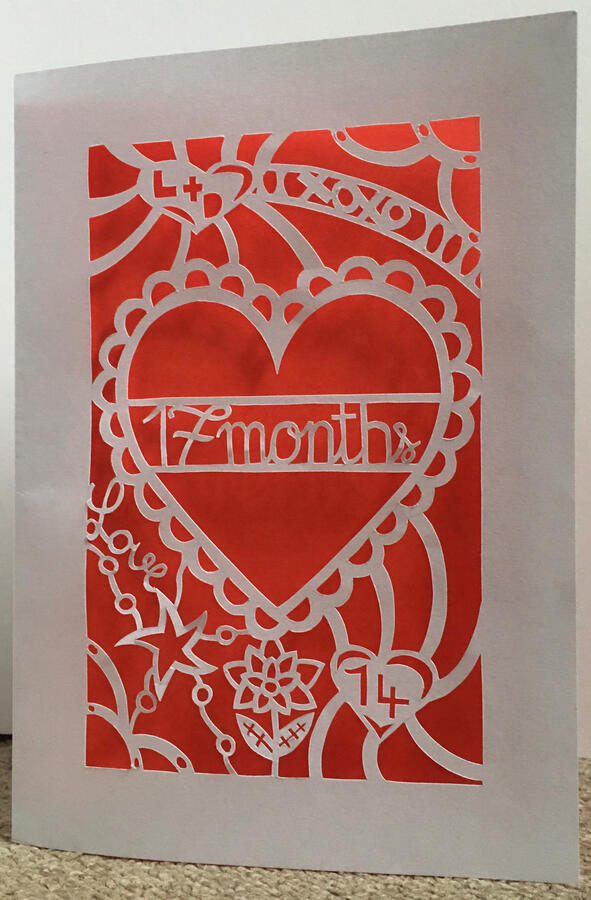
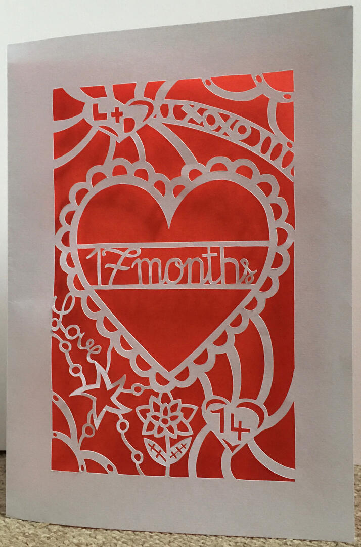
Papercut Card

App Icon

Hole Punch Circles

Watercolour & Fine liner

Custom Slippers
Products
Artzbylisa was originally designed for selling products before branching out to offering my creative services through digital art. - enquire today!
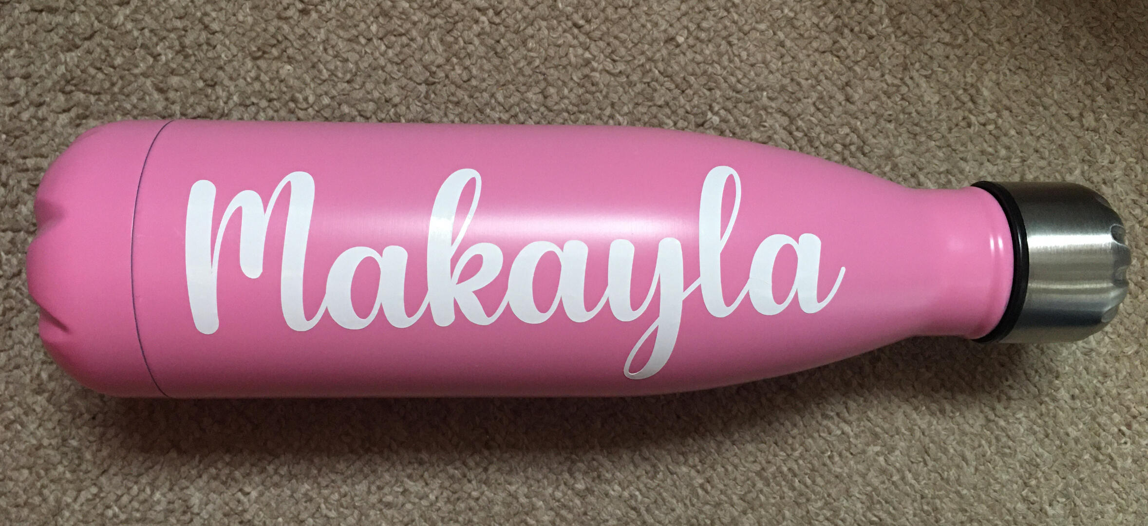
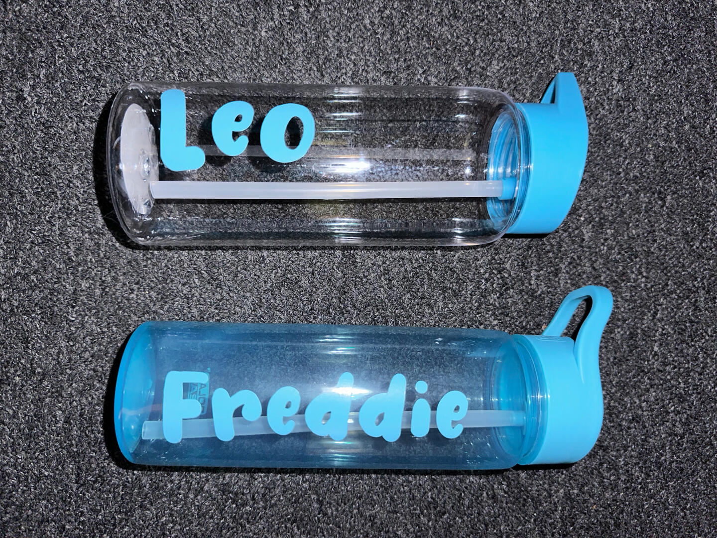
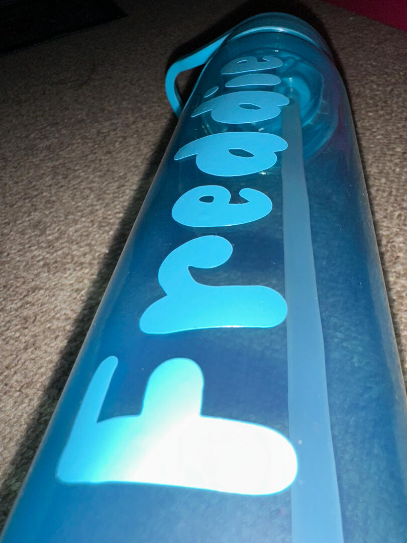
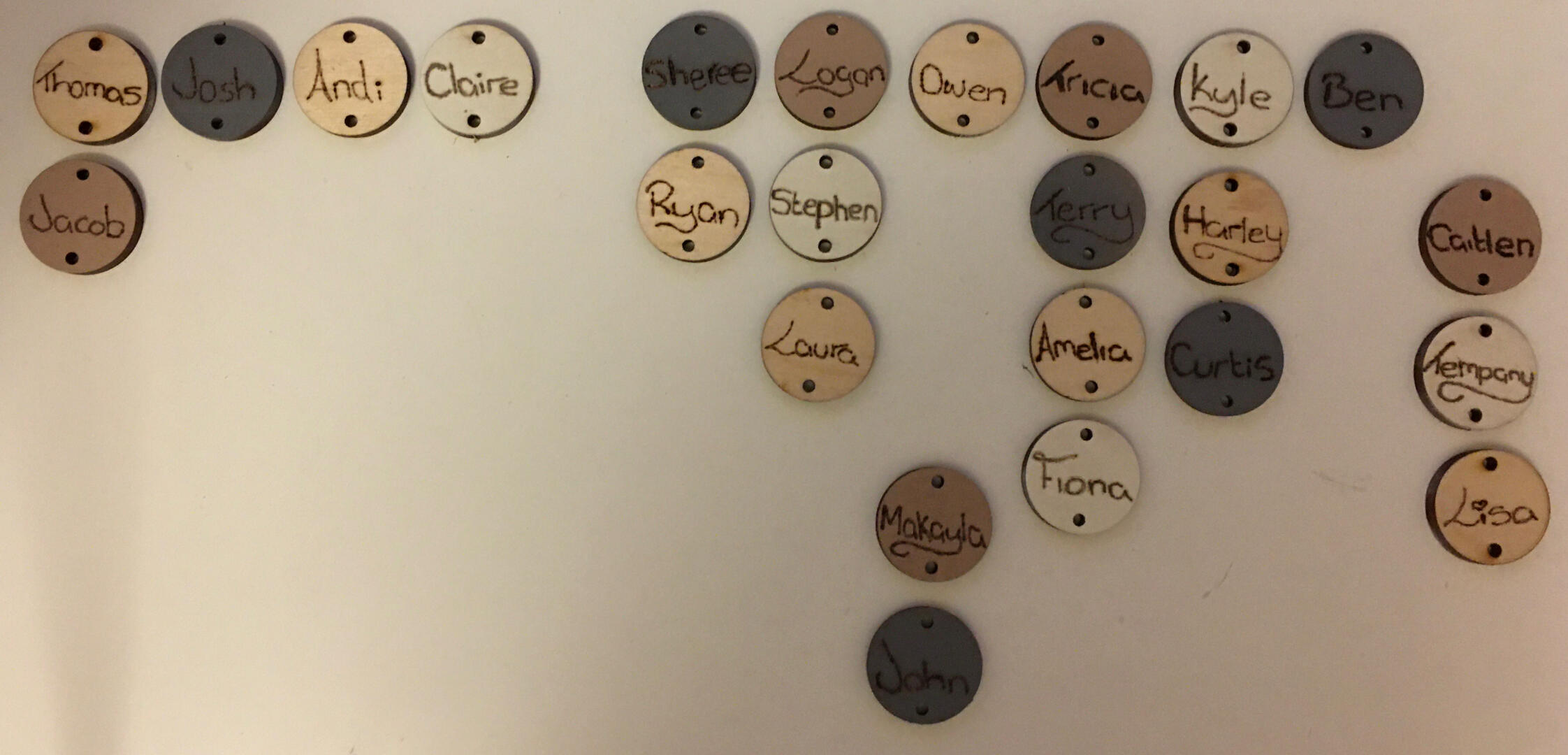
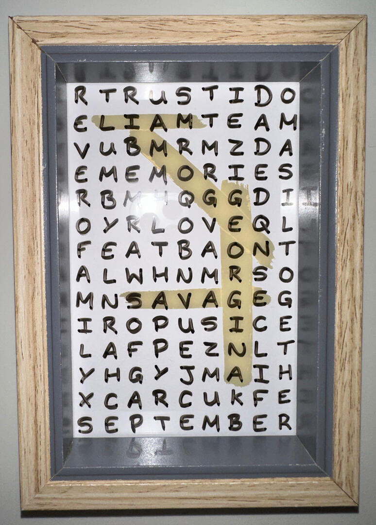
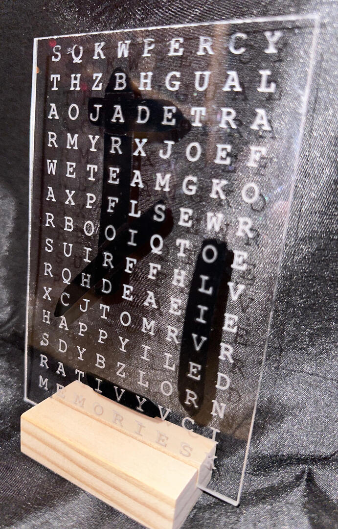
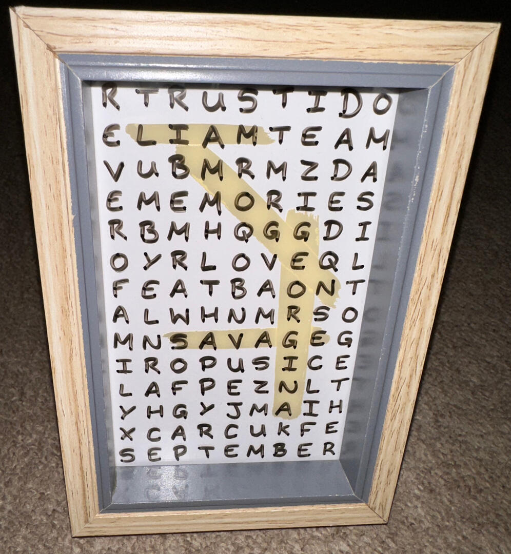
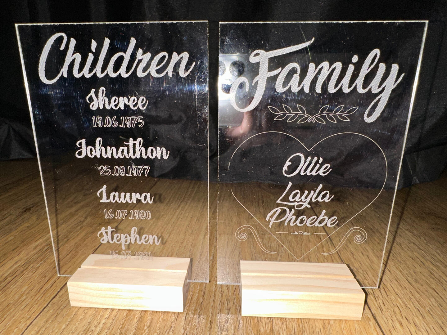
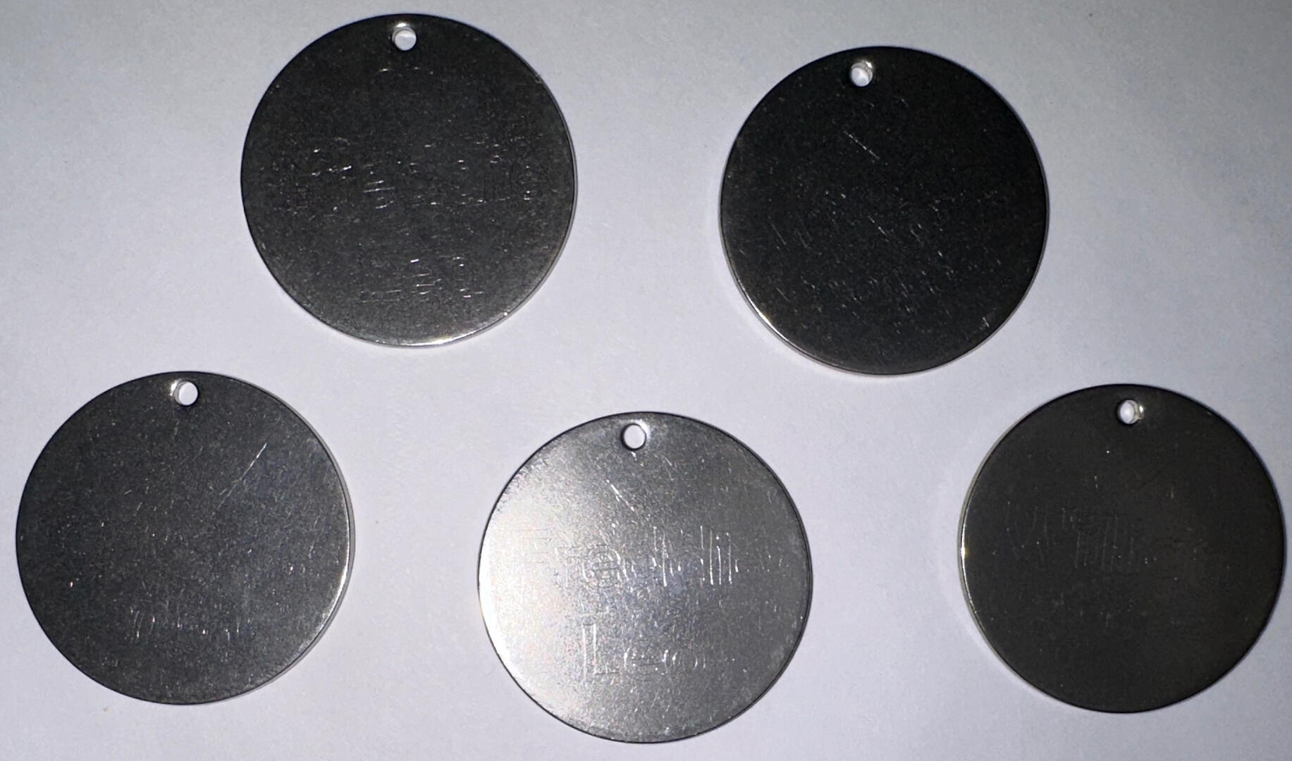
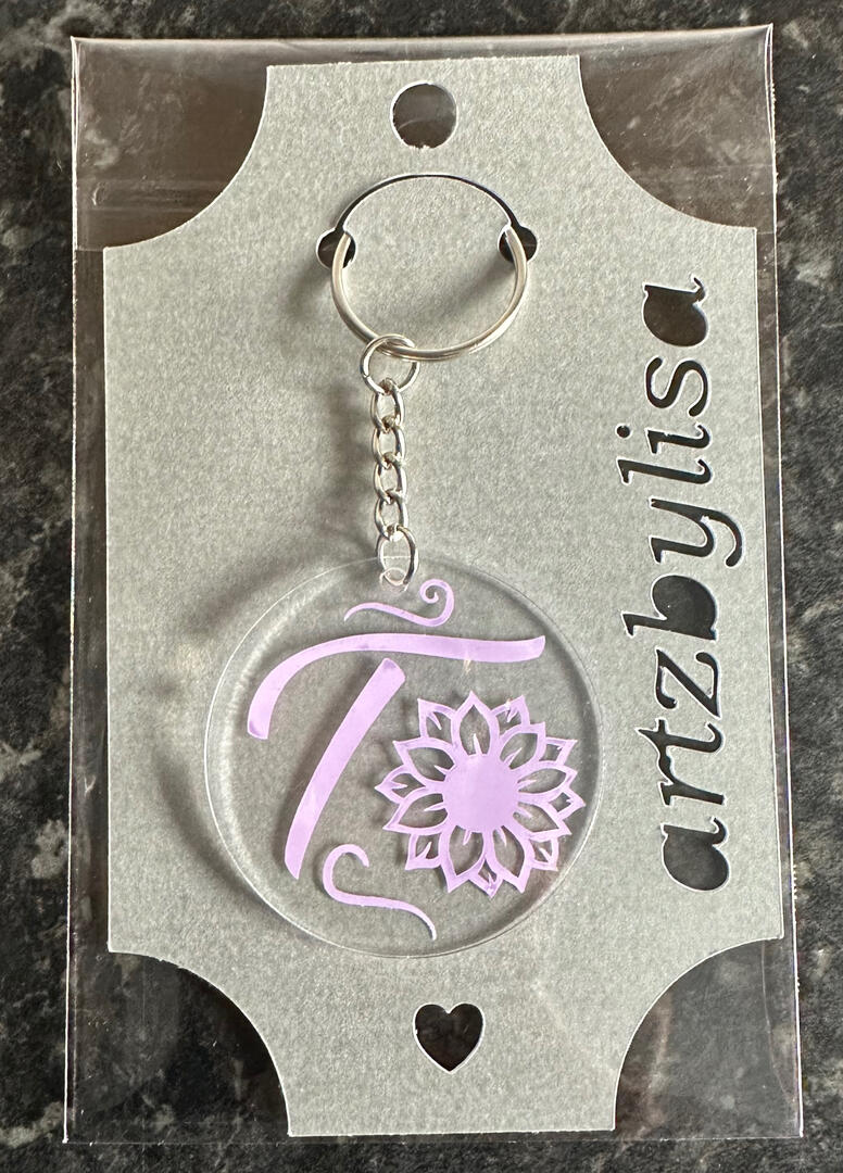
I’ve always loved to get my hands crafty whilst experimenting with many art forms.So far, my physical product range consists of: Keyrings, Etched Slate, Engraved Acrylic, Drawn Cards, Woodburning…and many more to come. Please see belowI am currently working on making some of my photographs into cards to sell either individually, or as a boxed set.
Cards
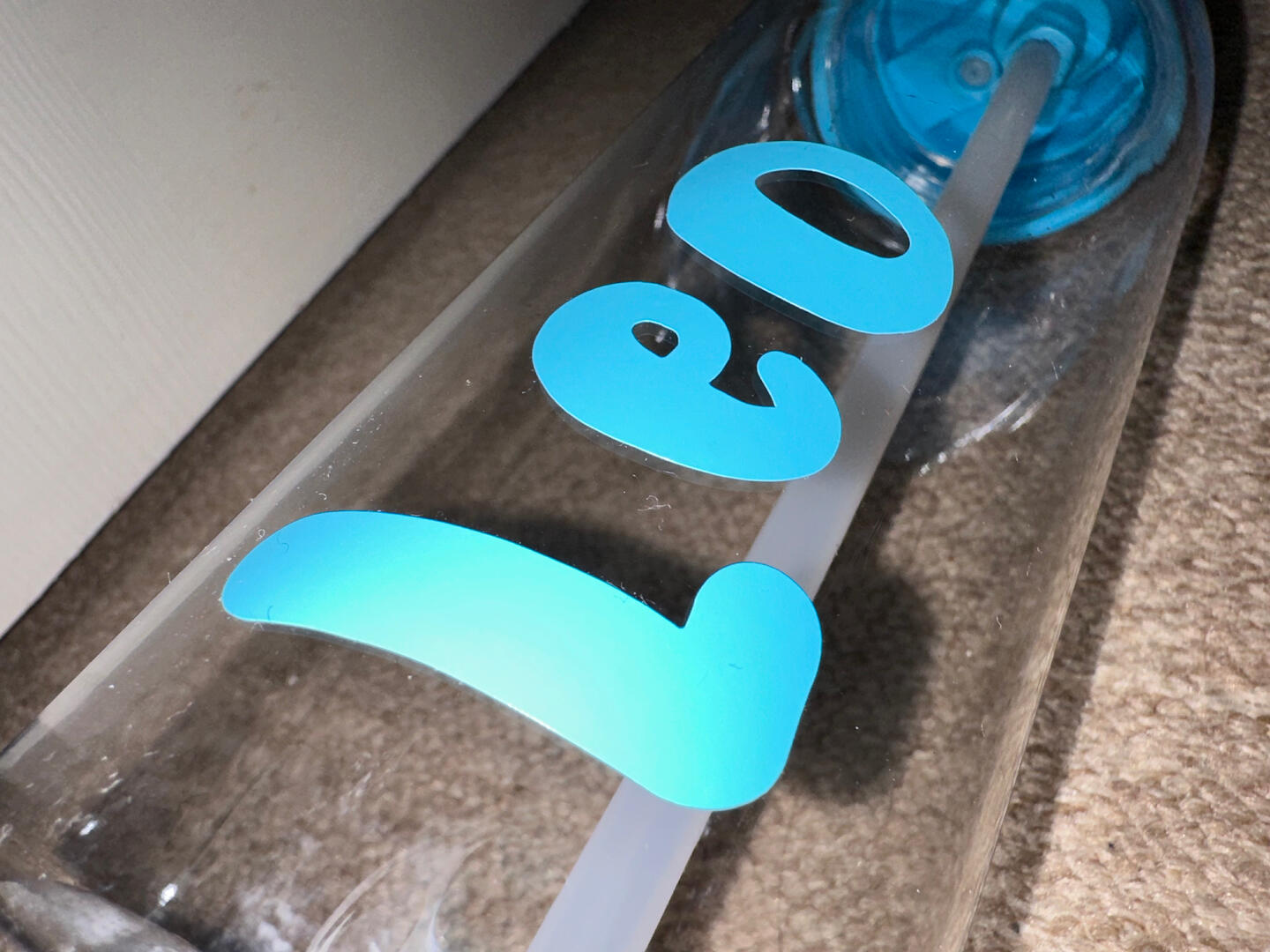
Vinyl Cuts
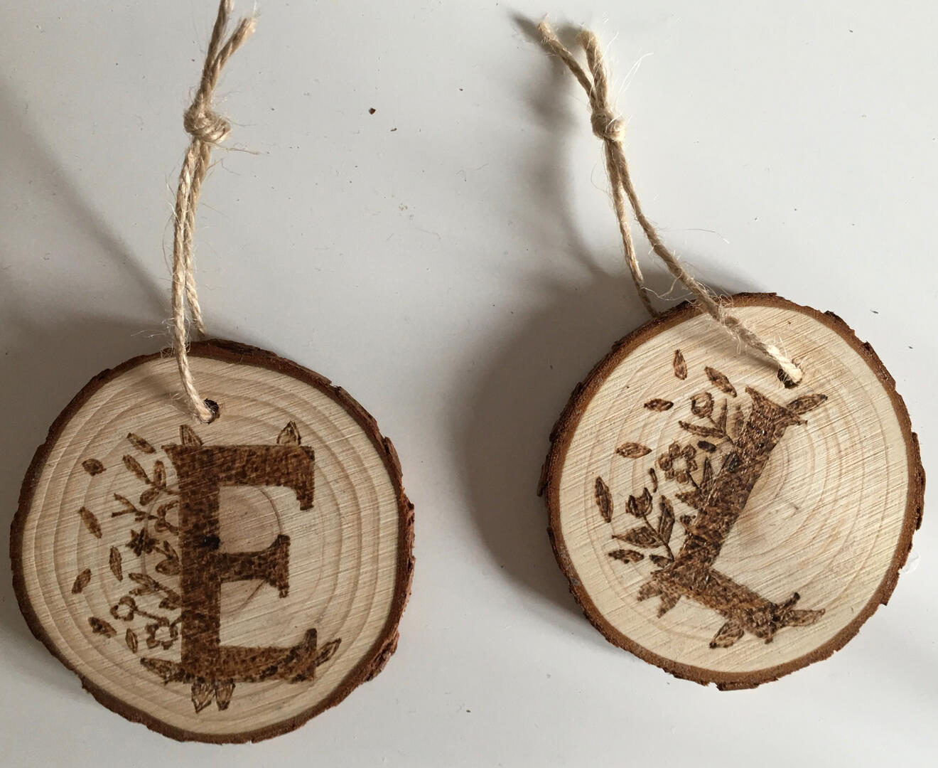
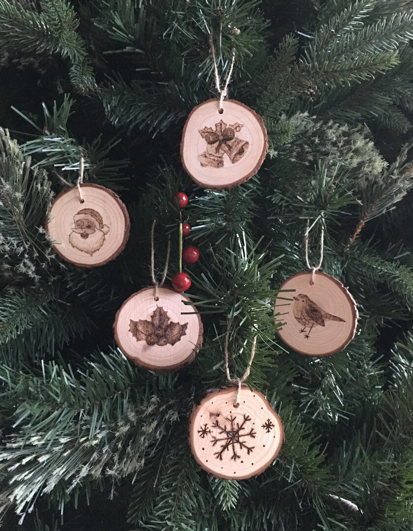
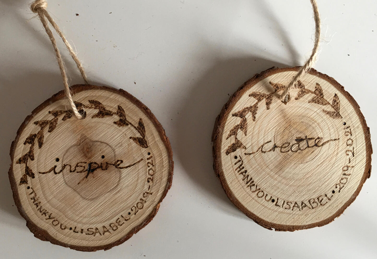
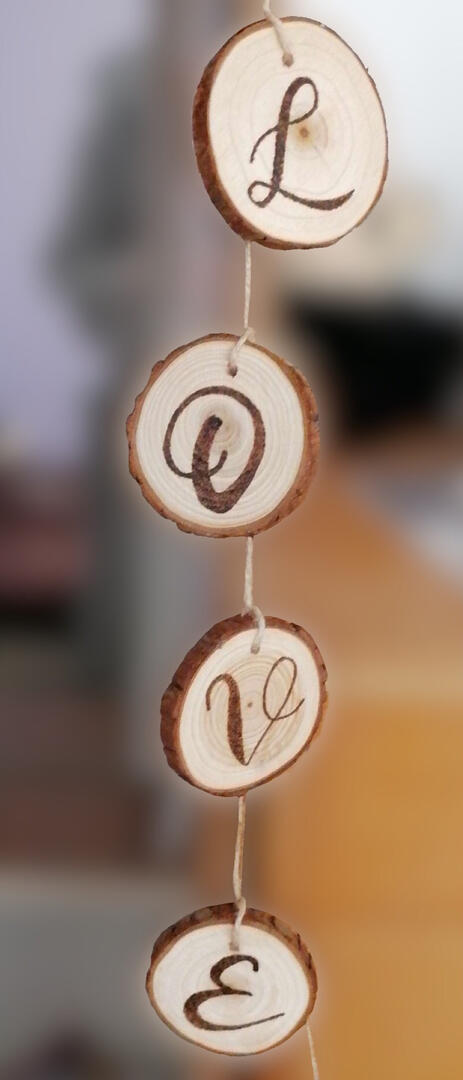
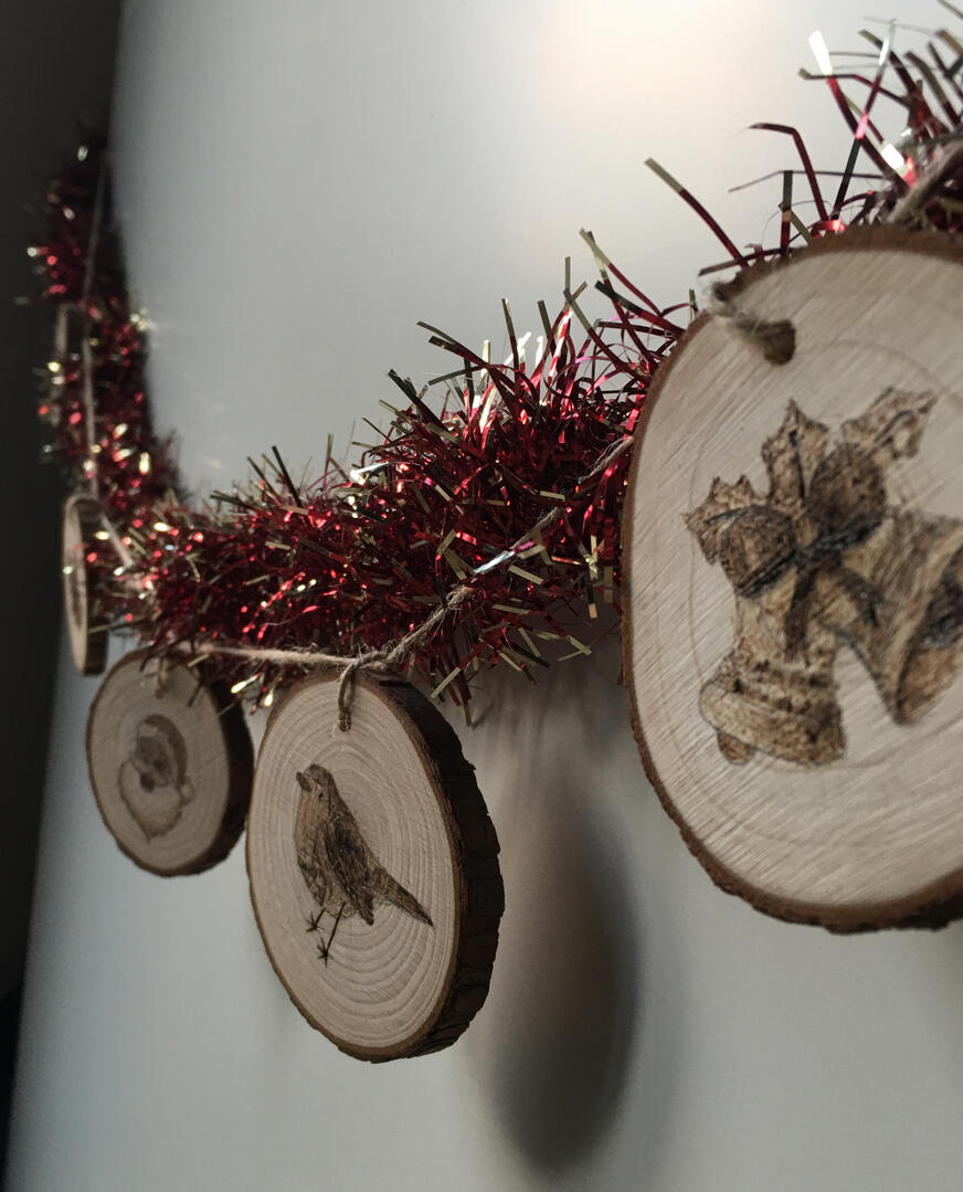
Pyrography
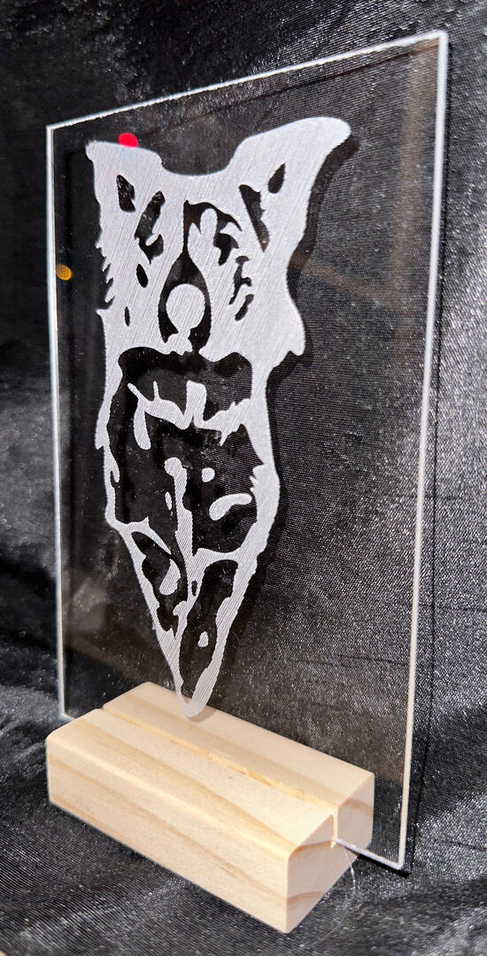
Etched Slate
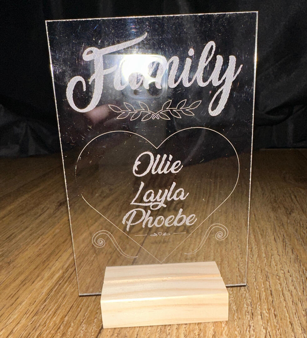
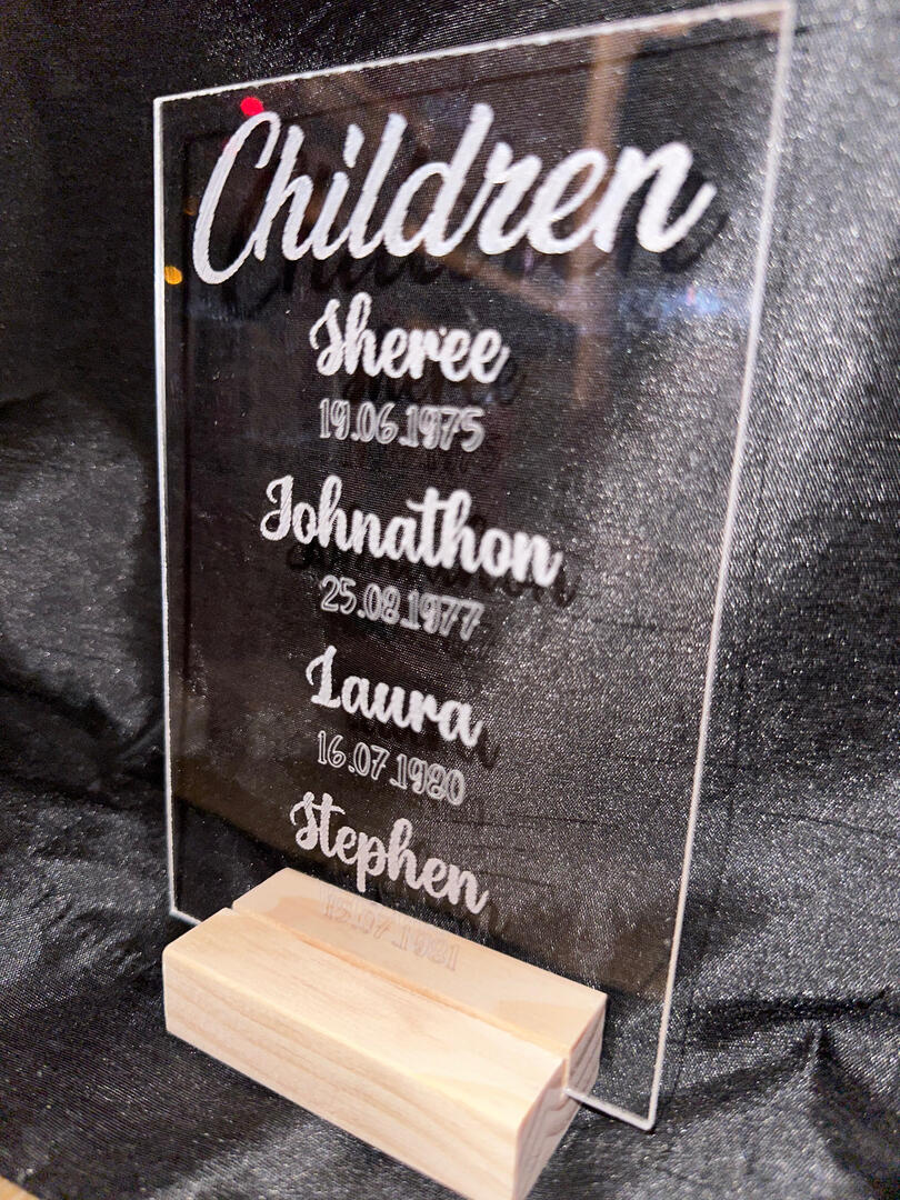
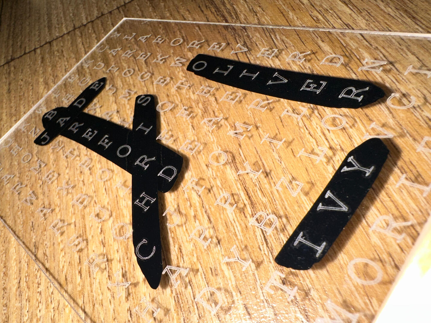
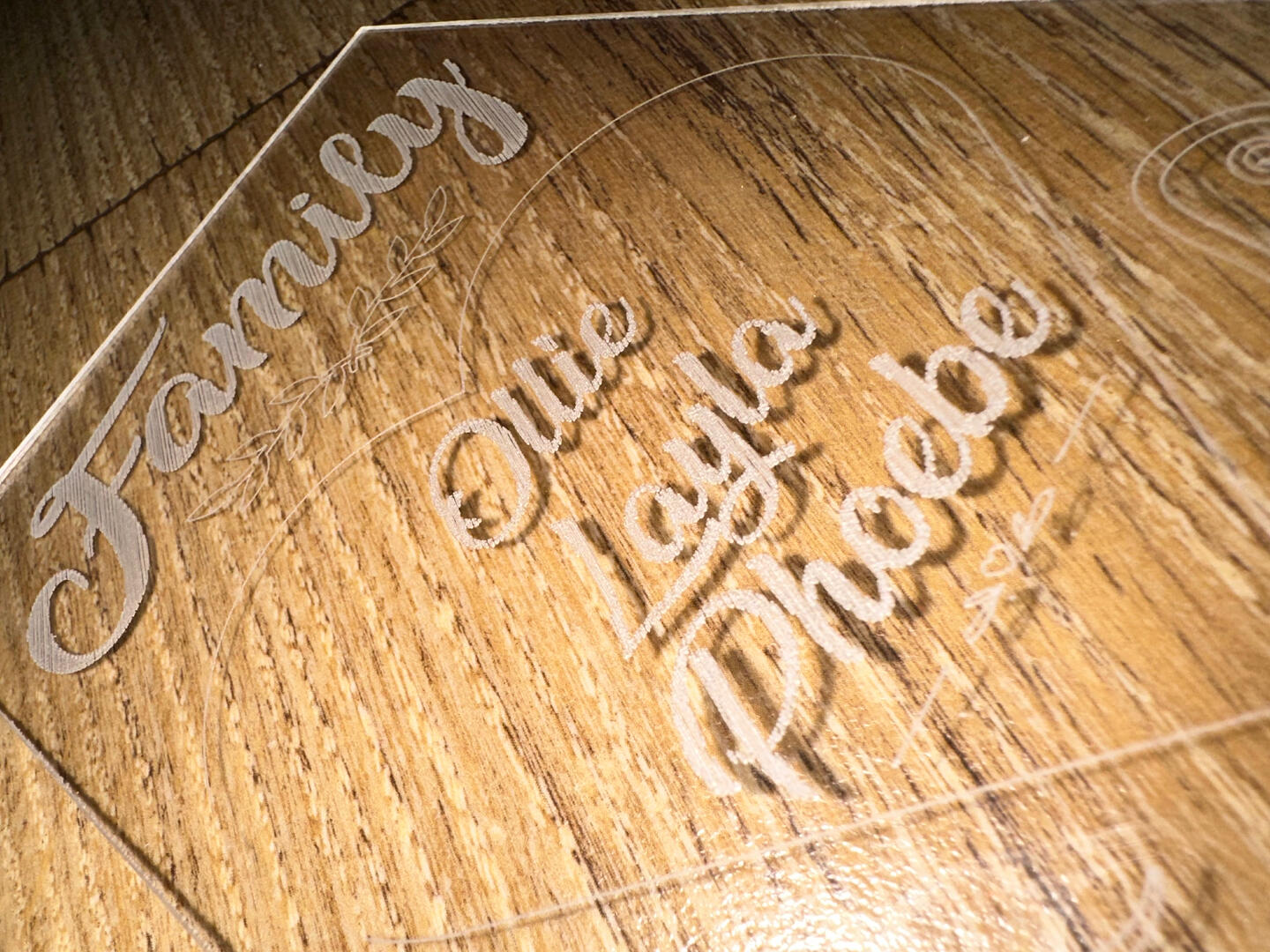
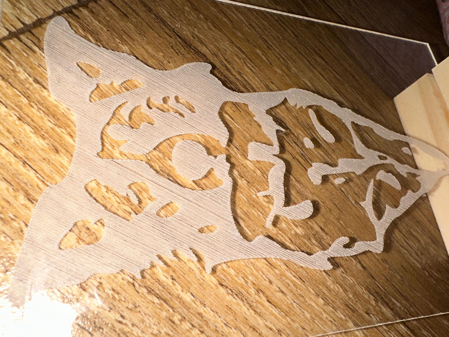
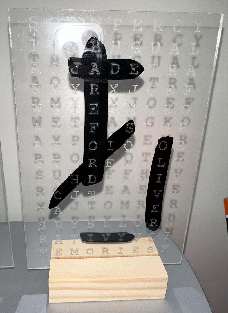
Engraved Acrylic
Packaging
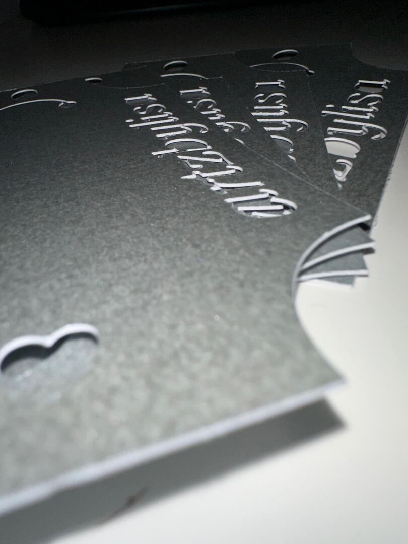
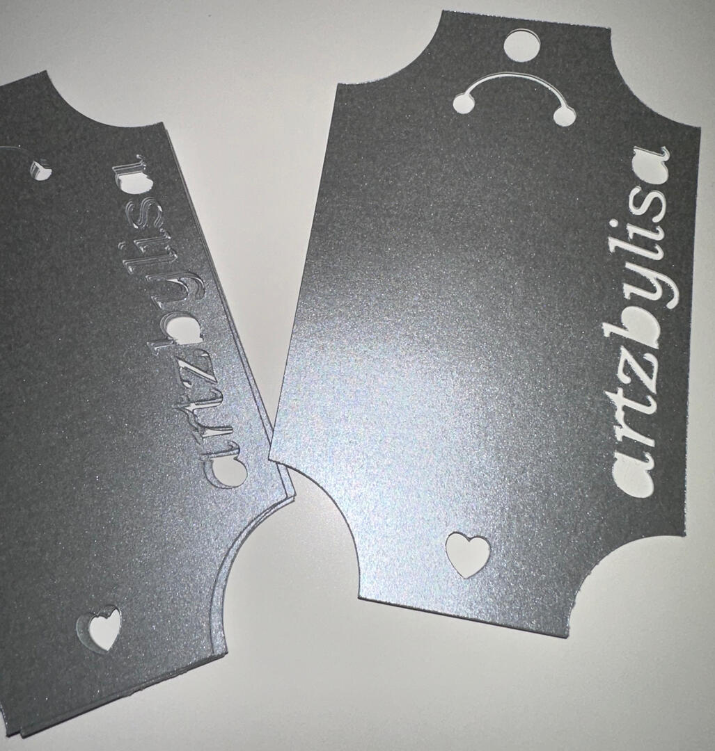
I have designed some packaging for when I give products to my customers.
I never thought I would have enjoyed creating them! I will definitely be creating many more in the future.Here are some images of my current packaging and labels.
Clients & Case Studies
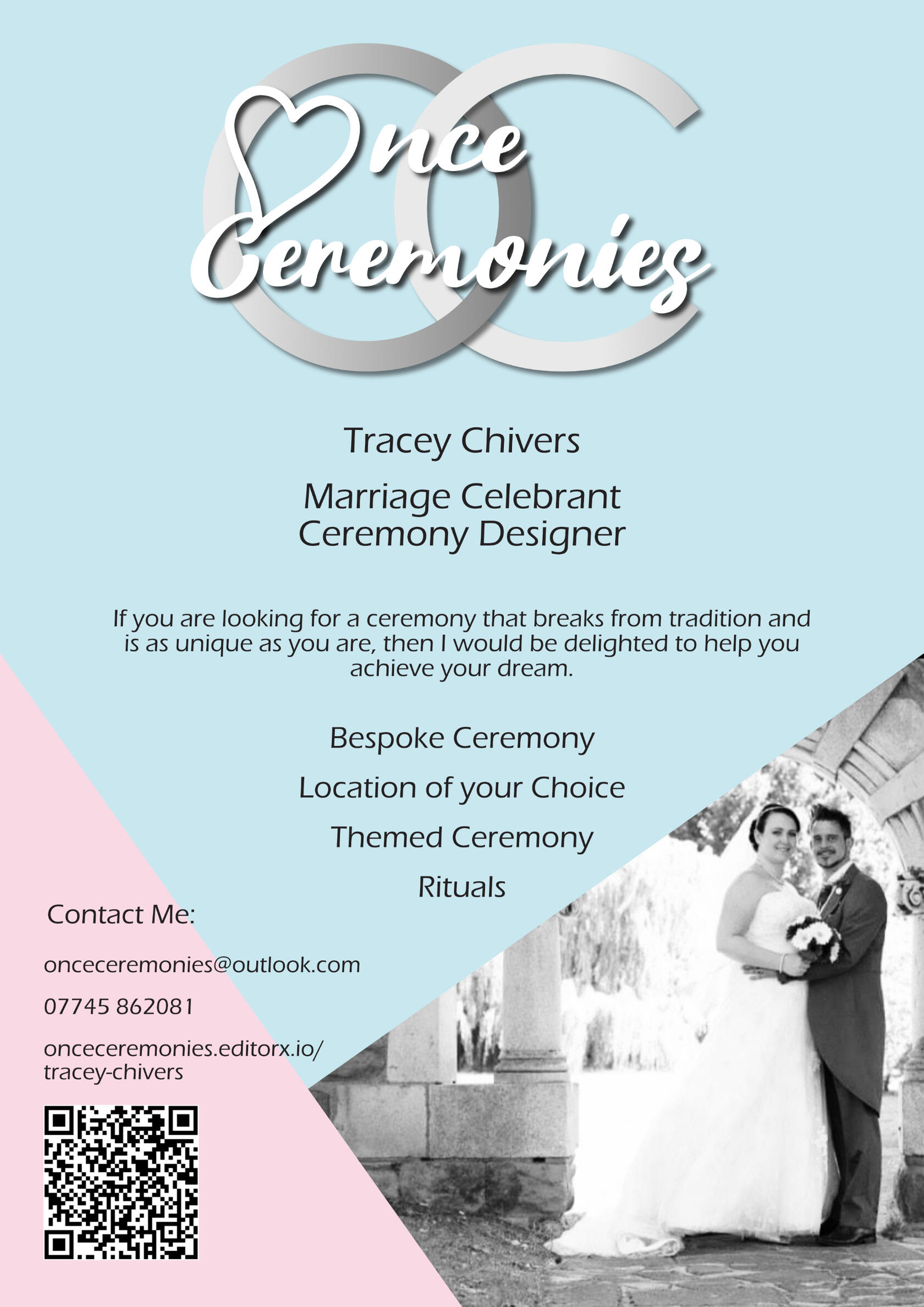
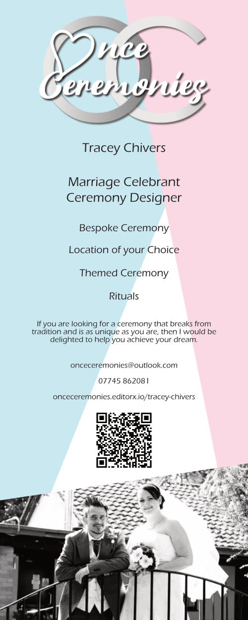
Once Ceremonies
The given brief was to help establish a small business by creating a brand and assets such as a logo, website, and digital and print media.I have thoroughly enjoyed this experience and I am willing to expand my skills by helping others.View the Once Ceremonies blog for more detail and the process of creating the assets.
Businesses Card
Facebook Banner
Poster
Roller Banner
Appraisal
Review
Lisa Abel
Lisa has been professional, dedicated and creative in building the website and assets for my company. She has communicated effectively throughout the process and is always approachable and respectful of my views. Lisa has worked tirelessly to create a website and assets that I am proud to have as the face of my business. Her ideas have allowed my original brief to evolve into an artistic creation that captures both me and my business.
It has been a pleasure to work with Lisa, from beginning to end. Her dedication to produce first class work is commendable and her diligence is outstanding. Thank you Lisa.
